WordPress pattern: Pure Image Light PIL-PRO-08
Build WordPress sites with MaxiBlocks. All features free forever. No locked functionality. Optional Cloud Library saves you 10+ hours per project. Start free
Elevate your website with a stunning multi-column image layout
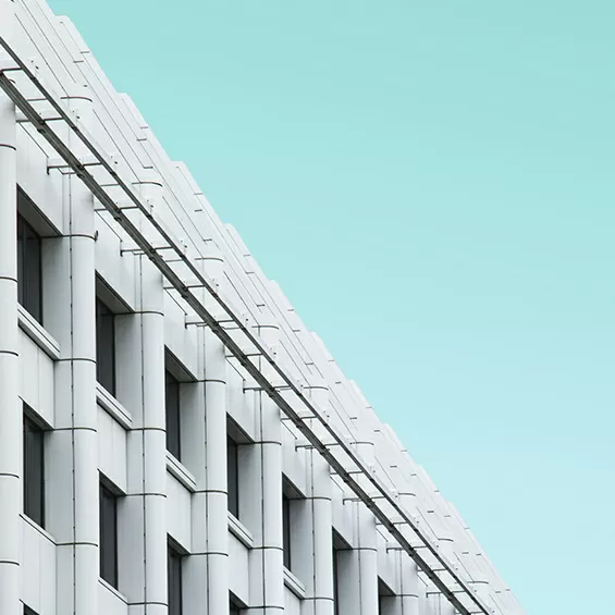
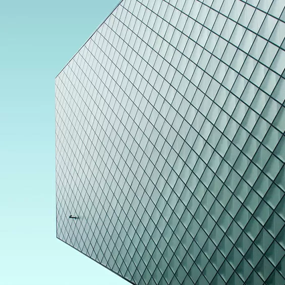
Transform how you present information on your WordPress website design with a sleek and eye-catching multi-column layout. This stunning format offers three equal columns, each showcasing a unique image to complement your content. Whether you’re highlighting architectural masterpieces or displaying abstract art, this design promises to captivate your audience with a visually dynamic presentation.
Layout analysis
Let’s dive into what makes this layout both functional and appealing:
Overall structure
- A modern multi-column layout offers three equal sections aligned side by side for a compelling visual journey.
- Each column is dedicated to a central theme, making the arrangement of rows and columns clear and cohesive.
- Varying graphic elements inside the columns break symmetry, creating captivating visual interest.
Element and feature description
Here are the essential elements that enhance this design:
- Visible elements:
Bold numerals like 01, 02, 03 grab attention, with descriptive text beneath each number enhancing engagement. Distinct images enrich the narrative. - Interactive elements:
The design is static for focused visual storytelling without interactive buttons or forms. - Typography:
Large, bold fonts for numerals immediately draw focus, while smaller sans-serif text ensures readability. - Icons and graphics:
Utilising featured images as the main graphical element maintains a minimalist aesthetic. - Image features:
Minimal borders ensure a clean appearance, with landscape-oriented images, subtle frames, or shadow effects for added depth.
Unique design aspects
The layout includes several standout features:
- Attention-grabbing labels: The bold numerals create a strong visual hierarchy.
- Hover effects or animations: While the approach is static for clarity, subtle interactions can be included if desired.
- Responsive design: The layout transitions to a single column on smaller devices, ensuring mobile-friendliness.
- Accessibility considerations: Clear typography and structure enhance readability, though additional information on color contrast is warranted for full accessibility compliance.
Overall design style
- Design style: Embracing minimalism, the design focuses on clean lines and simplicity.
- Visual hierarchy: Large numbers lead the user’s attention, followed by guiding text.
- White space and balance: Generous space fosters balance and focus in the layout.
Use cases for website image-based patterns
Art gallery showcase
Display exquisite pieces with ease using the multi-column layout. Each column can capture the essence of a different collection or artist. The seamless structure enhances visual storytelling, inviting viewers to embark on an aesthetic journey. Whether online or on-site, galleries benefit from the clarity and style offered by this pattern, ensuring that art remains the centrepiece.
Architectural portfolio
Architects can frame their finest projects within this layout, highlighting different facets of a single project or showcasing a variety of works. The clean structure allows for detailed presentations without overwhelming the viewer, making it easier to communicate design innovations and concepts effectively.
Fashion lookbook
Fashion brands can utilise this layout to blend apparel imagery with concise description. By aligning three different fashion lines or styles side by side, brands can create an engaging narrative that draws the viewer into the ambience of each collection. This not only enhances brand storytelling but also improves user engagement.
Travel destination guide
Travel websites can effectively use this layout to display captivating images of must-visit spots. Each column can highlight a new destination with vibrant imagery and enticing descriptions, inviting readers to explore the world from the comfort of their homes.
Food blog features
Offer your audience a feast for the eyes with images of culinary delights. By highlighting different recipes, courses, or ingredients, this layout helps connect avid readers with culinary content that inspires them to try new dishes in their own kitchens.
Event promotions
Whether it’s a music festival, conference, or local market, events stand out effectively through this layout. Feature posters, sneak peek images, or promotional graphics in an organised manner that keeps your target audience informed and excited.
Educational content highlights
Educators and institutions can arrange learning materials creatively within these columns. This structured layout aids studious minds in grasping diverse concepts efficiently as they explore subjects across the visual spectrum.
Brand storytelling
Companies can enhance their narratives by chronicling brand history or achievements through captivating imagery. By using this design, businesses can communicate their ethos compellingly and memorably to connect with current and potential clients.
Home improvement ideas
For interior designers and DIY enthusiasts, this layout offers a platform to present inspired home improvement ideas across various styles or solutions. By crafting a visually appealing display, users gain inspiration and clarity on transforming their spaces.
Product feature comparison
Brands can effectively present diverse product lines using this layout, comparing features side by side in an engaging and organised manner. Consumers gain a better understanding of the offerings without feeling overwhelmed, enhancing purchasing decisions.
Pages to use image-based designs
Homepages
A homepage acts as the virtual storefront for any WordPress website. Utilising image-based designs on the homepage can captivate visitors from the get-go, guiding them through different sections or categories with relevant, striking images.
Portfolio pages
Artists, designers, and creatives use portfolio pages to showcase their work. Image-based designs create an immersive experience that blends photography with professional achievements, letting each piece speak for itself within a holistic presentation.
Blog posts
Blogs often employ images to break up text and engage readers. Using image-based layouts ensures that imagery and information coexist beautifully, elevating user experience without sacrificing the clarity of written content.
Service pages
Highlight the diverse offerings of your business with vivid images. Service pages that incorporate image-based designs allow potential clients to visualise and better understand the benefits and features of various services.
Product galleries
Image-based layouts are perfect for e-commerce sites. They provide a visually driven method to showcase products, making the browsing experience engaging while encouraging consumers to make more informed purchasing decisions.
Contact pages
Though often overlooked, contact pages can gain significant visual appeal through image-based designs. Embedded maps, photos of office spaces, or team members can make the company more approachable and trustworthy.
Team pages
Introduce your team with visual storytelling on team pages. Showcasing professional headshots alongside mini-biographies offers an engaging introduction to team members, building client connection and trust.
Case studies
Present successful projects with an exploratory image-centric format. Image-based case studies allow clients to walk visually through processes and outcomes, enhancing credibility while narrating your company’s achievements.
Service landing pages
Engage customers from the first click with strategically placed images on service landing pages. Offering a preview of service benefits through thoughtfully curated visuals captures attention and enriches understanding.
News and portfolio pages
Whether showcasing headlines or personal achievements, think of these pages as a display board inviting inquiry and engagement. Image-based designs make information appear more vivacious and easily digestible across a variety of topics and stories.
Conclusion
Our minimalist multi-column layout is the ideal solution for showcasing key concepts or services beautifully. With striking numerical labels, carefully placed text, and unique imagery, you can create an organised and aesthetically pleasing way to engage your visitors. Don’t miss the chance to elevate your WordPress website design with this compelling format. For more on an effective WordPress website builder, and inspiration on best design practices, explore further resources to transform your site’s potential.


