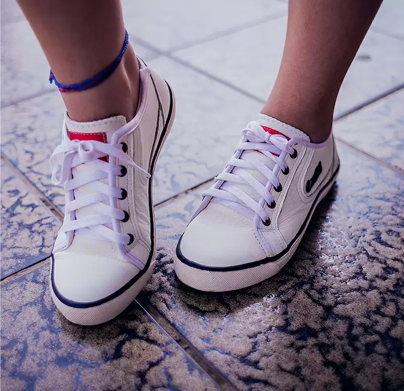
A better way
Lorem ipsum dolor sit amet, cons ectetuer adipiscing elit.
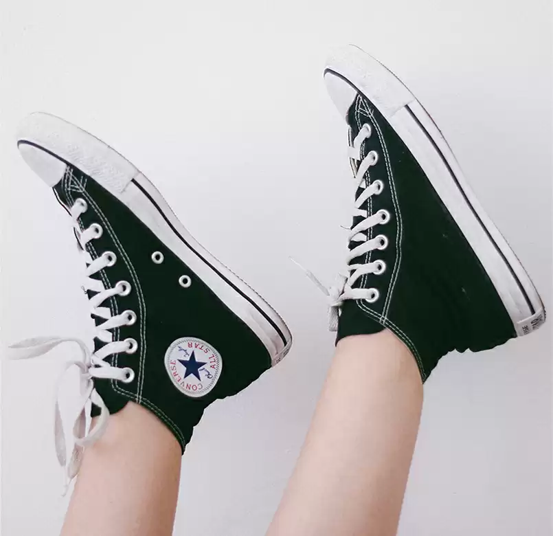
Choose freedom
Lorem ipsum dolor sit amet, cons ectetuer adipiscing elit.
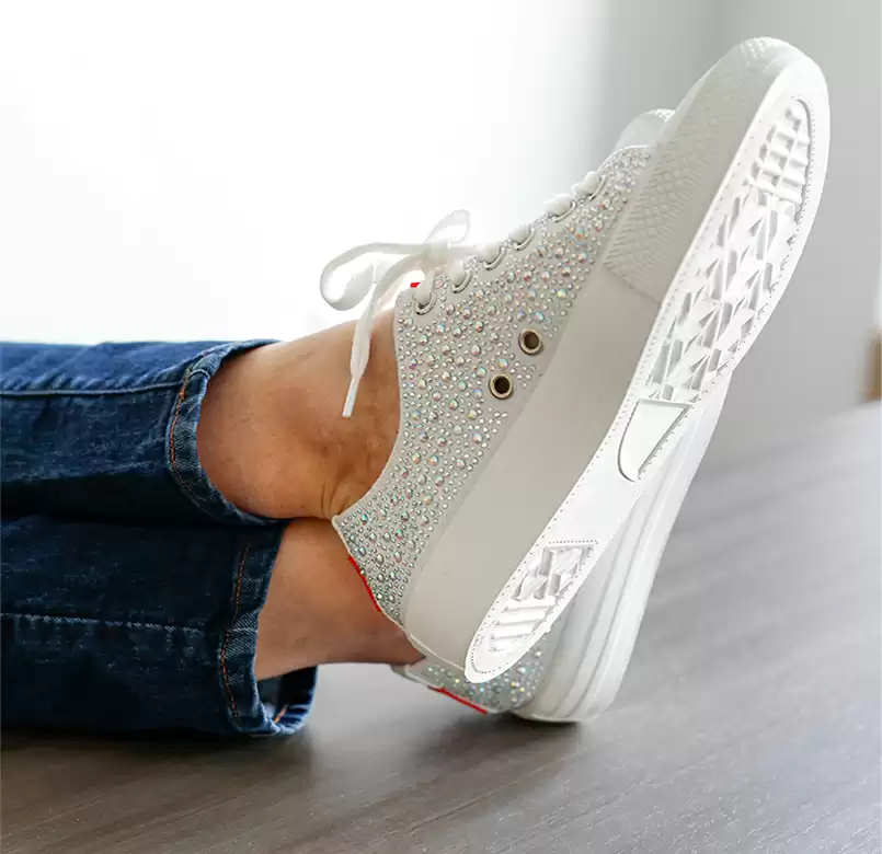
Connecting people
Lorem ipsum dolor sit amet, cons ectetuer adipiscing elit.

Build WordPress sites with MaxiBlocks. All features free forever. No locked functionality. Optional Cloud Library saves you 10+ hours per project. Start free

Lorem ipsum dolor sit amet, cons ectetuer adipiscing elit.

Lorem ipsum dolor sit amet, cons ectetuer adipiscing elit.

Lorem ipsum dolor sit amet, cons ectetuer adipiscing elit.
We’ve designed a sleek and stylish three-column layout for the WordPress website users, crafted to showcase your products with elegance and clarity.
This design stands out with its cohesive theme of shoe imagery across columns, rounded borders injecting a modern flair.
It is responsive, effortlessly adjusting to different screen sizes by stacking columns where necessary. High contrast between text and background ensures accessibility for all users.
Perfect for businesses looking to highlight their products, this layout lets you present images and descriptions side by side, enhancing user understanding and keeping attention on each item. Ideal for online retail, where clarity and aesthetics can lead a browsing visitor toward a purchasing decision.
For artists and photographers, this design can elegantly house a collection of your work. Leverage stylish imagery with descriptive texts to give potential clients insights into your creativity and expertise without overwhelming them with clutter.
Make your written content shine by accompanying each piece with a beautiful, relevant image. This layout enhances engagement as visitors can easily digest accompanying visuals, drawing them deeper into your storytelling.
Visual storytelling is compelling and this layout helps businesses present their journey in a visually engaging way. Use alternating images and text to show key milestones in your company’s history for an immersive experience.
Educational platforms can utilize this layout to correlate images with content meaningfully. Enhancing the learning experience with visual aids can lead to a greater understanding of complex concepts.
Highlight different services provided with clear, descriptive texts bolstered by engaging images. This clean layout improves readability, ensuring potential clients understand each service’s delivered value.
Embed customer testimonials alongside images for credibility and engagement. This setup makes the reviews personal, showing potential customers what existing users have enjoyed about your offerings.
Highlight major events with compelling visuals and succinct descriptions all in one place. When promoting an event, clear and direct communication with enticing visual content helps engage your audience effectively.
A menu is more appealing when accompanied by mouth-watering images. Use this layout to present your offerings artistically, ensuring potential diners not only see but experience the taste visually.
If you are looking into best website builder software to showcase your style, this layout is perfect for fashion brands looking to promote their newest collections. The clean and symmetrical image-centric layout elevates the style quotient, appealing directly to fashion enthusiasts’ sensibilities.
Your homepage introduces your brand, and with an image-centric design, you create an immediate impact. This style keeps navigation streamlined and encourages exploration, making a potent first impression.
Communicate the passion behind your business with an “About Us” page that uses design to connect with visitors. By showing relevant images alongside your story, you create a personal and engaging connection.
Drive specific campaign goals using an image-based landing page design. By guiding users with thoughtfully placed visuals, you maintain focus on conversions and engage more efficiently.
Your service pages benefit from the balance of visuals and descriptions to convey benefits clearly. Visual aids can illustrate crucial aspects, assisting in understanding service scope effortlessly.
Organise products attractively on category pages to enhance navigation between related items and encourage exploration. This design helps in retaining users’ attention across varied offerings.
Even the contact page can be a visually engaging experience! Images and pertinent information can speak to your brand personality, encouraging users to reach out.
Offer clarity and guidance with aesthetically crafted help or FAQ pages. Guided visuals simplify complex explanations, improving user interaction by making the self-service approach pleasant and intuitive.
Curate powerful galleries using this design, be it for art, photography, or product displays. A cohesive structure makes navigating through visual content a joy.
On blog pages, images enhance reader engagement and complement the written word effectively. They foster a pleasant environment that keeps readers immersed in content.
Highlight successful projects or clients in an appealing format. Paired with brief case studies or testimonials, this structure builds trust and displays versatility and competency, which can be pivotal in securing new clients.
This elegant three-column design can substantially elevate your wordpress site design. From small businesses to creative portfolios, the modern flair of rounded image borders combined with accessible typography positions this layout as a compelling choice for any WordPress website. Start your design journey with this robust foundation, emulating sophistication and clarity throughout your web presence. Embrace the opportunity to transform your website’s visual narrative with this intuitive and powerful free wordpress themes layout today!
