What makes us stand out?

WordPress pattern: Pure Image Light PIL-PRO-13
Build WordPress sites with MaxiBlocks. All features free forever. No locked functionality. Optional Cloud Library saves you 10+ hours per project. Start free
Transform your website with an engaging grid layout
Imagine a visually stunning grid layout that not only catches the eye but keeps your visitors engaged. This design features a structured grid of two rows and three columns, creating six equally spaced sections that exude balance and symmetry. It’s perfect for showcasing your offerings appealingly.
Key features of this layout
- Prominent headers: The main header, “It’s the little things that make a big difference,” grabs attention immediately, setting the tone for the content.
- Informative subheaders: Each section is adorned with a relevant header, such as “Suites & Rooms” or “Fine Dining,” followed by text that keeps your audience informed.
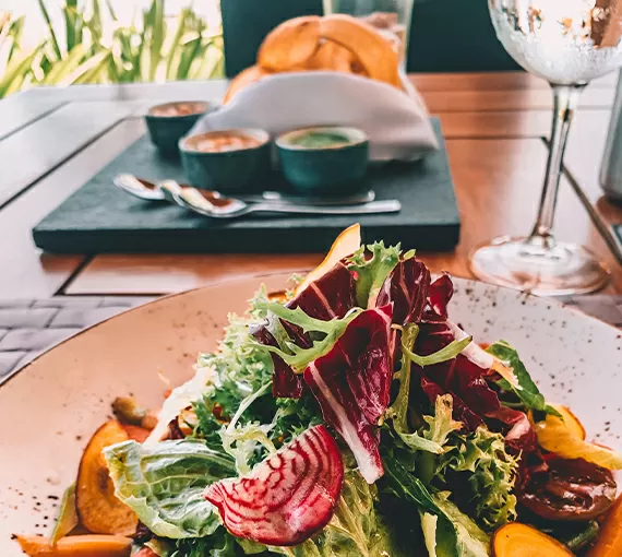
- Visually stunning images: Every grid section showcases a unique, landscape-oriented image that relates directly to the header, enhancing user engagement.
Interactive and accessible
- Clickable elements: The text and images are designed to be interactive, potentially serving as links to more content, creating an overall engaging experience for users.
- Readability matters: With a bold main header and standard font styles for subheaders, the typography is not just stylish but ensures that your content is easily readable.
Design elements that stand out
- Engaging imagery: The images not only beautify the layout but are strategically used to represent offerings, making them highly engaging for visitors.
- Hover effects: While the design doesn’t show it visibly, implementing hover effects can bring each section to life, encouraging interaction.
- Responsive design: This grid layout is ideal for mobile devices, maintaining its clean structure and balance across varying screen sizes.
Modern and inviting style
With its modern and inviting design, this layout effectively guides visitor attention from the main title to each offering. The strategic use of white space ensures that the interface remains visually comfortable, allowing users to navigate effortlessly.
10 use cases for an image-based layout
Showcasing products
Present a stunning array of your products with an image-based layout on your WordPress website. It helps highlight different ranges and styles efficiently, engaging viewers with beautiful visuals. Each product image can link to a detailed product page, enhancing user experience while conveying all necessary information seamlessly. Perfectly organised, this method draws customers into exploring more, ultimately boosting your sales. Consider integrating a click-to-enlarge feature to allow consumers closer views of intricate design details.
Portfolio display
For photographers or designers, an image-based grid is the answer to displaying your portfolio effectively. Visitors to your site can easily navigate through your work, catching glimpses of various projects in different categories. By linking images to detailed project descriptions or completed works, you promote an engaging browsing experience. This approach not only shows professionalism but ensures potential clients understand your capabilities at a glance, ultimately leading them to engage your services.
Event highlights
Cherish memorable moments by showcasing event highlights using a structured WordPress website builder. Photos bring events to life, letting visitors relive these special occasions. The grid format gives equal attention to each event section, allowing easy event navigation. Use this setup for galleries, wrap-ups, or celebratory moments, adding captions to include further snippets of event information, enhancing user curiosity and engagement with your brand.
Travel blogs
Bring travellers an immersive visual feast with photos from your adventures displayed beautifully within a grid layout. Each travel story becomes dynamic, engaging the audience and making them eager to read more. By segmenting into destinations or themes, your audience can choose their interest swiftly. Link individual posts or galleries that delve deeper into each story, enriching the overall browsing experience and extending readers’ time spent on your WordPress templates blog.
E-learning modules
Enhanced e-learning experiences can be achieved through image-based modules. Each grid ensures tidy and clear associations between texts and visual aids, providing learners with structured content. Link images to detailed lesson plans or resources tailored to specific topics or interests. The grid design allows easy shuffle between different areas, simplifying learning paths and offering an intuitive journey through the educational content delivered via online courses.
Restaurant menu showcase
Appeal to food lovers with an engaging menu presentation using this modern grid format, capturing luscious dish images paired with descriptions. Easily distinguish courses or menu sections, with clickable images that link to additional meal particulars or nutritional details. A well-organised layout reflects upon your restaurant’s quality, enticing patrons to choose you next time they’re hungry-all made possible using your WordPress navigation menus.
Real estate listings
Present properties in a coherent and compelling manner with well-curated image grids. Listings become enticing with stunning property visuals matched to the text detailing their selling points. By creating linked buttons or sections leading directly to property specifics or virtual tours, you allow buyers to picture themselves there. This showcases professionalism while significantly aiding users in their search process by efficiently employing web design for WordPress.
Customer testimonials
Build trust with visually engaging testimonials. Display client photos alongside their testimonials in this compelling layout, inspiring your prospective customers’ confidence. By categorising feedback under different service areas, viewers can find testimonials relevant to their needs quickly. Each snippet can link to an entire story, deepening audiences’ insights into clients’ positive experiences with WordPress website platforms.
Non-profit campaigns
Create emotional resonance in your advocacy efforts by leveraging the power of images. Portray the heartbeat of your campaigns through an immersive visual journey, systematically segmented by cause or project. This configuration compels visitors to explore your movement further, as each image accompanies critical narratives and calls to action. Drive engagement by ensuring users access more nuanced elements of your cause, prompting them toward actionable involvement over time.
Artist or band promotion
Elevate attention toward performing artists or emerging bands through this multifaceted grid. Stir excitement around past performances or releases visually-energetically surrounding viewers with photography capturing energy and enthusiasm from shows. Annotate moments of success like album releases, fostering stronger connections with fans, and driving further engagement through newsletters, subscriptions, or exclusive VIP accesses portrayed within visuals across website design in WordPress.
10 types of pages you can use image-based designs
Home page
Create a striking first impression with an image-based home page, encapsulating the essence of your brand instantly. This page reflects your company’s core ethos and values, injecting excitement into visitors’ first encounters. Use graphics and accompanying text effectively over a clear grid, connecting them to relevant sections of your site using a WordPress free themes approach.
Portfolio page
Your portfolio page should be a jumble of visually stunning works, carefully curated and organised for maximum impact. Using the grid format ensures every piece gets deserved attention, showcasing your skill set and range effectively to prospective clients accessing various media. It’s about maintaining professionally attractive images, encapsulating your intended narrative powerfully by incorporating Elementor Alternatives.
Photography gallery
Let your photography shine through with a dedicated gallery. The grid layout symmetry provides structure without detracting from the artistry, offering a clean showcase for your work. Each shot is optimally placed, providing ease of navigation while communicating professionalism–key attributes when collaborating with WordPress pattern library within creative platforms.
Product page
Transform generic product pages into compelling, sales-driving engines through sophisticated image design, using efficient grids for seamless arrangement and elegant presentation. Alongside high-quality photos, each item has pronounced calls-to-action, enticing potential buyers via targeted shopping page design formed around solid Gutenberg blocks practices.
Destination or travel page
Using grid designs to curate destination pages enhances storytelling by whisking journey-hungry audiences away visually. Convey rich experiences that form the backbone of adventure stories. Heightened travel images invite users deeper into immersive content, essentially transporting housebound explorers atop dream trips through grounded interface management across WordPress block themes.
Services showcase page
Leverage image-based layouts on service-highlight pages that encapsulate offerings professionally while allowing individual aspects room in bracketing photos. By visually representing collective talents using enhanced digital arrangements, users understand your core capabilities rapidly while navigating effortlessly paths shorter journeys constructed concise sections using WordPress block templates.
Blog page
Modernise traditional blog pages employing image-based designs to hold narratives dynamically. Direct focus towards key stories enriched aesthetically with vibrant scored images that accompany brief overviews. Seize attention while ensuring natural flow transitions, vocalising personal viewpoints through sharp sectional captures carefully linked, deepening visitors’ interactions with your articulated world vision within WordPress templates.
Events gallery
For those organising regular events, forming an event gallery navigationally propels inspiring recaps independent exploration atmospheric slices. Visually referencing each additionally showcasing engagements holistically aids attendees’ reflection while unveiling further competitive draws potential new clients distinctly through photojournalistic entries powered by WordPress website builders.
Charity initiative page
Create space for charity initiatives placing dynamic gripping content capturing mission energy immediately. Images excite stakeholders focusing invaluable efforts encouraging donate follows vibrant causes steadfastly represented through polished learning platforms maintaining clarity collaboratively across WordPress development.
Music or video page
Ultimately manifest cinematic values through music-focused pages celebrating artistry digitally. Share journeys behind scenes reflecting intrinsic creative passions, letting them reverberate visually against backdrops blending music harmonising media-operated facility directing exciting pathways coordinating streaming visuals aided open source website builder for free websites.
Image resources for your WordPress website
Imagery enhances user engagement and brings your web design to life; yet acquiring the right images presents challenges.
How to get an image for a website?
When getting images for your site, consider quality, relevance, and licensing. Use WordPress icons and images that align with your site’s themes. Professional licenses or phased resources hosted over platforms such as Shutterstock assure your permissions.
What is the website image called?
Images displayed on a website can be branded as digital graphics, representing the site’s user interface or affiliating websites, often coined WordPress favicon images, thumbnails, or hero images based on placement roles.
Where can I download free images?
Several platforms supply high-quality free visuals-Pixabay, Unsplash or Pexels offer expansive directories fluidly, meeting commercial licensing standards without expense. Recognise image contributions within these networks, establishing credibility amongst creators leveraging contents responsibly.
How to use Google images without copyright?
When using Google to scout images, navigate through the advanced search dropdown, filter results by license type to locate images tagged ‘labelled for reuse’, safeguarding your site legally. Consult WordPress wiki forums about unfamiliar terms concerned over usage policy clarities entering publications.
Where can I find public domain images?
Public domain images, free from restrictions, collectively store historical contents widely accessible via platforms spanning Wikimedia Commons or Listening freely produced creative commons collections available online easily through dragging on block template-focused websites.
How do I download images online?
To download images online correctly, grant release agreements residing stock proofs covering viewer-access availability through secure channels, avoiding potential copyrighting issues which could arise, ensuring published materials comply contextually sourced mechanisms holding credible data files.
Conclusion
If you’re looking to make a great impression and boost visitor engagement, embracing a grid-based layout on your WordPress website design is a savvy move. It offers a stylish, user-friendly way to showcase products, services, or content. The seamless blend of http://freewordpress-themes/target=”_blank” elements contributes to this versatile layout, ensuring your site leaves a lasting mark. Choose thoughtfully from the many designs offered through simple modern solutions encompassing sublime uses enriching every justified pattern far beyond call expectation buttresses.


