BG-Image-maxiblocks-1726746624-578207009

WordPress pattern: Pure Image Light PIL-PRO-137


In touch with tomorrow

Imagine the possibilities
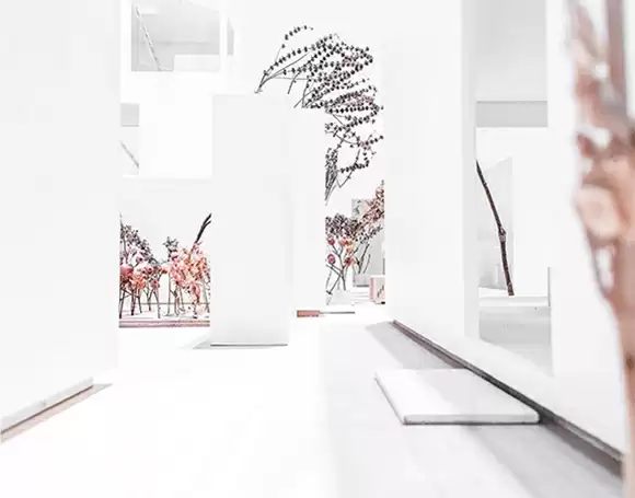
pure-image-light-pil-27-1
Don’t do evil

Lorem ipsum dolor

pure-image-light-pil-27-2
Consider it solved

Lorem ipsum dolor

pure-image-light-pil-27-3
Empowering people

Lorem ipsum dolor

pure-image-light-pil-27-4
Get in the game

Lorem ipsum dolor

pure-image-light-pil-27-5
Ideas for life

Lorem ipsum dolor

pure-image-light-pil-27-6
Leap ahead

Lorem ipsum dolor

pure-image-light-pil-27-7
Connecting people

Lorem ipsum dolor

pure-image-light-pil-27-8
Life is good

Lorem ipsum dolor

Build like a pro

Discover Our Versatile Image-Text Grid Layout

Looking to transform your WordPress website with something sleek and modern? Our image-text grid layout is perfect for creating engaging and visually appealing web pages. With eight dynamic content blocks arranged in 2 rows and 4 columns, you’ll have a delightful way to showcase your ideas and visuals. Each block combines images and minimalist text to capture and maintain your audience’s interest.

Key features

  • Overall structure: A grid format that’s visually balanced, ensuring both aesthetics and functionality.
  • Asymmetrical choices: Lively engagement with varied content types such as images and text blocks, all while maintaining symmetry in the grid.

Element details

  • Captivating headers: A bold header, “In touch with tomorrow,” paired with a thought-provoking subheader, “Imagine the possibilities.”
  • Informative text blocks: Each block holds a catchy title like “Don’t do evil,” accompanied by placeholder text.
  • Relevant images: Each block features an image that aligns with the accompanying text, enticing further exploration.
  • User-friendly typography: Clean fonts enhance readability with larger headers and easy-to-read body text.
  • Elegant visuals: Landscape images with no borders or filters ensure content remains in focus.

Unique design aspects

  • Standout design choices: Achieve a professional look with a minimalist design prioritising images and text.
  • Responsive design: A flexible grid format that ensures excellent viewing on any device.
  • Accessibility minded: Clear headings and minimal text support accessibility, though increased contrast may enhance readability.

Overall design style

  • Minimalist and modern aesthetic: Simplicity and clarity for a polished look.
  • Effective visual hierarchy: Prominent headers guide reader navigation effortlessly.
  • Generous white space: Provides a balanced reading experience, letting each element stand out.

Use cases for this layout

  1. Portfolio showcase

    Graffiti artists, fashion designers, or photographers can use this layout to present their work professionally. The clean grid ensures every piece stands out while maintaining a cohesive and modern look.

  2. Product features

    Highlight unique aspects of your products by pairing images with descriptive text. This method can be particularly useful for tech companies showcasing gadgets or software features.

  3. Travel blog

    Encapsulate your journeys by featuring images of destinations alongside intriguing stories of your adventures. This layout invites readers to dive into your experiences visually.

  4. Event recap

    For event organisers, summarise the essence of an event by displaying images of key moments accompanied by captions that highlight significant details.

  5. Recipe sharing

    Pair images of your culinary creations with ingredient lists or cooking instructions. This format is ideal for food bloggers or chefs wanting to share their passion for cooking.

  6. Educational content

    Use the grid to pair explanatory images with educational text for students or lifelong learners. Visual aids can accompany scientific or historical content effectively.

  7. Team introduction

    Introduce your team members to potential clients or stakeholders. Each block can feature a team member’s photo accompanied by their role and contribution.

  8. Customer testimonials

    Showcase customer feedback using this layout by pairing portraits of customers with their testimonials, adding a personal touch to your brand.

  9. Case studies

    Present project case studies by pairing visuals from the project with text summarising objectives and results, ideal for consultancy firms or creative agencies.

  10. Art gallery

    Feature artwork in a digital gallery with each piece accompanied by a description, perfect for artists seeking an online portfolio.

Page types suitable for image-based designs

  1. Homepage

    Making a stellar first impression is crucial. Use this layout to captivate visitors with a dynamic mix of core visuals and text capturing your essence.

  2. About us page

    Give your visitors insight into your company’s mission and values by pairing visual storytelling with engaging text.

  3. Service description page

    Highlight your services with relevant imagery and detailed descriptions, providing potential clients with a clear understanding of your offerings.

  4. Blog post

    Enhance your narratives by including images that reinforce the blog’s topic. This layout creates a visually engaging reading experience.

  5. Gallery page

    Perfect for photographers or artists, this setup allows for the display of collections or bodies of work with accompanying insights for each piece.

  6. Portfolio page

    Use image-text blocks to showcase your skills and past projects efficiently, suitable for freelancers or creative professionals.

  7. Contact page

    Enliven your contact details with visuals depicting your office or team, creating a personal connection beyond just text.

  8. FAQ page

    Provide clear responses to common queries by using visuals to support your answers, resulting in a more inviting experience for users.

  9. Press release page

    Complement your official announcements with visuals of events or products mentioned, strengthening media engagement.

  10. Landing page

    Optimize conversions by pairing targeted visuals with messages designed to capture interest and prompt action.

How to source images for your website

Finding the right image for your WordPress website design can be challenging. The best approach is to use reputable stock photo websites like Unsplash or Pixabay, which offer a wide range of free images. You can access Gutenberg blocks to infuse creativity and visuals. When exploring Google Images, use the “Usage rights” filter to find copyright-free options. Always verify the rights and permissions, especially for commercial use.

Conclusion

This grid layout offers a balance of visual elegance and functionality, indispensable for any contemporary WordPress website design. Whether you aim to captivate with a free WordPress theme or seek Elementor alternatives, this minimalist approach promises a polished presentation of your content. Start transforming your website today, and let your audience discover the possibilities.

You may also like