Discover our engaging three-column layout design!
Transform your WordPress website with this sleek, three-column layout that invites user interaction! Designed for clarity and visual appeal, this engaging setup features three individual cards placed harmoniously in a tidy row, allowing for a balanced and intuitive browsing experience.
Design highlights
- Overall structure: A clean, multi-column format with three cards arranged horizontally ensures your content stands out.
- Arrangement of rows and columns: Each card is evenly spaced in a single row, providing a symmetrical and organized look, perfect for guiding users’ attention without distractions.
Element and feature description
Visible elements:
- Headers: Captivating headings like “Read our stories,” “Join our cause,” and “Make a donation” make it easy for visitors to understand your message at a glance.
- Text blocks: Additional context beneath each header enriches user comprehension and enhances content engagement.
- Buttons: Each card sports a bold call-to-action button – “Read the blog,” “Join now,” and “Make a change,” urging visitors to interact.
Interactive elements: Buttons are designed to be clearly interactive, encouraging clicks and fostering user engagement.
Typography: Featuring a modern sans-serif font that ensures readability with varied sizes for headers and body text, establishing a strong visual hierarchy.
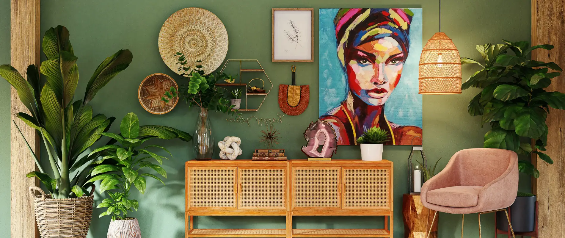
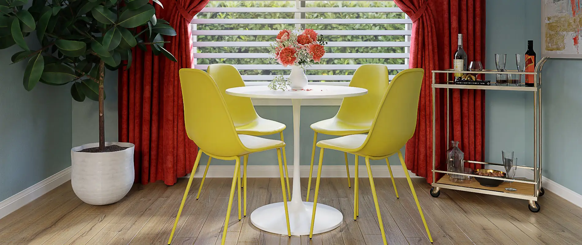
Visible icons/graphical elements: Eye-catching images accompany each panel, promoting a seamless blend of visuals with your text.
Image characteristics: The images have a square or rectangular orientation, complemented by subtle shadows to add depth, while remaining borderless for a minimalist effect.
Unique design aspects
Standout choices: The integration of images with text creates a visually appealing and informative balance that enhances user interest.
Hover effects or animations: While currently unobservable, typical hover effects on buttons add an interactive touch that elevates the user experience.
Responsive design elements: The layout’s adaptability ensures it looks great on any device, stacking neatly into one column on smaller screens.
Accessibility considerations: High contrast between text and background improves readability, while action-oriented button labels heighten accessibility.
Overall design style
Design style: Embracing a minimalist approach, this layout prioritizes clear communication and simplicity, making it ideal for various online platforms.
Visual hierarchy: Key actions are naturally highlighted through the prominence of headers and buttons, guiding users effortlessly through your content.
White space and balance: Generous white space around each card fosters a light and uncluttered appearance, enhancing usability.
Use cases for website image-based patterns
- Blog showcase: Highlight your engaging writings using visually appealing cards, making it easy for users to navigate through different articles.
- Nonprofit promotion: Encourage visitor engagement with causes, providing clear paths to learn more, join efforts, or donate directly.
- E-commerce display: Showcase featured products with vivid images, concise descriptions, and a purchase call-to-action.
- Portfolio presentation: Artists or photographers can display their work portfolio, integrating images with project descriptions.
- Event announcement: Feature upcoming or ongoing events effectively on your site with highlights and direct signup links.
- Service offerings: Service-based businesses can present different service tiers or packages with this intuitive layout.
- Educational resources: Educators can provide direct links to various courses, workshops, or reading materials.
- Restaurant menus: Highlight popular dishes with captivating images and descriptions that whet the appetite instantly.
- Travel itineraries: Showcase travel packages with details, images, and booking links for effortless user interaction.
- Technology updates: Keep your tech-savvy audience informed with the latest updates, gadgets, or software, presented crisply.
Types of pages suitable for image-based designs
- Homepage: Make a memorable first impression with a visually striking layout that captures the essence of your site.
- About Us: Share your story visually, integrating images and text to convey the mission, vision, and values effectively.
- Contact page: Use an engaging layout to provide multiple ways to reach out, supported by visual cues and friendly call-to-actions.
- Services page: Clearly illustrate different services or products your business offers with interactive and easy-to-navigate cards.
- Gallery page: Present an artsy or professional gallery, focusing on visuals that draw in your audience aesthetically.
- Blog page: Organise your blog list page with visual separators for each post, enhancing readability while maintaining interest.
- Portfolio page: Whether showcasing designs, photographs, or creative work, use a structured layout to attract potential clients.
- Events page: Showcase upcoming events, seminars, or webinars effortlessly with a chronological or thematic layout breakdown.
- Resources page: Introduce learning materials, guides, or helpful downloads through visually supported cards for easier user digestion.
- Landing page: For targeted marketing campaigns, create a design that instantly conveys your message and purpose to prospective clients.
Conclusion
Elevate your WordPress website design with this stylish, minimalist three-column layout. With engaging headers, supportive text, and prominent action buttons, this design effectively maximises user clarity and accessibility. It’s the perfect way to invite your visitors to connect and engage with your content! Whether you’re using wordpress responsive design elements or exploring other WordPress web designs, this layout promises a sophisticated and streamlined user experience.


