
WordPress pattern: Pure Image Light PIL-PRO-139
Build WordPress sites with MaxiBlocks. All features free forever. No locked functionality. Optional Cloud Library saves you 10+ hours per project. Start free

Discover the power of minimalism with our unique image design
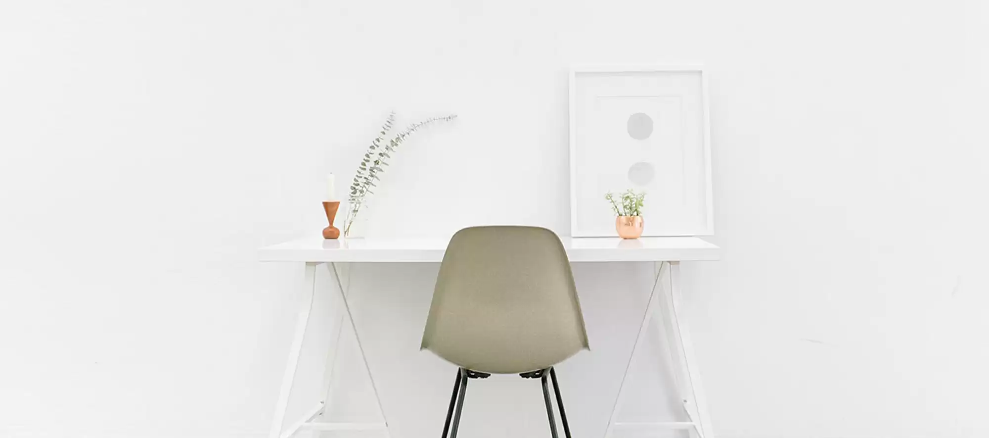
Imagine a visually striking layout that embodies simplicity and sophistication-a design that captures attention using a single-column format. Centered around a minimalist desk, the unique off-center placement introduces a touch of modern asymmetry, drawing the eye while maintaining an overall balance. This enhances visual engagement, allowing your WordPress website design to truly shine.
Detailed image analysis
Layout analysis
- Overall structure: A sleek single-column design emphasising clarity and focus.
- Arrangement of rows and columns: Featuring a clean vertical format, with the desk as a focal point, it offers minimalistic appeal with no complex grid.
- Asymmetry and unusual layout choices: The desk’s slight off-centre positioning adds intrigue, elevating the design while retaining harmony.
Element and feature description
- Visible elements:
- Desk: A stylish white minimalist desk with sharp, angular legs.
- Chair: A light-coloured chair placed directly in front, creating a welcoming workspace.
- Decorative items: A small vase of foliage, an elegant ornament, and a framed picture add personality.
- Text block: A bold rectangular button stating “Committed to people, committed to the future,” designed to grab attention, yet not clickable.
- Typography:
- Font style: Modern sans-serif for clarity and contemporary style.
- Size: The prominent text size ensures visibility and engagement.
- Image borders: Seamlessly blend into a white backdrop, reinforcing the minimalist look.
Unique design aspects
- Standout design choices: Negative space creates a peaceful environment, allowing each element to breathe.
- Hover effects or animations: Static yet impactful, emphasising stillness and simplicity.
- Responsive design elements: The spacious layout works well on mobile, ensuring a great experience across devices.
- Accessibility considerations: High contrast augments readability, though specific enhancements aren’t detailed.
Overall design style
- Design style: A blend of minimalism and modernity, fostering clarity and openness.
- Visual hierarchy: The text block guides the viewer through the design with ease.
- Use of white space: Expansive white space offers balance and serenity.
Use cases for image-based patterns
- Corporate websites: Minimalist designs convey professionalism, making them ideal for business sites aiming for a clean and modern image.
- Personal blogs: A crisp and simple layout allows bloggers to highlight personal narratives or hobbies without visual clutter.
- Portfolio showcases: Creative professionals can use such layouts to let their work stand out, ensuring nothing distracts from their art or design pieces.
- E-commerce sites: Minimalism can guide shoppers’ focus toward products, enhancing user experience and driving sales.
- Landing pages: Clean, straightforward layouts enhance the effectiveness of calls to action, key for conversions.
- Non-profit organisations: A simple design can highlight mission statements and calls for donations effectively.
- Tech startups: Conveying innovation through minimalist designs can resonate well with tech audiences.
- Real estate listings: Clean layouts ensure property highlights remain front and centre, attracting potential buyers.
- Event announcements: Minimalism allows the event details to be the star, easing information digestion for attendees.
- Restaurant menus: Enhances the visual appeal of culinary offerings, focusing on quality ingredients and dishes.
Pages for image-based designs
- Home pages: Capture visitor interest immediately with a striking yet simple design.
- About pages: A clear layout can effectively convey a company’s story and values.
- Contact pages: Simple designs ensure user-friendly navigation, helping visitors reach out easily.
- Service pages: Minimalism highlights service details without unnecessary distractions.
- Product pages: Let the product shine by focusing on the key details and benefits.
- Blog pages: Enhance readability of content, encouraging visitor engagement and return visits.
- Gallery pages: A minimalist gallery allows images to take centre stage, ideal for photographers and artists.
- Testimonials pages: Feature client feedback prominently without overshadowing the content.
- FAQ pages: Simple layouts make it easier for users to find answers quickly.
- Portfolio pages: Showcase work in a clean, professional manner, perfect for designers and artists.
Conclusion
Minimalist website image design brilliantly embodies the blend of simplicity and modernity. By leveraging negative space, strong visual hierarchy, and asymmetrical elements, this approach becomes a perfect fit for diverse [WordPress website] needs. Whether you’re crafting an e-commerce platform or showcasing a personal portfolio, these designs can elevate your site’s aesthetic allure. Embrace this trend, and leverage tools like [free WordPress themes] or innovative [best website builder software] to ensure your site not only looks great but performs effortlessly.


