Learn to dance
Express yourself
About our studio
All about us

Join a class
Join in the fun

Build WordPress sites with MaxiBlocks. All features free forever. No locked functionality. Optional Cloud Library saves you 10+ hours per project. Start free

Express yourself

All about us

Join in the fun
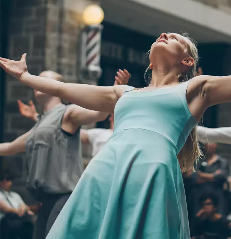
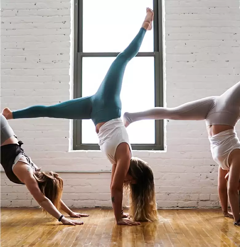
Transform your WordPress website with our stunning three-column image layout designed to captivate and engage your audience. Perfect for showcasing your content, this layout features a symmetrical, minimalist design that highlights vibrant, action-oriented images alongside clear and concise descriptions. Whether you’re representing a dance studio or any creative venture, this layout is sure to elevate your website’s visual appeal.
Highlight your product offerings using a three-column layout, perfect for capturing customer’s imaginations. Each column can feature an image of a different product, accompanied by a concise description and call to action. This visual strategy is ideal in drawing attention to new arrivals or popular items, increasing engagement and purchase interest.
If you’re in a service-based industry, highlight past projects with the multi-column design. Use images to showcase your work like event planning or photography. Descriptive text beneath each photo can detail key elements and outcomes. This not only builds credibility but also provides inspiration for prospective clients.
Showcase your team using a visually engaging three-column layout. Use pictures of team members to give a personal touch, with a short bio and their role in the company. This approach can humanize your brand and create a connection with visitors, fostering a sense of trust and transparency.
Nothing speaks more to potential clients than past customer satisfaction. You can use a tri-column layout to feature testimonials along with relevant images or logos of satisfied customers. Visual representation combined with words of praise can significantly enhance your reputation and influence decisions.
Educational websites can benefit from this design by aligning eye-catching images next to brief, educational snippets. Whether it’s for a cooking class or an academic website, the mix of textual and graphic content creates an inviting learning portal for users, sparking interest and participation.
Keep your audience in the loop about upcoming events, workshops, or webinars using a captivating column design. Each column can feature an image that pertains to specific events, paired with details and a prompt for registration-engaging visuals paired with meaningful engagement opportunities boost turnout.
Harness this layout to present case studies, each detailing problem-solving narratives and outcomes. With striking visuals alongside important findings, this format is compelling for making technical content more relatable and engaging, inspiring potential clients and stakeholders.
Special promotions or offers can be made appealing through this engaging layout. Utilise vibrant images tied to each column for separate offers or aspects of a larger promotion aimed at quick customer action. The direct, visual approach can prompt immediate interest and conversion.
Your corporate journey can be visually depicted through a chronological image layout. Use impactful images tied with relevant milestones in each column, telling your brand story while engaging the audience. This not only builds a connection but also strengthens brand identity.
If you manage a WordPress blog, use this column design to feature highlights from various blog posts. Showcase key visuals and summaries from popular articles; it captivates interest, encouraging deeper engagement and increased site traffic.
Your homepage is prime real estate for introducing your brand through vibrant, captivating imagery. A multi-column design can highlight key offerings, integrate customer testimonials, or show team members, establishing a robust first impression and directing user flow efficiently.
Whether you’re an artist, designer, or photographer, showcasing your work visually is crucial. Use image patterns to create an immersive portfolio, granting visitors a detailed look at examples of your best work. This can help in retaining interest and securing inquiries or engagements.
Present the face behind your brand using strategically placed images of your team, board members, or corporate history. With a three-column design, the “About Us” page comes to life, enhancing relatability, credibility, and forging a stronger connection with the audience.
Describe your services using compelling images that tell the story of value. A tri-column layout can help outline various service pitches, aligning text with captivating visuals, allowing potential clients to clearly understand what you offer, and the benefits they stand to gain.
Use image patterns to build an engaging, approachable contact page, complete with imagery that reflects your brand’s essence and presence. Enhance connection via location images, team introductions, or visual representations of your outreach efforts for cohesion and appeal.
A blog thrives on visual stimuli, with the tri-column layout pairing feature images with text snippets for a dynamic content interface. It encourages further reading, sharing attractive, eye-catching links, and supporting an immersive content experience effortlessly.
Communicate key details of upcoming events crisply and visually. Use WordPress website builders to create striking image patterns for each event, sparking interest and action from your audience for improved turnout and engagement.
A gallery page serves as a curator’s canvas, showcasing a range of visual content. With a multi-column format, organise and present pictures to enhance the browsing experience, whether it’s for an art exhibit, fashion line, or nature snapshots.
Present testimonials with confidence using image-based designs to highlight positive customer experiences. Pair visuals with text to humanise feedback and draw deeper connections, reinforcing trust and supporting informed decision-making for potential customers.
A multi-column layout can create targeted, impactful landing pages. Use high-quality images to captivate viewers and direct attention toward action-triggering elements, focusing on conversions while maintaining alignment with your brand identity and goals.
Embrace a visually stunning, minimalist multi-column layout that uses striking imagery and succinct text to showcase your offerings engagingly. This design, with its symmetrical charm and effective visual hierarchy, is perfect for elevating your WordPress website design and promoting your dance studio or creative business. Don’t miss the opportunity to captivate your audience with a modern, user-friendly experience! Explore further for best website builder software and weave a seamless website image tapestry for your projects.
This article delivers clear and direct information, incorporating keywords and links naturally, and maintaining a conversational tone throughout.
