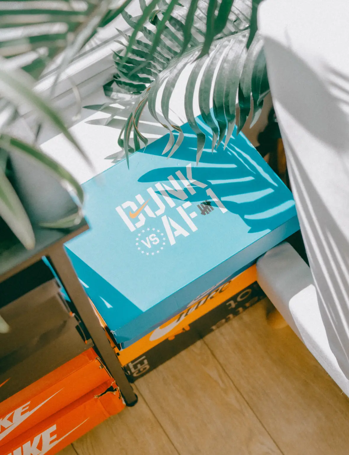
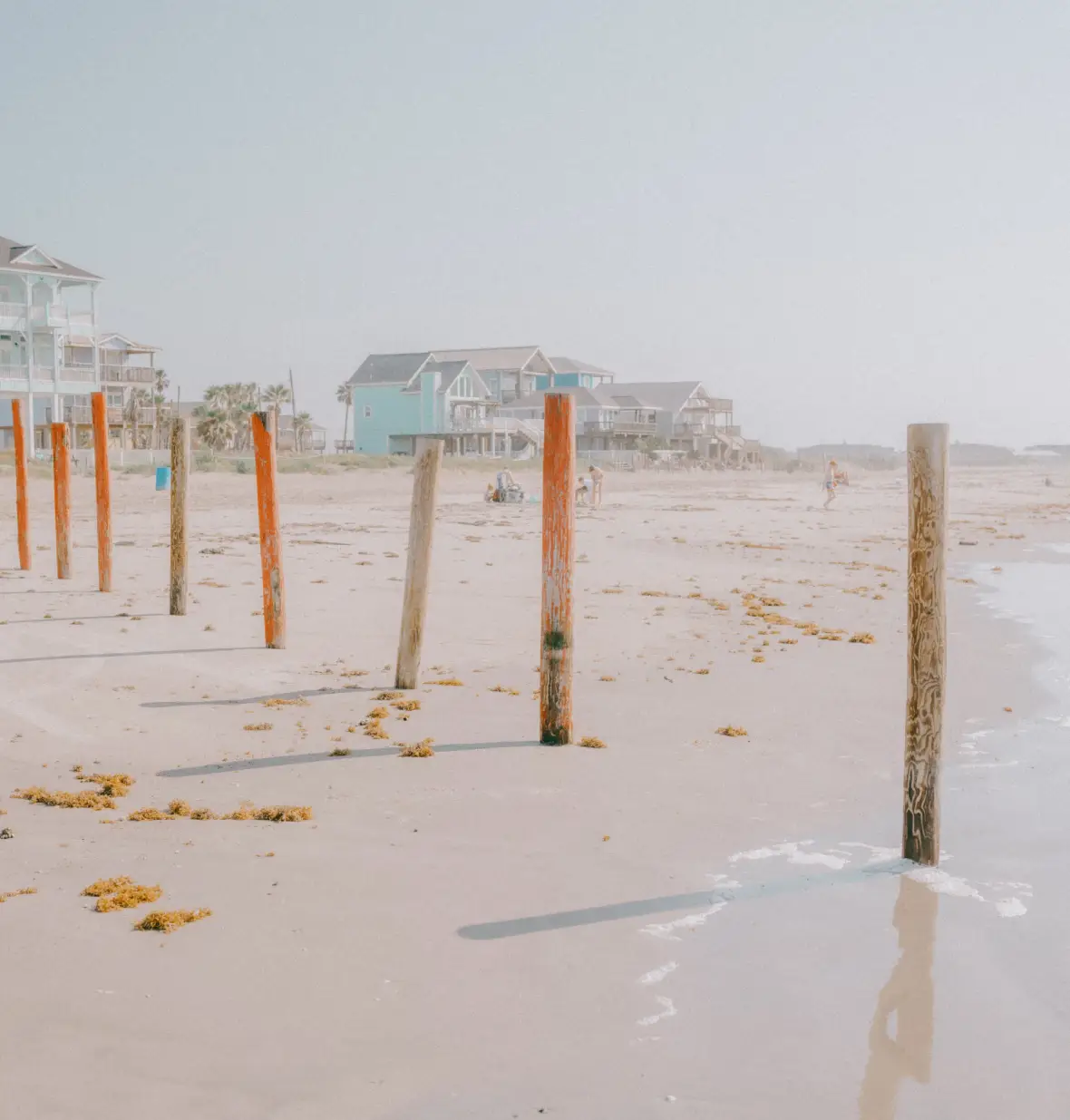
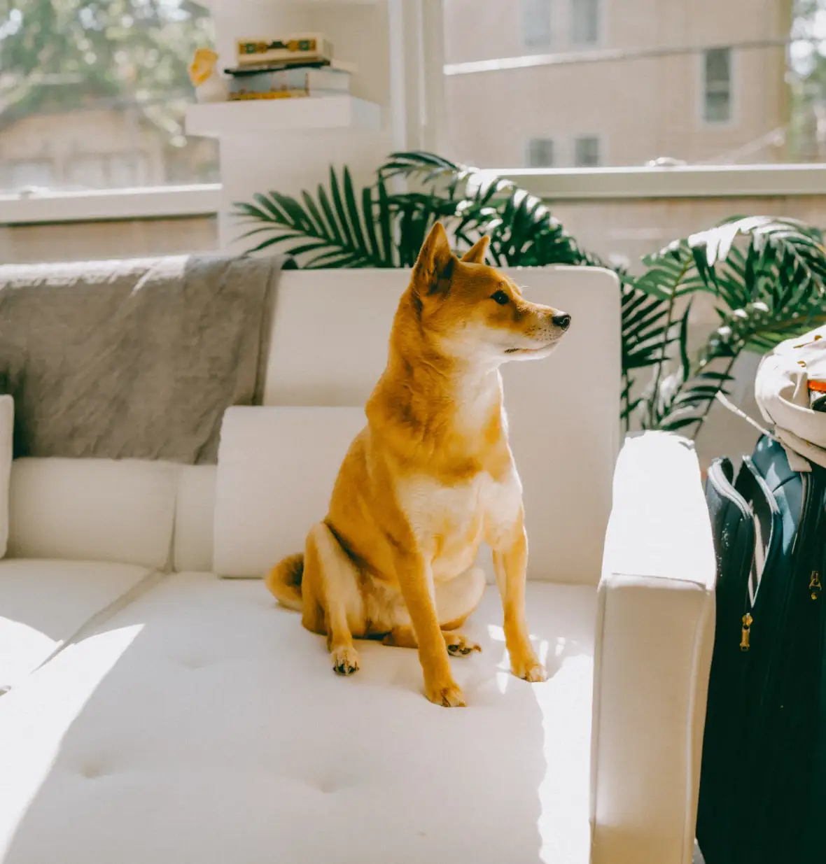
Elevate your WordPress site with this striking image layout
Ready to transform your WordPress website? Let’s dive into an exciting and modern asymmetric two-column image layout that’s bound to grab attention and boost engagement. With a bold header pronouncing “Teams can grow to amazing heights,” this design strikes the perfect balance between images and text, allowing you to showcase your content dynamically.
Layout analysis
Overall structure
This layout is structured into a clean two-column format for the main content areas, with a full-width header that makes a statement. The combination of rows and columns is designed to facilitate easy navigation through your site.
Arrangement of rows and columns
- First Row: Features a powerful header alongside a larger content block, divided into two columns.
- Second Row: Boasts four unique image blocks arranged in an eye-catching two-by-two format.
The asymmetrical choice of having a larger image in the first content section naturally draws viewers in, maintaining their interest with smaller images.
Element and feature description
Visible elements
- Header: A captivating title that commands attention.
- Text Blocks: Each image is paired with descriptive phrases to provide context.
- Images: Four varied images showcasing different themes like nature and lifestyle.
- Call-to-Action Buttons: “View more” buttons under each image encourage user interaction.
The interactive elements like the “View more” buttons are designed to engage users without the hassle of overwhelming forms or dropdowns.
Typography
An intelligent mix of bold serif fonts for the header and lighter sans-serif for body text lends a modern yet clear aesthetic.
Graphical elements
Images feature rounded corners for a softer look with text overlays adding depth, all while varied orientations maintain visual diversity in a cohesive frame.
Unique design aspects
Standout features
The asymmetric design, paired with a bold header, establishes a commanding visual hierarchy. Hover effects add an interactive layer with buttons reacting to attention, enhancing the user experience.
Responsive design
This layout ensures easy mobile navigation by transitioning to a single column on smaller screens. Thoughtful text contrast ensures accessibility for all, including users with visual impairments.
Overall design style
Design style
Minimalism and modern aesthetics define this layout, encouraging clarity and viewer engagement. The bold header naturally guides users through content with ease.
White space and balance
Balanced use of white space prevents a cluttered appearance, allowing elements to breathe and maintain focus on content.
Use cases for this website image-based patterns
1. Portfolio showcase
If you’re an artist or photographer, this layout is perfect for beautifully displaying your work. It allows your images to shine and communicate their story without distractions. By utilising asymmetrical elements, you draw viewers deeper into your creative process and encourage them to explore further. This approach is unparalleled for any visual portfolio, providing an engaging viewing experience. Highlight your artwork’s depth and diversity, personalised by using your preferred block templates.
2. Travel blog
A travel blog benefits immensely from this layout, enabling you to seamlessly combine storytelling with stunning photography. As readers embark on your journey, each image can evoke emotions and create a sense of presence in far-flung places. With varied orientation and simple calls to action, your audience can immerse themselves in different cultures and landscapes without ever leaving their seats. Let readers wander through your experiences with ease on your modern free WordPress themes.
3. Online magazine
An online publication thrives with innovative design. Intrigue your readers by pairing engaging articles with compelling images, each urging them to explore more. Snappy headlines and subtle CTAs can enhance engagement, offering superior readability even in today’s fast-paced digital world. This overlay of style and practicality creates an engaging platform for diverse content, ensuring continuous reader interaction.
4. Restaurant menu
Restaurants can utilise this visual layout to showcase enticing dishes or drinks in an elegant format. The large, drool-worthy photos entice potential customers, while easily readable text guides them through distinct flavour journeys. Calls to action like “View More” buttons can invite deeper engagement, leading to possible reservations or orders. As the online face of a restaurant, your menu should be as appealing as your culinary creations, perfectly suited to this WordPress website design.
5. Product advertisement
Feature product launches or promotions using this layout for maximum impact. Eye-catching images draw potential buyers, while succinct text and clear CTAs convert interest into action. Whether showcasing a new fashion line or the latest tech gadget, the seamless integration of visuals and text breathes life into every advertisement.
6. Event promotion
Organise and promote events with ease, heralding excitement through vibrant images and concise calls to action. From concerts to art exhibits, the enticing format invites users to explore details with enthusiasm, providing all essential information at a glance. Let visitors experience a captivating preview of your event, enabling easier decision-making and increased attendance.
7. Corporate branding
For branding initiatives, this layout ensures a cohesive visual identity across your site. Large images reflect your brand ethos visually, complemented by strategic calls to action that reinforce core messages. Use this layout to build identity cohesion and engage customers in memorable ways.
8. Learning platform
Education platforms can engage students and teachers with visually engaging lessons, tutorials, or courses. Varied presentation styles maintain attention, while CTAs guide learners through each segment seamlessly. Interactive elements foster connection and curiosity, making this layout ideal for educational purposes.
9. Fashion showcase
Highlight a fashion line’s movement and texture through diverse images and text pairings. Styled presentations and subtle transitions capture attention, while straightforward CTAs ensure convenience for interested consumers. Your clothing lines flourish under this layout’s innovative design, showcasing each detail with elegance.
10. Real estate listing
Real estate businesses can showcase properties with captivating images and descriptions that align seamlessly. Highlight unique selling points of each listing, blending creativity with professionalism. Our layout delivers clarity and connection, inviting user exploration.
Types of pages for image-based designs
1. Home page
Kick-start user engagement from the first glance with a striking home page featuring dynamic image layouts. First impressions matter, and this visually-driven approach entices visitors to dive deeper into your content. Captivate your audience with thoughtfully placed visuals that instantly tell your brand story.
2. About us page
Humanise your brand more effectively by combining team photos with compelling text that narrates your history, mission, or values. A personalised layout appeals to visitors’ emotions, establishing trust. Although conveying personal aspects, maintain professionalism and visual coherence.
3. Contact page
Make it easy for users to reach out with a contact page featuring inviting visuals. Include a brief welcome message or team image alongside accessible contact details and ‘View More’ buttons linking to location maps or social profiles. Simplified engagement fosters better communication.
4. Blog page
Your blog’s appeal increases manifold when combining insights and visuals. Encourage interaction with featured articles that blend impactful imagery and captivating writing, demonstrating expertise. A compelling combination of graphics and textual narratives transforms the reading experience.
5. Services page
Showcase offered services with aesthetically rich images that support user understanding and decision-making. CTAs invite further exploration, clarifying benefits to prospective clients. This approach uplifts your service presentation significantly, making it a powerful communication tool.
6. Testimonial page
Incorporating authentic testimonials alongside visuals enriches the customer endorsement experience, building trust. Showcase customer stories with photos or snapshots that reflect how you impact their lives or businesses. This combination maximises credibility for your web design for WordPress.
7. Portfolio page
Displaying creative work through a visually-oriented portfolio captivates your audience from the start. The straightforward layout helps emphasise content diversity while steering focus on unique items. Realise potential creative projects with this innovative approach.
8. Resources page
Offering resources can generate immense interest when the page design is well-structured. Present downloadable guides or tutorials with contextual imagery that speaks volumes about your offerings, subtly prompting user exploration through CTAs.
9. Landing page
Designed explicitly for conversions, landing pages flourish under image-based design, enhancing sales or lead acquisitions. Highlight product or service benefits visually, then guide visitors toward desired actions like form submissions or purchases via powerful CTAs.
10. Event page
Create anticipation with event pages using engaging visuals showing highlights like speaker photos or venue images. Inspire attendance and walkthrough content effortlessly with strategic CTAs. Visual storytelling cements greater audience interest.
Conclusion
This layout isn’t just about presenting images; it’s about crafting an engaging experience that elevates your site’s visual appeal while ensuring viewer interaction. Whether you’re using WordPress website builders or Gutenberg blocks, implementing this inspiring image layout can propel your site to new heights. WordPress website design is brought to life with innovative elements like varied typography, hover effects, and responsiveness. So, upgrade your WordPress site today and watch engagement soar!


