WordPress pattern: Pure Image Light PIL-PRO-60
Build WordPress sites with MaxiBlocks. All features free forever. No locked functionality. Optional Cloud Library saves you 10+ hours per project. Start free
Discover our stunning grid-based image layout
Transform your WordPress website with this eye-catching grid-based layout! Featuring four well-defined columns and minimalist text, this design emphasizes impactful images, making it perfect for showcasing products or services.
Layout overview
- Overall structure: Enjoy a clear, organised arrangement of image and text blocks in a clean grid format.
- Arrangement: This layout consists of four uniform columns in a single row, each housing a unique set of content.
- Symmetry & balance: All columns are equal in width, maintaining a harmonious and balanced design aesthetic.
Elements & features
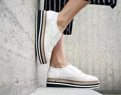
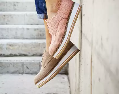
- Visible elements: Each column beautifully presents an image at the top, followed by a bold title, descriptive text, and an engaging call-to-action link (“Hello there”).
- Interactive features: The “Hello there” links serve as buttons, encouraging user engagement and interaction.
- Typography choices: Bold, larger titles paired with smaller regular text create a striking visual hierarchy that is easy to navigate.
- Graphical elements: Each image includes a small circular icon in the bottom left corner, adding a touch of personality.
- Image quality: The images are portrait-oriented, maintaining a consistent size without visible borders, enhancing the overall aesthetic.
Unique design aspects
- Visual appeal: The combination of large images and minimal text captivates viewers’ attention effectively.
- Hover effects: While specific hover effects aren’t detailed, typical designs suggest interactive feedback on the buttons for a more engaging experience.
- Responsive design: This adaptable grid layout seamlessly adjusts for various screen sizes, potentially stacking elements neatly in mobile views.
- Accessibility matters: The text contrasts well against the background, ensuring readability for all users, though additional assistive attributes may be beneficial.
Overall design style
- Minimalist approach: Clean lines and ample spacing embody a modern and refined design ethos, focusing heavily on imagery.
- Effective visual hierarchy: The layout directs attention from the striking images to their corresponding titles and descriptions, guiding viewers elegantly through your content.
- Thoughtful use of white space: Generous margins and spacing around elements prevent overcrowding, enhancing the design’s modern feel.
10 use cases for this website image-based pattern
1. Product showcases
This grid-based layout is ideal for displaying a variety of products in a clean, organised manner. Each product’s image can be featured prominently at the top, followed by its description and a call-to-action link. This format highlights product features effectively while encouraging potential customers to learn more or make a purchase. Whether you’re offering clothing, electronics, or artisanal goods, this layout enhances visibility and interaction.
2. Service portfolio
Use this layout to present a list of services with eye-catching visuals and concise descriptions. Each service gets its own spotlight, making it easy for potential clients to understand what you offer. The engaging call-to-action buttons drive user engagement and conversion, guiding visitors to further explore the specifics of each service.
3. Photography portfolios
For photographers looking to showcase their work, this layout provides the perfect blend of style and substance. With large images taking centre stage, you can display your portfolio with minimal distractions. Potential clients can enjoy an immersive experience while exploring different categories or sessions, accompanied by relevant information and contact options.
4. Art galleries
Artists and galleries can leverage this design to exhibit artwork with a polished and professional look. Each column serves as a mini-gallery, featuring captivating images of artworks, their titles, brief descriptions, and an invitation to explore more. This setup boosts viewer engagement and encourages deeper exploration of the artist’s work.
5. Food menus
For restaurants and cafes, this layout can beautifully present menu items, highlighting dishes with enticing images and descriptions. Patrons can easily navigate through the offerings, enticed by the visuals and engaged by the descriptions and special highlights of ingredients or culinary techniques.
6. Home decor ideas
Home decor enthusiasts and bloggers can use this pattern to share inspirational designs and styling tips. With stunning images accompanied by brief descriptions and styling advice, readers are drawn into a world of interior possibilities. Each call-to-action link can lead them to more detailed articles or purchasing options.
7. Travel itineraries
Travel bloggers and agencies can present engaging itineraries by featuring destination images, descriptions, and activity highlights. This visually appealing layout captures the essence of each location, transporting viewers to new places, while providing them with actionable steps to book their next adventure.
8. Fashion lookbooks
Fashion designers and influencers can showcase collections or style guides using this structured design. Display each outfit with flair, making a lasting visual impact. The layout’s simplicity ensures the focus remains on fashion, while descriptive text offers insights into style choices and fashion tips.
9. Testimonials and reviews
Share client testimonials and reviews in a readable format that pairs visuals of satisfied customers or related images with quotes and feedback. This authenticity builds trust and invites new customers to explore your offerings, supported by real-world experiences.
10. Educational courses
Academic institutions and online educators can use this pattern to introduce course offerings. Feature course images, titles, descriptions, and enrollment links that lead learners to more detailed syllabi or signup pages, facilitating a seamless educational journey.
10 different types of pages you can use image-based designs
1. Landing pages
Image-based designs are perfect for landing pages, grabbing visitor attention and providing them with a visually engaging experience. Use these designs to effectively display key offers, promotions, or information about your brand in a way that is easy to digest and compelling to explore further.
2. About us pages
Tell your company’s story with compelling images that reflect your ethos and team culture. This approach brings personality to your brand while supporting the text. Engaging visuals help humanise your business, fostering a connection with new visitors and potential clients.
3. Gallery pages
Gallery pages benefit greatly from a grid-layout design, as they allow for a seamless display of numerous visuals at once. Whether showcasing art, photography, or event images, this setup ensures viewers can appreciate each image’s uniqueness and context.
4. Portfolio pages
For creatives, having a captivating portfolio is essential. Use an image-based layout to present your work in a clean, organised manner. Showcase your projects through visuals complemented by brief descriptions that tell your story and highlight your skills.
5. Product pages
Image-based designs are highly effective for product pages where visuals need to do the selling. High-quality images within this layout not only showcase your product but also encourage deeper exploration through detailed descriptions and purchasing options.
6. Event pages
Promote your events with a captivating design that highlights key details through strong visuals. Use images from past events or themed designs related to the upcoming event. Such setups drive excitement and generate interest among potential attendees.
7. Tutorials and guides
For instructional content, this layout aids learning by breaking down complex topics with visual aides. Use images to illustrate each step or concept clearly, ensuring users can follow along easily with accompanying text and interactive elements.
8. News and announcements
Bring life to your news page with an image-centric approach, using relevant visuals to support and emphasize key stories. This method keeps the content dynamic and engaging while ensuring that important updates grab reader attention effectively.
9. Blog posts
Enhance your blog with rich visuals, making each post more inviting and shareable. Images break up text for better readability and add layers of context to your stories, resulting in a more enjoyable reading experience that resonates with your audience.
10. Testimonials pages
Testimonial pages with images create a sense of authenticity and connection with potential clients. By pairing faces with stories, visitors can relate better and trust such feedback, making their decision-making process smoother and more confident.
Conclusion
Elevate your WordPress website with this stunning grid-based layout. Its minimalist design, engaging visuals, and straightforward structure not only enhance user interaction but also effectively showcase your products and services. Embrace this opportunity to create a modern and inviting online presence! Additionally, consider exploring free WordPress themes and Elementor Alternatives to further expand and elevate your web design capabilities.


