WordPress pattern: Pure Image Light PIL-PRO-69
Build WordPress sites with MaxiBlocks. All features free forever. No locked functionality. Optional Cloud Library saves you 10+ hours per project. Start free
Discover the perfect grid layout for your WordPress site!
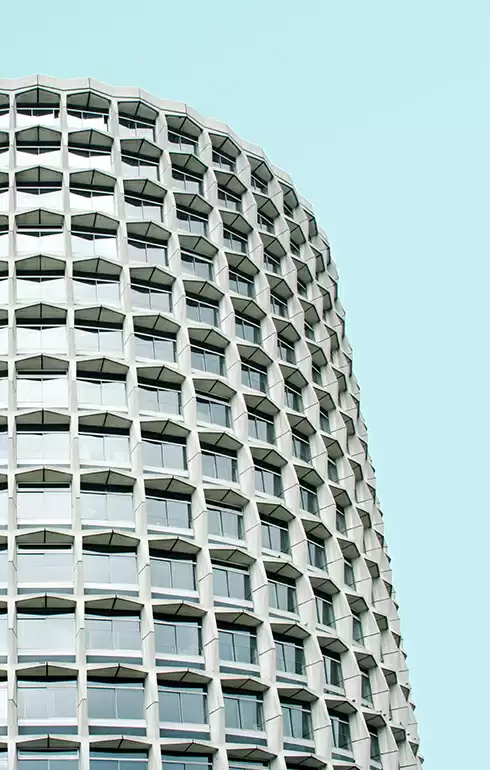
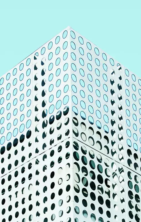
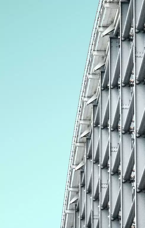
Are you looking for a stunning way to showcase your content? This well-designed image layout features a modern, minimalist grid, comprised of six unique blocks in an elegant two-column format. With three rows and two columns, this design highlights eye-catching architectural imagery paired with concise headers and context-rich text-ideal for engaging your audience! Enhance your WordPress website design with this fantastic layout.
Layout analysis
- Overall structure: This grid creates a harmonious visual experience, balancing six distinct sections effectively.
- Arrangement: With three rows and two columns, your content will shine in this well-organised space.
- Asymmetrical choices: While the grid boasts a symmetrical framework, the varied content within each block offers a refreshing, asymmetrical feel that captures attention.
Element and feature description
- Visible elements:
- Headers: Each block prominently presents a short text header, ensuring excellent visibility.
- Text blocks: Additional context below some headers enriches the viewer’s experience.
- Images: Distinctive architectural images fill each block, instantly appealing to design lovers.
- Interactive elements: This design is static, highlighting clarity and simplicity without distractions.
- Typography: A modern sans-serif font enhances readability with header sizes clearly standing out from accompanying text.
- Icons/graphical elements: While no specific icons are present, the stunning images serve as compelling graphical elements.
- Image borders and orientation: Images are presented in a clean square format, landscape-oriented for a contemporary touch.
Unique design aspects
- Standout design choices: The use of architectural photography adds trendy allure, while the clean layout presents each image and text block distinctly.
- Animations: This static display focuses on elegance without animations or hover effects.
- Responsive design: The adaptable grid format is designed to look great on various screen sizes, though specifics can only be confirmed on the actual site.
- Accessibility considerations: The text is legible, promoting clarity, though additional features might be needed.
Overall design style
- Design style: Featuring a minimalist and modern approach, this layout prioritises simplicity and clarity.
- Visual hierarchy: A clear hierarchy ensures headers grab attention first, followed by captivating images that complement the text.
- Use of white space: Thoughtful use of white space between blocks provides balance and enhances readability.
10 use cases for image-based patterns on your site
1. Photography portfolios
Display your photographic works in a visually striking grid layout that brings out the best in each image. Whether you’re a seasoned professional or an aspiring photographer, this design will help you organise and showcase your portfolio beautifully, making it easy for clients to browse your work.
2. Architecture firms
Highlight your previous projects with compelling images that speak volumes about your architectural prowess. Use this layout to neatly present project details and photos, giving potential clients a clear and aesthetically pleasing overview of your work.
3. Art galleries
Engage visitors with a sleek presentation of artworks, each accompanied by artist information and exhibit details. This grid layout will ensure that the art is the center of attention, creating a virtual gallery experience that’s both attractive and informative.
4. Fashion catalogs
Showcase your fashion collections with appealing product images and concise descriptions. This layout design will help each clothing line stand out, providing a clean and fashionable browsing experience for your customers.
5. Travel blogs
Capture readers’ attention by sharing stunning travel photos and intriguing stories. This grid layout allows you to present each destination in the best light, enriching your travel blog with visually compelling content that keeps audiences engaged.
6. Food and recipe sites
Entice your visitors with mouth-watering food photography. Pair these images with easy-to-follow recipes within an organised and user-friendly format. This layout will ensure your culinary creations pop, keeping readers coming back for more delicious content.
7. Design agencies
Present completed projects and creative work prominently, emphasising innovative designs and successful campaigns. This modern layout will help agencies demonstrate their value and attract new clients by clearly displaying their creative expertise.
8. Product showcases
Allow your products to shine with dynamic images and well-structured descriptions. Use this layout to communicate key features and benefits, ensuring that each product makes a powerful impression on potential buyers.
9. Personal blogs
Share your life experiences with captivating visuals and engaging storytelling. This image-based layout will help you balance text with images, resulting in a blog that is both personable and visually pleasing.
10. Event photography
Display images from recent events, offering potential clients an insightful look into your photography services. This grid layout elegantly presents each image, capturing the essence and excitement of each event while demonstrating your skill.
10 types of pages ideal for image-based designs
1. Homepage
The homepage is your first impression, so make it stunning with a sophisticated image grid. Showcase key highlights or featured content, allowing visitors to quickly navigate to their interests while leaving an impactful impression.
2. Portfolio page
Creatives can showcase various projects or artworks in a grid format, making it easier for potential clients or employers to explore their work. This design displays both images and project descriptions effectively, blending beauty and functionality.
3. Gallery page
Perfect for art galleries or exhibition venues, gallery pages can utilise this design to present a collection of artworks, exhibitions, or events. The format allows for easy navigation, creating an inviting experience for art lovers.
4. Product page
Sell your products with detailed images and concise descriptions that communicate essential information. This format ensures that each product receives focused attention, enhancing the shopping experience for potential buyers.
5. Blog page
Create an engaging blog with visually compelling posts that capture readers’ attention and encourage further reading. This grid layout balances visuals and text, making your blog inviting and accessible.
6. Landing page
Capture leads and highlight offers with a well-structured layout that draws attention to your call-to-action. The image grid can illustrate product features or customer testimonials, enriching the user experience.
7. Testimonial page
Build trust by showcasing customer stories or client feedback alongside relevant images. Such a format provides a visually appealing and credible way to share positive experiences with potential customers.
8. Services page
Detail your services with engaging visuals and succinct text. This layout helps communicate the value and benefits of your offerings, ensuring that your services take center stage in a clear and compelling manner.
9. About us page
Let visitors get to know your team with photos and personal bios. This informal yet professional design offers a unique glimpse into your company culture, providing a personal touch to your WordPress website.
10. Contact page
Encourage visitors to get in touch by combining contact details with facilitative imagery. The grid layout creates an intuitive navigation route, making the contact page both functional and visually inviting.
Getting the perfect image for your website
High-quality, rightfully-owned images can significantly enhance web designs. To get images for your site, consider these sources:
- Stock photo sites: Platforms like Unsplash, Pixabay, and Pexels provide free images.
- Public domain image archives: Sites like Wikimedia Commons host public domain works.
- Google Images: Use the ‘Usage Rights’ filter to find reusable images.
To download and use images online, click to open the image, right-click, and select ‘Save As’. Ensure you adhere to copyright rules to prevent legal issues.
Conclusion
This grid layout is a sophisticated solution to effectively showcase your ideas, making it perfect for WordPress users who prioritise aesthetics and functionality. Its minimalist style, strategic use of white space, and clear visual hierarchy invite user engagement while enhancing content readability. Transform your site with this stunning design today! For more customisation options and to explore free WordPress themes or explore WordPress website builders that fit your needs, check out our extensive resources. Discover the right WordPress website design and bring your vision to life with our Elementor alternatives.

