
Listening
Choose freedom

Taking ownership
Pushing limits
Having fun
Ideas for life

Community
Life is good

Build WordPress sites with MaxiBlocks. All features free forever. No locked functionality. Optional Cloud Library saves you 10+ hours per project. Start free

Listening
Choose freedom

Taking ownership
Pushing limits

Having fun
Ideas for life

Community
Life is good
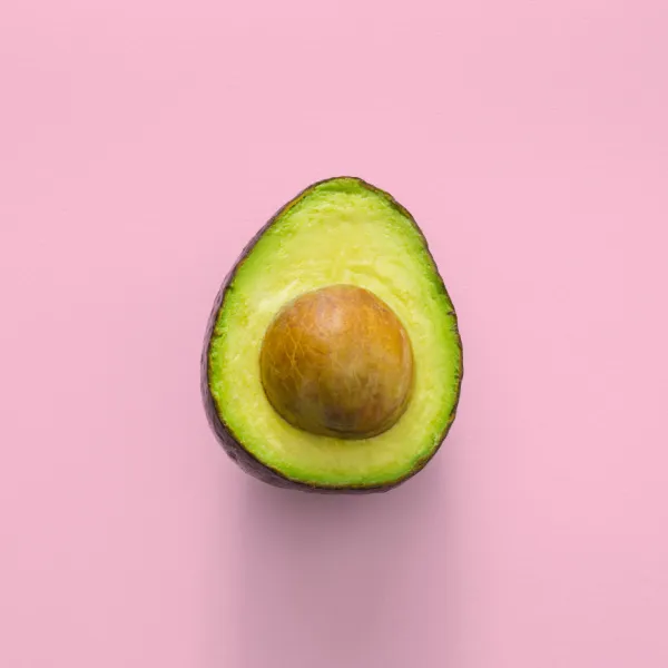
Unleash your creativity with this engaging multi-column layout, designed specifically for WordPress website users looking to enhance their content with vibrant visuals and clear messaging. This layout showcases four distinct sections in a horizontal format, each featuring eye-catching food imagery and bold typography that immediately draws attention.
Create eye-catching digital menus that showcase your dishes with vibrant food graphics. This layout ensures your culinary creations are front and centre, enticing customers with just a glance.
Enhance your WordPress website food blog by displaying rich images of your recipes. Inspire your audience with both visuals and tasteful tips.
Use a lively design to spread the word about upcoming events. The colourful arrangement attracts attention, while concise headers communicate essential details.
Present your products in an engaging and visually appealing manner. The layout’s structure allows each item to shine individually while maintaining a cohesive look.
Highlight your professional photography skills using this layout, which beautifully frames each image, ensuring your portfolio captures attention.
Tell a story through visuals on your WordPress website. The layout supports narrative flow, bringing stories to life with captivating images.
Strengthen your brand by aligning visual communication with company values. Use imagery and bold headers to convey what makes your brand unique.
Create engaging digital magazine layouts using this design. Bright imagery and sharp typography captivate readers, encouraging them to explore more content.
Curate and display artwork collections with elegance. Each piece is given its own space complemented by descriptive text that enriches viewer engagement.
Offer step-by-step guides with supporting visuals. Clear images and narrative text ensure readers can easily follow along and apply their new skills.
Make a strong first impression with a vibrant, image-focused homepage. Capture the essence of your brand and guide visitors through your WordPress website effectively.
Showcase your products with stylish imagery. Highlight key features and benefits, leading to higher engagement and conversion rates.
Use imagery to tell your company’s story, introducing your team and values visually, making your “About Us” page more engaging.
Display your work prominently. For creatives, showcasing the breadth and depth of projects visually can attract more clients.
Illustrate your services using image-based layouts to clearly convey what you offer and how potential clients can benefit.
Enhance your blog with a multi-column layout that uses images to complement written content, encouraging readers to explore further.
Create stunning galleries that captivate your audience. The cohesive layout ensures each image is a part of the bigger picture.
Humanise your contact page with images of your team, providing a more approachable touch to your communications.
Draw attention to upcoming events with vibrant imagery. Ensure dates, times, and locations are clearly communicated alongside compelling visuals.
Add customer testimonials with images, showing happy clients alongside their words. This approach adds authenticity and trustworthiness to your claims.
In the quest for the right images to use on your WordPress website, multiple resources offer solutions. “Images” or “website images” refer to visual files used to enhance content on your site. Websites like Unsplash, Pixabay, and Pexels provide royalty-free images, while public domain images are available from sites like Wikimedia Commons. Yes, you can find free images online; however, when using sources like Google, always ensure images are free of copyright infringement. To download images online, visit these websites, search your theme, select appropriate visuals, and follow their download instructions.
Crafted for WordPress users, this playful multi-column layout combines vibrant food imagery with bold typography, making it both visually appealing and easy to navigate. It effectively communicates concepts and values in a modern context, giving your website the creative edge it needs. Transform the way you present content-this layout is an excellent choice for anyone looking to add a lively touch to their online presence!
