Meet the team: a clean and professional design
Introducing our innovative Meet the Team layout – a sleek, minimalist design that effortlessly showcases your team members. This versatile structure features three distinct columns, each designed to highlight individual profiles with clarity and elegance.
Layout overview
Overall structure
A tidy multi-column layout that allows guests to quickly familiarise themselves with your team.
Arrangement
Comprising one row with three evenly spaced columns, this layout offers an organised presentation.
Asymmetrical choices
While columns are equal in width, the content can vary in length to create a dynamic yet balanced aesthetic.
Element and feature highlights
Visible elements
- Headers: Each column proudly displays the name of a team member, with a clear and bold header.
- Text Blocks: Below each name, a concise description provides additional context about each person’s role and expertise.
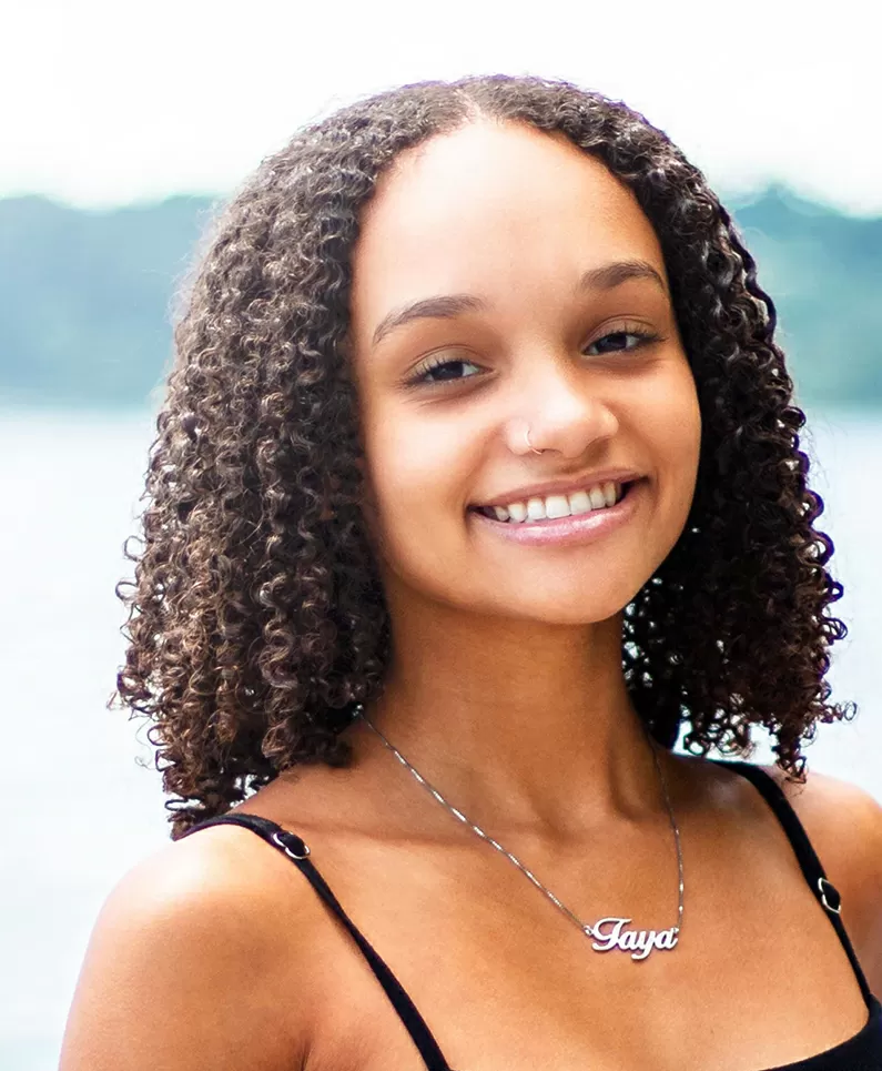
- Images: A professional portrait in portrait orientation is included for each team member, enhancing personal connection.
Interactive elements
This layout maintains a straightforward presentation style, focusing on static information without complex interactions.
Typography
- Font Styles and Sizes: The larger font for names makes them stand out, while smaller descriptive texts offer supplementary insights effectively.
Graphical elements
Though no interactive icons are displayed in this summary, integrating social media links can further enhance team visibility.
Image characteristics
- Orientation: Consistent use of vertical portrait images ensures a professional look across all profiles.
- Sizing: Each image maintains uniform dimensions for a cohesive appearance.
Unique design aspects
Standout features
The combination of professional images and structured layout guarantees an effective team presentation that draws viewers in.
Hover effects/animations
While this design doesn’t feature hover effects, its simplicity emphasises essential information.
Responsive design elements
The adaptable three-column layout ensures clarity and usability on both WordPress websites on desktop and mobile devices.
Accessibility considerations
Clear labelling and appropriate text contrast improve accessibility, though further enhancements could enhance user experience.
Overall design style
Design style
Embracing a minimalist aesthetic, the layout prioritises organisation and clarity, making it user-friendly.
Visual hierarchy
The prominent name headers draw immediate attention, followed by images and descriptive text that guide the viewer naturally.
Use of white space
Thoughtful use of white space keeps the design open and uncluttered, enhancing both readability and visual appeal.
Ten elements for your Meet the Team section in WordPress
Professional headers
Clearly label each team member with a bold header that communicates professionalism and clarity. Well-structured WordPress navigation menus can ensure visitors find what they need effortlessly.
Concise bios
Offer compendious yet informative biographies that capture the unique skills and personality of each individual on your team, making them approachable to potential clients and collaborators.
Standard images
Maintain uniform image dimensions for consistency across your WordPress website templates, ensuring each team member’s portrait aligns with the professional aesthetic.
Social media links
Enhance team visibility by embedding social media links within individual profiles, directing readers to team members’ professional networks without clutter.
Responsive design
Guarantee smooth adaptability across various devices and screen sizes by employing a responsive WordPress menu design for your Meet the Team section.
Accessibility features
Ensure your design is accessible to all users by integrating contrast-friendly color options and easy-to-navigate interfaces, enhancing overall user experience.
Organised layout
Employ a structured arrangement that neatly divides content into understandable sections, allowing users to easily digest each team member’s information.
Dynamic content lengths
Allow for varying content lengths to tailor each profile presentation, fostering a dynamic visual composition while maintaining uniformity across columns.
Elegant typography
Select an elegant yet readable font that compliments the overall design ethos, ensuring key information remains prominent when browsing your WordPress block templates.
Static approach
Focus on simplicity by milling complex interactions in favour of static, easily digestible information that captures the viewer’s attention without distraction.
Ten content ideas to include in your Meet the Team section
Employee quote
Feature a personal quote from each team member that reflects their philosophy or motivation. These insights can enrich their profiles, adding depth beyond their job title and responsibilities.
Background story
Share a brief background story of each team member, exploring what brought them to your company and their journey throughout the organisation. This storytelling approach fosters a personal connection with the audience.
Personal achievements
Highlight individual accomplishments both inside and outside the workplace. Including notable achievements can showcase diverse skills and promote your team’s dynamic nature.
Team member video introduction
Incorporate short video introductions that allow each team member to connect with site visitors, offering authenticity and a human touch that resonates well. Adding multimedia elements can cater to different content preferences.
Contact information
Provide direct means to connect with each team member by displaying contact details, prioritising strategic reachability in professional interactions.
Day in the life feature
Share a “Day in the Life” segment for each team member, outlining routine tasks and roles. This approach gives a transparent view of your team’s daily contributions to your WordPress navigation setup and operations.
Hobbies and interests
Balance professionalism with the personal by detailing hobbies or interests, enough to personalise profiles without overwhelming professional insights.
Team member values
Highlight individual core values in brief narratives, reinforcing alignment with company culture and mission, underscoring synergy in your AI website builder environment.
Achievements and certifications
Accreditations and certifications accentuate professional growth and credibility within the industry, directly reflecting your team’s expertise and capability.
Inspirational stories
When applicable, include inspirational stories or messages of perseverance, contributing to the motivational ethos of the team and inspiring potential clients and partners.
Conclusion
Our Meet the Team layout is the perfect solution for showcasing your group in a professional and engaging manner. With its clean, minimalist three-column design, this layout effectively balances images and text, establishing a clear visual hierarchy that engages viewers. By integrating these elements and content ideas, you can elevate your team’s presentation, ensuring your WordPress website design remains both stylish and functional. Adapt your strategies creatively with WordPress website design and deliver a compelling team narrative across devices seamlessly.


