Featured products
Every buy will give you a reason to smile

Build WordPress sites with MaxiBlocks. All features free forever. No locked functionality. Optional Cloud Library saves you 10+ hours per project. Start free
Featured products
Every buy will give you a reason to smile
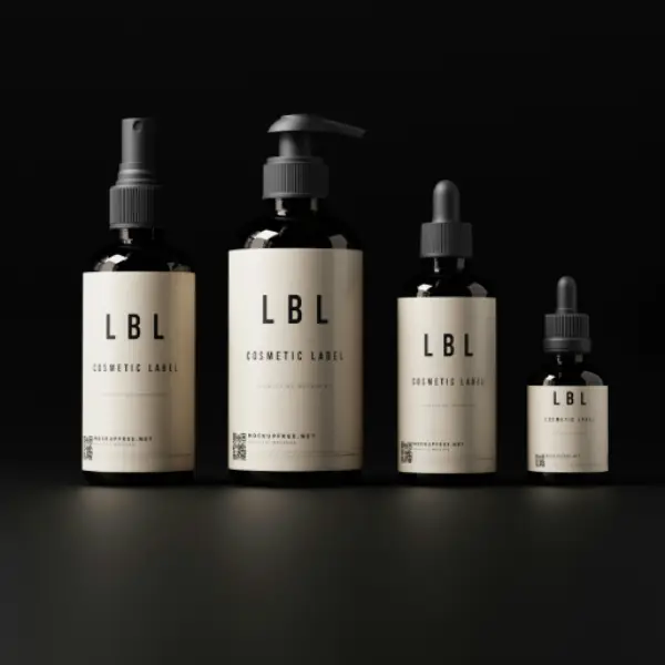
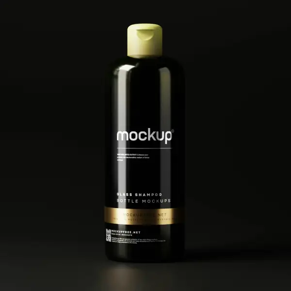
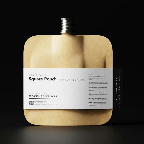
Are you looking to elevate your WooCommerce website’s design? Check out this modern, minimalist layout that effortlessly showcases your featured products. With its striking three-column format, users can enjoy a clean, organized view that highlights what you offer.
The design includes intuitive icons for adding items to the cart, seamlessly integrating shopping functionality.
The bold header and consistent font styles across titles and descriptions ensure everything is easy to read.
Images are showcased with minimal borders and slight shadows for depth, primarily in portrait orientation.
To achieve a professional look, incorporate a three-column layout. This design allows users to compare products side by side and makes it easier for customers to find what they need quickly. Incorporating flexibility ensures that the design adjusts seamlessly on mobile devices, enhancing user experience across multiple platforms.
The importance of high-quality imagery cannot be overstated. Ensure your product images are vibrant, clearly showcasing the details. Use portrait orientation with minimal borders and added shadows for depth, enticing customers to make that purchase. Remember, an image speaks a thousand words; let it do the talking!
A fluid and intuitive navigation system lets users browse effortlessly through your store. Implement clear, structured menus that direct customers to different sections like product categories, sale items, and customer support. Employ best practices in using dropdown menus to offer detailed navigation without sacrificing the clean look.
Your headers should be your voice-strong, clear, and unwavering. Use them to draw attention to key areas such as special offers or sales events. Each word in your header should be impactful, reflecting the quality and uniqueness of your products.
Carefully position your most attractive or best-selling products at the forefront of your layout, where they’ll generate the most impact. Consider adding new arrivals or a ‘recent additions’ section to guide returning customers to fresh inventory. Balancing out new items with classics ensures a dynamic yet consistent customer journey.
Select typography that is clear and consistent. The right choice of font style and size can subtly enhance readability and brand recognition. Complement product titles with clean fonts, and ensure descriptions are compact yet informative, enticing quick decisions.
The next step should never be ambiguous. Your call-to-action buttons must prompt quick, decisive responses from shoppers. Whether it’s “Add to Cart” or “View Details,” these buttons should be strategically placed and highlighted, making them irresistible to click. Crafting a strong CTA can drive conversions significantly.
Adopt a responsive design to reach customers accessing your store through various devices. Ensure seamless transitions in layout and functionality from desktop to mobile without losing quality or aesthetic appeal.
Employing striking colour contrast enhances the entire visual experience, ensuring that essential components pop to the observer’s eye. A well-chosen contrast emphasises the product’s visuals without overpowering or distracting. It promotes readability and naturally guides the customer’s focus to your products.
With a WordPress website builder, customisation becomes a breeze, allowing for swift adjustments and integration of business-specific plugins. This enables flexibility and control over your design, catering it closely to your users’ needs while enhancing operability.
Catch your customer’s attention with a clear and enticing invitation to shop. Emphasise exclusivity to create a sense of urgency and importance. It’s not just about purchasing; it’s about gaining access to something special that others might miss out on. This phrasing not only drives immediate action but also builds anticipation over what unique products you offer.
This invitation encourages exploration and discovery in your store. It leverages curiosity and the love for novelty, targeting those who appreciate keeping up with trends. When customers click, guide them through a visually stunning page that highlights the latest additions with comprehensive product information.
People love to be the first in line for something new. By offering early bird notifications, you ensure that they’ll return to your store with anticipation, ready to make a purchase. This strategy not only increases potential sales but also builds a loyal customer database for future product launches.
Invite your customers to subscribe to newsletters or updates in exchange for exclusive discounts. Emphasise the benefit of receiving these offers, ensuring shoppers feel they’re securing a valuable deal by staying in touch with your business news and promotions.
An “add to wishlist” option lets potential buyers save products they’re interested in, to revisit and purchase at their leisure. It’s a handy function for those reluctant to impulse-buy but allows them to come back easily once they’re ready to commit.
A favourite incentive worldwide, promoting free shipping can be the nudge customers need to finalise their purchase. Clearly outline any conditions, like a minimum purchase requirement, to motivate customers to add more items to their basket.
Simplify the transaction process by offering a one-click checkout solution. This CTA highlights convenience and efficiency, crucial for busy shoppers looking for a swift shopping experience. Streamlined steps in buying can elevate user satisfaction and encourage repeat sales.
Highlight your best-performing items by leading customers directly to them. This CTA indicates these products are consumer-approved, boasting quality and value. The promise of a satisfactory purchase is often enough to guide tentative buyers towards the checkout.
Encourage exploration of additional resources your brand offers, like free WordPress themes, expanding their experience beyond just shopping. This approach not only showcases your products but positions you as a knowledgeable resource in WordPress website design.
Offering direct contact ensures potential purchasers that their unique needs will be met. A CTA urging them to “contact us for a tailored solution” suggests personalisation and high-quality customer support, building trust and paving the way for custom orders or services.
With this powerful design, you can transform your WooCommerce store into a visually appealing and user-friendly marketplace. Showcase your products in style and watch your sales soar! Embrace modern minimalism, ensure mobile responsiveness, and give your customers a seamless shopping experience. For more tips on enhancing your WordPress website, explore insights into Elementor alternatives. Get started today!


