Our products

WordPress pattern: WooCommerce Dark WCD-PRO-02
Build WordPress sites with MaxiBlocks. All features free forever. No locked functionality. Optional Cloud Library saves you 10+ hours per project. Start free
Elevate your WooCommerce store with a stunning product display
Imagine a beautifully designed product display that draws your customers in and makes shopping seamless. Our WooCommerce product layout features an elegant, minimalist design to enhance your WordPress website‘s appeal.
Original design overview
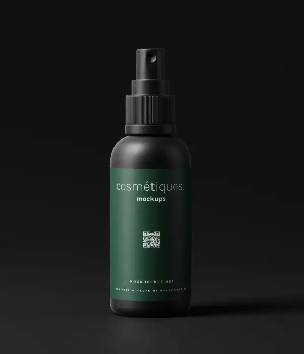
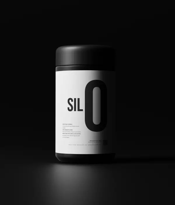
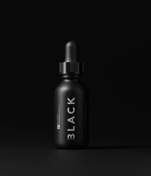
The initial product display showcases a clean, multi-column layout, featuring four products in a single, well-structured row. This symmetrical arrangement provides a sleek, organized look, allowing each product to shine against a striking dark background.
Why choose this layout?
1. Layout analysis
- Overall structure: A modern multi-column layout enhances product visibility.
- Arrangement: Displaying four products in one row optimizes the browsing experience.
- Symmetrical balance: All columns are evenly sized for a balanced aesthetic.
2. Element and feature description
- Visible elements:
- Headers: The engaging title “Our products” prominently directs attention to your offerings.
- Text blocks: Each product block includes a clear placeholder for both the title and price, making essential information easily accessible.
- Buttons: Interactive “Add to cart” buttons, elegantly styled in orange, invite user interaction.
- Interactive elements: User-friendly “Add to cart” buttons allow customers to quickly add products to their cart with just a click.
- Typography: The bold and modern typography enhances legibility, with larger product titles and appropriately sized prices, using a clean sans-serif font.
- Icons/graphical elements: Featuring simple icons for the “Add to cart” action, this design is both functional and visually appealing.
- Image properties:
- Products are presented with rounded borders, giving them a contemporary finish.
- Vertical (portrait orientation) product images add a professional touch.
3. Unique design aspects
- Standout features: The stark contrast of the dark background makes your products pop, ensuring they grab attention.
- Hover effects: Anticipate engaging hover effects on buttons or images, enhancing interactivity.
- Responsive design: This layout gracefully adapts to mobile devices, stacking products vertically.
- Accessibility considerations: Striking contrast between text and background improves readability for all users.
4. Overall design style
- Design style: Experience a minimalist design that accentuates your products without distractions.
- Visual hierarchy: The “Our products” header serves as a guiding focal point, leading customers effortlessly to browse.
- White space and balance: Plenty of white (or black) space allows each product to stand out.
WooCommerce design elements for your WordPress website
Incorporating effective design elements elevates your WooCommerce store’s appeal, creating a seamless shopping experience. These elements enhance functionality and visual interest, meriting the use of a WordPress website design.
Interactive product carousel
An interactive product carousel showcases your items dynamically, drawing in customers with rotating displays. It’s the perfect way to highlight featured products and special offers, ensuring your visitors don’t miss out on your best-selling or new items. With intuitive navigation, users can smoothly browse through various options, enhancing their shopping experience.
Customisable product badges
Stand out from the crowd by using customisable product badges. These are small, striking labels that highlight discounts, newness, or limited stock items directly on the product image. They grab the customer’s attention immediately, prompting potential sales and helping customers make quick decisions.
Rich media integration
Enhance your product descriptions with rich media such as videos or 360-degree views. Adding media boosts user engagement, providing a comprehensive understanding of your product, which can influence their buying decision favourably. Narrated videos or interactive images allow a more immersive product experience.
Advanced filter options
Provide customers with advanced filter options to refine their searches efficiently. Compare products based on price, brand, or popularity, making navigation more user-centered. These filters streamline the search process, improving the customer shopping experience by cutting through clutter.
Responsive product grids
Ensure a clean and accessible browsing experience with responsive product grids. Automatically adjusting to different screen sizes, these grids maintain clarity and usability, crucial in today’s mobile-first era. Enhance visibility and browsing ease across a range of devices, meeting the needs of all potential customers.
Embedded social proof
Incorporate embedded social proof elements like reviews or testimonials directly beneath your products. Buyer feedback acts as a strong influence on new customers, inspiring trust and breaking down purchase barriers. Including a star rating system or summarised customer reviews can nudge potential buyers towards conversion.
Cross-sell widgets
Encourage bigger purchases with strategically placed cross-sell widgets, highlighting complementary products or accessories. Wisely suggesting items that pair well with what’s already in the cart increases average order value, while also enhancing the shopping experience by offering product solutions in one go.
Clear navigation menus
Effective navigation menus are the backbone of any WordPress website. A clearly structured menu guides customers through your store effortlessly. Thoughtful categorisation and clear labelling of sections enhance the user’s visiting experience, reducing abandonment rates.
Lifestyle imagery
Engage customers with lifestyle imagery by showing products in real-world situations. This approach helps shoppers envision how products fit into their lives, aiding in decision making. It’s a powerful narrative tool that goes beyond plain product pictures, offering inspiration and persuasion to potential buyers.
Personalised recommendations
Utilise AI-driven personalised recommendations to offer a curated shopping journey. By understanding browsing habits and preferences, suggest the most relevant products, making the experience feel custom-tailored. This element connects with users on a more personal level, encouraging them to explore further.
Call to action ideas for your WooCommerce website
Inviting and well-placed calls to action (CTAs) significantly increase customer engagement and conversion rates. By integrating effective CTAs, guide potential buyers towards desirable actions, boosting your store’s performance. Here are some CTAs tailored for a persuasive WordPress website.
Limited time offer
Leverage urgency with a “Limited time offer” CTA. Highlight flash sales or temporary discounts, urging users to act fast. This compelling approach can spur customers to finalise their transactions promptly, reducing hesitance. Ideal for clearing out stock quickly or giving a sales boost in slow periods.
Free shipping thresholds
Encourage shoppers to increase their cart value with CTAs revolving around free shipping. For instance, “Add £20 more for free delivery” prompts customers to reach a certain target, driving higher order values. It’s a valuable incentive, making your offer more attractive without altering product prices.
Explore new arrivals
Capture interest with a dynamic “Explore new arrivals” CTA. Direct attention to fresh merchandise with an inviting message that allures shoppers keen to discover the latest trends. Keeping your audience updated with what’s new maintains their interest, encouraging consistent return visits.
Join our loyalty programme
Engage and retain customers with a “Join our loyalty programme” CTA. Keeping them motivated with promises of rewards, discounts, or exclusive previews strengthens buyer relations. This approach builds customer satisfaction and fosters repeat purchasing behavior, essential for long-term business success.
Sign up and save
Promote email sign-ups with a “Sign up and save” CTA, widening your reach while offering immediate value to users. Exchange a discount code or special offer for subscription, effectively expanding your marketing list. This beneficial trade-off strengthens both customer relationships and your sales strategy.
Leave a review
Capitalize on social proof by inviting past buyers to leave reviews with an effective CTA. Highlight in a heartfelt manner how their feedback will assist others in making informed choices. Building a repository of genuine reviews instills confidence in future shoppers, enhancing credibility and trust.
Check top-rated products
Direct potential buyers towards your best offerings with a “Check top-rated products” CTA. By showcasing highly-rated items, set a standard of quality that influences purchasing decisions. Featuring popular favourites can allure curious customers, leading to increased sales and customer satisfaction.
Add to wishlist
Facilitate purchasing decisions with an “Add to wishlist” CTA. Allowing users to save potential buys for later consideration ensures they’re not lost in the clutter. This thoughtful option serves forgetful or busy shoppers, supporting conversion of these postponed intentions into actual sales.
Discover trending items
Exploit consumer curiosity with a “Discover trending items” CTA. By highlighting popular products in the marketplace, you tap into a sense of belonging and awareness. This connection can spur quick purchasing decisions, driven by the desire to stay on-trend or own sought-after items.
Customise your products
Invite interaction and satisfaction with a “Customise your products” CTA, offering bespoke options. By allowing buyers to tailor their purchase to exact preferences or needs, you enhance product desirability. Personalisation invites deeper connections between consumers and your brand, fostering loyalty.
Conclusion
Transforming your WooCommerce store into a visual masterpiece is within reach with these innovative layout strategies and CTA ideas. Leveraging stylish design and interactive elements like the ones in responsive WordPress design captivates clients and leads to more significant engagement. In your pursuit of excellence, consider exploring Elementor alternatives for innovative design success. Embrace these tips and elevate your WordPress website’s reception and performance today!


