Featured products
Best spring products

Build WordPress sites with MaxiBlocks. All features free forever. No locked functionality. Optional Cloud Library saves you 10+ hours per project. Start free
Featured products
Best spring products
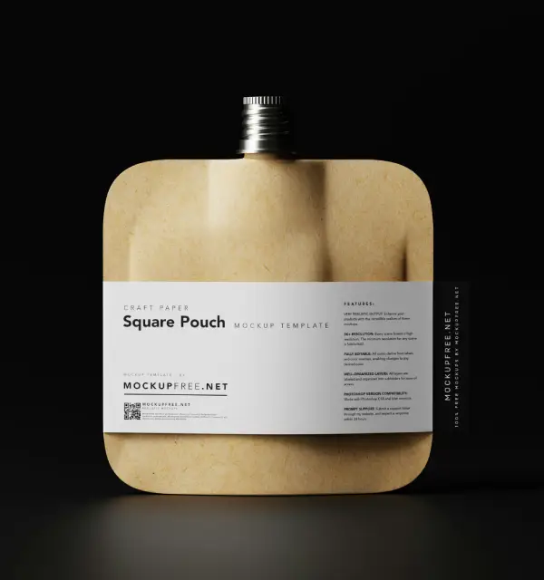
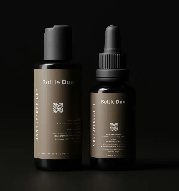
Want your WooCommerce store to stand out? Check out this striking WordPress website design layout that can elevate product visibility and enhance user interaction.
The original design features a multi-column layout with a clean, organized grid arrangement. It uses a single row to showcase four unique product columns. This symmetrical setup offers an aesthetically pleasing view, perfect for enticing customers.
Beautiful, high-quality images are the backbone of any striking WooCommerce store. Ensure your product images are vibrant and well-composed to draw customers in and give them a clear understanding of the product’s features and benefits. Use lighting and angles that best display the item, and provide zoomable images for a closer look. Coupled with a clean free WordPress themes, these images can make your storefront both attractive and effective.
Keeping navigation simple and intuitive is key to enhancing user experience. Use clear, concise labels for your categories and subcategories. Implementing WordPress navigation menus helps users find what they need quickly, reducing bounce rates and encouraging more customer engagement.
Strong call-to-action (CTA) buttons are essential for guiding users where you want them to go, like adding products to their cart or signing up for a newsletter. Make sure your CTAs stand out, using contrasting colours and actionable language. Phrases such as “Add to Cart” or “Sign Up Now” should be clear and compelling.
In today’s mobile-first world, a responsive design is crucial. Double-check that your WooCommerce store layout adapts seamlessly to different devices, whether it’s a smartphone, tablet, or desktop. A responsive WordPress design ensures your site looks great and functions well, regardless of the screen size.
Security is paramount when handling customer data. Ensure your checkout process is straightforward, fast, and secure to prevent drop-offs. Highlight security features like SSL certificates and trusted payment gateways to build confidence and trust with your users.
A well-detailed product description can sway a purchasing decision. Use clear, informative, and engaging language to describe your products while integrating relevant keywords naturally. Highlight the features, benefits, and unique points of each product to help your customers make informed decisions.
Potential buyers often look at reviews before making a purchase. Include a section for customer reviews and ratings on your product pages. This not only helps with Gutenberg blocks for engaging content but also builds trust and provides real-world insights into your product’s performance.
A wishlist feature lets customers save products for later, keeping your store on their radar. Make it simple for users to add and view items on their wishlist, encouraging them to return to your site when they’re ready to purchase, boosting sales in the long run.
Providing real-time assistance through live chat support can significantly enhance customer satisfaction. Immediate answers to queries can improve conversion rates, show you value your customers, and differentiate your business from the competition.
Allow customers to connect and share their favourite products through social media using integrated buttons on your product pages. This not only spreads the word about your store but also leverages the power of social proof to attract new customers.
Guide customers to make quick decisions with an enticing “Add to Cart” button. Tailor its colour and positioning to catch the eye, ensuring it’s easily clickable and located near the product details for a seamless purchase process.
A great way to capture emails is by offering exclusive discounts upon signing up for a newsletter. Make sure the phrase is visible and tempting, potentially combining it with a pop-up for immediate impact.
Encourage customers to check out the latest products with a CTA that leads them to a section with fresh stock. Use engaging language to pique interest and stimulate browsing.
New customers appreciate a welcoming deal. Persuade first-time shoppers with a discount on their initial purchase, cultivating brand loyalty from the start with a simple sign-up or code redemption process.
Boost the visibility of your bestsellers by pointing customers towards a collection of top-rated items. Highlight star ratings and customer favourites to instil confidence and inspire purchases.
Encourage deeper engagement by prompting visitors to join a VIP club or rewards program. Outline the benefits, such as exclusive access to deals or early product launches, to attract sign-ups.
Enhance brand interaction by encouraging customers to join your social community. Include clear links to your profiles and highlight the perks of following, such as insights and special offers.
Offer a personalised experience by allowing customers to book consultations or shopping sessions. Use inviting language that conveys the exclusivity and tailored service they’ll receive.
Motivate customers to provide feedback by entering them into a draw or competition. This can offer insights into your service while also rewarding loyal clientele.
If you have a mobile app, direct users to download it by emphasising convenience and the enhanced shopping experience it offers. Include a straightforward link to the app store for easy access.
Implementing these strategies and elements can transform your WordPress website into a captivating, efficient, and conversion-oriented platform. Whether you’re leveraging the power of high-quality images, intuitive menus, or inviting CTAs, each aspect plays a role in enhancing user experience. For even more design flexibility, consider exploring Elementor alternatives or various WordPress website builder options. Ready to WOW your customers? Implement this winning layout in your WooCommerce store today!


