Trending products
Browse the newest products

Build WordPress sites with MaxiBlocks. All features free forever. No locked functionality. Optional Cloud Library saves you 10+ hours per project. Start free
Trending products
Browse the newest products
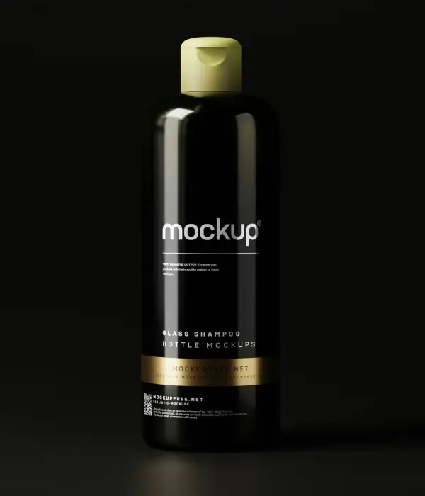
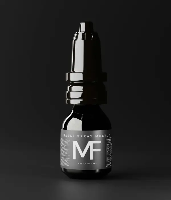
Transform your WordPress website design with a stunning WooCommerce layout that captures attention and enhances user experience. Dive into this detailed analysis, exploring the design elements that make your product showcase truly stand out.
Our layout is built on a modern, multi-column grid format, seamlessly organising multiple product items. With one prominent row featuring four columns, this design champions symmetry and uniformity, offering a clean and appealing visual experience.
A dynamic grid layout can transform your WordPress templates into a vibrant showcase. Using a flexible multi-column setup allows you to display products in a structured yet visually exciting manner. This ensures customers find what they are looking for swiftly while enjoying an aesthetically pleasing experience. The grid adjusts seamlessly, accommodating products of various sizes, keeping your website clean, organised, and appealing regardless of your inventory’s range or variety.
Interactive product cards can significantly enhance the shopping experience on your WooCommerce store. Each card displays crucial details, such as product images, descriptions, and prices, and includes “Add to Cart” buttons and interactive icons. Adding dynamic features like hover effects gives customers instant access to more information, fostering quicker buying decisions. Ensuring these elements are user-friendly and visually enticing encourages exploration, leading to increased engagement and higher sales conversions.
Engaging CTAs are key to guiding your visitors through your WooCommerce store. They should be compelling, using action-oriented language such as “Shop Now” or “Explore New Arrivals.” Positioning CTAs strategically throughout your site-in product pages, banners, and headers-can effectively draw customer attention, driving traffic to specific areas. By ensuring these CTAs reflect your store’s voice and are visually noticeable, you can motivate visitors to take desired actions with ease and excitement.
Implementing a well-defined visual hierarchy helps your customers navigate your WooCommerce store effortlessly. By emphasising essential elements through size, colour, and placement, you guide visitors’ eyes naturally from headlines to product details and buttons. A logical flow enhances comprehension and ensures key information is easily accessible. This not only improves the user experience but also increases the likelihood of conversions, as customers can easily find what they’re looking for and follow your intended path of interaction.
Typography in your WooCommerce design should enhance readability and reflect your brand’s essence. Opt for clear, modern sans-serif fonts that convey a contemporary feel, making text easy to read across all devices. Use larger font sizes for headings and key information to draw immediate attention, while smaller, concise text suits product descriptions. Balancing stylish typography with functionality ensures your content is both attractive and accessible, improving the overall user experience and retention.
A responsive design is crucial for a successful WooCommerce store. It ensures your site looks fantastic on any device, offering seamless navigation on desktops, tablets, and smartphones. Implementing responsive elements, such as adaptable grids and flexible images, guarantees that your layout adjusts to fit various screen sizes. This not only enhances user satisfaction but also boosts your site’s SEO performance, as search engines prioritise mobile-friendly websites in their rankings.
High-quality product images are essential in showcasing your WooCommerce store to its fullest potential. Clear, professional visuals provide an up-close view of your items, sparking customer interest and confidence in their buying decisions. Opt for images with genuine colour representation and multiple angles to give a comprehensive view. Displaying images without borders enhances minimalism and emphasises the products, captivating your audience and increasing the likelihood of conversions.
Implementing a dark mode background can make your WooCommerce store stand out. This sophisticated choice enhances the contrast and vibrancy of your product images, drawing immediate viewer focus. Dark backgrounds also add a modern, sleek feel to the design, setting a striking stage for your items. Integrating this element not only boosts aesthetics but can also improve readability and reduce eye strain, providing visitors with an enjoyable browsing experience.
Incorporating accessibility features ensures everyone can enjoy your WooCommerce store. Use alt-text for images, clear labels for buttons, and high-contrast colour schemes to aid users with visual impairments. Provide keyboard navigation options and ensure your layout is screen reader-friendly. These considerations not only demonstrate an inclusive approach but also broaden your audience reach, improving user satisfaction and encouraging positive interactions among all visitors.
Unique icons and graphics can breathe life into your WooCommerce design. Using distinctive symbols for features like “New” or “Sale” tags draws attention to special offers. Custom graphics should align with your brand’s identity, adding an extra layer of professionalism and consistency to your site. Such visual cues help direct customers to areas of importance, enhancing their browsing experience while subtly influencing their purchasing decisions.
Guide your customers to explore more with a “Shop the Collection” CTA. This inviting prompt encourages visitors to dive deeper into your product range, sparking curiosity and interest. Placed on product pages or banners, it provides a gateway to discover full product lines or related items, enhancing the shopping journey. By highlighting the diversity and uniqueness of your offerings, this CTA can increase engagement, help build a loyal customer base, and boost overall sales.
Invite visitors to receive discounts and promotions with an enticing “Get Exclusive Offers” CTA. This approach not only attracts bargain hunters but also fosters a sense of exclusivity and special treatment. Placing this on your homepage or pop-ups can draw attention and lead to email sign-ups or account creations. By offering occasional deals to those who opt in, you build loyalty and maintain customer interest over time, creating opportunities for repeat business.
Create a sense of urgency and privilege with the “Be the First to Know” CTA. This encourages users to subscribe to newsletters or notifications about new arrivals and exclusive launches. Strategically positioned on your homepage or in pop-ups, it taps into the audience’s fear of missing out, prompting swift action. By keeping your audience updated with the latest products and news, you nurture anticipation and excitement, driving consistent engagement and long-term customer relationships.
Engage your audience on a personal level by inviting them to “Discover Our Story.” This CTA encourages a deeper connection by allowing visitors to learn more about your brand’s history, values, and mission. Whether through an “About Us” page or an engaging blog post, sharing your journey adds authenticity and builds trust with your audience. When customers feel connected to your story, they’re more likely to develop loyalty and advocate for your brand enthusiastically.
Create a sense of belonging with a “Join Our Community” CTA. This invitation encourages customers to become a part of a vibrant group of like-minded individuals. Whether through social media groups or membership areas on your website, building a community fosters interaction and support. Position this CTA on your homepage or in newsletters to draw in users. It strengthens customer loyalty by promoting engagement and interaction, which can fuel brand growth through word-of-mouth promotion.
Drive urgency with a “Limited-Time Offer” CTA. Highlighting short-term promotions creates a sense of scarcity, prompting immediate action. Place this prominently on your homepage, product pages, or within emails to effectively capture interest. By emphasizing the temporary nature of the deal, customers are motivated to act quickly, increasing sales during promotional periods. This tactic is particularly effective for clearing out stock or introducing new items to the market.
Expand your customer base with a “Refer a Friend” CTA. This encourages users to share your products with their network, often incentivized by discounts or rewards. Place near checkout or within email communications, promoting word-of-mouth marketing. It’s a cost-effective way to gain exposure and reach potential customers who trust their friends’ recommendations. By rewarding current customers, you build loyalty and increase satisfaction while simultaneously growing your audience organically.
Boost sales with an enticing “Request a Demo” CTA. This option suits products that benefit from hands-on interaction, enabling customers to experience elements before purchasing. Position this in product descriptions or as part of landing pages, offering a glimpse into functionality and features. This builds assurance and confidence among potential buyers, driving conversions through informed decision-making. A seamless demo experience can bridge uncertainty, transforming prospects into satisfied customers.
Build trust with the “View Customer Reviews” CTA. Highlighting honest feedback increases credibility, helping potential customers make informed purchasing decisions. Place this strategically on product pages or linked to testimonials. By showcasing satisfied customers’ opinions, you alleviate hesitation and inspire action. This CTA nurtures a transparent connection with your audience, assuring them of product quality and boosting their confidence, ultimately increasing your conversion rates.
Invite exploration with the “Start Your Journey” CTA. This engaging prompt encourages visitors to embark on an adventure through your offerings. Placed on your homepage or as part of tour guides, it fosters curiosity and a willingness to engage. By associating your brand with new beginnings, you create a narrative that resonates with your audience, prompting exploration and repeated visits, building a dynamic relationship that evolves with each interaction.
With a modern, multi-column design that prioritises product visibility, your WordPress website can feature minimalistic card designs, crisp typography, and a striking dark background. This setup attracts attention and encourages exploration, enhancing the purchasing experience. Upgrade your WooCommerce store today to unlock its full potential and deliver an outstanding shopping journey for your customers. Explore Elementor Alternatives and discover countless free WordPress themes to further customise your digital space.


