WordPress pattern: WooCommerce Light WCL-PRO-05
Build WordPress sites with MaxiBlocks. All features free forever. No locked functionality. Optional Cloud Library saves you 10+ hours per project. Start free
Transform your WooCommerce store: a deep dive into product display design
Are you ready to elevate your WordPress website? Discover the powerful impact of a thoughtfully designed product display that captivates visitors and drives sales.
Original design overview
The original product display adopts a sleek, four-column grid layout that organizes your products with precision. Each column is dedicated to a distinct product, providing a clean and structured browsing experience.
Unpacking the layout
- Overall structure: A streamlined four-column grid ensures that your products are presented uniformly, making navigation intuitive for customers.
- Row and column arrangement: One row with four equal columns allows for simultaneous viewing of multiple products, enhancing user engagement and interaction.
Key elements and features
- Product headers: Clearly labelled with names like “Starter,” “Silver,” and “Gold,” each product card’s header captures attention right away.
- Descriptive text blocks: Below the headers, placeholder text hones in on the product’s benefits and features, enticing potential buyers.
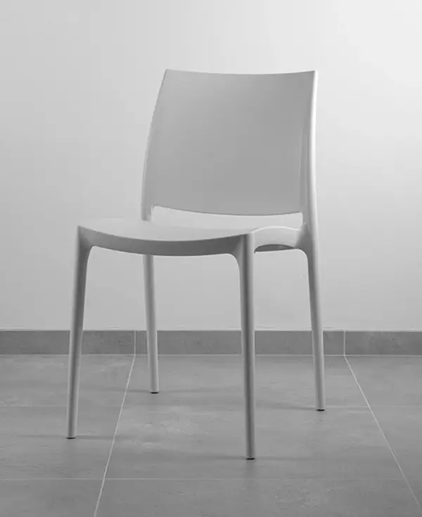
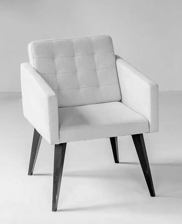
- Striking product images: Each card showcases a tasteful grayscale image of a chair, with slight design variations to maintain aesthetic interest.
- Prominent call-to-action: The “Add to basket” button is strategically placed and visually distinct, simplifying the purchasing process for users.
Interactive and visual appeal
- Interactive features: The “Add to basket” buttons are designed for seamless user experience, allowing for quick additions to the cart.
- Typography: With bold headers and softer descriptive text, the hierarchy is clear, guiding users effortlessly through your offerings.
- Design elements: While icons are minimal, the focus remains on high-quality product images, complemented by a clean and modern presentation.
Distinctive design choices
- Monochromatic elegance: The use of a grayscale colour scheme delivers a contemporary and minimalist aesthetic that highlights your products without distraction.
- Responsiveness and accessibility: Although the specific designs for mobile aren’t visible, the adaptable grid suggests usability on all screen sizes. Contrast levels offer clear readability, making your content more accessible.
Overall aesthetic
- Minimalist focus: The design emphasises simplicity and functionality, ensuring a crisp and inviting shopping experience.
- Visual engagement: A well-crafted visual hierarchy showcases product names and images, while strategically placed white space around each card prevents clutter.
Ten elements to enhance your WooCommerce design
Responsive design
Ensure that your WooCommerce store looks great on any device. A responsive WordPress website design adapts smoothly to different screen sizes, providing a consistent and pleasant user experience, whether your visitors are using a desktop, tablet, or mobile phone.
Engaging product descriptions
Write enticing product descriptions that speak directly to your customer’s needs. Good descriptions highlight the benefits of the product, use persuasive language, and include keywords naturally to improve SEO. They should be clear, concise, and informative, persuading potential buyers to make a purchase.
Clear call-to-action buttons
Add clear and inviting call-to-action buttons like “Add to Cart” or “Buy Now.” These buttons should be prominently displayed and easy to find, directing your visitors to complete their purchase efficiently and effortlessly.
Customer reviews section
Provide a space for customer reviews to build trust and social proof. Positive reviews and ratings can greatly influence purchasing decisions, offering reassurance to potential buyers about the quality and satisfaction of a product you are offering.
High-quality product images
Use high-resolution images that clearly showcase your products from multiple angles. Consider integrating a zoom feature for more detailed viewing, providing potential customers with a comprehensive understanding of the product’s appearance and features.
User-friendly navigation
Ensure your navigation menus are easy to use, guiding users to find what they’re looking for quickly. A well-structured menu layout enhances usability and improves the overall user experience, making it easier for visitors to explore your store’s offerings.
Search bar functionality
Implement a robust search bar option, allowing users to find products swiftly and easily. An effective search system should return accurate results based on keywords or product details, enhancing the customer’s navigation and shopping experience.
Simplified checkout process
Streamline the checkout process by minimising steps and offering multiple payment options. A smooth and straightforward checkout increases the likelihood of completing sales, reducing cart abandonment and boosting customer satisfaction.
Personalised recommendations
Leverage data analytics to provide personalised product recommendations based on user behaviour and preferences. This approach can increase engagement by offering relevant suggestions, encouraging customers to spend more time on your site and explore additional products.
Effective use of categories
Categorise products clearly, helping customers find what they are looking for with ease. Use intuitive labels and subcategories that align with your store’s product range, offering a structured and efficient browsing experience.
Ten creative call to action ideas for your WooCommerce website
Shop the latest collection
Invite visitors to explore your newest arrivals with an enticing “Shop the Latest Collection” button. Highlighting fresh products can entice returning customers to explore more and encourages impulsive buying behaviour among new visitors.
Exclusive member discounts
Encourage users to sign up or log in to access exclusive deals. A “Join Now for Exclusive Member Discounts” prompt can inspire loyalty and repeat business, as customers appreciate feeling valued and rewarded.
Seasonal offers you can’t miss
Capitalise on seasonal shopping trends with a “Don’t Miss Our Seasonal Offers” call to action. By creating a sense of urgency and limited-time availability, you can heighten the customer’s desire to act quickly and close the sale.
Free shipping on orders over $50
Promote a “Free Shipping on Orders Over $50” incentive to encourage larger purchases. Customers often add more items to their cart to avoid shipping costs, a strategy that can elevate your average order value.
Unlock exclusive online demos
Offer users live demonstrations with an “Unlock Exclusive Online Demos” button. Providing interactive sessions allows customers to experience the product’s features and benefits first-hand, bridging the gap between curiosity and purchase.
Subscribe for a weekly newsletter
Grow your email list with a “Subscribe for a Weekly Newsletter” call to action. Regular newsletters keep your audience connected and informed about updates, new arrivals, and exclusive promotions, fostering a long-term customer relationship.
Book a free consultation
Encourage potential buyers to learn more about your products with a “Book a Free Consultation” prompt. Personal consultations can address individual queries, building trust and helping facilitate a purchase decision.
Check out customer favourites
Create interest around your best-selling items with a “Check Out Customer Favourites” button. Social proof through popular products can reassure visitors about product quality and reliability, influencing them to purchase.
Join our loyalty programme
Offer rewards for repeated purchases with a “Join Our Loyalty Programme” call to action. Loyalty programmes incentivise customers to return, increasing engagement and fostering a sense of belonging and appreciation.
Get personalised product alerts
Keep customers informed with tailored updates using the “Get Personalised Product Alerts” button. Providing personalised notifications helps you maintain customer interest and increase the chances of timely purchases.
Conclusion
This minimalist four-column grid layout is crafted to maximise product visibility and user engagement. With clear headings, compelling typography, and ample white space, your WooCommerce store can deliver a browsing experience that transforms visitors into loyal customers. Elevate your WordPress website design today and harness the power of effective product display design to drive more sales!


