Our news

WordPress pattern: Pure Blog Dark PBGD-PRO-98
Build WordPress sites with MaxiBlocks. All features free forever. No locked functionality. Optional Cloud Library saves you 10+ hours per project. Start free
Captivating image design for your WordPress blog
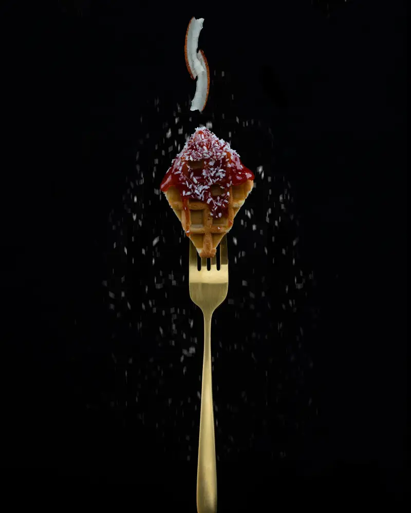
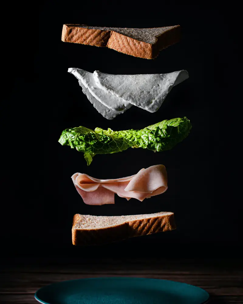
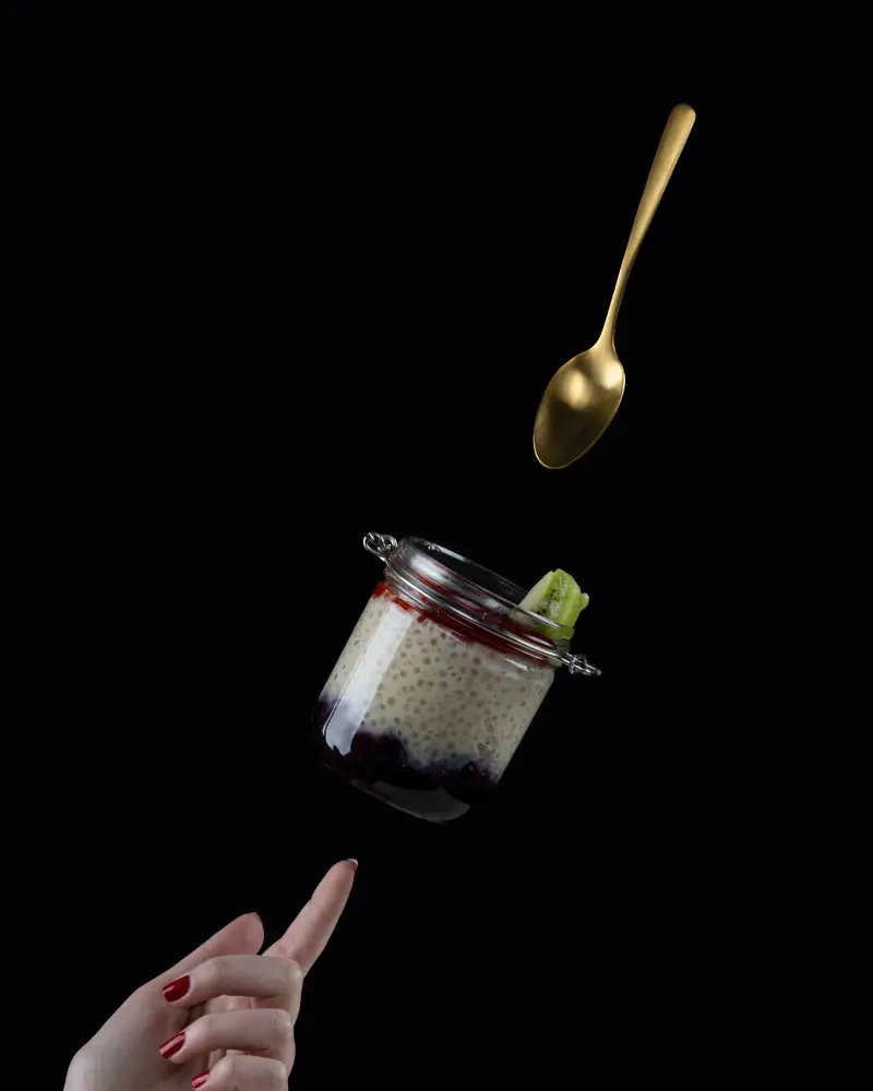
Thinking of making a bold statement with your blog posts? Dive into this stunning layout that boasts a modern, minimalist design. Featuring three symmetrical columns that showcase striking food images against an eye-catching dark backdrop, this setup not only grabs attention but also highlights high-impact visuals while keeping distractions to a minimum.
Detailed analysis of image design
Layout analysis
- Overall structure: Enjoy a beautifully organized three-column layout, arranged side by side for maximum visual engagement.
- Arrangement: Each column consists of three distinct rows, maintaining uniform height to create a sense of balance and visual weight.
- Unusual layout choices: The symmetrical column arrangement pairs elegantly with unique, asymmetrical images to deliver a dynamic visual experience.
Element and feature description
- Visible elements:
- Headers: The eye-catching header “Our news” sits prominently above the columns, immediately setting the topic for viewers.
- Text blocks: Minimal text means stunning imagery is the star, ensuring readers focus on what’s important.
- Images: Each column displays a striking vertical food-related image, enhancing the layout’s appeal.
- Interactive elements: Simplicity reigns with visual richness over interactivity.
- Typography: Bold, clear sans-serif font for headers ensures readability and modernity.
- Graphical elements: Sleek design skips additional icons or graphics, emphasizing imagery and headers.
- Image characteristics:
- Borders: Each image is framed with a clean border for clear separation between columns.
- Image orientation: Vertical layout highlights delightful food items.
- Effects: Dark backdrop enhances imagery vibrancy; textures pop without overlays or filters.
Unique design aspects
- Standout design choices: The dark background boosts the food images’ visual appeal, ensuring detail clarity.
- Hover effects/animations: Minimalist approach avoids hover effects, focusing viewer’s experience.
- Responsive design elements: Adaptable columns ensure design looks great on any screen size.
- Accessibility considerations: Dark background and light text contrast promotes readability; assess alternative text for images further.
Overall design style
- Design style: Embodies a modern, minimalist style prioritising visuals over clutter.
- Visual hierarchy: Prominent header seamlessly guides the gaze to captivating images for engaging information flow.
- White space and balance: Ample dark space between elements creates a balanced layout, allowing room to breathe.
Use cases for the blog
Food blog appeal
Enhance your food blog’s appeal by illuminating delicious dishes with vibrant, well-positioned images. This layout’s focus on imagery ensures that your culinary creations take the spotlight, captivating your audience’s taste buds. A dark backdrop elevates visual contrast, making colours and textures pop.
Photography showcase
Photographers can beautifully display their art using the minimalist, image-centric design. The three-column layout provides a clean, organised space to tell visual stories, essential for professionals showcasing portfolios or capturing life’s moments.
Travel blog allure
Whisk your readers away to exotic locales by incorporating stunning travel photos within the design. The eye-catching layout brings destinations to life, promoting wanderlust and a keen interest in your travel anecdotes.
Fashion blog highlight
Highlight the latest trends or unique designer works on your fashion blog. The layout can spotlight high-impact fashion shoots with a dark background enhancing colours and textures, keeping the focus on style.
Home decor inspiration
For blogs focused on interior design, this layout perfectly highlights home decor. Large, vibrant images allow readers to visualise elements like colour palettes, furnishings, and architectural details seamlessly.
Portfolio presentation
Artists and designers can effectively showcase their portfolios using this layout. With emphasis on imagery over text, your creations can truly shine, offering potential clients or employers an unobstructed view of your skills.
Creative writing visualisation
Pair snippets of creative writing with relevant images for an evocative blog presence. This design allows the imagery to set the mood, amplifying the emotional impact of your prose or poetry.
Events and community spaces
Event blogs can use this layout to capture the essence of various gatherings. Striking visuals of previous events draw potential attendees in, while delivering the atmosphere conveyed at your functions.
Educational content
Educators can use vibrant, illustrative images to supplement teaching materials on their blogs. The layout’s emphasis on visuals addresses diverse learning styles by turning abstract ideas into comprehensible concepts.
Health and wellness motivation
Wellness blogs can use bold imagery to inspire readers towards healthy living. Evocative images of health journeys or nutritious meals can deeply engage audiences, encouraging lifestyle transformations.
Ways to use the blog
Optimising blog performance
Ensure efficient performance by regularly maintaining your blog. Consider lightweight plugins and optimising images to keep loading times swift and engaging experiences seamless. Reliable getting started guides can illuminate practical strategies for beginners.
Curating quality content strategies
Drive blog engagement with strategic content plans. Integrate keyword research and trending topics to craft relevant articles tailored to your audience’s interests. Approaches like cost-effective design options can also serve your creative direction.
SEO optimisation strategies
Boost visibility through SEO optimization, refining your posts for higher rankings. Target keywords that resonate with your audience and link to industry-specific resources. Utilize WordPress editorial techniques to polish your impact.
User-friendly blog interfaces
Create seamless interactions with accessible interfaces conducive to engagement. Employ intuitive navigation, responsive layouts, and clear visuals to enhance user satisfaction, emulating features from top AI-powered configurations.
Interactive blog widgets
Augment blog functionality and reader experience with interactive widgets. Features like polls, social media feeds, and comment sections invite engagement, drawing audiences closer to your content and community. Explore versatile website builder options for further enhancement.
Summary
Transform your WordPress website with this modern, minimalist layout of symmetrical columns featuring captivating food images, perfect for highlighting stunning visuals over text. This design is sure to be an impactful media display that keeps your audience engaged on your WordPress site!


