
WordPress themes: Blog Hero Light BHOL-PRO-04
Build WordPress sites with MaxiBlocks. All features free forever. No locked functionality. Optional Cloud Library saves you 10+ hours per project. Start free

Discover your perfect WordPress hero pattern
Transform your WordPress website with a stunning blog layout that captivates your audience! This minimalistic design features a harmonious single-column structure, ensuring a focused reading experience that highlights your content effectively.
Original design features
- Overall structure: The layout is predominantly a single-column design, emphasizing a smooth vertical flow of content for an engaging reading journey.
- Arrangement: It includes one main row with layered elements that showcase the title, author name, and publication date elegantly positioned above a captivating central image.
- Asymmetrical touches: The framing of the image introduces an appealing asymmetry, enhanced by the generous vertical white space that surrounds the core content.
Element and feature highlights
- Visible elements:
- Header: Command attention with the blog title “Maximising Productivity: Top 5 Tools Every Business Should Use,” prominently displayed for immediate impact.
- Text Block: The author’s name (“Name Surname”) and publication date (“12 Dec, 2019”) are tastefully presented just below the header.
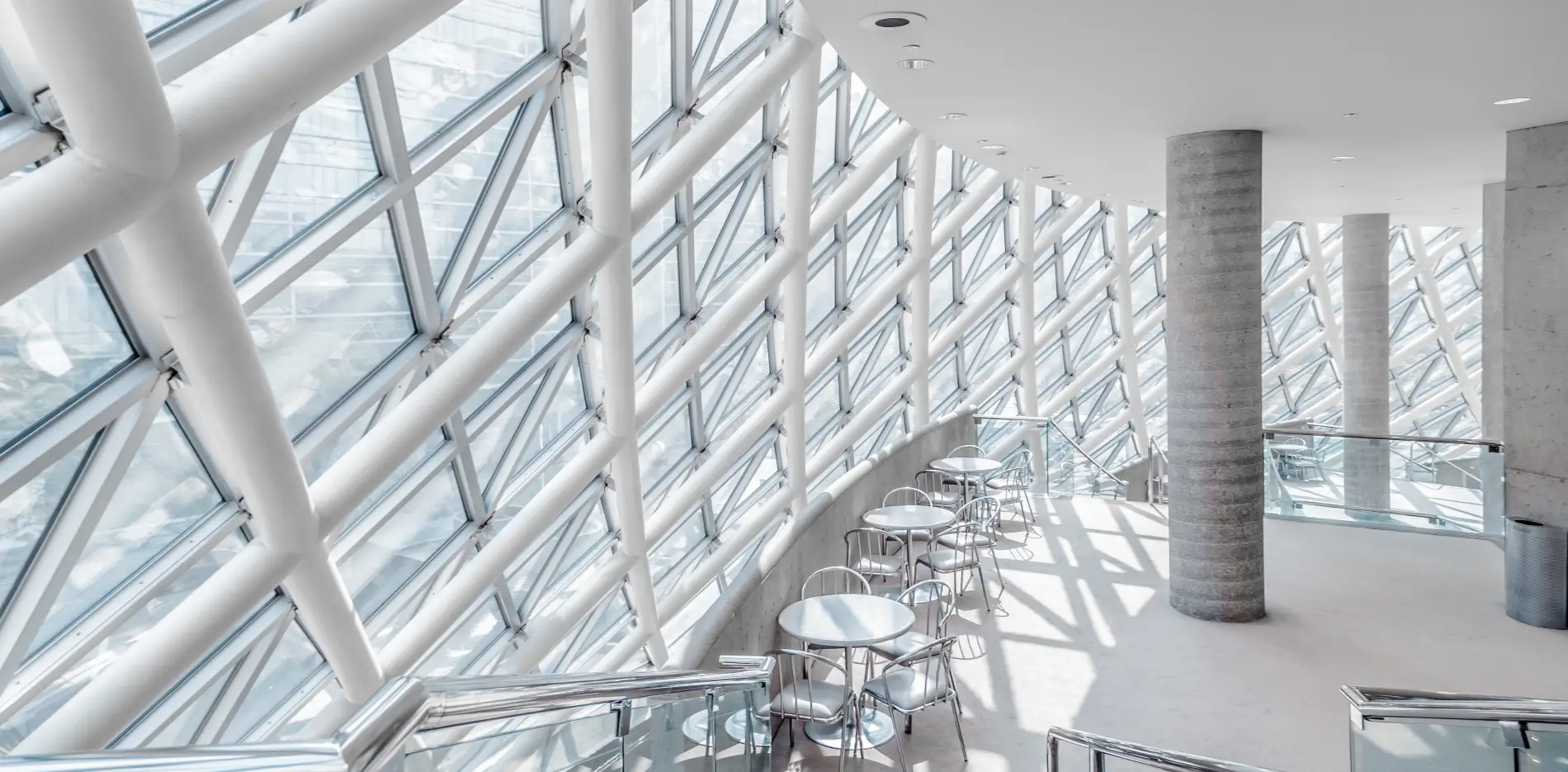
- Image: A large, beautifully placed image with softly rounded corners that draws the reader’s eye.
- Interactive features: While static, the header and text can easily incorporate links for further reading and navigation if utilised as part of a blog.
- Typography: A modern sans-serif font conveys a contemporary aesthetic. Larger, bolder titles stand out, while the author’s name and date are elegantly smaller and lighter.
- Graphical elements: Featuring architectural themes, the image serves as an intriguing focal point, capturing attention from the start.
- Image attributes: The landscape-oriented image, softly bordered and subtly shadowed, enhances depth and visual interest.
Unique design attributes
- Standout choices: The ample white space creates a clean and inviting appearance, guiding focus directly to your content without distraction.
- Responsive layout: The single-column structure is designed to be mobile-friendly, ensuring your content displays beautifully on all devices.
- Accessibility elements: Clear typography and generous spacing enhance readability for a diverse audience.
Overall design style
- Design aesthetic: Embracing a minimalist style, the layout emphasises clarity and simplicity, making it ideal for various topics and themes.
- Visual hierarchy: A bold title commands attention, skilfully guiding the reader’s gaze down to the author name and date.
- Balancing effects: The clever use of white space fosters a sense of calm and organisation, making for a pleasant viewing experience.
Understanding the hero section of a blog
The hero section is the prime real estate of your WordPress website design. It’s the first thing users see when they arrive on your page. Positioned right at the top, its main job is to grab attention and keep the visitor intrigued. This section usually includes an eye-catching image or graphic, complemented by a headline that succinctly conveys what the blog is about. Sometimes you’ll also find a short summary or a call to action, inviting readers to explore further. Creating an effective hero section involves thoughtful WordPress site design choices that balance attention-grabbing visuals with clear, compelling text.
What is a blog hero image?
A blog hero image is typically a large and visually striking image that forms the centerpiece of your blog’s hero section. Its key role is to magnetically draw the reader’s eyes, delivering an immediate visual impression that encapsulates the theme or topic of the post. When selecting a hero image, ensure it aligns cohesively with your post’s content and maintains high resolution for both aesthetic appeal and professional quality. The WordPress icon library can be a fantastic resource for this, offering countless options to add visual intrigue to your piece.
How to design the hero section?
Designing the hero section involves a delicate mix of visual and textual elements. Start with identifying a bold, high-quality visual that resonates with your content’s mood and purpose. Pair this with a succinct, powerful headline and supporting text that clarifies your message swiftly-without overshadowing the visual element. Engage users with a clear call to action, guiding them to their next step, whether that’s reading more, subscribing, or engaging with your brand. Balancing these components creates a hero section that’s both appealing and effective in engaging visitors.
What is a hero website design?
Hero website design centers around the main entrance area of a webpage-the hero section. This methodology focuses on crafting an impactful first impression with a full-width, prominently visible section, featuring engaging visuals and compelling texts. The goal is to influence the viewer from the get-go, driving them to delve deeper into the content or convert through a specific action. Hero designs often leverage modern aesthetic choices, such as clean photography, paired with a direct call to action. Considerations around typography, relevant icons from the WordPress icon library, and bold colour schemes are key.
What is the difference between a landing page and a hero page?
While both landing pages and hero pages aim to command attention, their purposes diverge. A landing page is designed with conversion at its core-structured to elicit a specific user response like signing up or purchasing. It emphasizes strategic content organisation and focused CTAs. A hero page, on the other hand, serves as the enticing gateway to your broader website or blog, offering a bold visual introduction without necessarily requiring immediate user action. It’s more about sparking interest and showcasing the website’s style rather than closing a deal on the spot.
How big should a hero image be?
The size of a hero image can significantly impact user engagement. Typically, a hero image should be at least 1200 to 2000 pixels wide, maintaining a balance between high resolution and fast loading times. It’s crucial for this image to be responsive, adapting seamlessly to different screen sizes from desktop to mobile devices. The orientation of the image, preferably landscape, should be considered to fit well within the WordPress template. Choose your hero image dimensions thoughtfully to ensure they retain quality while delivering the desired aesthetic across all devices.
What makes a good hero image?
Crafting a compelling hero image involves several critical elements. First, alignment with your brand’s visual identity and the page’s content theme is vital. The image should evoke the desired emotional response and spark curiosity. High quality and resolution ensure it looks crisp on all devices. Simplicity is key-cluttered images can distract rather than captivate. Lastly, consider the placement of supporting text; ensure it’s easy to read against the background while enhancing the image rather than clashing with it. This synergy is essential for a visually cohesive WordPress web design.
What is the hero image layout?
The hero image layout is essentially the design blueprint that dictates how the image is placed within your WordPress site design. Usually, it’s positioned right at the top of the page, spanning full-width or fitting the entire screen on load, to exhibit its visual impact. This approach not only offers a grand entrance to your content but also sets a visual tone that befits your entire website. The layout might also attach minimal yet engaging text elements and a call to action to drive further engagement.
How to create a full-page hero image?
Creating a full-page hero image is about ensuring your initial visual content seizes the viewer’s complete attention. Start with selecting an image that embodies your brand essence and has a high resolution. Use responsive design practices; adjust CSS to span the image across any screen dimension fully. Overlay simple, powerful call to action buttons and succinct, inviting text. Employ thoughtful colour contrasts and typography to keep the focus clear without overshadowing the image itself-striking a balance between visual allure and message clarity.
10 elements to use in your WordPress hero pattern
Linking content and aesthetics through optimal WordPress design features can elevate a hero pattern significantly. Here are ten elements to enhance user engagement:
- High-Quality Images: Use crisp, compelling visuals that resonate with your blog’s subject. Opt for landscapes to better fit header areas.
- Contrast Typography: Select font styles and sizes that stand out against the hero image, ensuring readability.
- Strategic Call to Action: Integrate a clear call to action to guide visitor interaction, like “Learn More” or “Get Started.”
- Mobile Responsiveness: Ensure all design elements, including images and text, fluidly adapt to different screen sizes.
- Simplistic Icons: Use the WordPress icon library to subtly enhance communication and aesthetics without overshadowing the main message.
- Navigation Menus: Position a clear, intuitive menu near the hero section for seamless access to the rest of the site.
- Descriptive Headline: Create engaging, informative headlines that immediately outline the content’s value.
- Subtle Animation: Engage visitors with minimal animations, like gentle floating effects, to add dynamism without overwhelming.
- Social Proof: Incorporate testimonials or client logos as overlays to build trust instantly with new users.
- Color Palettes: Use cohesive colour schemes that align with your brand and highlight the hero image’s key features.
How to write catchy blog titles: 12 tips and examples
A riveting blog title can significantly boost your content’s visibility and reader engagement. Here are twelve tips to sharpen your headline-writing skills:
- Use Numbers: “10 Ways to Save Money” grabs attention quickly through a definitive offer of value.
- Ask Intriguing Questions: Spark curiosity with questions like “Have You Tried the Latest Fashion Trend Yet?”
- Empathize with Problems: Appeal directly to the reader’s pain point-“Struggling to Get Results? Here’s How…”
- Infuse Power Words: “Amazing New Techniques to Transform Your Day” carries persuasive punch.
- Promise Solutions: Offer solutions upfront, like “How to Easily Improve Your Public Speaking Skills.”
- Create Urgency: Imply immediate action with titles like “Last Chance to Grab These Deals!”
- Be Direct: Clear messages like “DIY Home Renovations: What You Need to Know” work best.
- Use Hyphenated Titles: Pair related concepts, such as “SEO for Beginners – Simple Tips to Get Started.”
- Incorporate Testimonials: “Experts Agree: This Product is a Game-Changer…” lends authority and credibility.
- Utilize Lists: Appeal with structured, digestible content such as “5 Ingredients of a Perfect Smoothie.”
- Reflect Popular Culture: Use relatable references to resonate-“Hustle Like Beyoncé: Work Smarter, Not Harder.”
- Include Keywords: Improve searchability with relevant phrases, such as “[Keyword] Tips That Actually Work.”
Conclusion
Your journey towards crafting the perfect WordPress website design is enriched by understanding the effective utilisation of hero patterns. From selecting vibrant graphics and vital text placement to incorporating strategic call to actions, each design choice can enhance the user experience. By employing the suggestions and insights we’ve explored, you can captivate your readers and elevate your site’s aesthetic and functional allure. Let this detailed framework serve as your blueprint in transforming your blog’s visibility and engagement across all devices.


