Try MaxiBlocks for free with 500+ library assets including basic templates. No account required. Free WordPress page builder, theme and updates included.

Updated 6 April 2025
Why vertical navigation makes a difference
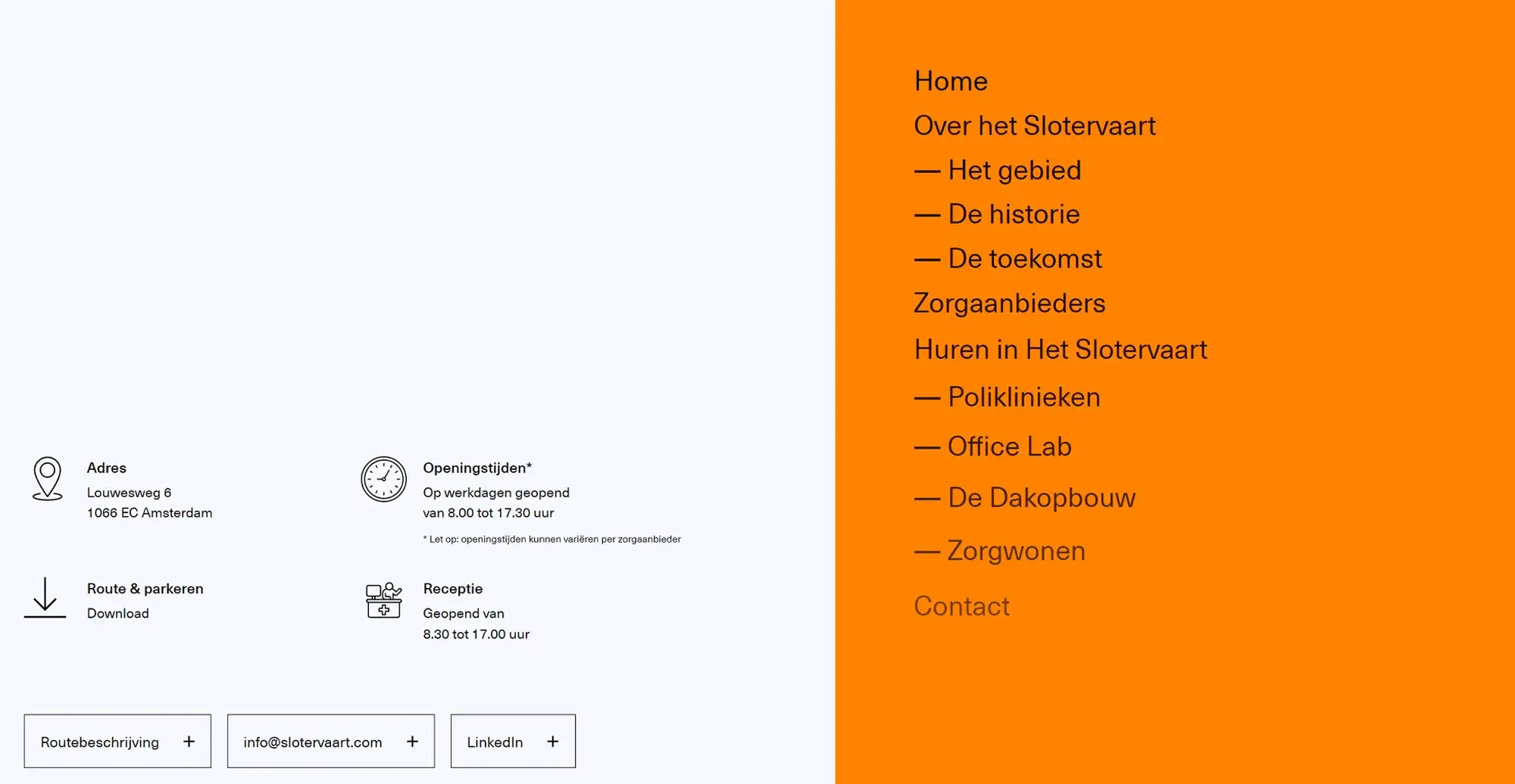
The structure of your website’s navigation has a direct effect on how users interact with your content. Vertical menus, placed along the left or right side of the screen, offer a clear alternative to standard horizontal bars and bring specific usability benefits.
They are especially suited to websites with deep content hierarchies, allowing users to browse multiple sections without the need for bulky dropdowns. Vertical menus also align well with how users naturally scroll through pages, supporting a smoother, more intuitive experience. This format works particularly well for storytelling websites, educational resources, and sites that rely on progressive navigation.
Additionally, vertical menus are a natural fit for sidebar integration, where you can include widgets, search bars, or recent posts. By supporting both structure and interaction, vertical navigation becomes a powerful design feature that helps guide users more effectively through your site.
Why vertical menus offer real user experience value
Vertical navigation menus are more than a design choice, they provide tangible benefits for user interaction and content accessibility. By shifting the navigation to the side, they open up new layout possibilities that enhance usability and site structure.
Vertical menus make efficient use of screen space, especially on wider displays. This frees up the top of the page for branding elements, featured content, or call-to-action buttons. Because they extend vertically, these menus support a larger number of links, making them ideal for content-rich websites.
Another benefit is their consistency. When used with sticky positioning, vertical menus remain accessible throughout the user’s scroll, which is helpful for long-form content or multi-section layouts. Designers also gain more flexibility. There’s room to use larger fonts, add icons, or include banners without overwhelming the interface.
This type of navigation fits especially well on e-commerce sites that require category and filter links, portfolio websites with multiple case studies, and content-heavy blogs or news platforms that need to highlight tags, authors, or archives.
Subscribe to our newsletter
How to make vertical navigation clear and user-friendly
Designing an effective vertical navigation menu is about balancing form and function. It should look polished, but more importantly, it needs to guide users through your site smoothly and intuitively.
Focus on clarity when choosing link labels. Use familiar terms that match user expectations, and keep them short to avoid visual clutter. Break long menus into sections using spacing, icons, or dividers to improve readability. A clear hierarchy using font size or indentation and helps users understand how different items relate to one another.
The menu’s position also matters. Placing it on the left feels natural and familiar, especially for Western audiences who read left to right. A right-side menu can work well for modern or creative layouts, drawing attention without being disruptive.
Accessibility should never be an afterthought. Use semantic HTML, including proper <nav> elements and aria labels to help screen readers. Make sure users can navigate with a keyboard and that all menu states hovered, focused, and active are clearly visible with strong contrast and outline styling.
Thoughtful interaction cues like smooth transitions or subtle animations also enhance usability, helping users orient themselves as they browse through your site.
Tools and options for creating vertical menus
WordPress offers multiple ways to create vertical navigation menus, whether you’re using built-in features or extending functionality with plugins. Begin by navigating to Appearance and selecting Menus in the dashboard. From there, you can structure your links by adding pages, custom URLs, or post categories and arranging them into a clear order.
To display your vertical menu, you can add it to the sidebar using a navigation block in the block editor or by placing it inside a widget area. These areas are ideal for vertical layouts and offer a convenient space for navigation without interfering with your main content.
Customising the look and feel of your menu is straightforward. Most themes provide design settings where you can adjust typography, spacing, colour schemes, and hover styles to align with your brand. For more flexibility, page builder tools like MaxiBlocks and Elementor offer drag-and-drop functionality that simplifies design without needing to write code.
If you’re working with a large content structure, WP Mega Menu is useful for showcasing categories and submenus clearly. To improve usability, Sticky Menu on Scroll helps keep your vertical menu fixed to the side of the screen while users scroll.
For mobile responsiveness, make sure your menu adapts well to smaller screens. Many themes support responsive design out of the box, or you can use plugins and CSS media queries to convert your vertical menu into a collapsible or hamburger-style navigation panel. This ensures your menu remains accessible and user-friendly across all devices.
Build like a pro
Why vertical menus are worth considering
Vertical navigation menus are more than just a stylistic choice they are a practical solution for websites that need clear structure and strong user guidance. They are particularly effective when your site contains multiple layers of content, or when you’re aiming to create a distinctive user experience.
By making better use of vertical screen space, these menus help declutter top navigation areas and offer visitors a consistent way to explore your content. With support for modern design elements like icons, animations, and sticky placement, vertical menus also allow for a highly engaging and accessible layout.
When vertical navigation works best
You might consider vertical navigation if your website includes deep content hierarchies or category-rich structures. This applies especially to creative portfolios, agency sites, documentation hubs, and large e-commerce platforms. The ability to add collapsible or responsive menu styles also makes vertical navigation a good fit for mobile-first designs.
Regardless of where and how you use them, the key is always usability. When implemented thoughtfully, vertical menus contribute to a smooth, focused browsing experience that makes your website feel more organised and user-friendly.
Want to go further?
Enhance your navigation with advanced techniques
Once your vertical menu is in place, you can take it even further by refining its functionality and enhancing the user experience. Start by exploring best practices in menu design, such as maintaining clear labels, grouping items logically, and ensuring visual consistency throughout.
Sticky navigation is another powerful strategy. Keeping your menu visible as users scroll can improve usability on content-heavy pages. This is especially effective when combined with collapsible sections or simplified submenus.
You can also integrate additional features directly into the menu itself. Adding a search bar allows users to find content quickly without leaving the menu. Contact buttons and social media icons offer quick access to key actions and external platforms, helping boost interaction and reach.
Experiment with different layouts and placements using your theme’s controls or plugins. The more your menu reflects your site’s goals and user needs, the more effective it will be in guiding visitors.If you’re looking to take your website’s design further, consider using themes and tools like MaxiBlocks, which provide flexible customisation options and advanced design controls. Experiment with different layouts and placements to find the perfect menu setup for your site’s unique needs, ensuring visitors can navigate with ease and enjoy a seamless browsing experience. Start building and refining your site today with MaxiBlocks for better functionality and a polished, user-friendly design.
Discover how to create clear, responsive, and stylish WordPress menus with expert tips and resources.
What is vertical navigation in WordPress?
Vertical navigation in WordPress refers to a menu layout where navigation links are displayed in a vertical column, typically along the left or right side of the screen. It is an alternative to traditional horizontal menus found in headers.
Why use vertical navigation on a WordPress site?
Vertical navigation is useful for websites with a large number of pages, detailed categories, or structured content. It improves usability by giving visitors a clear view of all options without crowding the top of the page.
How can I add vertical navigation to a WordPress site?
You can create vertical navigation using block themes, page builders like Elementor or custom CSS. Many themes and plugins also support sidebar menus that act as vertical navigation.
Is vertical navigation supported in Full Site Editing?
Yes, Full Site Editing allows you to place navigation blocks anywhere in your layout, including sidebars or columns. You can use the navigation block and adjust its orientation to vertical.
Can I make a sticky vertical navigation menu?
Yes, you can create a sticky vertical menu using CSS or plugins. This keeps the navigation menu visible as the user scrolls, improving access to key links.
Are there themes that support vertical navigation by default?
Some themes are designed with vertical navigation in mind, especially those meant for portfolios, documentation, or business dashboards. Look for themes that offer sidebar menu options.
Does vertical navigation work on mobile?
Yes, but it may collapse into a toggle or hamburger menu for smaller screens. Responsive design ensures the vertical navigation adjusts based on device size and orientation.
What’s the difference between vertical and horizontal navigation?
Vertical navigation is aligned down the side of the page, while horizontal navigation is displayed across the top. Vertical menus are better for long lists or detailed navigation, while horizontal menus suit simpler site structures.
Can I customise the design of vertical navigation?
Yes, vertical menus can be styled with CSS or through your theme settings. You can adjust colours, spacing, hover effects, icons, and layout to match your branding.
Are plugins available for vertical navigation?
Yes, there are plugins that help you build vertical navigation menus, offering features like accordion behaviour, icons, mega menus, and responsive design. These can be helpful if your theme lacks built-in support.
WordPress itself
Official Website
wordpress.org – This is the official website for WordPress, where you can download the software, find documentation, and learn more about using it.
WordPress Codex
codex.wordpress.org/Main_Page – This is a comprehensive documentation resource for WordPress, covering everything from installation and configuration to specific functionality and troubleshooting.
WordPress Theme Directory
wordpress.org/themes – The official WordPress theme directory is a great place to find free and premium WordPress themes. You can browse themes by category, feature, and popularity.
maxiblocks.com/go/help-desk
maxiblocks.com/pro-library
www.youtube.com/@maxiblocks
twitter.com/maxiblocks
linkedin.com/company/maxi-blocks
github.com/orgs/maxi-blocks
wordpress.org/plugins/maxi-blocks

Kyra Pieterse
Author
Kyra is the co-founder and creative lead of MaxiBlocks, an open-source page builder for WordPress Gutenberg.
You may also like
