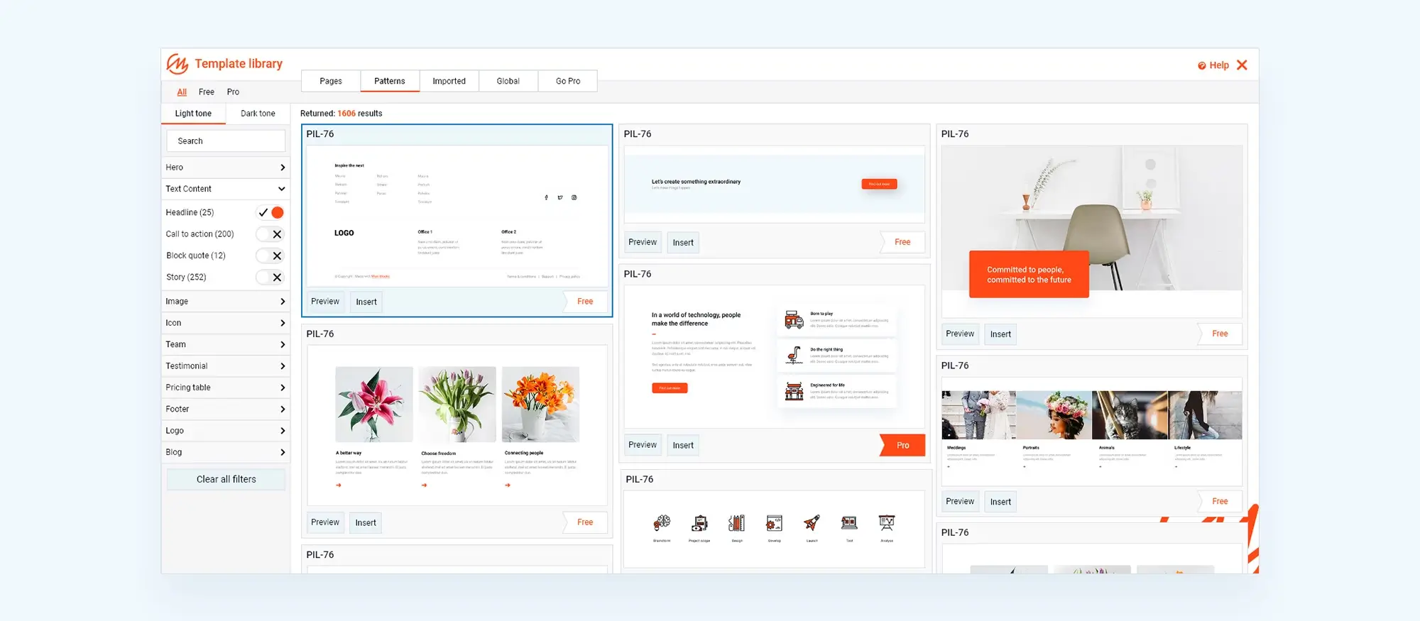
Try MaxiBlocks for free with 500+ library assets including basic templates. No account required. Free WordPress page builder, theme and updates included.

Mega menus extend from a site’s navigation bar to show several levels of content at once. They’re especially popular on e-commerce sites with many products or categories, offering a cleaner, more visual way to browse compared to standard dropdown menus.
Updated 21 May 2025
What defines a mega menu
A mega menu is a large, multi-column dropdown panel that typically spans at least 600 pixels in width. Unlike traditional dropdowns that show a single vertical list, mega menus organise content into sections sometimes with icons, images, or promotional content offering a full view of category hierarchies at a glance.
Where they came from and how they’ve changed
Mega menus gained traction in the late 2000s as e-commerce platforms scaled up. Amazon led the way around 2007, followed by Walmart in 2009 and fashion sites like ASOS by 2012. Their goal was simple: make it easier for users to explore growing product catalogues without deep, tedious click paths.
As product lines expanded Zalando, for instance, now lists more than 700 brands showing the full structure in one screen became crucial. A well-designed mega menu turns overwhelming options into an orderly, visual map.
From desktop roots to mobile reimagination
Mega menus started on desktop, where wide screens supported full-width panels. On mobile, their layout evolved into full-screen overlays or tiered accordion menus. The information architecture stays the same the difference is in how it adapts to smaller screens and touch interaction.
Why they work
Psychologically, mega menus reduce cognitive strain by showing users all major options at once. Seeing the entire structure removes the guesswork of digging through one submenu at a time. It’s the overview effect in action less anxiety, more control.
Takeaway
From simplifying catalogue browsing to supporting product discovery, mega menus have become the go-to for large, complex websites. They’re not just a UI trend they’re a user-first response to scale, clarity, and choice.
UX advantages for product-rich stores
Why mega menus work so well for large inventories
For websites with extensive product ranges, mega menus offer more than aesthetics as they directly improve the shopping experience. Their layout supports fast scanning, deeper category visibility, and cross-sell potential in a single hover or tap.
Speed and clarity
Eye-tracking studies show that users process mega menu layouts using an F-pattern, letting them locate sub-categories up to 30 percent faster than standard dropdowns. By flattening click depth, from four or five taps down to just two shoppers, spend less time navigating and more time browsing.
Context-rich discovery
These menus serve as visual maps. Columns can include icons, mini banners, or brand logos that spark impulse exploration. Including seasonal categories like “Holiday Gifts” or “New In” adds a layer of relevance that boosts engagement. Shoppers can spot what’s trending or on sale at a glance.
Supporting decisions and conversions
Grouping products by shopper mindset such as by gender, use case, or collection reduces cognitive load and guides faster decision-making. Mega menus also become ideal places to highlight trust-building tags like “Vegan,” “Eco,” or “Made in the UK,” which reinforce values and brand promise.
Increased average order value
Mega menus are powerful cross-selling engines. Adding columns for gift cards, clearance items, or current best-sellers draws attention to high-converting links. Many brands report uplifts in both click-through rates and average order value after making these updates.
A quick takeaway
Even smaller brands with a handful of categories can benefit. If your users browse more than six top-level options, a mega menu might not just improve navigation it could directly impact sales.
Subscribe to our newsletter
Structuring mega menus for clarity and conversion
An effective mega menu is more than just a wide dropdown it’s a carefully structured information system. Its success depends on applying core design principles that prioritise readability, hierarchy, and user intent.
Start with information architecture
Keep the layout within four to six columns to prevent overload. Organise links based on how users think not how your internal teams are structured. For example, group by buying intent (“Shop by Category,” “Shop by Occasion”) rather than by internal departments.
Maintain a consistent vertical rhythm of 8–10 pixels between items. This subtle spacing keeps the content organised and easy to scan, especially when users are navigating quickly.
Typography and labelling
Use sentence case for column headers, ideally set in bold and sized between 14 and 16 pixels. Sub-links should be slightly smaller 12 to 14 pixels in regular weight. Clear labelling reduces guesswork and improves scannability.
Visual hierarchy and spacing
Avoid using hard dividers between columns. Instead, rely on generous gutters ideally twice the space between list items to visually separate content. This approach is not only cleaner but proven to increase comprehension.
Imagery and interaction timing
Use imagery with care. One banner or up to four small thumbnails is often enough. Overloading menus with visuals can slow down scanning and confuse navigation. Animations should be subtle a fade-in of 150 to 200 milliseconds feels responsive without overwhelming. Introduce a small delay (about 100 milliseconds) before closing the menu to reduce flicker when users accidentally move their cursor away.
Responsive design considerations
On mobile, mega menus shift to slide-in drawers with expandable accordions. Consider adding a sticky chip labelled “Shop” at the top or using a bottom sheet navigation pattern. These mobile-first options make large menus accessible without crowding the screen.
Final check
To evaluate your current mega menu, audit it against these six principles: clear groupings, consistent spacing, balanced typography, restrained imagery, smart interaction timing, and responsive adaptability. A well-structured menu not only improves UX it supports better engagement and higher conversion rates.
Optimising speed and usability without sacrificing discoverability
Mega menus can be powerful for user experience, but they must be built with care to avoid harming site performance, accessibility, and SEO. Here’s how to optimise all three without compromise.
Keep performance top of mind
Deliver critical CSS first and lazy-load non-essential elements like images or icons that sit below the initial viewport. This ensures that your interaction-to-next-paint (INP) metric stays under the 200 millisecond threshold an increasingly important Core Web Vital.
Use code-splitting and hydration techniques to delay heavy JavaScript until needed. One effective method is to serve a minimal HTML structure and hydrate the JavaScript only when the user hovers over or clicks to open the mega panel. This keeps the main thread free for key interactions.
Be aware of layout shifts caused by opening mega menus. If panels push page content down, they can trigger cumulative layout shift (CLS) penalties. To prevent this, use transform overlays instead of position: relative or height changes that cause reflows.
Accessibility essentials
Mega menus must be fully navigable by keyboard and readable by screen readers. Use semantic roles such as role="menubar" and mark submenu toggles with aria-haspopup="true" and aria-expanded, updating the value dynamically when the menu opens or closes.
Keyboard interaction should follow best practice: use Tab to enter the menu, arrow keys to move between links, and Esc to close the menu. Make sure headings are announced to screen readers to help users understand menu structure.
SEO impact and link strategy
Because mega menus can expose hundreds of internal links, they influence how search engines crawl and prioritise your site. Overloading panels with unnecessary links can dilute link equity and impact crawl efficiency. Focus on linking only the most valuable and relevant pages.
Properly structured mega menus can unlock enhanced visibility in search results. Using meaningful anchor text, structured lists, and semantic tags increases the chance of rich sitelinks appearing in search snippets.
Final notes
To ensure your mega menu is delivering value, run regular audits using tools like Lighthouse, axe-core, and PageSpeed Insights. Pay close attention to interaction delays, visual stability, and ARIA compliance. When implemented correctly, mega menus boost usability, accessibility, and search visibility turning a complex layout into a seamless, high-performance user experience.
Build like a pro
Choosing the right path for your platform, team and timeline
Implementing a mega menu can range from drag-and-drop simplicity to enterprise-level complexity. The right approach depends on your platform, team capabilities, and performance goals. Whether you’re running a Shopify store or a headless React app, there are clear strategies and tools to make mega menus scalable and user-friendly.
Platform-specific options
If you’re using Shopify, the Online Store 2.0 architecture supports nested menu structures natively, and apps like Navigation Mega can extend functionality without needing custom code. WooCommerce users can use the Navigation Block or third-party plugins to enable flexible layouts.
For WordPress users, MaxiBlocks offers a no-code solution with drag-and-drop navigation blocks, responsive behavior, and built-in animation settings. Tools like Shogun and Elementor Pro also support rich navigation design, with options like MotionFX for subtle microinteractions.
Advanced, headless implementations
For headless setups, use a combination like React + GraphQL to dynamically fetch product categories and structure your navigation tree. With Next.js, structure your layout using app/layout.tsx to render the menu across routes. This gives complete control over rendering performance, personalization, and code-splitting for critical paths.
Pairing these stacks with CMSs like Sanity, Storyblok, or Contentful enables non-developers to manage categories and promotions. Alternatively, merchandisers can update menus using structured data in YAML or CSV feeds ideal for teams that want quick control without touching code.
Tracking and testing
To improve UX and conversion rates, hook into key analytics events: monitor hover_dwell, link_click, and abandon_exit actions. These events offer insight into what users see, what they skip, and where they disengage.
Platforms like Optimizely or Google Optimize let you run A/B or multivariate tests on navigation layout such as comparing text-only vs. image-supported menus or different ordering schemes (alphabetical vs. personalized).
Cost vs. ROI
While custom headless builds can require more upfront development time, they pay off in performance, flexibility, and conversion gains. For smaller teams, no-code tools provide fast deployment with lower maintenance. Use a simple matrix to weigh:
- Budget: Can you invest in dev time or prefer subscription-based tools?
- Flexibility: Do you need custom logic or mostly static links?
- Time to market: Is speed more important than granular control?
When done right, a well-structured mega menu not only streamlines navigation it elevates UX, improves SEO, and can increase add-to-cart rates. The investment is often justified by stronger engagement and higher revenue.
Mega menus are power tools that, when executed well, can significantly enhance your website’s navigation and user experience. They aren’t just a design choice; they’re strategic assets that improve product discovery and support faster, more confident decisions from your visitors. By flattening complex category structures and ensuring clarity, mega menus can streamline user journeys and provide easier access to essential content.
Continuous improvement is key
Effective navigation should never be static. As your site evolves with seasonal campaigns, new products, and promotions, your mega menu should evolve with it. Treat navigation as a dynamic, living product constantly monitored, tested, and optimised. Looking ahead, mega menus will likely incorporate AI-powered navigation to dynamically adjust content based on user behaviour, location, device, or even time of day. This context-driven approach will make mega menus even smarter, boosting engagement and driving better user interactions.
Three guiding principles
- Clarity: Group and label links intuitively, making it easy for users to find what they need.
- Conversion: Highlight key links, promotions, and high-intent pathways to drive actions.
- Continuous improvement: Leverage heatmaps and analytics to identify friction points and iterate with new solutions.
Action plan
- Audit your current navigation structure: Identify key categories and cross-sell opportunities for a streamlined layout.
- Map content into a mega layout: Organise your links based on user logic rather than internal team structure, making the navigation experience more intuitive.
- Prototype with low-code tools: Use platforms like MaxiBlocks or Elementor to quickly visualise and build your mega menu layout.
- Run performance and accessibility tests: Optimise for lazy loading, ARIA roles, and interactivity to ensure your mega menu is fast and accessible to all users.
- Launch A/B tests and iterate: Experiment with different layouts and measure their impact on click-through rates (CTR) and task completion.
Try this next
Run a heatmap analysis of your existing menu to see where users are clicking, pausing, or abandoning. This data can inform your redesign priorities, ensuring you address the most critical pain points first.
For additional support, you can download a Figma mega-menu template to help visualise your layout or check out a WCAG quick-reference sheet to ensure accessibility compliance as you scale.
Your website’s navigation is your storefront it needs to welcome, guide, and convert. With the right tools, like MaxiBlocks, you can enhance your menu and create a user-friendly, engaging experience that drives better results. Start building a more effective navigation system with MaxiBlocks today.
Discover how to create clear, responsive, and stylish WordPress menus with expert tips and resources.
What are mega menus in e-commerce?
Mega menus in e-commerce are large, expandable navigation panels that display multiple levels of product categories and subcategories in a structured, visually rich format. Unlike traditional dropdowns, mega menus can show dozens of links, images and promotions in one comprehensive view.
Why are mega menus important for online stores?
Mega menus help online stores manage and present a large product catalogue without overwhelming users. They allow shoppers to quickly understand the store’s structure, find relevant categories and discover new items, improving navigation and boosting conversions.
How do mega menus enhance user experience?
By organising links into clear sections with headings, icons or images, mega menus reduce the time users spend searching for products. They provide an at-a-glance overview of the store and make it easier to explore different departments or collections.
What content is typically included in an e-commerce mega menu?
Mega menus often feature product categories, subcategories, featured products, images, promotional banners, and occasionally brand or collection highlights. They may also include search bars, account links or customer service shortcuts for added convenience.
Are mega menus good for mobile devices?
Mega menus are more challenging on mobile due to limited screen space. Many e-commerce sites adapt them into collapsible panels, tabs or accordion-style menus that offer similar organisation in a more mobile-friendly format.
Can mega menus improve SEO?
Mega menus can help with internal linking and crawlability when implemented with clean code. By linking to a wide range of pages from the homepage, they improve site structure and help search engines index more content.
How do you design an effective mega menu?
An effective mega menu uses a clear layout with logical groupings, simple labels and visual hierarchy. It avoids clutter by focusing on the most important categories and makes use of whitespace, icons or images to guide users visually.
What are common mistakes with mega menus?
Overloading the menu with too many options, using inconsistent labels, or poor mobile implementation can confuse users and reduce usability. Failing to test with real users can also lead to missed opportunities for improving navigation.
Do mega menus slow down websites?
If not optimised, mega menus with lots of images or scripts can affect loading times. Using lazy loading, lightweight code and optimised assets helps keep the menu fast and responsive.
How can mega menus influence purchasing decisions?
By surfacing more product options and promotional content, mega menus increase exposure to items users might not have considered. This encourages browsing, cross-selling and can lead to higher average order values.
WordPress itself
Official Website
wordpress.org – This is the official website for WordPress, where you can download the software, find documentation, and learn more about using it.
WordPress Codex
codex.wordpress.org/Main_Page – This is a comprehensive documentation resource for WordPress, covering everything from installation and configuration to specific functionality and troubleshooting.
WordPress Theme Directory
wordpress.org/themes – The official WordPress theme directory is a great place to find free and premium WordPress themes. You can browse themes by category, feature, and popularity.
maxiblocks.com/go/help-desk
maxiblocks.com/pro-library
www.youtube.com/@maxiblocks
twitter.com/maxiblocks
linkedin.com/company/maxi-blocks
github.com/orgs/maxi-blocks
wordpress.org/plugins/maxi-blocks

Kyra Pieterse
Author
Kyra is the co-founder and creative lead of MaxiBlocks, an open-source page builder for WordPress Gutenberg.
You may also like

