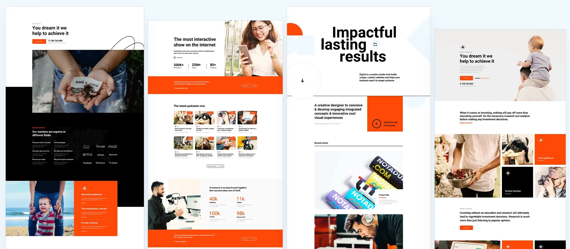
10 Key elements of effective website designs
Try MaxiBlocks for free with 500+ library assets including basic templates. No account required. Free WordPress page builder, theme and updates included.
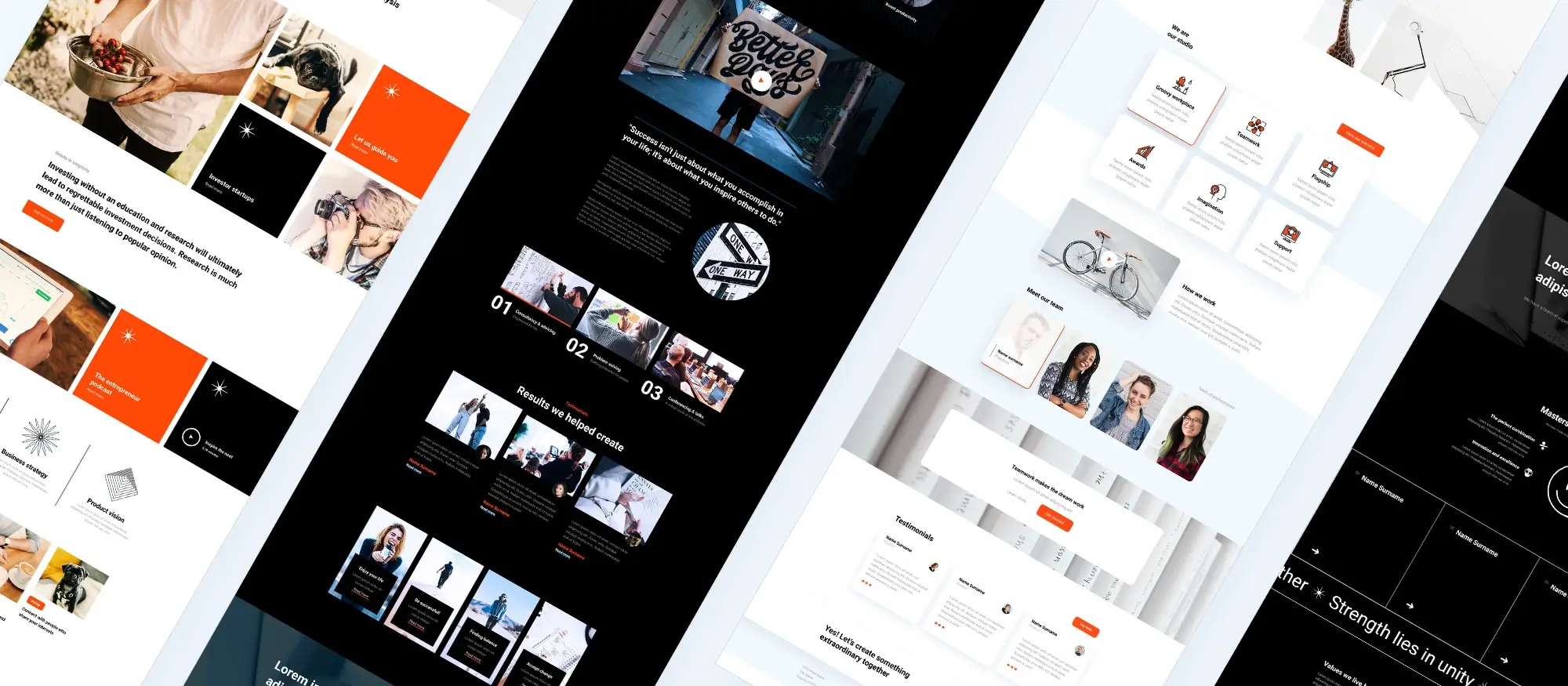
Updated 15th May 2025
An introduction to website design and its evolution
A young industry with deep roots
Website design as an industry is still relatively young. The very first website was launched in 1991 by Tim Berners-Lee at CERN, the European Organisation for Nuclear Research. This site explained how to use the World Wide Web, teaching people about creating web pages and introducing hypertext, now better known as HTML (hypertext markup language). Since then, both technology and design practices have changed dramatically.
How website design is growing as a creative field
Website design today is developing into its own creative discipline, much like print design evolved in the past. In the early days of print, the look and feel of printed materials were dictated by typesetters who controlled the technology. Only later, with the arrival of desktop publishing software, did graphic designers bring more creativity to the field.
A similar shift is happening in website design. Originally, developers controlled the creation of websites, focusing mainly on functionality. Now, with the rise of CMS platforms, page builders and design themes, more designers are entering the world of web creation. The technology is becoming easier to use, allowing creativity to play a bigger role in shaping how websites look and function.
The balance between form and function
Websites are about more than just visual style. Unlike a printed magazine that readers can flip through at their leisure, websites require clear and efficient navigation. Website design needs to create an experience where visitors can find information easily, engage with content and take meaningful actions, whether that is making a purchase, contacting a business or reading a blog.
Good website design balances beauty with usability. It makes a strong first impression, provides a smooth experience across devices and supports the goals of the site owner, whether that is building a brand, growing a business or sharing information.
10 key elements of effective website design
While many factors contribute to a successful website, there are 10 core elements that offer a strong foundation:
- Understanding the purpose: Every design decision should be guided by the main goal of the website, whether it is selling products, sharing ideas or building a community.
- The importance of first impressions: Visitors form an opinion about a site within seconds. A professional, visually pleasing design encourages users to stay and explore further.
- User experience (UX) and navigation: A well-organised, intuitive layout helps users find what they need without frustration.
- Responsive website design: Websites must work properly across all devices, from large monitors to mobile phones, ensuring a consistent and smooth experience.
- Website speed and performance: Fast loading times are crucial. Slow sites drive visitors away, no matter how good the design looks.
- Search engine optimisation (SEO) integration: Good design includes SEO best practices from the start, making it easier for search engines to find and rank the site.
- Accessibility in website design: All users, including those with disabilities, should be able to navigate and interact with the site easily.
- The role of content in website design: Content ties everything together. Clear, engaging writing supports the design and helps visitors understand the site’s message.
- The benefits of using website builders and templates: Tools like CMS platforms and page builders open up web design to a broader group, allowing those without coding skills to create functional, attractive sites.
- Ongoing maintenance and updates: A website is never really finished. Regular updates keep it secure, working properly and relevant to users.
The future of website design
As the web continues to evolve, design will play an even bigger role. The tools are becoming more accessible, allowing creativity to flourish. Websites are no longer just collections of information. They are rich, interactive spaces that need careful planning, smart design and ongoing care to stay effective and engaging.
Understanding these basics will help anyone approaching a website project to focus on what truly matters creating a site that serves its users well and stands the test of time.

Understanding the purpose of website design
Why every website needs a clear purpose
When you are designing a website, the first thing you need to get right is its purpose. A website without a clear goal can easily end up confusing visitors or missing the mark completely. Knowing what you want the site to achieve helps shape every choice you make, from the layout and colour scheme to the features you add and the way you organise the content.
A business website for example is often focused on promoting products or services. It needs to build trust, encourage people to get in touch or make a purchase and show clearly what the company is offering. You might find things like online shops, customer reviews and contact forms built into the design to help with this.
A personal website like a blog or portfolio is different. Here the goal might be to share experiences, showcase creative work or build a personal brand. The design can be a lot more flexible and expressive, with colours, fonts and layouts that reflect the individual’s style and voice.
Then you have informational sites like news pages or education platforms. These are all about delivering information clearly and quickly. The design needs to help people find what they are looking for without getting lost or distracted. A simple layout with clear headings and easy navigation is usually the best way to go.
No matter what type of website you are building, having a clear purpose from the start makes every other part of the design process easier. It gives you a clear direction and helps make sure that the final site meets the needs of the people who will be using it.
How the purpose influences the design choices
The purpose of the site shapes everything about how it looks and works. It affects what colours you choose, how you lay out your pages, what content you include and even the type of images and buttons you use.
For a business site, you will probably want a clean and professional look. The design needs to make it easy for customers to find information, browse products and get in touch. Calls to action like “Buy now” or “Contact us” need to be easy to spot and use. Colours should match the brand and give a feeling of trust and reliability.
A personal blog can be a bit more creative. You might choose brighter colours, playful fonts and layouts that allow for lots of different types of content like videos, photos and long-form posts. The design should feel welcoming and show off the blogger’s personality.
For a site that is mostly about sharing information, like a news page or an educational site, the main goal is to make everything easy to read and navigate. The design should be simple, clear and free from clutter, so visitors can find articles or resources quickly without any fuss.
By always linking the design choices back to the site’s main purpose, you can create a website that looks good, works properly and feels right for its audience. It is about making the site both attractive and practical, helping it do exactly what it was built to do.
Subscribe to our newsletter
The importance of first impressions in website design
How visual appeal shapes user perception
When someone lands on your website for the first time, their first impression is formed within just a few seconds. Often, they make a judgement based purely on how the site looks. A clean and attractive design can make users feel comfortable and encourage them to stay and explore. If your site looks messy, outdated or confusing, visitors might leave straight away, even if your content is good and your services are exactly what they need.
Visual appeal is not just about creating something that looks nice. It is about building trust and showing users that your website is professional and reliable. Colours, fonts, images and the layout all work together to create this first impression. These elements need to match the purpose of your website and support the message you want to send.
For example, a technology company might choose a clean and modern design with calm, neutral colours to create a sense of innovation and trust. A fashion brand might go for something more bold and vibrant to show creativity and style. It is about making design choices that feel right for the business and create a positive experience for the people visiting the site.
When you get the visual appeal right, you make the site more memorable and increase the chance that visitors will come back. It can also make them more willing to trust the information you provide or the products you sell.
How design choices set the tone for the user experience
The way a website looks and feels has a big effect on the kind of experience visitors have. Every choice you make, from the colour scheme to the style of the images and the fonts you use, helps set the mood of your site.
For instance, a financial services website might choose a colour palette of blues and greys to give a sense of security and professionalism. A website aimed at children might use bright colours and fun graphics to create a feeling of excitement and playfulness. These choices help visitors quickly understand what kind of site they are on and whether it matches what they are looking for.
Typography and layout also play a big part. A website with a minimalist design and lots of space around the text might feel calm and elegant, while one with bold fonts and lots of movement might feel energetic and modern.
If the design feels easy and welcoming, visitors are more likely to stay, explore and engage with your content. If it feels confusing or overwhelming, they might leave before they have a chance to find out what you offer.
By making thoughtful design choices that match the purpose of the site and the needs of the audience, you can create a positive first impression and set a tone that keeps visitors coming back.

Why user experience matters
User experience, often called UX, is about how people feel when they visit and interact with a website. It covers everything from how easy it is to move around the site to how quickly they can find the information they need. A website with good UX will feel smooth, easy to use and even enjoyable. Visitors are likely to stay longer, return in the future and recommend the site to others if they have a positive experience. If a website is confusing, slow or frustrating to use, people will leave quickly and are unlikely to come back.
Creating a good user experience is not something that happens by chance. It takes careful thought and planning. Designers have to step into the users’ shoes and think about what they need and how they will interact with the site. This might mean simplifying the layout, making important information easy to spot and making sure the website works well on phones, tablets and computers. A website that delivers a strong user experience becomes more than just a source of information. It becomes a place people enjoy spending their time, which is essential for achieving the site’s goals.
The role of intuitive navigation
Good navigation is one of the most important parts of a strong user experience. When people visit a website, they need to find what they are looking for quickly and without confusion. If navigation is clear and simple, visitors are much more likely to explore different areas of the site, stay longer and come back later.
Intuitive navigation is like a clear signpost that helps users find their way. It is not just about having a menu at the top of the page. It is about organising the site’s content in a way that makes sense. Pages should be grouped logically, with clear and simple labels. Breadcrumbs, a search bar and call-to-action buttons all help users move through the site without getting lost. The easier it is to get around, the more likely visitors are to stick around and engage with the content.
Best practices for creating easy navigation
Keeping navigation simple is one of the best things you can do. Try to limit the main menu to just the most important sections. Too many options can confuse visitors and make it harder for them to decide where to go. It is better to start simple and let users click through to find more detailed information if they want to.
Consistency is also important. The navigation should stay the same across all pages, so visitors do not have to figure it out all over again each time they move to a new section. Familiar patterns help too. Placing the main menu at the top of the page or on the left side is what most people expect. Using labels like Home, About and Contact makes it clear where each link will take them.
Adding a search bar can make a big difference, especially on sites with lots of content. It gives visitors a quick way to find exactly what they need without digging through menus.
By following these simple principles, designers can create websites that feel natural and easy to use. This not only makes visitors happier but also helps achieve the site’s goals more effectively.
Build like a pro
Responsive website design and why it matters
The need for responsive design in today’s mobile first world
With more people using smartphones and tablets to browse the internet, having a responsive website is no longer optional. A site must work properly on all devices, from large desktop monitors to small mobile screens. If a website is not designed to adjust automatically, users may have to zoom in and out to read text or click on links, which quickly becomes frustrating. In today’s mobile first world, if a site does not work well on a mobile device, visitors are likely to leave and find a better alternative.
Responsive design means that a website adapts itself to fit the screen size and orientation of whatever device someone is using. Images resize properly, text stays easy to read and navigation remains simple and accessible whether someone is on a mobile, tablet or computer. As mobile usage continues to rise, a responsive website is not just a nice extra, it is essential. Without it, a website risks losing a large number of potential visitors and customers who expect a smooth and easy online experience.
Tips for making sure your website works on every device
To make a website truly responsive, flexibility needs to be part of the design from the very beginning. One of the most important steps is using fluid grids and flexible images. Instead of setting fixed widths for page elements, fluid grids allow the layout to adjust smoothly to different screen sizes. This keeps the design looking balanced and clean whether it is viewed on a phone or a widescreen monitor.
Taking a mobile first approach also helps. This means designing the mobile version of the site first, making sure it is clean and simple, and then scaling up the design for larger screens. Starting with mobile forces you to focus on what really matters and ensures that the site remains easy to use on smaller devices, which are often the trickiest to design for.
Testing is another crucial part of creating a responsive site. It is important to view the website on a range of devices before launching it. This helps catch problems with layout, text size or navigation that could ruin the experience for some users.
By planning for flexibility, designing with mobile in mind and testing across different devices, designers can create websites that offer a smooth, enjoyable experience for everyone. In a world where first impressions count and users expect speed and convenience, a well-designed responsive website can make all the difference.

Website speed and performance
Why website speed is critical to keeping users engaged
Website speed plays a huge role in how users experience your site. In today’s world, people expect websites to load quickly. If a page takes more than a few seconds to appear, many users will simply leave and look elsewhere. A slow website can frustrate visitors and hurt your chances of keeping them engaged, which can mean lost business, fewer enquiries or missed opportunities.
Speed is not just important for users either. Search engines like Google use page speed as a ranking factor. Websites that load quickly are more likely to appear higher in search results, which means better visibility and more traffic. If your site is slow, it could slip down the rankings, making it harder for potential customers to find you online. In this way, website speed affects both your users’ satisfaction and the long-term success of your site.
How to improve website load times and performance
There are a few effective ways to make your website faster and more efficient. One of the first things to look at is your images. Large, high-quality images can slow a site down if they are not optimised properly. Reducing the file size of your images without losing too much quality can make a big difference. Using modern image formats and tools that compress images can help your pages load faster.
Another useful method is lazy loading, which only loads images when users scroll down to them. This means your page loads quicker initially, making the experience better for visitors.
It is also important to minimise the use of heavy scripts and unnecessary plugins. Too many features can weigh a site down and make it slow to respond. Keeping your code clean and using only essential plugins helps keep performance high.
Caching is another strong tool. It stores a copy of your website on the user’s device so when they visit again, it loads much faster. Using a content delivery network, or CDN, also helps by delivering your website content from servers that are closer to the user’s location, cutting down load times even further.
By focusing on these improvements, you can create a website that loads quickly, works smoothly and keeps your visitors happy. A faster website not only improves user satisfaction but also helps your site perform better in search engines, leading to better results for your business or project.
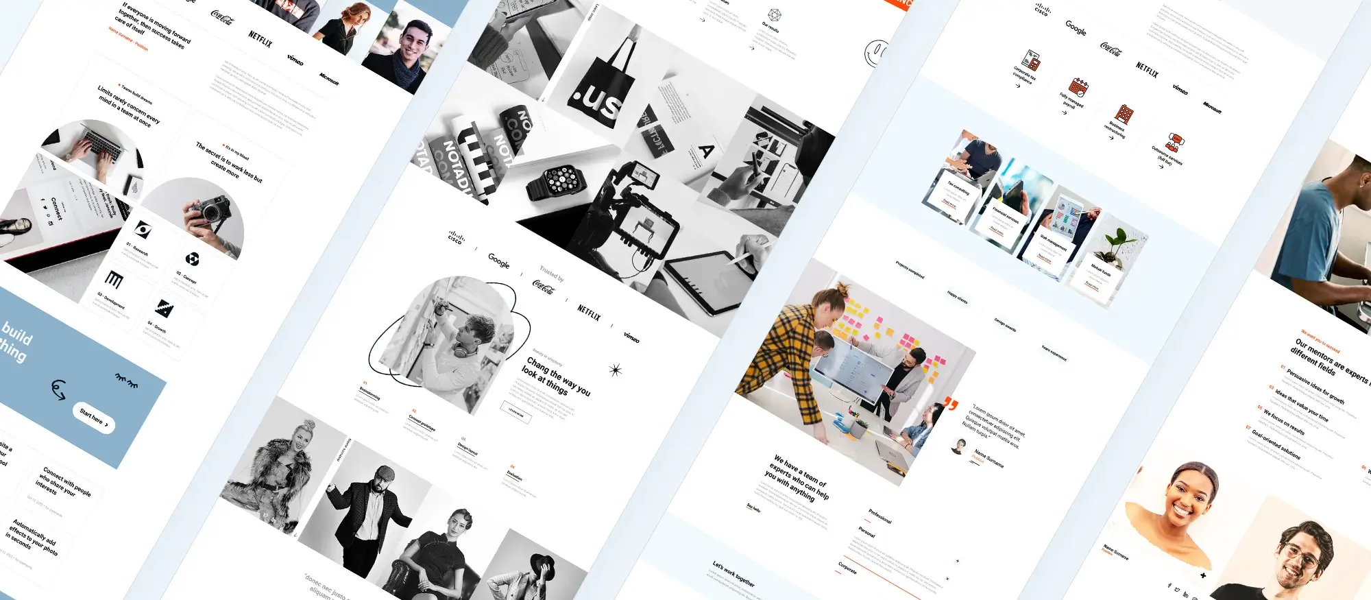
Search engine optimisation and website design
How website design affects SEO
The way a website is designed has a big impact on how well it ranks in search engine results. Search engine optimisation, or SEO, is not just about keywords or backlinks. It also depends heavily on how the site is built and organised.
A well-designed site with clean code and simple navigation makes it easier for search engines like Google to understand the structure and content. When a site is easy to crawl and index, it stands a better chance of ranking higher in search results, helping more people find it. On the other hand, if a site has messy code, broken links or confusing navigation, search engines may struggle to make sense of it. This can hurt the site’s visibility and lead to fewer visitors.
Design choices that improve the user experience also support SEO. Mobile responsiveness and fast page loading are both important factors that search engines take into account. A site that works well on mobiles and loads quickly offers a better experience to users and is more likely to be rewarded with higher rankings. Good website design is about more than just how a site looks. It is also about building a structure that supports SEO and helps the site perform better in search engines.
Practical tips for designing with SEO in mind
To make sure your website design supports SEO, you need to think about it right from the start. A clear site structure is essential. Pages should be organised in a logical way with simple menus and clear paths between sections. Using descriptive URLs also helps both users and search engines understand what each page is about.
Proper use of header tags like H1 and H2 helps break up content and show the importance of different sections. This makes pages easier to read and gives search engines more information about the content.
Images also need attention. Using descriptive file names and adding alt text not only improves accessibility but also gives search engines extra context. Compressing images helps with load speed, which is another important SEO factor.
Designing the site to be mobile-friendly from the start is crucial. More people browse on phones than ever before, and Google now uses mobile-first indexing, meaning the mobile version of your site is the one that matters most for rankings.
By thinking about SEO at every stage of the design process, you can build a site that looks good, works well and attracts more visitors through better search engine performance. It is about blending good design with smart strategy to create a site that succeeds on every level.
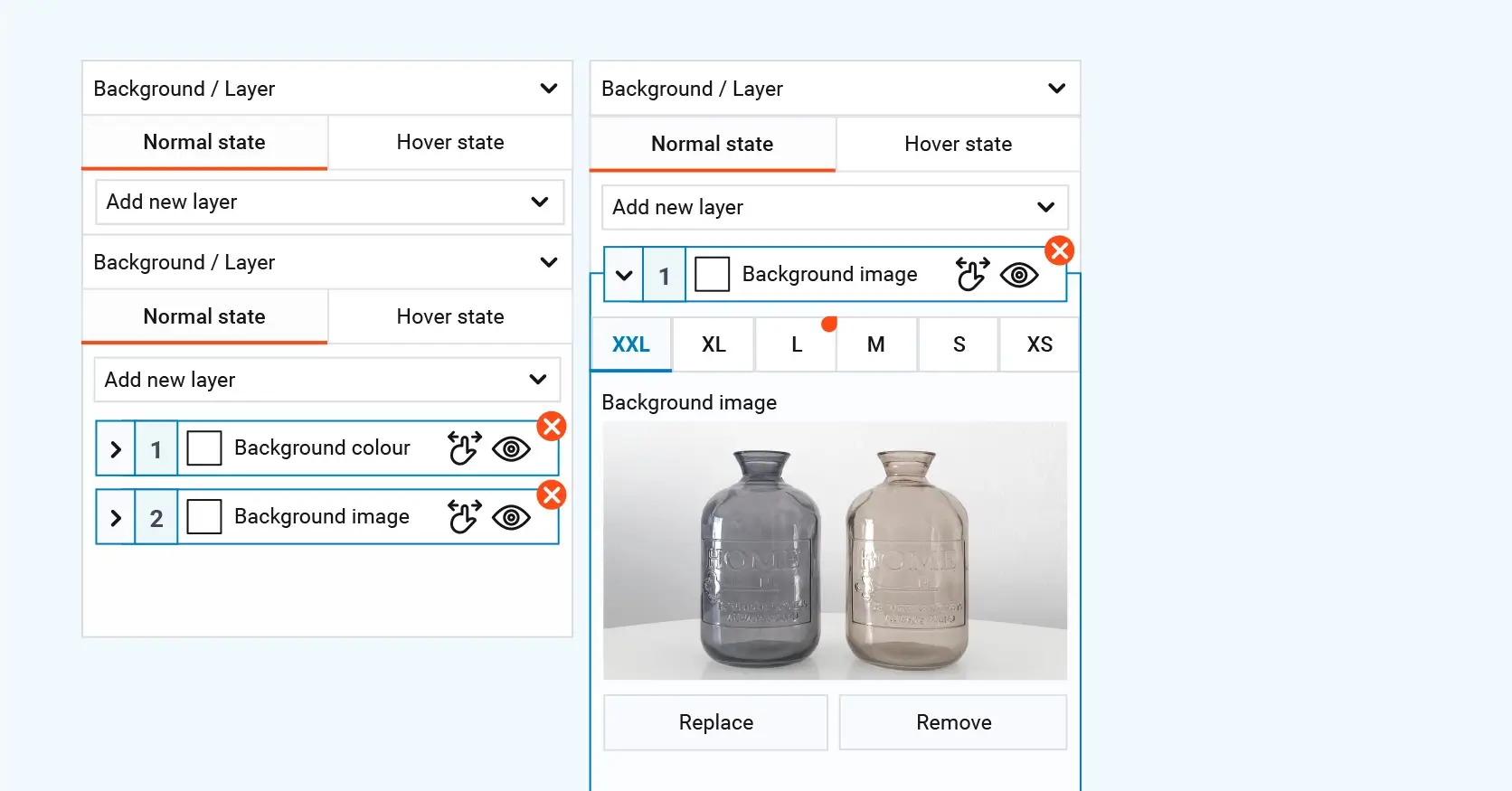
Accessibility in website design
Why making websites accessible matters
Creating websites that are accessible to everyone, including people with disabilities, is about fairness and inclusivity. In many places, it is also a legal requirement. Accessibility means that people with a range of needs, such as vision or hearing impairments, mobility challenges or cognitive difficulties, can use and navigate a website without extra barriers. The internet is an essential part of everyday life, and everyone should have the same opportunity to access information, services and communication online.
If a website is not accessible, it risks excluding a large number of users. This can damage the reputation of a business and limit its audience. Accessible websites are not just better for people with disabilities either. Features like larger fonts, high contrast colours and clear navigation also make websites easier to use for older people, those with temporary injuries or anyone in difficult lighting conditions. By focusing on accessibility, designers improve the overall experience for everyone and create a more welcoming environment online.
Making a site accessible is not just the right thing to do. It also shows respect for users and helps build a wider, more loyal audience.
How to improve website accessibility
There are clear guidelines and tools available to help designers and developers make their websites more accessible. One of the most important resources is the Web Content Accessibility Guidelines, or WCAG. These guidelines offer practical advice on how to build sites that work well for everyone. They cover everything from making sure text is easy to read and interactive elements can be used with a keyboard, to adding descriptions for images and videos so that people using screen readers can understand them.
Using tools like screen readers can help designers test their websites and experience them the way a visually impaired user would. There are also online accessibility checkers like WAVE and Axe that scan a website and point out where improvements are needed. They can highlight missing alt text, poor colour contrast or other barriers that might stop someone from using the site properly.
By following the guidelines and using the right tools, it is possible to create websites that are accessible to everyone. This not only improves the user experience but also supports a more inclusive and fair internet for all.
The role of content in website design
How content layout and design influence user engagement
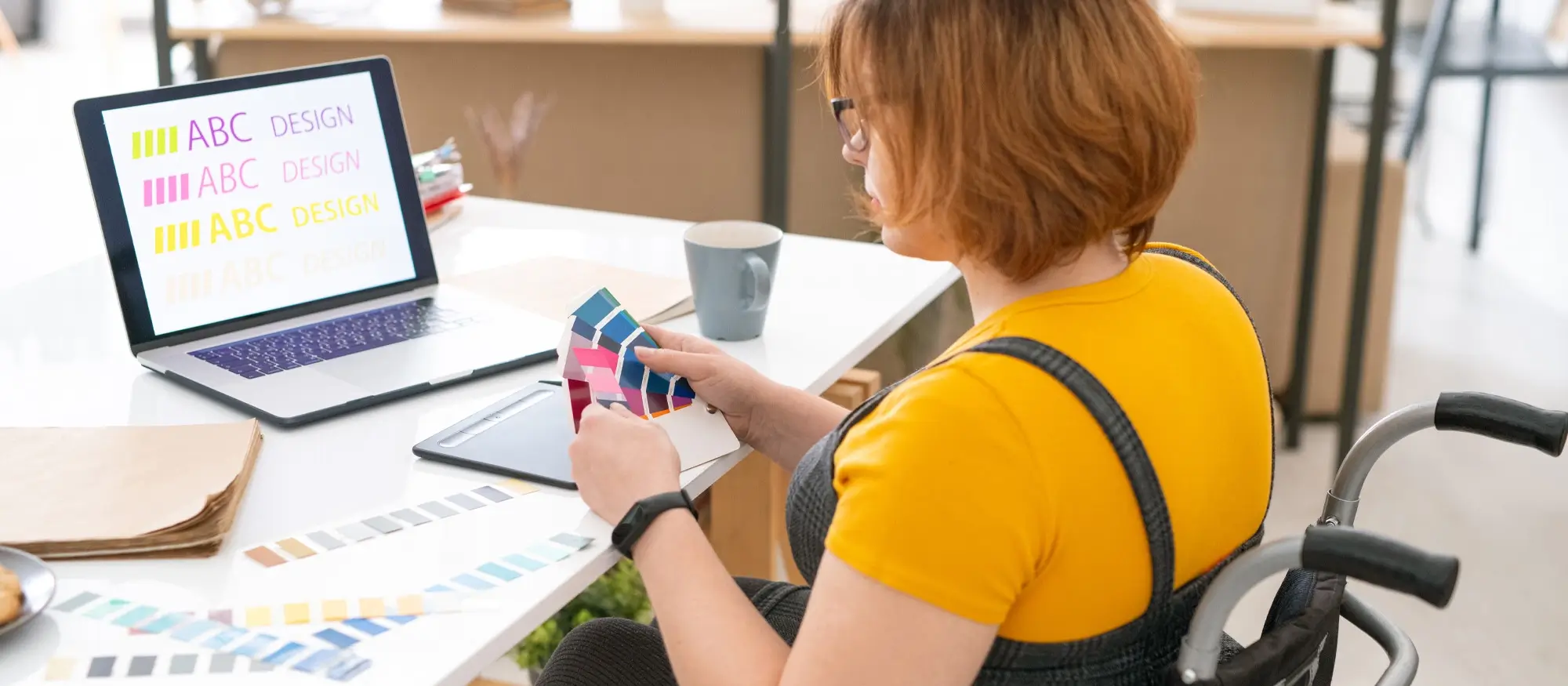
The way content is presented on a website has a huge effect on how users interact with it. A clear and well-organised layout makes it easier for visitors to find the information they want and understand it quickly. Breaking up long sections of text with headings, images and bullet points can make a page feel more inviting and easier to read. When content flows naturally and looks approachable, people are more likely to stay longer, click around the site and engage with the different parts of it.
If a website’s layout is confusing or cluttered, users often become frustrated and leave. Too many different fonts, uneven spacing or a lack of structure can make it hard for visitors to focus on the information. This can cause a high bounce rate, where people leave the site after only viewing one page. Good content design is not just about looking nice. It helps guide users through the site, makes them want to explore more and builds a stronger connection with them.
Tips for integrating content effectively into website design
To integrate content well into a website’s design, it is important to start with a clear structure. Grouping related information together and using headings and subheadings makes it easier for people to scan and understand the page. A consistent layout with the same fonts, colours and spacing throughout the site helps visitors move through the content smoothly without being distracted.
Using visuals carefully can also help bring the content to life. Images, videos and infographics should support the information, not overpower it. They should add meaning and make the page more interesting without making it feel crowded.
White space plays an important role too. Giving the content room to breathe makes a page feel cleaner and improves readability. It helps direct the user’s attention to the right places and makes the whole site feel more welcoming.
Finally, it is vital to make sure the content looks good on all devices. People use phones and tablets as much as computers now, so the layout must adjust to different screen sizes without losing its structure or clarity.
By organising content thoughtfully and designing pages with the user’s experience in mind, a website can keep visitors engaged, make information easier to understand and build lasting relationships with its audience.
The benefits of using website builders and templates
How a CMS makes building and managing websites easier
A content management system, often called a CMS, is a tool that helps people create and manage websites without needing to know how to code. For businesses, freelancers and individuals who want to get online quickly and easily, a CMS can be a real game-changer. Platforms like WordPress, Joomla and Drupal offer easy-to-use interfaces where you can add text, images and videos without touching a single line of code.
Using a CMS makes it much simpler to keep your website up to date. You can change your content, add new pages or update images whenever you need to without hiring a developer each time. This flexibility is especially useful for businesses that need to react quickly to changing information, promotions or news.
A CMS also grows with you. If you start with a basic site and later need more features, you can add them with plugins or modules. Whether you want an online shop, a booking system or better social media integration, a CMS can handle it. Thanks to large developer communities, there is usually a wide range of plugins and design themes available, offering endless options for customising your site to fit your needs.
How website builders and themes speed up the process
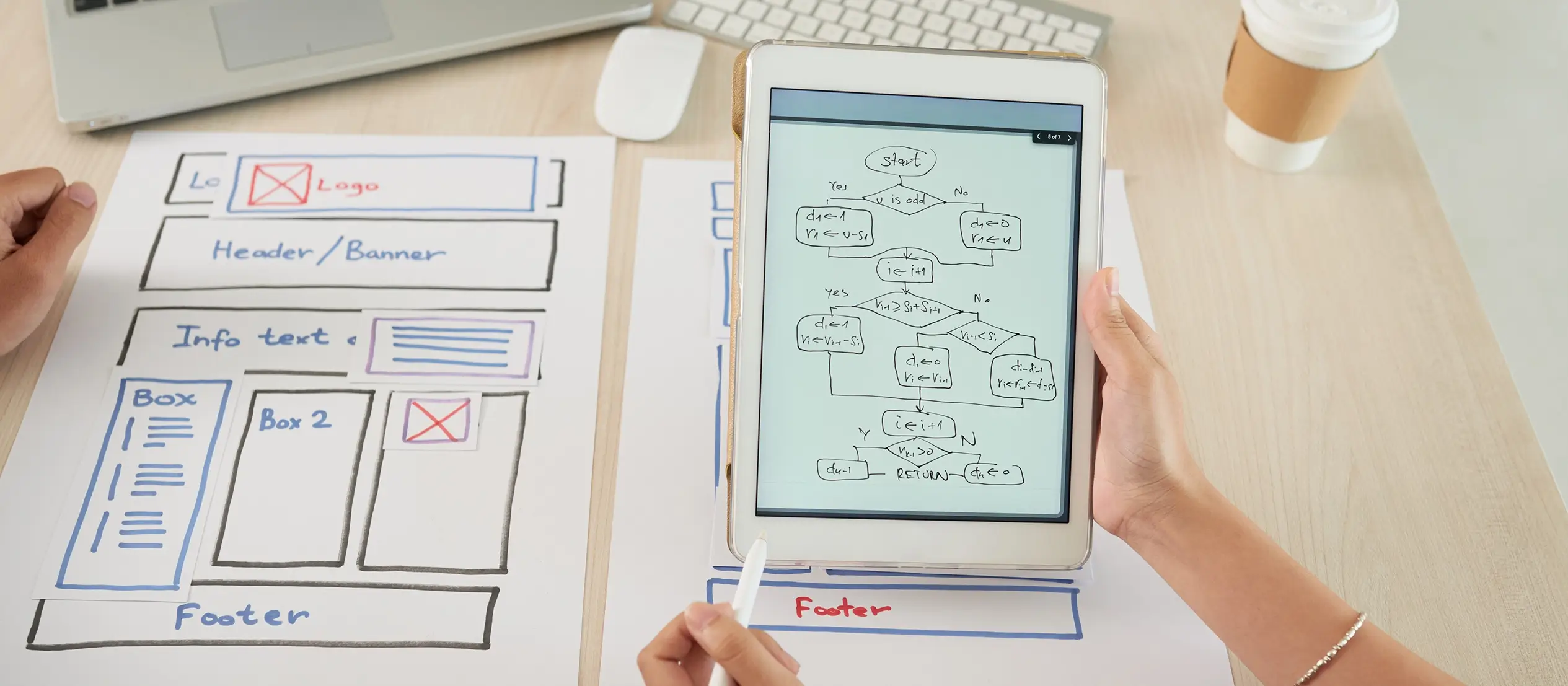
Website builders like MaxiBlocks and Elementor take website creation a step further by offering simple drag-and-drop tools. With these builders, you can place text, images, buttons and other elements exactly where you want them on the page, without worrying about technical details.
This approach means you can create a website quickly and with minimal stress. Even if you have never built a website before, a good builder makes it easy to get something professional-looking live in a short amount of time. You can focus on your content and ideas rather than wrestling with code or technical problems.
Using pre-designed block themes also helps speed up the process. Instead of starting from a blank page, you choose a theme that matches your style and business needs. Themes come with ready-made layouts, colour schemes and font choices, so most of the design work is already done. You can then customise the theme to make it truly yours, adjusting colours, images and text to match your brand.
For businesses or individuals who need to launch a site quickly, website builders and themes offer an efficient way to create a polished, functional website without the usual costs and time commitment of custom development.
The advantage of using pre-made website templates
Pre-made website block templates offer another way to build a professional-looking site quickly and affordably. Templates provide a ready-made structure that you can personalise by adding your own text and images. This saves a lot of time compared to designing everything from scratch.
Because the layout, colour palette and style are already set, you can focus on adding your own content and making small adjustments to match your brand. This is particularly useful for small businesses, freelancers and anyone who needs a high-quality website without a large budget.
Templates are also usually built with best practices in mind. They tend to be responsive, so they work well on mobiles and tablets, and they are often designed to be SEO-friendly. This means you can be confident your site will look good, perform well and be easier to find online.
In short, pre-made templates are a practical, affordable and smart choice for getting a professional website up and running without unnecessary hassle. They offer a strong starting point for creating a site that looks good and delivers results.

Ongoing maintenance and updates in website design
Why keeping your website updated is so important
Regularly maintaining and updating a website is vital for keeping it secure, functional and relevant. If a website is left without updates, problems can quickly appear. You might find broken links, outdated content or even security risks that make the site vulnerable to attacks. These kinds of issues frustrate visitors and can make your website look unprofessional, which can harm your reputation and drive people away.
Keeping a site updated also helps with search engine rankings. Google and other search engines favour websites that are active and regularly refreshed. If your website stays current, it has a better chance of appearing higher in search results, making it easier for new visitors to find you. This is especially important for businesses that rely on their website to attract and retain customers.
Regular updates are not just about fixing problems. They are also about making sure your website continues to meet the needs of your audience. Trends in web design and user expectations change over time. A site that worked well a few years ago might now feel outdated or harder to use. Reviewing and updating the design, functionality and content helps keep your website fresh, engaging and effective.
Tips for keeping your website design current and relevant
Keeping a website looking modern does not mean starting from scratch every year. Often, small thoughtful updates are all you need. A good place to start is by reviewing the design regularly to spot anything that feels old or no longer fits the purpose of the site. Refreshing images, updating the colour scheme or adjusting the layout slightly can make a big difference without the need for a full redesign.
It also helps to keep an eye on design trends and new technologies. While you do not need to follow every new style, being aware of what users expect can help you decide when it is time for changes. For instance, making sure your website works well on mobiles has become essential as more people browse on smaller devices.
Updating your content regularly is just as important. Adding new blog posts, updating product information or showcasing recent work not only keeps your site interesting but also shows visitors and search engines that your site is active and cared for.
By making regular updates to both design and content, you can ensure that your website stays engaging, competitive and ready to meet the needs of today’s users. This ongoing attention helps your site remain a valuable asset that continues to support your goals well into the future.
Final thoughts on website designs
Good website design isn’t just about making something look nice — it’s about making sure your visitors have a smooth, enjoyable experience from the moment they land on your page. Whether you’re running a small business, promoting a service, or simply sharing your ideas with the world, how your website looks and feels plays a massive part in how people see you.
A clean, modern design shows that you care about the details. It builds trust straight away. If your site is cluttered, slow or hard to use, people won’t stick around no matter how good your content or your products are. Today, people expect websites to load quickly, work perfectly on mobiles and be easy to navigate. If it’s a struggle to find what they’re after, they’ll be gone in seconds.
The good news is you don’t need to reinvent the wheel. There are loads of brilliant tools out there now, from platforms like WordPress to website builders such as Wix and Squarespace. And if you want even more control without getting bogged down in complicated design work, options like MaxiBlocks make it easy to build stylish, professional sites without needing to be a web designer.
At the end of the day, the best website design is the one that puts your visitors first. It’s not about cramming in fancy features just for the sake of it. It’s about being clear, welcoming, and making it easy for people to do what they came for whether that’s reading a blog post, buying a product, or getting in touch.
So if you’re thinking about building a new website or freshening up an old one, focus on keeping it simple, fast, and friendly. That’s what people remember and that’s what keeps them coming back.
The elements of effective website designs go far beyond visual appeal – they blend functionality, responsiveness, and user experience into a cohesive digital presence. For small businesses, a strong starting point is a site that prioritises clarity and conversion, as seen in this guide to WordPress website design for small business. Strong WordPress design and development also means having a flexible structure, and WordPress web design tools now make it easier than ever to build layouts that guide visitors intuitively. Crucially, optimising user experience ensures your audience stays engaged, while WordPress responsive design guarantees that your site performs flawlessly across devices.
Professional input from a skilled WordPress website designer can elevate your build even further, but you can also learn from real examples in these standout WordPress website designs and the best WordPress website designs. If you’re wondering how do I design my own WordPress website, the key is to focus on clean layouts, effective typography, and streamlined navigation. Tools like MaxiBlocks can speed up the process, while the WordPress guide to choosing a block addon helps extend your site’s functionality in smart, user-focused ways. By combining these elements thoughtfully, you’ll create a website that not only looks great but works brilliantly too.
Inspiring WordPress designs for any type of site
Explore creative WordPress designs that balance style, performance, and usability.
FAQs – Website designs
What are website designs?
Website designs are the visual and structural layouts that shape how a website looks and how users interact with it. Good website design combines elements like colour schemes, typography, imagery, spacing and navigation to create an appealing and functional experience.
Why is website design important?
Website design is important because it affects first impressions, user trust, and overall usability. A well-designed website helps visitors find information easily, encourages them to stay longer, and can significantly impact conversions and business goals.
What are the key elements of good website design?
Good website design includes clean layouts, consistent branding, easy navigation, fast loading times, mobile responsiveness, and clear calls to action. Visual balance, white space, and accessibility are also important factors.
How do I choose the right design for my website?
Choose a design that reflects your brand identity and serves your website’s purpose. Consider your target audience, the type of content you are sharing, and the emotions or actions you want to inspire in your visitors.
Can I design a website without coding?
Yes, using platforms like WordPress, Wix, Squarespace or website builders with drag-and-drop features, you can design a professional-looking site without coding skills. Templates and design libraries make it easy to customise layouts and styles.
What makes a website design mobile friendly?
A mobile-friendly design adapts to different screen sizes and touch interactions. Responsive layouts, readable text, accessible menus and optimised images ensure that your website works well across smartphones, tablets and desktops.
How does website speed relate to design?
Heavy or poorly optimised designs can slow down a website. Keeping designs lightweight by optimising images, limiting animations and using clean code helps maintain fast loading times, which improves user experience and SEO.
What are common website design trends?
Current trends include minimalism, bold typography, custom illustrations, dark mode, micro-interactions, and storytelling through visuals. These trends focus on creating engaging, accessible and visually striking user experiences.
Should I use a template or create a custom website design?
Templates are ideal for fast, cost-effective website launches and suit many small businesses and personal projects. A custom design is better if you have specific branding needs, unique functionality, or want a completely original look.
Can I update my website design after it is live?
Yes, websites can and should be updated over time. Refreshing the design keeps the site looking modern, improves usability, accommodates new features, and responds to changing user expectations or business goals.
WordPress itself
Official Website
wordpress.org – This is the official website for WordPress, where you can download the software, find documentation, and learn more about using it.
WordPress Codex
codex.wordpress.org/Main_Page – This is a comprehensive documentation resource for WordPress, covering everything from installation and configuration to specific functionality and troubleshooting.
WordPress Theme Directory
wordpress.org/themes – The official WordPress theme directory is a great place to find free and premium WordPress themes. You can browse themes by category, feature, and popularity.
maxiblocks.com/go/help-desk
maxiblocks.com/pro-library
www.youtube.com/@maxiblocks
twitter.com/maxiblocks
linkedin.com/company/maxi-blocks
github.com/orgs/maxi-blocks
wordpress.org/plugins/maxi-blocks

Kyra Pieterse
Author
Kyra is the co-founder and creative lead of MaxiBlocks, an open-source page builder for WordPress Gutenberg.
You may also like
