Try MaxiBlocks for free with 500+ library assets including basic templates. No account required. Free WordPress page builder, theme and updates included.

Updated 15 May 2025
In today’s information overload, where attention is fleeting, clear and intuitive navigation becomes vital. A well-designed navigation system is the backbone of a good user experience. It helps visitors move through your website and find what they need quickly, without friction. This guide walks through key strategies to build navigation that puts users first.
Forget frustration, embrace exploration
The power of user-friendly navigation
Navigation isn’t just about getting around. It shapes how users interact with your site and how they feel about it. If it’s simple and easy, people stay longer, click more, and find what they came for. If it’s messy or confusing, they leave. Great navigation works quietly in the background, guiding people where they want to go.
Start with user needs and behaviours
Before you think about menus, think about the people using them. What are they here for? What do they want to find? Tools like surveys, heatmaps, and feedback forms can give you real answers. Build your structure around that, not just your content layout.
Simplify and prioritise content
Keep it clear and focused
Don’t list every page in your menu. Start with the most important ones the pages that matter to your visitors and meet your goals. Use categories and dropdowns to group secondary items. The fewer choices users have to make, the faster they’ll get to the right page.
Implement clear visual hierarchies
Help users scan and act faster
Use size, spacing, and layout to show what’s most important. Make top-level items stand out. Group similar links. A clear visual structure helps users move with confidence instead of hunting through a wall of links.
Subscribe to our newsletter
People shouldn’t have to relearn how your site works on each page. Keep your menu in the same place. Use the same labels. If a dropdown behaves one way on the homepage, don’t change it on the contact page. Predictable patterns make people feel in control.
Optimise for search and accessibility
Some people want to browse. Others want to search. A visible search bar helps users skip menus entirely when they know what they want. Make sure your site is also usable by keyboard, screen reader, and on all devices. Accessible navigation helps everyone.
Test and iterate
You won’t know what works until you test. Use heatmaps and session recordings to see where people click or where they don’t. Ask real users what they think. Keep updating. Good navigation evolves with your content and your audience.
Introduction: why this topic matters
Intuitive navigation structures isn’t just a box to tick. It’s how your content gets seen, how visitors stay longer, and how conversions happen. Fixing your menu can improve nearly every part of your site experience. It’s one of the best low-effort, high-impact changes you can make.
Life hacks or productivity tips
- Keep your main menu to 5–7 items
- Use action-oriented menu labels
- Add a sticky call-to-action button like “Book a Call”
- Use a search bar on content-heavy sites
- Test how your navigation looks on mobile before launching
- Use real user behaviour, not guesses, to shape your menus
Key terms you should know
- Primary navigation: Your main menu
- Submenu: Items listed under a main menu link
- Hamburger menu: The mobile menu icon
- Breadcrumbs: A trail that shows users where they are
- ARIA labels: Accessibility features for screen readers
Troubleshooting common issues
- If users aren’t clicking, your labels may be too vague
- If bounce rate is high, try moving key pages higher in the menu
- If people don’t use your search bar, make it easier to find
- If your mobile menu breaks, simplify and retest
Myths vs facts
Myth: More links are better
Fact: Fewer links = easier choices
Myth: Hamburger menus hurt UX
Fact: They’re expected on mobile
Myth: People read every menu item
Fact: They skim so use clear spacing and labels
The don’ts: pitfalls to avoid
- Don’t bury important pages
- Don’t use vague names like “Explore”
- Don’t change your menu layout between pages
- Don’t ignore mobile design
- Don’t forget to test with real people
Build like a pro
Setting goals and staying motivated
Start small. Maybe your goal is just to get more users to visit your services page. Focus on that first. Then track clicks, adjust, and move on to the next. Don’t try to fix everything at once navigation is always a work in progress.
Case study: lessons learned from a growing content site
One education site added loads of content, but their menu didn’t change. People stopped finding older posts, and bounce rate shot up. They added better categories, a search bar, and a dropdown for key series. Engagement doubled. Don’t let your navigation fall behind your content.
Key takeaways and recap
- Keep it simple, clean and focused
- Make labels clear and honest
- Use spacing and layout to guide users
- Design with mobile in mind
- Test often, and update when things change
- Navigation is the tool that gets people to your best content so don’t make them work for it.
Next steps: moving forward with confidence
Take a look at your menu today. Is it doing too much? Not enough? Make one improvement now, like changing a confusing label or reordering links. Then keep going. Fixing your navigation doesn’t require a full redesign. It just takes thoughtful changes.
Bonus: build faster with MaxiBlocks
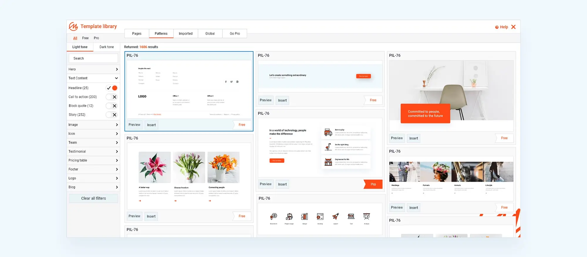
Need a head start? MaxiBlocks has 40+ professionally designed navigation patterns you can drop right into your WordPress site. They’re responsive, clean, and easy to edit. It’s the fastest way to improve your navigation without starting from scratch.
Discover how to create clear, responsive, and stylish WordPress menus with expert tips and resources.
How do WordPress navigation menus contribute to user-friendliness?
WordPress navigation menus make it easier for users to find what they’re looking for. A clear, well-organised menu improves site usability, keeps visitors on the page longer, and creates a more satisfying browsing experience.
What steps are required to create a simple navigation menu in WordPress?
Go to Appearance > Menus in your dashboard. Create a new menu, add your pages or custom links, then assign it to your chosen location (like the header or footer) using your theme’s settings.
How can I add and manage submenus in WordPress?
To add a submenu, drag a menu item slightly to the right under another item in the Menus section. This creates a parent-child structure and is great for grouping related links under one category.
What tips are there for customising the look of a navigation menu?
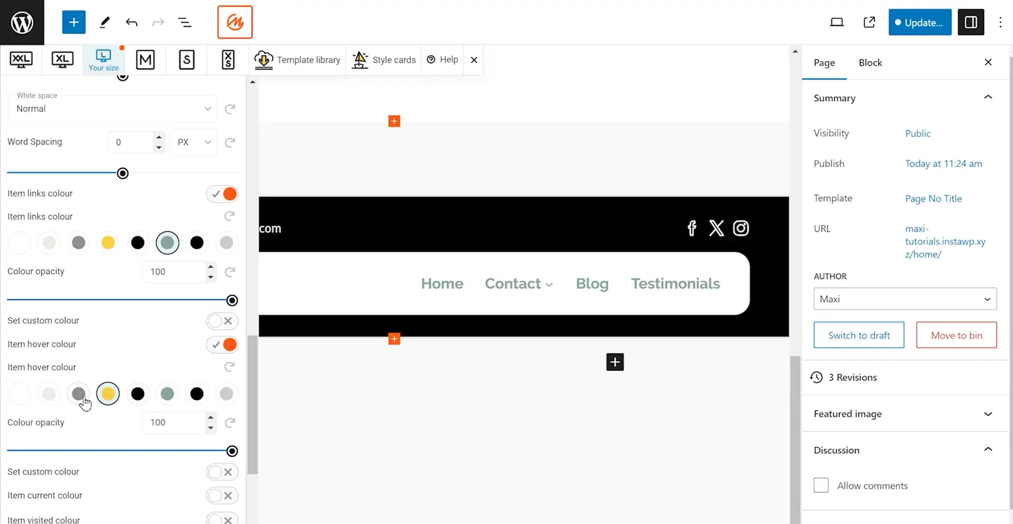
You can use the WordPress Customiser to change menu colours, fonts, spacing and layout. For more advanced design tweaks, use custom CSS or a visual builder like MaxiBlocks to apply brand styles.
What are the key elements of an effective WordPress navigation menu?
A good menu is easy to use, works on all screen sizes, has clear labels, and reflects the site’s content structure. It should make important pages easy to access and reduce confusion.
How has the evolution of website navigation impacted the user experience?
Navigation has moved from static, text-only links to dynamic, mobile-friendly menus. These updates have made websites more intuitive and helped users explore content with less effort.
Why is designing responsive navigation menus for mobile devices so important?
A large percentage of web traffic comes from mobile. Responsive menus that adjust for smaller screens improve usability, reduce bounce rate, and keep visitors engaged no matter what device they’re using.
What role does psychology play in the design of navigation menus?
Understanding how users think helps you design menus that feel natural. For example, grouping related items and placing the most important links where people expect them makes the experience smoother and more efficient.
How can customising WordPress navigation menus improve a website?
Customising your menu to match your brand, layout and user expectations can improve trust and navigation flow. It also helps visitors find what they need faster, leading to better outcomes like signups or purchases.
How can mega menus improve e-commerce websites?
Mega menus give users a full view of categories and featured products in one dropdown. They reduce the number of clicks and help customers find what they want faster which is great for shops with a large product range.
What strategies can improve the accessibility of navigation menus?
Use clear labels, enable keyboard navigation, apply ARIA roles for screen readers, and make sure your menu has high contrast and large clickable areas. These steps ensure everyone can navigate your site easily.
What are the latest trends in navigation menus?
Trends include full-screen navigation overlays, minimalist designs, icon-based menus, mobile-first layouts, and built-in search features. These designs prioritise ease of use and a clean browsing experience.
How can I master the design of footer menus?
Keep footer menus clean and well-organised. Group related links, repeat key pages like Privacy or Contact, and don’t overload them with content. They should support your main menu, not replace it.
What are the benefits of vertical navigation?
Vertical menus are useful for sites with many links, such as blogs or dashboards. They stay visible as users scroll, work well on mobile, and create a unique layout that stands out from traditional top navs.
Why are intuitive navigation structures so important for usability?
Users shouldn’t have to guess where to go next. Intuitive structures match how people naturally look for information, which leads to less frustration and more conversions.
What are the best practices for using dropdown menus?
Keep dropdowns simple. Don’t overload them with too many links. Make sure they’re touch-friendly for mobile and use clear labels so people know what to expect.
How can innovations in navigation benefit modern WordPress websites?
New navigation styles like sticky headers, sliding panels or animated dropdowns can make your site more interactive and easier to use. They also give your site a more modern feel.
What is the process for creating a sticky menu with MaxiBlocks?
With MaxiBlocks, create your menu layout, select the container, and apply the “Sticky” setting in the advanced panel. Set the top offset to zero, and your menu will stay visible as users scroll.
What are the benefits of adding a button to my MaxiBlocks menu?
Adding a button (like “Sign Up” or “Buy Now”) makes your call-to-action stand out. It catches the user’s eye and can improve clicks and conversions directly from the main navigation.
WordPress itself
Official Website
wordpress.org – This is the official website for WordPress, where you can download the software, find documentation, and learn more about using it.
WordPress Codex
codex.wordpress.org/Main_Page – This is a comprehensive documentation resource for WordPress, covering everything from installation and configuration to specific functionality and troubleshooting.
WordPress Theme Directory
wordpress.org/themes – The official WordPress theme directory is a great place to find free and premium WordPress themes. You can browse themes by category, feature, and popularity.
maxiblocks.com/go/help-desk
maxiblocks.com/pro-library
www.youtube.com/@maxiblocks
twitter.com/maxiblocks
linkedin.com/company/maxi-blocks
github.com/orgs/maxi-blocks
wordpress.org/plugins/maxi-blocks

Kyra Pieterse
Author
Kyra is the co-founder and creative lead of MaxiBlocks, an open-source page builder for WordPress Gutenberg.
You may also like

