BG Image maxiblocks

Kickstart your journey to website design with these 20 key insights


How to incorporate branding into website design

Key takeaways

This article discusses 20 general points on website design that are worth learning about. There are of course many more but this is a good start. Although all twenty are important these five key takeaways are amongst the most important.

1. Responsive design

2. User experience (UX)

Visitors often leave a website when they can’t easily find what they’re looking for. That’s where User Experience (UX) comes in. A well-designed UX makes sure the website is easy to navigate. It also means that visitors are encouraged to explore products or services, sample these for free or are enticed to buy.  The visitor path needs to be determined up front and laid out accordingly.

3. Search Engine Optimisation (SEO)

SEO is like the secret sauce that gets a website noticed in the crowded online space. Without it, the site might need to be promoted with costly advertising, promotions and PR. By optimising content and structure, SEO helps the website rank higher on search engines, driving more traffic and giving the business the visibility it needs to succeed.

4. Website performance optimisation

5. Website accessibility

It’s important to consider how people with other abilities experience the web. Website accessibility ensures that everyone, regardless of their abilities, can use the site effectively. Not only is it a legal obligation, but making the site accessible also demonstrates a commitment to inclusivity, helping to reach a broader audience and build a positive reputation.

Importance of website design

Overview of how website designs impact user engagement, branding, and conversion rates

Best website design practices for SEO"
Best website design practices for SEO

1. Web development

The differences between web design and web development

How development supports the design and functionality of a website

Subscribe to our newsletter

2. Website design trends

Current and emerging trends in website design

How to incorporate trends while maintaining a unique brand identity

Predictions for the future of web design

Steps to create a user-friendly website design

3. User experience (UX)

User Experience (UX) refers to the overall experience a person has when interacting with a product, service, or system. In the context of digital design, it covers all aspects of the user’s interaction with websites, apps, or software, including the ease of use, efficiency, and the satisfaction acquired from the experience. Good UX design is centred around the understanding of the user’s needs and behaviours. It’s not just about making things look good, but about making them function well in a way that feels natural to the user. Poor UX can lead to frustration, inefficiency, and ultimately a loss of customers or users, while strong UX can help to engage the customer ultimately resulting in a better relationship with the business. 

UX is often confused with User Interface (UI), but they are distinct concepts. UI refers to the actual layout and design elements that a user interacts with, such as buttons, menus, and icons, while UX is broader and includes how these elements are experienced. For example, a well-designed UI that is visually appealing but difficult to navigate would result in a poor UX. The goal of UX design is to ensure that users find value in what is being provided to them, which often involves extensive user research, prototyping, testing, and refining of the design to meet user needs effectively.

The Role of UX in web design

Best practices for creating user-friendly websites

Tools and techniques for improving UX

Build like a pro

4. User interface (UI)

User Interface (UI) refers to the visual elements of a digital product that users interact with, such as buttons, menus, icons, and layout. It is the point where the user meets the digital system. The primary goal of UI design is to create an interface that is attractive, easy to understand, and simple to use. A well-designed UI makes it easier for users to navigate a website, find information, and complete tasks without getting lost. It plays an important role in shaping the user’s first impression of a product or service, which can influence their overall impression of not only what is on offer but also the company or individual behind the offer.

Good UI design is not just about style and looks; it also covers how the website functions. Every element in the interface should have a clear purpose and add to the overall user experience. For example, buttons should be easy to click, text should be readable, and navigation should be straightforward. The design needs to guide the user intuitively through the system, helping them to read the content, enjoy images and videos, if on the website, and understand what the business is about. A cluttered or confusing UI can lead to irritation whereas a clean and logical UI can improve a user’s enjoyment and encourage repeated visits of the website which could lead to the purchase of a product or service. 

Significance of UI in assisting with website usability 

Tips for creating intuitive and good looking interfaces

Creating an easy-to-use and visually pleasing interface involves a few key steps. First, it’s important to keep the design consistent throughout the website. This means using the same colours, fonts, and styles across all pages, which helps users quickly get the hang of how things work. Consistency in design cuts down on confusion and makes the user experience more predictable, which is crucial for making the site easy to use. Another helpful tip is to use clear and simple language for labels and instructions, so users know exactly what to do without having to guess.

Alongside consistency, visual hierarchy is also important for creating an appealing interface. This means arranging elements on the screen so that the most important parts grab the user’s attention first. For example, using larger or bolder fonts for headings and buttons can help guide users through the content. It’s also a good idea to leave enough white space around elements, which not only makes the interface look tidier but also helps users focus on key actions. Finally, testing the interface with real users is vital, as it provides valuable feedback on how intuitive and visually effective the design is, allowing for improvements before the final launch.

Website design trends to watch in 2024

5. Graphic design

The role of graphic design in website design

How to use visuals to enhance website appeal

Using visuals effectively on a website is about more than just adding attractive pictures; it’s about selecting and placing visuals in a way that improves the overall user experience. A key part of this is making sure the visuals match the content. Images, icons, and graphics should support the message being communicated and help to highlight or clarify important points. For instance, showing products in use or using infographics to explain complex information can make the content more engaging and easier to understand.

The quality of the visuals is also important. High-quality images and graphics can make a website look more professional and appealing. However, it’s also crucial to consider the loading time of these visuals, as large files can slow down the website and affect the user experience. Using appropriately sized images and optimising them for the web can help balance visual appeal and performance. Additionally, the visuals should match the overall design and branding of the site, helping to create a consistent look and feel.

Tips for integrating branding elements into website designs

How to use white space effectively in website design

6. Responsive design

Importance of responsiveness in modern website design

How to ensure a website Is fully responsive across devices

Examples of responsive vs. non-responsive designs

Designing an engaging website layout

7. Mobile-friendly websites

A mobile-friendly website is designed to work well on mobile devices like smartphones and tablets. As more people use mobile devices to browse the internet, it’s important that websites are easy to use on smaller screens. A mobile-friendly website usually has simple navigation, bigger buttons, and content that’s easy to read without needing to zoom in or scroll too much. The aim is to make sure people can easily interact with the website on their mobile devices, whether they’re reading articles, making purchases, or finding information.

With the rise in mobile browsing, website design has had to adapt to meet the needs of mobile users. More people now access the internet on the go, so businesses and organisations must make sure their websites are mobile-friendly to stay competitive. If a website isn’t optimised for mobile use, it risks losing visitors because people are likely to leave sites that are hard to navigate or slow to load on their phones. So, creating a mobile-friendly website is essential for reaching a wide audience and providing a good user experience.

The rise of mobile browsing and its impact on website designs

Mobile browsing has grown hugely in the past decade, with many people now using smartphones as their main way to access the internet. This shift has big implications for website design, as designers now have to focus on the mobile user experience alongside traditional desktop design. Websites that aren’t optimised for mobile devices can end up being difficult to use, leading to frustrated users and lower engagement or conversion rates. Because of this, the focus in website design has moved towards creating responsive and mobile-first designs that adapt to different screen sizes and orientations.

The rise of mobile browsing also changes how content is presented. Designers need to think about the smaller screen space on mobile devices, which means content needs to be concise, well-organised, and easy to navigate. Mobile users often behave differently from desktop users—they tend to have shorter attention spans and want quick access to information. In particular the expense of buying data from mobile bandwidth service providers means that mobile users in many parts of the world depend on super quick access to the information they are looking for. This has made speed a key focus, with designers working to reduce loading times and making sure websites work well even on slower mobile networks. Overall, the increase in mobile browsing has made it essential for website designers to carefully consider how their designs will function on a range of devices.

Techniques to optimise websites for mobile users

Examples of successful mobile-friendly website designs

Website design tips for optimizing site performance

8. Website layout

Website layout refers to how visual elements like text, images, navigation menus, and other content are arranged on a web page. A well-organised layout is key because it affects how information is presented and how easily users can interact with the site. A good layout not only makes a website look tidy but also helps users navigate through the content in a logical and easy way. The aim is to create a layout that allows users to find what they need quickly and encourages them to engage with the site, whether that’s reading more content, filling out a form, or making a purchase.

The main principles of effective website layout include clarity, consistency, and balance. Clarity ensures the layout is easy to understand, with clear separation between different sections and elements. Consistency means keeping a uniform style across all pages, which helps users navigate the site without getting confused. Balance involves distributing elements evenly on the page, avoiding both overcrowding and excessive empty spaces. These principles help create a user-friendly experience, making the website more accessible and enjoyable for visitors.

Different types of layouts and when to use them

How layout influences user behaviour

The layout of a website greatly affects how users behave, influencing how they interact with the site and what actions they take. A well-designed layout can guide users’ attention to important areas, like call-to-action buttons, featured products, or key information. For example, placing a call-to-action button in a prominent spot, such as at the top of the page or in the centre, can increase the chances of users clicking on it. Similarly, using visual hierarchy—where more important elements are larger or more colourful—can help direct users’ focus and make the site easier to navigate.

On the other hand, a poorly organised layout can lead to confusion and frustration, causing users to leave the site. If important information is hard to find or if the layout is cluttered and overwhelming, users may struggle to achieve their goals, like finding contact details or completing a purchase. The layout also affects how users move through the site. A clear and logical layout can guide users smoothly from one section to another, increasing the chances that they will stay on the site longer and explore more content. In the end, the layout plays a crucial role in shaping the overall user experience and can greatly impact the success of a website.

The role of typography in website design

9. E-Commerce website design

E-commerce website design is all about creating online platforms where businesses can sell their products or services directly to customers. A successful e-commerce website needs to do more than just look good; it also has to work well, be easy to use, and keep customers’ data safe. The design should make it simple for customers to find products quickly and complete their purchases without any hassle. Key features include clear product categories, search functions, and a straightforward checkout process, all of which help create a smooth shopping experience. Building trust is also vital, so the design should include security features like SSL certificates and secure payment gateways to protect customer information.

Important elements of a successful e-commerce website include high-quality product images, detailed descriptions, and customer reviews. These features help customers make informed decisions by giving them all the information they need in a clear and accessible way. Another crucial element is responsive design, which ensures the website works well on all devices, including smartphones and tablets. As more people shop on their mobiles, an e-commerce site that isn’t mobile-friendly could miss out on a lot of sales. Additionally, easy navigation and a simple checkout process are key to reducing cart abandonment and keeping customers happy.

Strategies for optimising product pages, checkout processes, and user flow

Optimising product pages is essential for turning visitors into customers. Each product page should have clear, high-quality images from different angles, along with a zoom feature. Detailed descriptions should highlight key features, benefits, and specifications. Including customer reviews and ratings can boost credibility and help potential buyers feel more confident about their purchase. Product pages also need to load quickly and be mobile-friendly, as slow or hard-to-use pages can lead to lost sales.

The checkout process is another area where optimisation can improve user flow and reduce cart abandonment. A simple, one-page checkout is often more effective than a multi-step process because it reduces the number of actions a user has to take. Offering multiple payment options, including digital wallets like PayPal or Apple Pay, can cater to different customer preferences and make checkout more convenient. Showing trust badges, offering guest checkout, and being clear about shipping costs and return policies can also help build trust and encourage customers to complete their purchases. By streamlining the entire user journey—from finding products to checking out—businesses can significantly improve the shopping experience and boost conversion rates.

Examples of top E-Commerce website designs

Essential tools for professional website design

10. Website navigation

Best Practices for structuring website menus and links

Structuring website menus and links well is essential for creating a user-friendly navigation system. A good practice is to keep the menu structure simple and logical, with clearly labelled categories that match the site’s content. Grouping related items together and using familiar terms helps users quickly understand the menu options. For example, placing “Contact” and “About Us” links together makes sense as they are usually related. To avoid overwhelming users, limit the number of top-level menu items and use submenus to organise additional content.

Another important practice is to make sure all links are descriptive and meaningful. Instead of using vague phrases like “Click here,” links should clearly state what the user can expect, like “View Our Services” or “Download the Guide.” This not only improves usability but also helps with SEO by giving search engines more context. It’s also crucial to ensure that navigation is consistent across all pages of the website, so users don’t have to relearn how to navigate as they move through the site. A consistent and well-structured navigation system helps users find information more easily and enhances the overall user experience.

Tools for testing and improving navigation

How to enhance website design with interactive elements

11. Website wireframe

Steps to create a wireframe before moving to design

Examples of effective wireframing tools

There are several effective wireframing tools available, each serving different needs in the design process. One popular tool is Balsamiq, known for its simplicity and ease of use. Balsamiq allows designers to create basic wireframes quickly, focusing on layout and structure rather than visual design. Its drag-and-drop interface and large library of pre-built UI components make it easy to put together wireframes that clearly show the basic ideas of a website’s layout.

Another widely used tool is Sketch, which is especially popular with designers who work on both wireframes and detailed mockups. Sketch offers more flexibility and customisation, allowing designers to create detailed wireframes that can easily transition into more polished designs. For those working in teams, Figma is an excellent choice because it supports real-time collaboration, allowing multiple people to work on a wireframe at the same time. Figma also integrates well with other design tools and makes it easy to share work and gather feedback. Each of these tools has unique features that can help make the wireframing process smoother and ensure that the website design starts on solid ground.

Examples of successful website design strategies

12. Role of a CMS in managing website content

Comparison of popular CMS platforms (WordPress, Joomla, Drupal, etc.)

How to select the right CMS for your website

How to choose the right colors for your website design
How to choose the right colours for your website design

13. Website builders

Importance of showcasing your work through a website design portfolio

Tips for creating an impressive and professional portfolio

Creating an impressive and professional portfolio involves a few key strategies. First, it’s important to carefully select your best work. Instead of including every project you’ve done, focus on those that best show your skills and align with the type of work you want to attract. Quality is more important than quantity, so it’s better to present a few standout projects in detail rather than overwhelming viewers with too much content. Each project should include a description that explains the brief, your role in the project, and the design process you followed, highlighting any unique challenges you overcame.

Another important tip is to make sure your portfolio is well-organised and easy to navigate. The design of your portfolio should reflect your design style—clean, intuitive, and user-friendly. Consider grouping similar projects together or using categories to make it easier for visitors to find what they’re looking for. Additionally, it’s crucial to ensure your portfolio works well on different devices, so make sure it’s responsive and loads quickly on both desktop and mobile. Including a strong “About” section and clear contact information can also make your portfolio more engaging and help potential clients get in touch with you.

Examples of top website design portfolios

There are many great website design portfolios that effectively showcase work. One example is Adham Dannaway’s portfolio, which highlights his skills as both a website designer and developer. The portfolio features a split-screen design, allowing visitors to explore his work in both areas. The site is visually appealing, creative, and easy to navigate, serving as a strong example of how to balance design with usability.

Another impressive portfolio is Daniel Spatzek’s, which uses bold typography and interactive elements to create a memorable user experience. The site has a minimalist design that clearly showcases his work, allowing the quality of his projects to stand out. The portfolio also includes case studies that provide insight into his design process, helping potential clients understand his approach to each project. These portfolios, among others, are excellent examples of how to present work, skills, and personality in a way that attracts and engages viewers.

Guide to responsive website design

14. Website page templates

How to choose and customise page templates to fit a brand

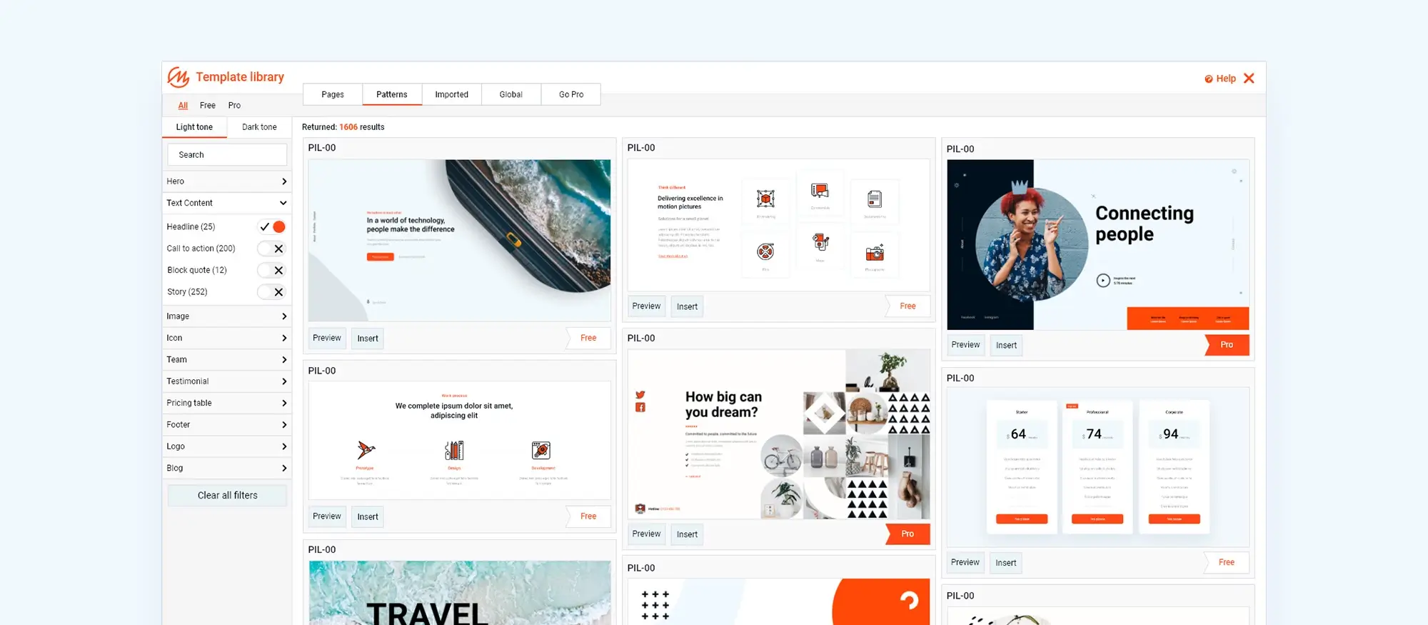
Popular platforms offering quality website page templates, including MaxiBlocks

Innovative website design ideas for modern businesses

15. What makes an effective landing page?

An effective landing page is designed with a clear goal in mind, whether it’s capturing leads, promoting a product, or encouraging sign-ups for a newsletter. The main aim of a landing page is to drive conversions, so it needs to be straightforward, focused, and directly aligned with what the user is looking for. Simplicity is key—by removing distractions and focusing on a single call to action (CTA), visitors are more likely to complete the desired action. The content should be clear and persuasive, with a headline that grabs attention and immediately communicates the page’s purpose.

The design and usability of a landing page are also crucial. The layout should be clean and easy to navigate, with important information placed above the fold—meaning it’s visible without scrolling. Fast loading times and mobile responsiveness are essential, as a slow or poorly displayed page can quickly put off potential customers. An effective landing page also builds trust by using testimonials, social proof, or clear guarantees, helping to reduce any hesitation the visitor might have.

Key elements to include in a landing page design

To make a landing page effective, certain key elements should be included. The headline is critical as it’s the first thing visitors see. It should be clear, compelling, and directly related to the ad or link that brought the user to the page. A subheadline can provide extra information or clarify the offer, keeping the visitor interested. The call to action (CTA) is another essential part of the design. It should be easy to find, stand out, and use action-focused language like “Sign Up Now,” “Get Started,” or “Download Free.”

Visual elements like images or videos can make the landing page more engaging and should support the overall message. Trust signals, such as customer testimonials, security badges, or partner logos, can help build credibility and reassure visitors. Form fields should be kept to a minimum to reduce any barriers—only ask for the information that’s absolutely necessary. Finally, making sure the landing page is responsive, meaning it looks and works well on all devices, is vital since many visitors may be using mobile phones.

A/B testing for optimising landing page performance

A/B testing, or split testing, is a way to improve landing page performance by comparing different versions of the page to see which one works better. This involves changing one element on the landing page—like the headline, CTA, or layout—and then directing some of the traffic to each version. By looking at the results, it’s possible to see which version leads to more conversions. A/B testing is powerful because it’s based on real user behaviour rather than guesses.

To run an effective A/B test, careful planning is essential. It is important to first decide which element to test and establish the objective, such as increasing click-through rates or reducing bounce rates. Testing only one element at a time allows for accurate measurement of its impact. Once the test is live, monitoring the results and collecting sufficient data is crucial to making an informed decision. After identifying the best-performing version, it should be implemented as the new standard, and testing of other elements can continue to further improve the page. Over time, A/B testing can lead to significant improvements in landing page performance, boosting conversions and achieving better results for campaigns.

Best practices for effective website design

16. Benefits of choosing a custom website design over templates

The process of creating a custom website design from scratch

How custom design can better reflect brand identity

A custom website design allows a brand’s identity to be accurately and effectively reflected throughout the website. Since every part of the site is designed specifically for the business, the visual style, tone, and overall look can perfectly align with the brand’s values and message. This includes using the brand’s colours, fonts, and imagery consistently across the site, creating a cohesive and professional appearance. A custom design also allows for unique elements, such as bespoke graphics or tailored animations, that resonate with the target audience and reinforce the brand’s personality.

Additionally, a custom-designed website provides the flexibility to communicate the brand story in the most impactful way. Whether through layout, content presentation, or interactive features, a custom site can be crafted to guide users through the brand narrative in a logical and engaging manner. This helps build trust and credibility with visitors and enhances their overall experience, making them more likely to connect with the brand on a deeper level. In short, custom design offers the chance to fully express a brand’s identity online, creating a more authentic and memorable impression on the audience.

How to improve your website design for better user experience

17. Signs that your website needs a redesign

There are several clear signs that a website might need a redesign. One of the most obvious is when the design and functionality look outdated. If the site appears old-fashioned or doesn’t work well on modern devices like smartphones and tablets, it can create a poor first impression for visitors and potential customers. A website that is slow to load, hard to navigate, or doesn’t support the latest web technologies can frustrate users and cause them to leave quickly, leading to higher bounce rates and lost opportunities.

Another sign that a website needs a redesign is when performance metrics start to decline. If there’s a drop in traffic, lower conversion rates, or fewer enquiries and sales, it could be because the website isn’t meeting the needs or expectations of its audience. A redesign can help address issues like a poor user experience, unclear calls to action, or content that no longer resonates with the target market. Regularly checking the website’s performance and listening to user feedback can help determine when it’s time for a redesign to keep the online presence effective and competitive.

Steps involved in a successful website redesign

How to maintain SEO and user experience during a redesign

Maintaining SEO and user experience during a website redesign is crucial to ensure the site doesn’t lose visibility or traffic. To protect SEO, start by conducting a thorough audit of the current site, identifying the pages that rank well and the keywords they target. It’s important to keep the same URL structure whenever possible, or use 301 redirects to make sure any changed URLs point to the correct new pages. This helps retain the link equity and search engine rankings of existing pages. Also, update the sitemap and submit it to search engines after the redesign is complete.

User experience (UX) should also be a top priority during a redesign. To ensure a smooth transition, involve real users in testing by conducting usability tests with prototypes or beta versions of the new design. This helps identify any potential issues with navigation, layout, or content before the new site goes live. Keeping the user journey in mind is crucial, ensuring that the redesigned site remains intuitive and easy to navigate. Clear calls to action, fast load times, and mobile responsiveness are essential for a positive user experience. By focusing on both SEO and UX throughout the redesign process, the website’s performance can be improved without losing search rankings or user satisfaction.

Top trends in website design this year

18. Integrating SEO Into the website design process

Integrating SEO into website design

How design choices impact Search Engine Rankings

Design choices can greatly affect search engine rankings, influencing how search engines view and index a website. For example, using large, unoptimised images or heavy multimedia content can slow down page load times, which is a key factor in search engine algorithms. Slow-loading pages can lead to higher bounce rates, where visitors leave the site before it fully loads, negatively affecting rankings. To prevent this, it’s important to optimise images, use modern web technologies, and limit elements that could slow down the site.

Another crucial design choice that impacts SEO is the structure of the website. A well-organised site with clear, logical navigation helps both users and search engines find and understand the content. This includes using proper heading tags (H1, H2, etc.) to organise content in a way that makes it easier for search engines to determine the importance of different sections of the page. Additionally, design elements like menus, internal links, and breadcrumbs should be implemented in a way that guides users through the site and allows search engines to crawl it efficiently. Poor design choices, such as complex navigation or hidden content, can make it difficult for search engines to index the pages, resulting in lower rankings.

Best Practices for on-page SEO

On-page SEO involves optimising individual web pages to rank higher in search engine results and attract more relevant traffic. One of the best practices for on-page SEO is to ensure that each page targets a specific keyword or set of related keywords. These keywords should be naturally integrated into key areas of the page, including the title tag, meta description, headers, and body content. The title tag and meta description are particularly important as they appear in search engine results, so they should be compelling and accurately describe the content of the page while including the target keyword.

Another best practice for on-page SEO is to create high-quality, valuable content that addresses the questions or needs of the target audience. Content should be well-structured, with clear headings and subheadings that include relevant keywords. Internal linking is also crucial, as it helps to establish a logical flow of information and directs users (and search engines) to related content on the site. Additionally, optimising images with descriptive file names and alt text helps search engines understand what the images represent, further boosting on-page SEO. By following these best practices, a website’s visibility can be improved, driving more targeted traffic to its pages.

WordPress website designers preview
Website design examples for 2024

19. Importance of making websites accessible to all users, including those with disabilities

Website accessibility is essential because it ensures that everyone, including people with disabilities, can use and benefit from the internet. Accessible websites are designed to be usable by people with various abilities, such as those who are blind or visually impaired, deaf or hard of hearing, or those with motor or cognitive disabilities. Making websites accessible isn’t just about being inclusive; it also broadens the audience, making sure the content reaches as many people as possible. By providing an accessible website, businesses contribute to a more equal online environment, where everyone has access to information, services, and opportunities.

In addition to being the right thing to do, making a website accessible improves the overall user experience for everyone. Features like clear navigation, descriptive alt text for images, and captions for videos benefit all users, not just those with disabilities. Moreover, accessible websites are often more SEO-friendly because many practices that improve accessibility—such as using proper headings and clear labels—also make it easier for search engines to index and rank the content. Essentially, accessibility is about creating a website that works well for all users, regardless of their abilities.

Guidelines and tools for improving website accessibility

Improving website accessibility involves following established guidelines and using tools that help identify and fix issues. The Web Content Accessibility Guidelines (WCAG) are the most widely recognised, offering a comprehensive set of recommendations for making web content more accessible. WCAG focuses on four main principles: making content perceivable, operable, understandable, and robust. Following these principles ensures that a website is accessible to a wide range of users. For example, adding alt text to images, providing keyboard navigation options, and using clear, simple language are all part of adhering to these guidelines.

Several tools can help assess and improve website accessibility. Tools like WAVE and Lighthouse can scan a website and highlight areas that don’t meet accessibility standards, such as missing alt text or poor colour contrast. These tools also suggest ways to fix these issues, making it easier to improve the site. In addition to automated tools, manual testing—such as navigating the site using only a keyboard or screen reader—ensures that all users can access and interact with the content. By using these guidelines and tools, website accessibility can be systematically improved, providing a better experience for all users.

Legal considerations for website accessibility

Website accessibility is not just a best practice; it’s also becoming a legal requirement in many countries. In the UK, for instance, the Equality Act 2010 requires organisations to ensure their services, including websites, are accessible to people with disabilities. Failing to meet these legal requirements can lead to lawsuits, fines, and damage to the organisation’s reputation. In the US, similar laws, like the Americans with Disabilities Act (ADA), apply to websites, making it mandatory for businesses to provide accessible online content.

Beyond legal compliance, making a website accessible helps protect the organisation from potential legal risks. Lawsuits related to website accessibility are on the rise, with companies facing legal action for not providing accessible websites. By proactively ensuring the website meets accessibility standards, organisations not only comply with the law but also show a commitment to inclusivity and social responsibility. Regularly reviewing a website’s accessibility and staying updated on legal requirements helps avoid potential legal challenges and creates a more inclusive online presence.

Creative website design examples for 2024

20. How website speed and performance impact user experience

Website speed and performance are crucial for user experience. When a website loads quickly and runs smoothly, visitors are more likely to stay, explore the content, and complete actions like making a purchase or filling out a contact form. However, if a website is slow or often lags, it can frustrate users, leading to higher bounce rates and less engagement. Even a delay of just a few seconds can make users leave the site. In today’s fast-paced digital world, where people expect instant access to information, optimising website speed is vital to keeping visitors satisfied and engaged.

Website performance also plays a key role in how well a site ranks in search engine results. Search engines like Google use page speed as a ranking factor, so slower websites are less likely to appear at the top of search results. This can make it harder for potential customers to find the site. Therefore, improving website performance not only enhances user experience but also helps with search engine optimisation (SEO), leading to more traffic and better conversion rates.

Tools and techniques for optimising website performance

Common issues that slow down websites and how to fix them

Several common issues can slow down websites, but many can be fixed with simple solutions. One of the main problems is large image files. Uncompressed or oversized images take longer to load, which can significantly slow down a website. The solution is to resize images to the correct dimensions for the site and use image compression tools to reduce file size without losing quality. Unoptimised code, such as bloated HTML, CSS, and JavaScript, can also slow down the site. Minifying these files and removing unnecessary code can help streamline the site’s performance.

Another common issue is too many HTTP requests. Each time a user visits a page, the browser requests various elements like images, scripts, and stylesheets. If a page has too many elements, it can slow down the loading process. Reducing HTTP requests can be done by combining files, such as merging multiple CSS files into one, or using CSS sprites to combine multiple images into a single file. Additionally, server-related issues, such as using a slow or unreliable hosting provider, can affect website performance. Upgrading to a better hosting service or optimising server settings can resolve these issues and improve overall site speed. By addressing these common problems, a website’s performance and user experience can be greatly improved.

Conclusion

cooffee shop wordpress block theme
How to make your website design stand out

FAQs on website design

What is the difference between web design and web development?

Web design focuses on the visual aspects and user experience of a website, while web development involves the technical side, turning designs into a functional website using coding languages like HTML, CSS, and JavaScript.

Why is responsive design important in website design? 

Responsive design ensures that a website works well on all devices, providing a consistent and user-friendly experience across desktops, tablets, and smartphones, which is essential for user satisfaction and SEO.

How can I improve the user experience (UX) on my website? 

Improving UX involves creating a clear structure, ensuring responsive design, optimising for fast loading times, and using tools like Google Analytics to gather user feedback and make data-driven improvements.

What role does graphic design play in website design? 

Graphic design enhances the visual appeal and usability of a website by using fonts, images, colours, and layout to communicate the right message and engage the audience.

What are the benefits of using a CMS for website management? 

A CMS allows easy creation, management, and updating of website content without technical skills, making it an efficient tool for businesses to keep their websites up-to-date and relevant.

How do I choose the right website page template for my brand? 

Choose a template that matches your brand’s style and tone, then customise it by updating colours, fonts, and images to ensure it reflects your brand’s identity and meets your specific needs.

What are the signs that my website needs a redesign? 

Signs include an outdated design, poor performance metrics, a drop in traffic, or user feedback indicating difficulties with navigation or content. A redesign can help improve user experience and SEO.

How does SEO integration affect website design? 

Integrating SEO into website design ensures that the site ranks well in search engine results by focusing on factors like loading speed, clean code, and a well-structured layout that is easy for search engines to crawl.

Why is website accessibility important? 

Website accessibility ensures that all users, including those with disabilities, can access and interact with the site. It’s also a legal requirement in many regions and contributes to a better overall user experience.

How can I improve my website’s speed and performance? 

Improve speed and performance by optimising images, minifying code, using browser caching, and regularly testing the site with tools like Google PageSpeed Insights to identify and fix any issues.

WordPress itself

Official Website
wordpress.org – This is the official website for WordPress, where you can download the software, find documentation, and learn more about using it.

WordPress Codex
codex.wordpress.org/Main_Page – This is a comprehensive documentation resource for WordPress, covering everything from installation and configuration to specific functionality and troubleshooting.

WordPress Theme Directory 
wordpress.org/themes – The official WordPress theme directory is a great place to find free and premium WordPress themes. You can browse themes by category, feature, and popularity.

maxiblocks.com/go/help-desk
maxiblocks.com/pro-library
www.youtube.com/@maxiblocks
twitter.com/maxiblocks
linkedin.com/company/maxi-blocks
github.com/orgs/maxi-blocks
wordpress.org/plugins/maxi-blocks

Author-Kyra

Kyra Pieterse

Author

Kyra is the co-founder and creative lead of MaxiBlocks, an open-source page builder for WordPress Gutenberg.

You may also like