Try MaxiBlocks for free with 500+ library assets including basic templates. No account required. Free WordPress page builder, theme and updates included.
To set up a navigation menu in WordPress, go to Appearance > Menus in your dashboard. Start by creating a new menu, give it a name, and choose where you’d like it to appear on your site. From there, you can add items such as pages, posts, categories, or custom links. Simply drag and drop to arrange the order, then save your menu when you’re done.
- Effective navigation menus are crucial for website usability as they help users find the information they need quickly and easily. A clear and easy-to-understand navigation structure enhances the user experience.
- WordPress offers various menu options, including responsive menus that adapt to different screen sizes and devices, and mega menus that provide more detailed navigation. The evolution of navigation menus reflects broader web design trends and adapts to user behaviour and technological advancements.
- Accessibility, responsive design, and user experience are important factors in navigation menu design. These elements directly impact the overall usability and engagement of a website.
- The development of WordPress navigation menus mirrors broader web design trends, adapting to user behaviour and technological advancements.
Updated 21 May 2025
WordPress navigation menus offer web designers the ability to create custom navigation menus using the built-in Menu Editor, accessible in the WordPress admin area under Appearance » Menus. This feature allows users to create their own menus, starting with a default menu that lists current WordPress pages. Users can add posts, pages, and custom links to a menu using intuitive drag-and-drop functionality. Navigation menus can be displayed in various areas of a WordPress site, such as sidebars and footer areas, using widgets.
WordPress supports multiple menus, allowing the use of different navigational menus, such as header and footer menus. You can add a navigation menu to various areas of your site. Designers also have the option to add CSS classes to menu items and modify their appearance with custom styles. Additionally, dynamic navigation menus can be created using WordPress hooks and filters to add items to specific menus.
Imagine a website as a national park. To navigate, you need a layout or map. The WordPress navigation menu functions like a map, showing users where to find information. The clearer the instructions, the easier it is for visitors to locate what they’re looking for.
A well-designed WordPress navigation menu is essential for a website’s success. It’s not just about aesthetics; it makes it easier and faster for users to find information, increasing the likelihood that they’ll stay on the site rather than leaving in frustration. A visitor’s experience often hinges on how effective the navigation is.
Navigation menus have had to adapt as websites have become more sophisticated. Basic menu items have evolved into more comprehensive structures to handle the additional information on websites. WordPress menus have also adapted to different screen sizes. What fits on a 4k monitor needs to be adjusted to make sense on a mobile screen. It’s all about how the visitor views the site.
The website has to intuitively adapt to the visitor’s screen size. Navigation elements need to guide visitors to the pages the website owner wants to promote, whether it’s a product, service, or information. Today’s websites need to balance organising content clearly, working well on all devices, and looking good, ensuring the navigation fits with the site’s overall design.
Introducing WordPress navigation menus
WordPress, a leading content management system (CMS), powers a significant portion of the web, ranging from blogs to large-scale e-commerce sites. WordPress website examples are: The White House or Taylor Swift. A major factor contributing to its popularity is its highly customisable navigation menu system. No complex coding required! WordPress is user-friendly for building, customising, and managing the website’s navigation.
The platform offers various menu types, including headers, footers, sidebars, and menus that easily resize to accommodate mobile screens. Users can add pages, categories, custom links, or even dynamic content. Features such as drag-and-drop organisation, multi-level dropdowns, and location assignment within themes provide comprehensive control over navigation structure.
WordPress plugins further extend the website’s navigation capabilities. From mega menus displaying information-rich columns to specialised mobile menus, the possibilities are endless. This flexibility makes WordPress ideal for anyone wanting to design a website that prioritises navigational efficiency and a user-centric experience.
The tale of website navigation menus mirrors the captivating evolution of the web itself. From their humble beginnings to their present-day complexity, they offer a glimpse into our constant pursuit of user-centric design.
Early days: Navigating by text
In the early days of the internet, website navigation was simple text. Users relied on basic lists of hyperlinks with plain, underlined text acting as their guide. While functional, this method lacked the visual appeal and engagement we expect today.
The rise of graphical user interfaces (GUIs)
As technology advanced, so did navigation menus. The introduction of GUIs in web design brought a focus on visual appeal and ease of use. Buttons, bars, and icons began to adorn menus, making them more intuitive and visually pleasing. Dropdown menus emerged, neatly tucking away complex structures until needed, saving screen space and reducing user strain.
Tech’s impact on navigation design
Technological advancements have significantly shaped navigation menus. The ability to easily add and customize menus has been a major development. Key players include:
CSS (Cascading Style Sheets): This revolutionised web design by offering finer control over styling. Custom fonts, colours, and hover effects made menus more attractive and user-friendly.
JavaScript: This introduced interactivity, enabling features like dynamic dropdowns, mega menus revealing rich content on hover, and sticky menus that remained visible while scrolling.
Responsive design: The rise of mobile browsing demanded menus that adapted to various screen sizes and devices. This led to mobile-first design and the use of the hamburger menu icon, consolidating navigation links into a single button on smaller screens.
WordPress and navigation menu milestones
WordPress, reflecting the web’s growth, has seen significant advancements in its navigation menu system:
In 2010 (WordPress 3.0), the introduction of custom menus allowed users to easily create and manage menus without needing to write code by using the menu page. The theme location feature, introduced alongside custom menus, enabled themes to define multiple menu locations (primary, secondary, footer, etc.) for greater flexibility.
As responsive design became the norm, WordPress block themes started including responsive menu options, ensuring a consistent experience across all devices. This is important for menus to appear correctly on every screen.
The WordPress community has contributed plugins that add complex functionalities like mega menus, allowing for the display of rich content within the menu structure without coding.
The design and implementation of navigation menus vary widely, each serving different purposes and catering to various user needs.
Header menus
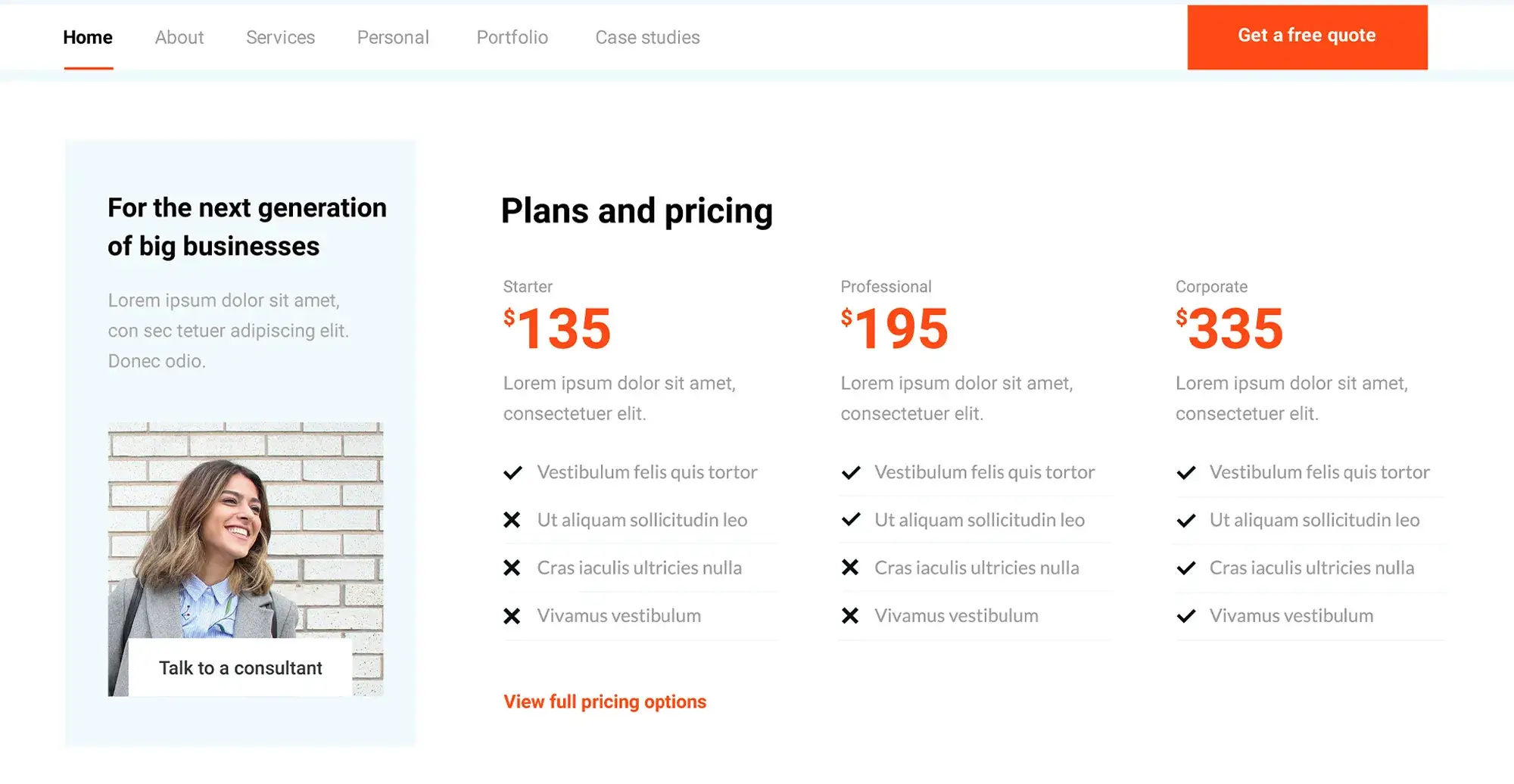
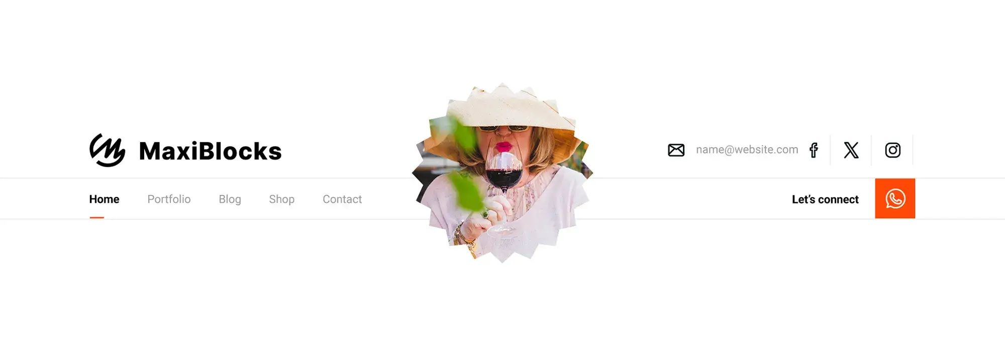
Header menus are typically horizontal and located at the top of a website. They’re the first element users interact with, making them important for first impressions. These menus are usually placed at the top centre or top right of a webpage and are easily visible when the site loads. Almost every website uses a header menu for its primary navigation, including corporate sites, e-commerce platforms, blogs, and educational sites.
Footer menus
Footer menus serve as a secondary navigation area, offering links to information not prioritised in the header menu, such as contact information, privacy policies, and social media links. They should be simple and not overwhelm the user with too many links. Footer menus often include items omitted from the main navigation, providing a second chance for users to find what they’re looking for without cluttering the primary navigation space.
Sidebar menus
Sidebar menus are versatile and used in blog layouts for categories and archives, in e-commerce sites for product categories, and various other needs. They can be made sticky (fixed on the page as the user scrolls) or collapsible, especially useful in responsive designs where screen space is limited. WordPress makes this easy with a drag-and-drop feature.
Dropdown menus
Dropdown menus expand from a main menu item to display sub-menu items, allowing for a clean, organised navigation structure that doesn’t overwhelm the user with choices upfront. They appear upon hover or click, providing a smooth navigation experience without navigating away from the current page. On mobile devices, dropdown menus often transform into accordion menus or integrate into the site’s hamburger menu for usability on smaller screens.
Mega menus
Mega menus are large dropdown menus that display multiple columns of links, organising a vast number of items under broad categories. They are ideal for e-commerce sites and large-scale websites, facilitating quick navigation across many sections or products and reducing the number of clicks needed to reach a destination. Design best practices include keeping the design clean and clear, using categories effectively, and ensuring the menu stands out visually from the rest of the page content.
Mobile navigation menus (hamburger menus)
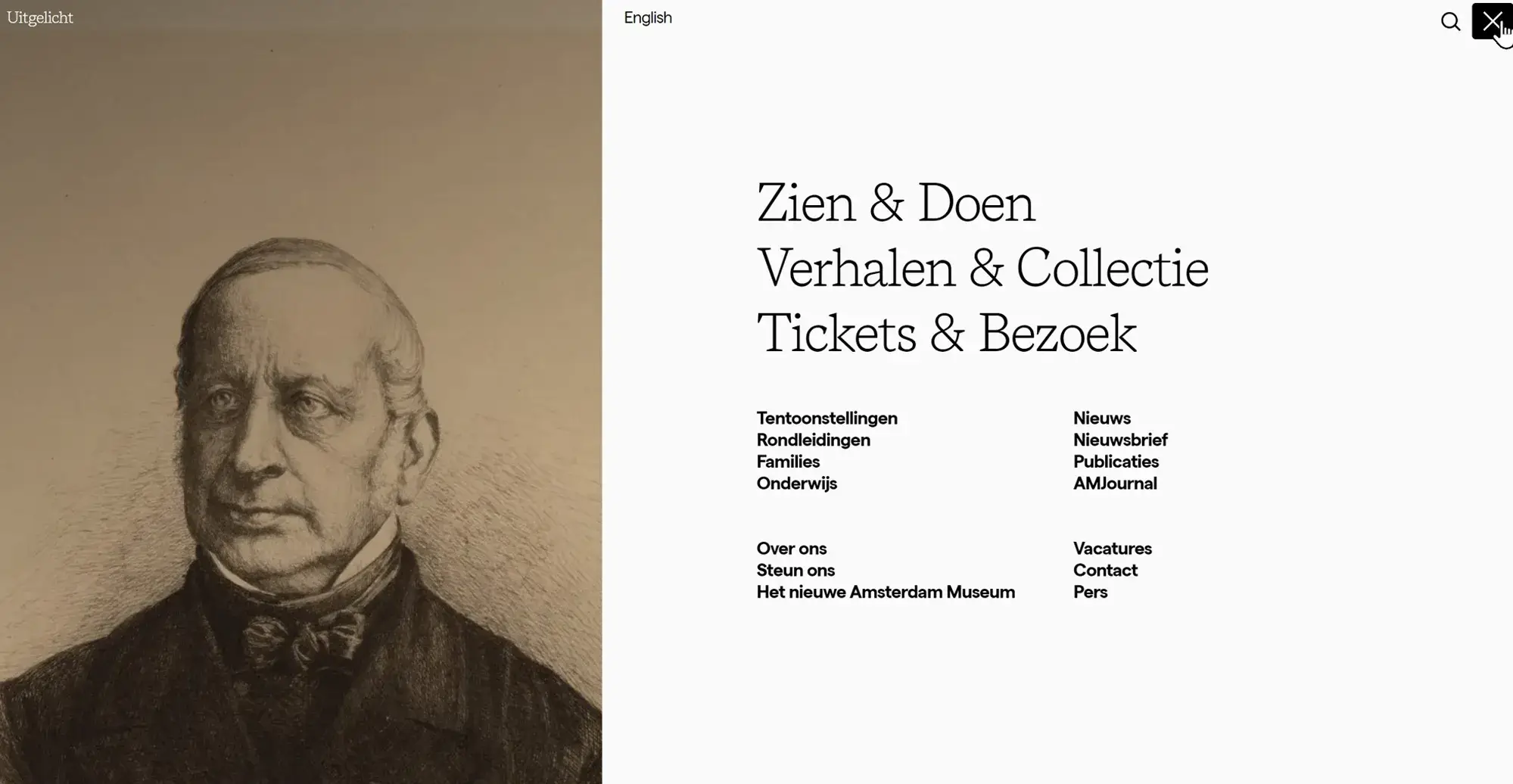
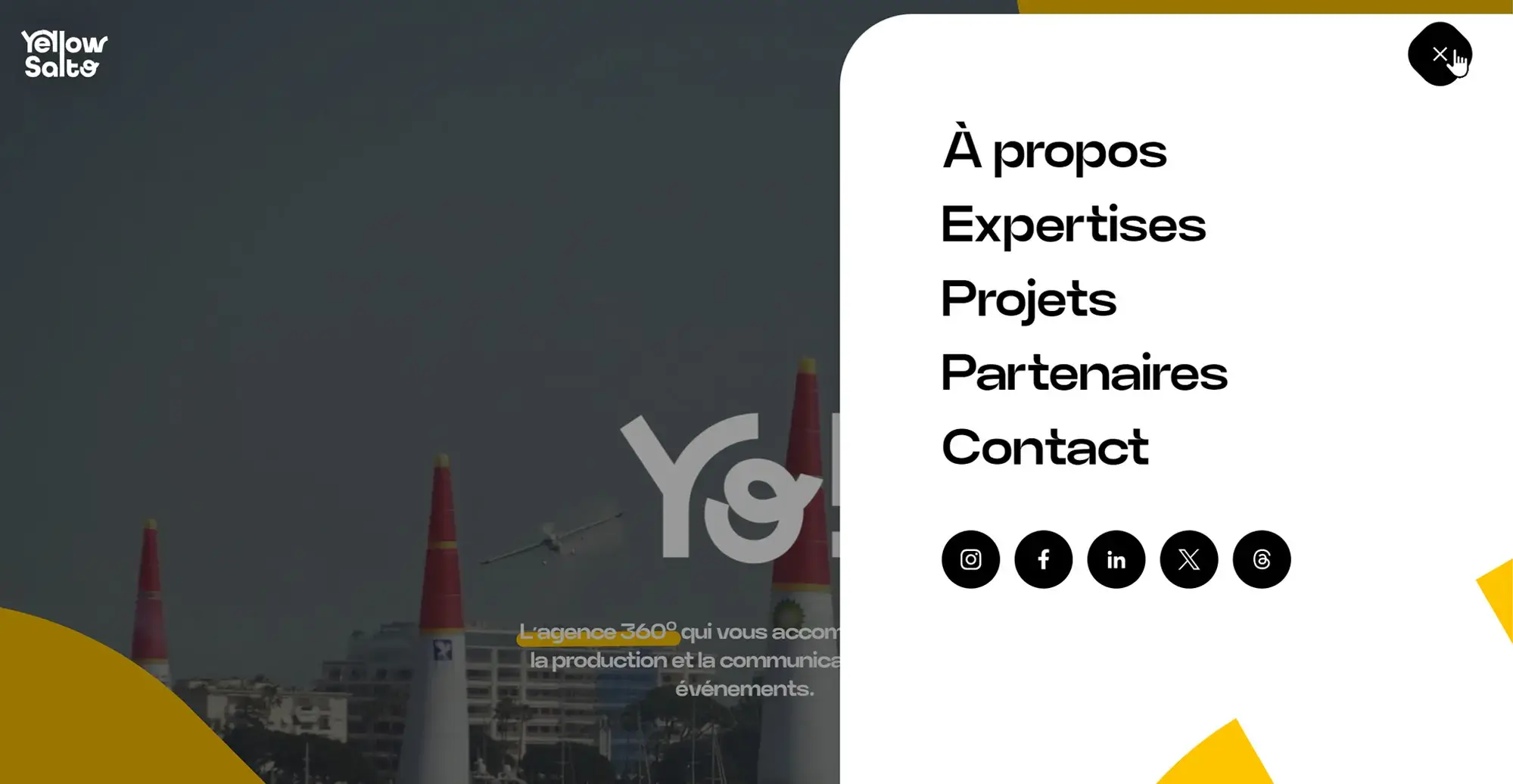
The hamburger menu (typically represented by three horizontal lines) has become a standard for mobile navigation. Tapping the hamburger icon reveals the site’s navigation menu, often as a full-screen overlay or a slide-in menu, allowing for a compact yet accessible navigation experience. Modern trends include animating the icon into a close (X) button once opened, using clear labels alongside icons for clarity, and considering the ease of reach for thumb navigation on larger devices.
Each type of navigation menu has its unique role and best practices for implementation. The choice of which to use depends on the website’s content, design, and user needs, often employing a combination of types for optimal navigation across different sections and devices.
The evolution of website navigation menus has paralleled broader trends in web design and technology, adapting to new user behaviours, devices, and design preferences.
From text-based to graphical user interfaces
In the early days of the internet, navigation was purely text-based, using hyperlinks within lines of text to guide users through websites. This approach was functional but limited in terms of design and user engagement. The introduction of graphical user interfaces (GUIs) marked a significant shift, allowing designers to use visual elements like buttons, icons, and tabs. This not only made navigation more intuitive but also opened up new possibilities for branding and visual design.
The rise of mobile-first design and its impact on menu structures
Before the widespread use of smartphones, websites were primarily designed for desktop viewing, with navigation menus designed to take advantage of wider screens. The explosion of mobile internet usage prompted a shift towards mobile-first design, prioritising the user experience on smaller screens. This led to the development of responsive design principles, where navigation menus became adaptable to various screen sizes. One of the most noticeable impacts was the adoption of the hamburger menu for mobile sites, conserving screen space while still providing access to the full site navigation.
Trends in animation, colour schemes, and interactivity
Subtle animations have become a popular way to enhance the user experience, guiding attention and providing feedback. For navigation menus, this might include smooth transitions, hover effects, and animated icons. The use of bold and distinctive colour schemes has become a way to make navigation elements stand out, contributing to the site’s overall look and enhancing usability. Interactive elements, such as mega menus that expand to reveal images or additional content, have become more common, making navigation a more engaging experience.
Predictions for future navigation menu trends
Voice-activated navigation: As voice recognition technology becomes more sophisticated, we might see an increase in voice-activated navigation options, allowing users to navigate websites without clicking or tapping.
Augmented reality (AR) and virtual reality (VR): As AR and VR technologies continue to develop, navigation menus may evolve to become more spatial, with users navigating through virtual spaces to access content.
AI-powered personalisation: Artificial intelligence could lead to navigation menus that adapt in real-time based on user behaviour, displaying the most relevant links or suggesting content based on past interactions.
Increased focus on accessibility: With growing awareness of the importance of web accessibility, future trends will likely include a stronger focus on making navigation menus usable for everyone, including those with disabilities. This could include better keyboard navigation, more consistent use of ARIA roles, and voice navigation support.
As technology continues to evolve, so too will the ways in which users interact with web content. Future navigation menu designs will likely continue to balance the need for innovation with usability and accessibility, ensuring that websites can be navigated easily by everyone.
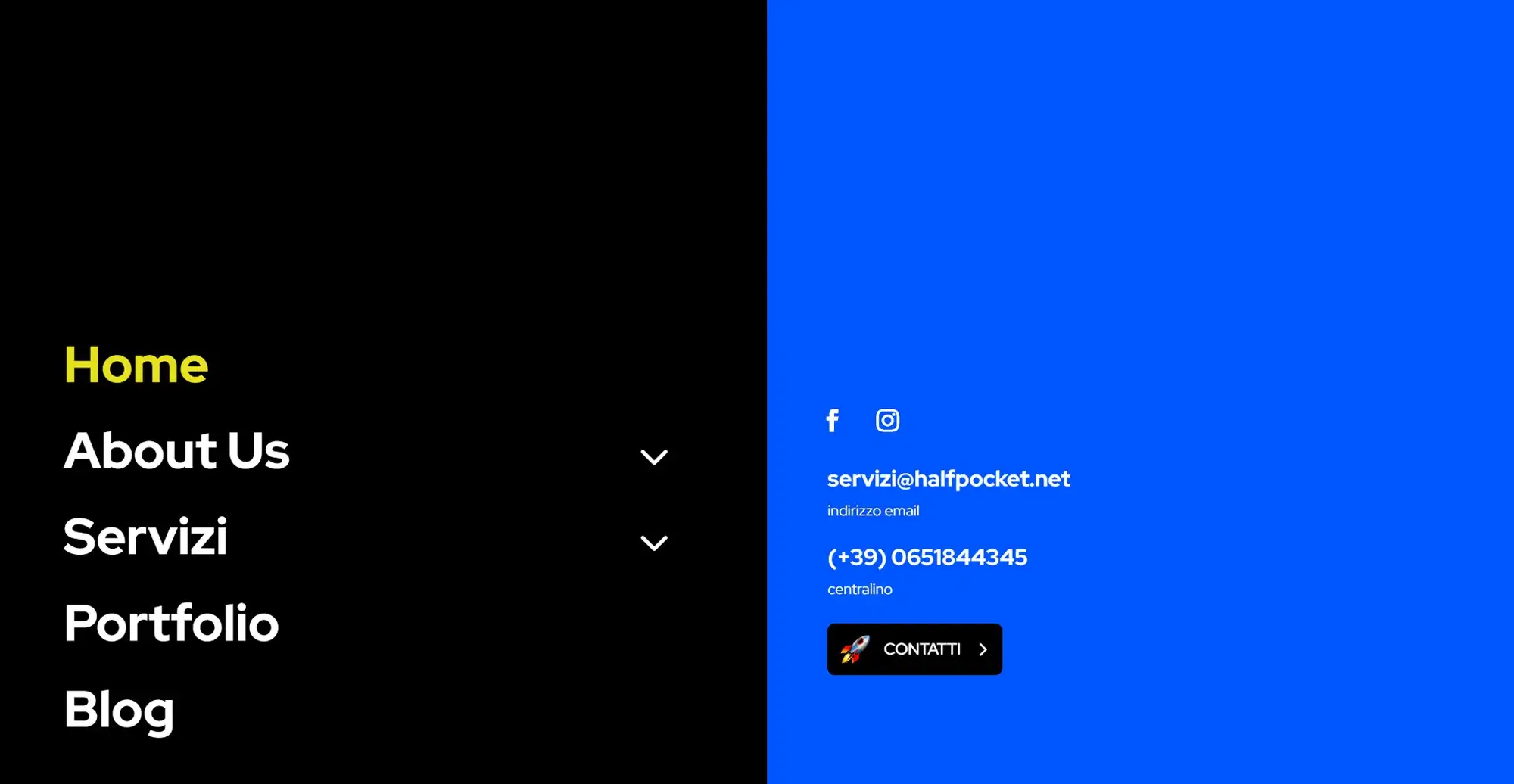
Creating visually appealing and coherent navigation menus for a positive user experience. Follow these styling tips, best practices for design, customization techniques using CSS and JavaScript, and readers may find some examples for inspiration.
Best practices for designing menus
Best practices for creating a clear and visually appealing menu include keeping the design consistent with the website’s overall theme and branding. A simple and uncluttered menu makes it easier for visitors to navigate without feeling overwhelmed. It helps to organise menu items in a way that highlights the most important links using different sizes or positions to guide attention. Adding subtle visual cues can also make frequently used options stand out. It is important to make sure the menu looks good and functions well on all devices, especially smaller screens like phones and tablets.
Tips on using CSS and JavaScript for customization
CSS is a useful tool for customising the look of navigation menus, allowing adjustments to colours, fonts, spacing, and hover effects to suit the overall design. Pseudo-classes can be used to add interactive feedback, such as highlighting menu items when hovered over. For more advanced interactivity, JavaScript can introduce dynamic elements like dropdowns or slide-in effects. Libraries such as jQuery offer plugins that make it easier to implement features like sticky headers or animated transitions, adding a polished touch without the need for extensive coding.
CSS Flexbox and Grid provide powerful layout control, helping to keep navigation menus responsive and organised. Flexbox is ideal for aligning menu items horizontally or vertically, while Grid is a great choice for more complex layouts, such as mega menus. Media queries in CSS allow further adjustments to the menu’s layout based on screen size, ensuring a mobile-friendly experience. This could include switching from a horizontal menu to a hamburger icon for smaller screens, improving usability on mobile devices.
Examples of well-styled WordPress navigation menus for inspiration
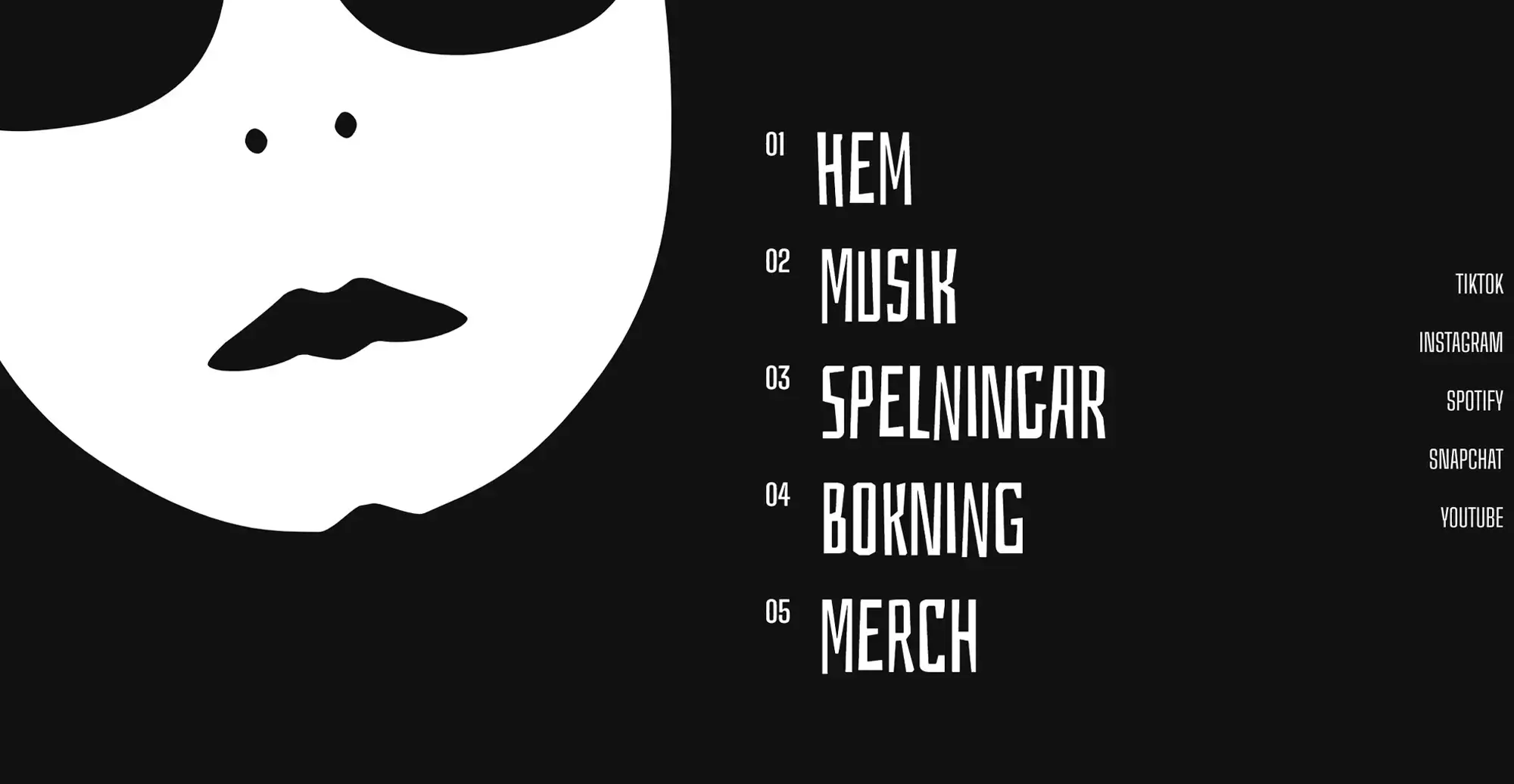
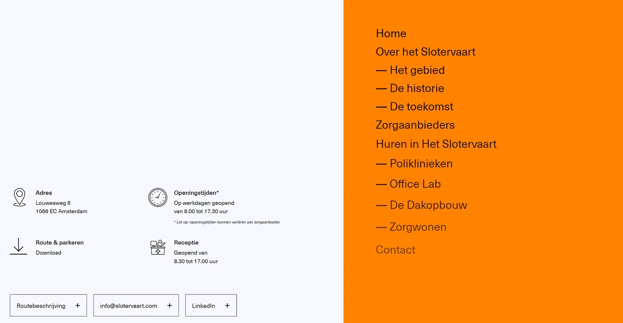
Minimalist designs in WordPress themes often focus on clean typography and well-spaced layouts to create sleek, user-friendly navigation menus. These menus typically feature simple lines, plenty of white space, and a neutral colour palette, making the site feel modern and sophisticated. By keeping the design simple, visitors can easily find what they need without unnecessary distractions, which is particularly useful for professional portfolios, blogs, and service-based websites.
Some websites take a bolder approach by using strong colour contrasts and distinctive fonts in their navigation menus. This method works well for brands aiming to stand out and leave a memorable impression. When done thoughtfully, unique fonts and colour choices can enhance brand personality and reinforce the overall visual style. However, it is important to maintain readability and avoid combinations that might make the menu hard to use or visually overwhelming.
Interactive elements, such as subtle animations or hover effects, can make navigation menus feel more dynamic and engaging. For example, hovering over a menu item might reveal extra details or change its appearance, encouraging visitors to explore further. E-commerce sites often use mega menus with images or icons to display product categories in an organised yet visually appealing way. For more creative sites, vertical navigation menus can offer a different browsing experience by sticking to the side of the page as users scroll, ensuring easy access to key links throughout the visit. By observing well-designed WordPress navigation menus, designers can gather ideas to create menus that are both stylish and practical, improving overall usability and user experience.
Common issues with WordPress navigation menus and their solutions
If a menu isn’t appearing, it’s worth checking if it has been correctly assigned to a menu location in WordPress. This can be done under Appearance > Menus > Manage Locations. If everything looks right but the issue remains, it may be theme-related. Switching to a default WordPress theme can help determine if the problem is with the theme itself. Broken dropdown menus are often caused by JavaScript errors, which can be identified using the browser’s developer tools. These errors are commonly linked to plugin conflicts or scripts added by the theme, so deactivating plugins one at a time can help pinpoint the issue.
Alignment problems in menus are usually caused by CSS conflicts. Using developer tools can highlight which CSS rules are causing misalignment, making it easier to adjust margins, padding, or flexbox properties to fix the layout. If the menu is too long for mobile screens, consider switching to a more mobile-friendly design, such as a hamburger menu. Media queries can also be used to adjust font sizes and spacing for smaller screens. Alternatively, using a vertical menu layout can help keep everything accessible and easy to navigate on mobile devices.
Debugging tips for menu responsiveness, alignment, and functionality problems
Browser developer tools, like those in Chrome and Firefox, are essential for debugging menu issues. The inspect feature allows the examination of the HTML structure and CSS properties, while the console highlights any JavaScript errors that may be affecting functionality. These tools make it easier to pinpoint exactly where things are going wrong. Plugin conflicts are another common cause of menu issues, especially when plugins load their own scripts or styles. Deactivating plugins one by one can help identify which one is causing the problem. Once identified, it may be necessary to find an alternative plugin or reach out to the developer for support.
Responsive design testing is key to ensuring menus work well across different devices. Tools like Google Chrome’s Device Toolbar simulate various screen sizes and resolutions, helping to spot breakpoints where menus may not display properly. This makes it easier to apply targeted CSS adjustments to fix any display issues. Caching can also interfere with updates to menus or CSS. Clearing the cache from any caching plugins, browser settings, or even the hosting provider’s cache often resolves this issue by ensuring the latest changes are displayed correctly.
Errors in HTML or CSS can also cause layout and functionality problems in navigation menus. Validators like the W3C Markup Validation Service help detect and correct coding errors. Additionally, if a premium theme is being used, checking the theme’s documentation can provide useful guidance on specific menu settings or known issues. Support forums and contact channels for the theme can also offer solutions tailored to the theme’s features. Troubleshooting navigation menus requires a mix of technical and design steps, but with a systematic approach, most issues can be resolved, resulting in a well-functioning and user-friendly menu.
Accessibility tips
Ensuring that all users, including those with disabilities, can use and navigate your website effectively. Here are essential guidelines and practical tips for enhancing accessibility in WordPress navigation menus.
Importance of making navigation menus accessible
Accessible navigation menus create a more inclusive web experience, allowing individuals with disabilities, such as visual impairments, motor difficulties, and cognitive disorders, to access content more easily. Features like keyboard navigation, focus indicators, and screen reader-friendly labels make it possible for users to browse menus without relying solely on a mouse or visual cues. Ensuring compliance with accessibility standards, such as the Web Content Accessibility Guidelines (WCAG), not only helps meet legal requirements in many regions but also improves overall usability for all visitors, regardless of their abilities. Accessibility considerations often result in cleaner, more intuitive designs, which can also enhance SEO performance and make the website more appealing to a wider audience. By prioritising accessibility, website creators can build a more welcoming and functional online space that benefits everyone.
Guidelines for keyboard navigation, screen reader compatibility, and ARIA roles
Keyboard navigation is essential for ensuring that menus are usable for those who cannot rely on a mouse or touchscreen. Users typically use the Tab key to move between menu items and press Enter or Space to make a selection. This makes the site more accessible for individuals with motor impairments and improves the browsing experience for power users who prefer keyboard shortcuts. It’s important to structure the menu so that the tabbing order follows a logical sequence, avoiding any confusing loops or skipped elements.
Screen reader compatibility is another key factor in building accessible menus. Using semantic HTML tags like <nav>, <ul>, <li>, and <a> helps screen readers understand the structure of the menu and relay it accurately to users. Clear, descriptive link text is vital, as screen reader users often rely on the link’s text to understand the destination or purpose without seeing the surrounding page context. Additionally, ARIA (Accessible Rich Internet Applications) roles and attributes can further improve accessibility, especially for more complex menus like those with dropdowns. Attributes such as aria-labelledby can associate menu items with their labels, while aria-expanded indicates whether submenus are open or closed. These small but important additions provide screen reader users with vital context, making navigation menus far more intuitive and user-friendly.
Practical tips for improving navigation menu accessibility in WordPress
Choosing an accessible theme is an important step in building an inclusive website. Themes designed with accessibility in mind often adhere to WCAG (Web Content Accessibility Guidelines) and may have passed WordPress’s accessibility-ready reviews. These themes prioritise proper HTML structure, contrast ratios, and keyboard-friendly navigation, making it easier to create a site that works for all users. For those using plugins to enhance navigation with features like dropdowns or mobile-friendly layouts, it’s important to select plugins that support accessibility features. Many plugins already consider keyboard navigation and screen reader compatibility, but it’s worth verifying these capabilities before adding them to a site.
When creating custom menus in WordPress, using the correct HTML structure ensures that the menu remains accessible for both keyboard navigation and screen readers. It’s crucial to ensure that any custom CSS or JavaScript added doesn’t interfere with these functions. Simple oversights, like hidden focus states or JavaScript that disrupts tabbing order, can make menus unusable for some visitors. Regular accessibility testing is essential to catch any issues. Tools like the WAVE Web Accessibility Evaluation Tool can provide automated checks, but manual testing with screen readers such as NVDA or VoiceOver and using only keyboard navigation can uncover issues that automated tools might miss.
Adding skip links can significantly improve the user experience for keyboard and screen reader users by allowing them to bypass long navigation menus and jump directly to the main content. These links are typically hidden but become visible when focused, making them a useful feature without cluttering the visual layout. Ultimately, making navigation menus accessible goes beyond meeting legal or ethical standards—it ensures that everyone, regardless of their abilities, can navigate and use the site effectively, providing an equal experience for all visitors.
WordPress plugins provide an effective way to extend and enhance navigation menus, offering advanced features and customisation options that go beyond what standard themes typically include. These plugins can introduce functionalities such as mega menus, sticky headers, or mobile-friendly toggles, allowing website designers to create more interactive and user-friendly menus without extensive coding. Popular plugins often come with pre-designed layouts and settings that simplify the customisation process, saving time while adding flexibility. However, while plugins can significantly enhance menu functionality, they can also introduce potential drawbacks, such as compatibility issues with themes or other plugins and additional page load times. Careful selection of well-maintained plugins and regular updates can help minimise these risks while maximising the benefits of a more feature-rich and versatile navigation system.
Popular WordPress plugins for enhancing navigation menus
Max Mega Menu is a plugin that enhances existing menus by transforming them into user-friendly, accessible, and touch-ready mega menus. It is particularly useful for websites with extensive navigation needs, such as e-commerce stores or large content sites that require organised subcategories and multiple menu levels. The plugin helps streamline complex navigation structures, making it easier for visitors to browse and find information efficiently.
UberMenu offers a highly customisable approach to mega menus, with advanced content and layout options such as columns, maps, images, and even forms embedded within the menu. It supports responsive design and mobile optimisation, ensuring menus look and function well on all devices. WP Responsive Menu focuses on improving mobile navigation by creating slide-out menus with swipe gesture support and custom styling options, all without needing to write any code. For a more modern, space-saving approach, Superfly Responsive Menu provides vertical push, sliding, and fullscreen menus with animation effects, background customisations, and flexible display triggers, making it a popular choice for creative websites.
Benefits of using plugins for menu customization
Plugins can significantly enhance menu functionality by adding advanced features that might not be available in standard themes. These can include mega menus that display categories and images, sticky menus that remain visible as users scroll, and interactive elements such as animations and icons to create a more engaging user experience. Features like these are particularly helpful for e-commerce websites or content-heavy sites where clear and detailed navigation is crucial. In addition to improving functionality, some plugins also support additional design elements, such as background images and section dividers, helping menus stand out while remaining organised.
Many menu plugins offer user-friendly interfaces, often featuring drag-and-drop builders that simplify the process of designing complex menus without requiring any coding skills. They also provide responsive design options, ensuring menus adapt to different screen sizes and devices, which is vital for maintaining a consistent experience across desktops, tablets, and mobile phones. Customisation options often include settings for fonts, colours, button styles, and even hover effects, allowing for precise branding that matches the overall site aesthetic. With these capabilities, plugins make it easy to create professional-looking menus that balance functionality and design, ensuring that navigation remains intuitive and visually appealing for visitors.
Potential drawbacks of using plugins for menu customization
Adding plugins to improve navigation menus can affect website performance, particularly if the plugins are poorly coded or if multiple plugins are used that load additional scripts and styles. This can increase load times, which may impact the user experience, especially on slower networks or mobile devices. To minimise this, it’s important to choose plugins that are optimised for performance and avoid installing unnecessary ones. Compatibility is another consideration, as some plugins may not work well with all themes or other plugins. This can lead to conflicts, styling issues, or broken menus that require troubleshooting and, in some cases, additional technical adjustments.
Some advanced menu plugins offer a wide range of features, but this can come with a steep learning curve, especially for beginners or those seeking simple solutions. It’s worth considering how much time will be needed to learn and customise the plugin before making a selection. Maintenance is also essential—plugins must be kept up to date to ensure compatibility with the latest version of WordPress website builder and to address any security vulnerabilities. Neglecting updates can leave a site exposed to security risks, such as outdated code or bugs that could be exploited. When selecting plugins, it’s important to choose well-reviewed options that are actively maintained and updated. Ensuring they suit the site’s design and functionality needs helps avoid issues that could affect the website’s performance or appearance.
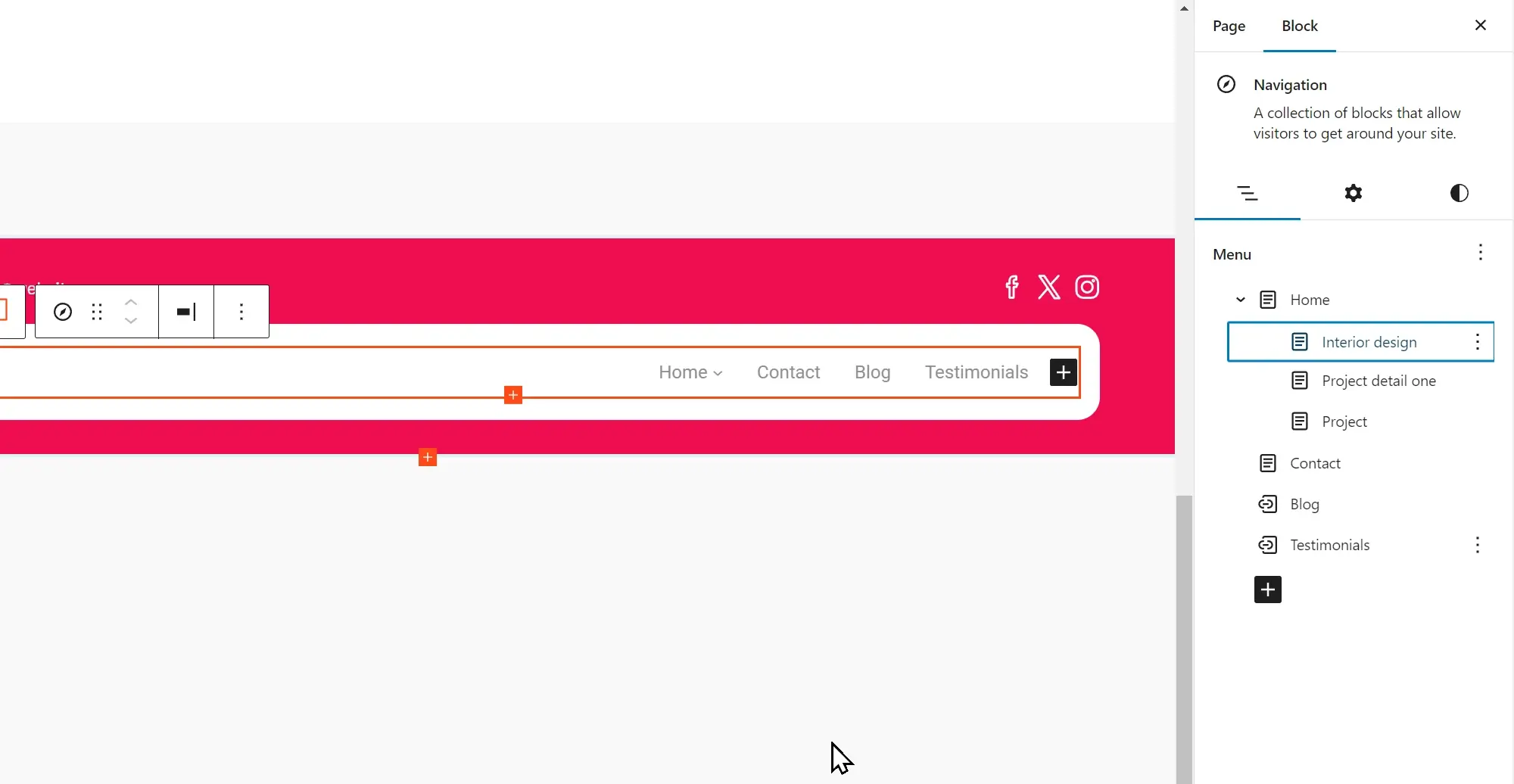
The choice between standard menus and mega menus in web design plays an important role in shaping navigation, user experience, and the overall appearance of a website. A comparison of these menu types, along with key factors to consider, can help determine the most suitable option for a WordPress site.
Comparison of standard and mega menus
Design
Standard menus: Typically simpler and more straightforward, standard menus feature a list of links arranged horizontally or vertically. They are clean, minimalist, and focus on direct access to primary sections of a website.
Mega menus: More complex and expansive, mega menus display multiple options through columns, images, icons, and sometimes even widgets. They showcase a wide range of content and sections at a glance, suitable for websites with extensive content categories.
User experience
Standard menus: Offer a quick and easy way to navigate websites with a smaller number of sections.
Mega menus: Provide immediate access to several subcategories and content areas from a single point, reducing the number of clicks needed to reach specific information. However, they can overwhelm users if not organized properly or if the menu is too crowded.
Suitability for different types of websites
Standard menus: Ideal for smaller websites, blogs, portfolios, and business sites with a limited number of pages or categories. They help maintain a clean and uncluttered look, focusing the user’s attention on a concise range of options.
Mega menus: Best suited for large e-commerce sites, news websites, educational platforms, and any site with a broad array of topics or products. They enable users to understand the site’s scope at a glance and directly access deep or nested content.
Decision factors in choosing between standard and mega menus for a WordPress site
When choosing between a standard menu and a mega menu, it’s important to consider how much content the site has and how it’s organised. Websites with a lot of sections or large product ranges may need a mega menu to keep everything easy to find. For smaller sites with fewer pages, a standard menu is often enough to keep navigation simple and clear.
It’s also worth thinking about what the site’s audience prefers. If visitors want quick access to different sections without extra clicks, a mega menu can make browsing easier by showing multiple options at once. On the other hand, if simplicity and a clutter-free design are priorities, a standard menu is often a better fit for creating a focused and easy-to-use layout.
The overall design style and usability of the site should also guide the choice. A standard menu works well for minimalist designs and smaller WordPress sites, while a mega menu suits more complex sites that need to display lots of information in one place. However, mega menus need to be well-organised to avoid overwhelming visitors. It’s also important to consider that mega menus can take longer to set up and may slow the site down if not optimised. By weighing content needs, audience preferences, and site performance, it’s easier to choose the right menu style for a user-friendly experience.
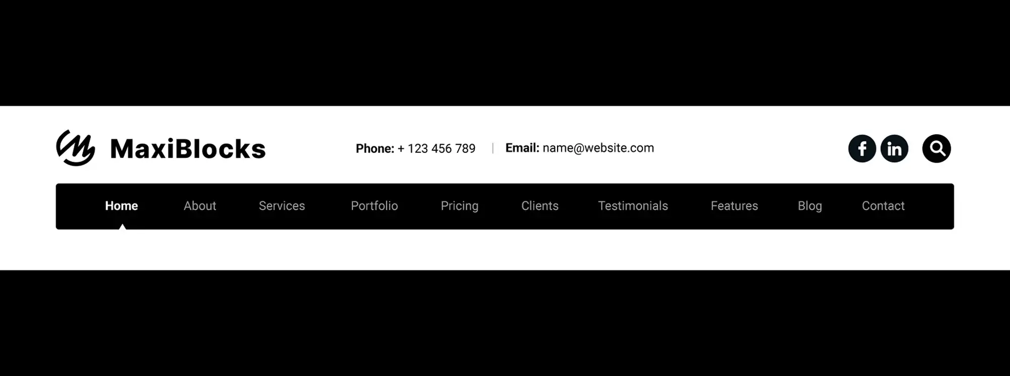
A good navigation menu does more than just link to your pages — it sets the tone for how visitors move around your site. If it’s confusing or cluttered, people leave. If it’s clear and easy to use, they stick around and explore. To help you get it right, here are the top 10 things to do (and avoid) when it comes to building and managing your navigation.
Do’s navigation menu design
Do: Keep it simple and intuitive
Don’t overthink it. People should know where to click without having to guess. Use plain language and a clean layout so visitors can find their way without friction.
Do: Use descriptive labels
Be clear about where each menu item leads. “Services,” “About,” and “Blog” are great examples. Avoid quirky names or inside jokes — they might make sense to you, but not to your visitors.
Do: Make it accessible
Not everyone navigates with a mouse. Your menu should work just as well for people using keyboards or screen readers. Use ARIA labels and check your tab order — it all adds up to a better experience for everyone.
Do: Test it on different devices
Menus should look and work great whether someone’s on a laptop, tablet or phone. Use responsive design so your menu doesn’t break or become unreadable on smaller screens.
Do: Prioritise your most important items
Put your key pages — like “Get a Quote,” “Shop,” or “Contact” — at the start or end of the menu. These positions get the most attention, so use them wisely.
Do: Stick with a limited colour palette
Don’t turn your menu into a rainbow. Keep colours simple and on-brand. A little contrast is helpful to show what’s clickable, but it shouldn’t distract from the content.
Do: Use visual hierarchy to guide the eye
Make your menu stand out with thoughtful spacing, sizing, and placement. It should be easy to find and even easier to read.
Do: Include a search bar (if your site is big)
If you’ve got lots of content, give users a way to skip the menu and just search. This small addition can make a huge difference in usability.
Do: Keep it consistent across the site
Your menu shouldn’t jump around or change from page to page. Stick with the same structure and design sitewide so users don’t get lost.
Do: Review and update it regularly
As your site grows, your menu should evolve with it. Make it a habit to check and adjust your navigation every so often based on new content or how people are actually using it.
Don’ts navigation menu design
Don’t: Overload the menu
Too many links just overwhelm people. Keep your main menu focused — less really is more.
Don’t: Use jargon or clever labels
Avoid using internal terms or creative wordplay. Visitors shouldn’t have to guess what a link means.
Don’t: Ignore mobile users
Menus built for desktop only are a pain on phones. Make sure yours works just as well on a small screen as it does on a big one.
Don’t: Skip hover and focus states
When people hover over or tab through your menu, there should be some visual feedback. A simple highlight or underline is enough to let them know what’s interactive.
Don’t: Mix up your styling
Stick to one style. Using different fonts, colours, or layouts in your menu can look messy and hurt your brand.
Don’t: Arrange items randomly
There should be a clear order based on importance or logic — not just what you added last. Think about how people look for information and group things that belong together.
Don’t: Forget to test and listen to feedback
User testing is your friend. It shows you what’s working and what’s not. Don’t wait for complaints — check in regularly and make improvements based on what real users experience.
Don’t: Make it hard to return to the homepage
People expect your logo to link back to the homepage. If it doesn’t, you’re breaking one of the web’s most basic rules.
Don’t: Rely only on dropdown menus
Dropdowns are helpful, but they’re not always easy to use — especially on mobile. Make sure your menu still works even if someone doesn’t open a submenu.
Don’t: Treat the menu as an afterthought
Your menu isn’t just another design element — it’s how people move through your site. Make sure it reflects your site’s purpose and helps guide users to where you want them to go.
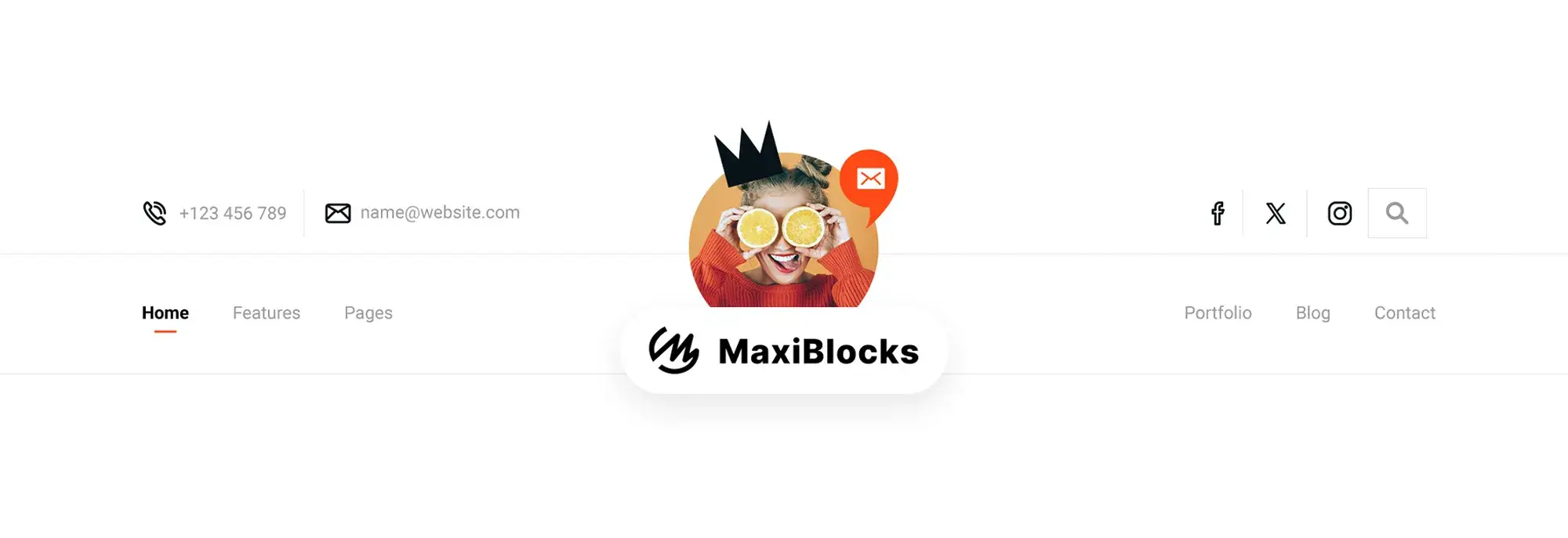
Creating and customising navigation menus in WordPress is a simple process that can improve both the usability and appearance of a website. The following tutorial outlines the steps for building a functional and visually appealing navigation menu.
- Accessing the WordPress menu editor Log in to the WordPress dashboard. Navigate to Appearance > Menus. This is the main hub for creating and managing menus.
- Adding, organising, and removing menu items
- Creating a new menu: Click on “Create a new menu” at the top of the page. Enter a name for the menu in the Menu Name box and click “Create Menu.”
- Adding items: On the left-hand side, there are boxes listing the website’s content, such as pages, posts, categories, and custom links. To add an item, check the box beside it and click “Add to Menu.”
- Organising items: Drag and drop menu items to rearrange their order. To create a dropdown menu, drag a menu item slightly to the right of another item to make it a sub-item.
- Removing items: Click the arrow next to a menu item to expand it, then click “Remove” to delete it from the menu.
Customising menu settings for display locations
Below the WordPress navigation menu items, the Menu Settings section allows menus to be assigned to different locations. These locations vary depending on the theme and may include options such as Primary Menu and Footer Menu. Check the boxes next to the desired locations and click “Save Menu” to apply the changes.
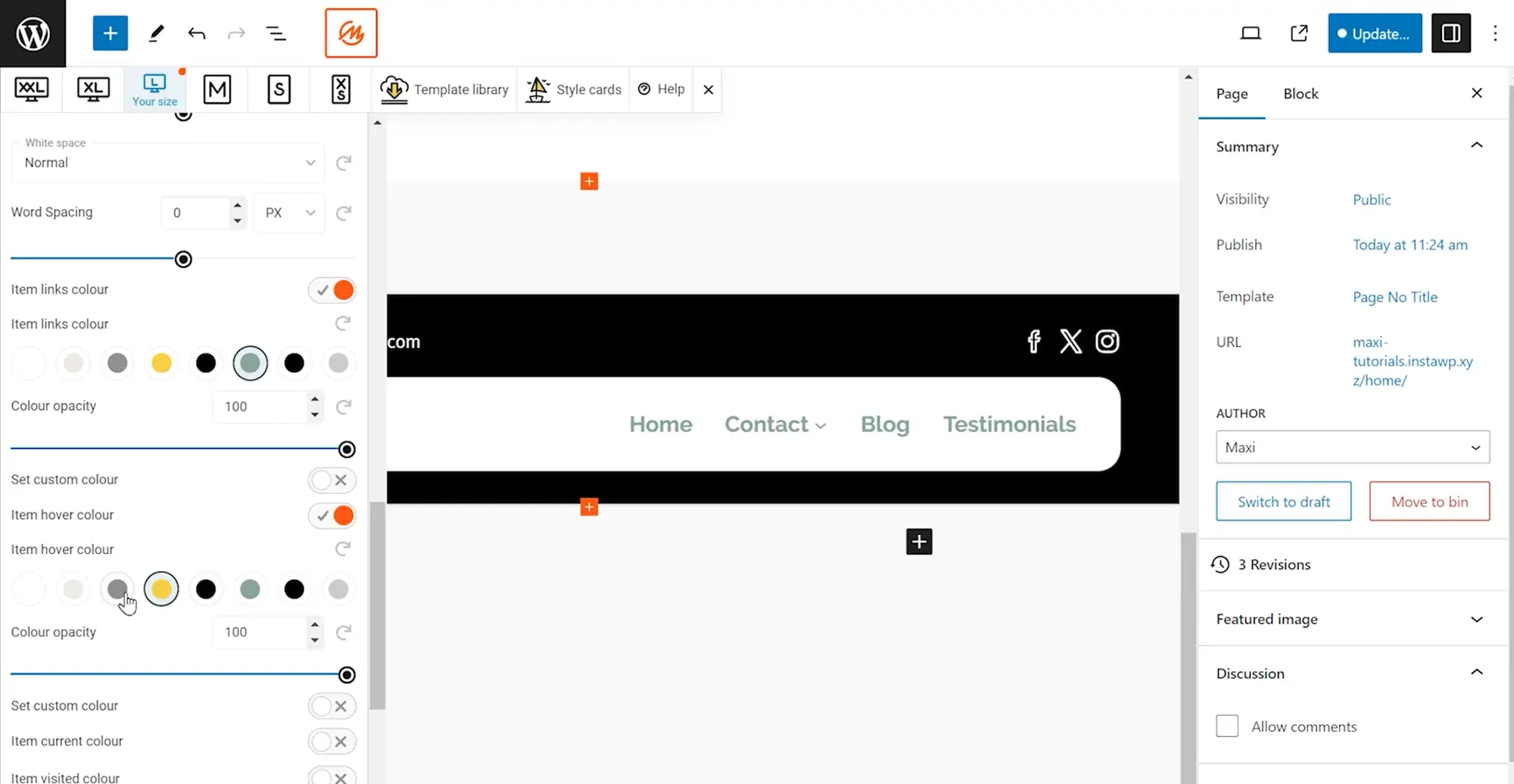
Final thought on navigation menus in WordPress
Navigation menus are a big part of how people use your site. They help users find their way around and can make your site feel polished and easy to use. Whether you’re going for something simple or adding mega menus, the way you set up your navigation really shapes the user experience. Throughout this guide, we’ve gone over different menu types, tips for better design, accessibility, and how to manage everything directly in WordPress.
What are WordPress navigation menus?
They’re menus you create to help people find pages on your site. You can include links to pages, blog posts, categories, or even custom links.
How do I create WordPress navigation menus?
Go to your WordPress dashboard, then click Appearance > Menus. From there, you can create a menu, add your items, organise them how you want, and assign the menu to your site’s main navigation area.
Can I customise the look of WordPress navigation menus?
Yes, you can use the Customiser (under Appearance > Customise) to change colours, fonts, and layout. If you want more control, you can add custom CSS or use a plugin.
How can I add custom links to WordPress navigation menus?
In the menu editor, look for the “Custom Links” section. Paste in a URL and give it a name, then click Add to Menu.
Are there plugins that can improve WordPress navigation menus?
Yes, there are plenty. Max Mega Menu, WP Mega Menu, and UberMenu are good options for adding advanced features and design tools.
How do I organise items in WordPress navigation menus?
Just drag and drop the items into the order you want. You can also drag one item under another to make it a dropdown or submenu.
How can I add icons to WordPress navigation menus?
Use a plugin like Menu Icons by ThemeIsle. It lets you add icons to each menu item from right inside the editor.
Can I have different menus on different pages?
Yes, with a plugin like Conditional Menus, you can set up different menus depending on the page someone’s on.
How do I create dropdown menus?
Add your main items first, then drag others slightly to the right underneath them. That will turn them into sub-items and make them appear as dropdowns.
How can I include categories in a menu?
In the menu editor, find the “Categories” box. Check the ones you want and click Add to Menu.
What is a website navigation menu?
It’s a list of links that helps visitors get around your website. It’s usually at the top or on the side and includes links like Home, About, or Contact.
What’s the difference between navigation and a menu?
Navigation is the overall system of moving through your site. A menu is the actual list of links used to do that.
What is a menu used for in WordPress?
It’s used to organise and show links that help people get around your website easily.
How do I access the menu editor in WordPress?
Log in to your dashboard, go to Appearance > Menus, and that’s where you can create and manage your menus.
Further resources
To continue learning and improving your WordPress navigation menus, here are some valuable resources for additional reading and tutorials:
- WordPress Codex and Developer Resources: The WordPress Codex offers comprehensive guides on menu management and theme development, while the WordPress Developer Resources provide in-depth documentation on coding standards and APIs for more advanced customization.
- WPBeginner: A leading resource for WordPress beginners, WPBeginner features tutorials, tips, and how-tos on enhancing WordPress functionality, including navigation menus.
- Smashing Magazine: Known for its high-quality articles on web design and development, Smashing Magazine publishes tutorials and case studies on WordPress development that often cover navigation and UI/UX best practices.
- W3Schools: For brushing up on HTML, CSS, and JavaScript, which are for customizing menus beyond WordPress defaults, W3Schools offers easy-to-follow tutorials and examples.
- WordPress Support Forums: The WordPress Support Forums are a great place to ask questions and share knowledge about navigation menu customization and other WordPress-related topics.
WordPress itself
Official Website
wordpress.org – This is the official website for WordPress, where you can download the software, find documentation, and learn more about using it.
WordPress Codex
codex.wordpress.org/Main_Page – This is a comprehensive documentation resource for WordPress, covering everything from installation and configuration to specific functionality and troubleshooting.
WordPress Theme Directory
wordpress.org/themes – The official WordPress theme directory is a great place to find free and premium WordPress themes. You can browse themes by category, feature, and popularity.
maxiblocks.com/go/help-desk
maxiblocks.com/pro-library
www.youtube.com/@maxiblocks
twitter.com/maxiblocks
linkedin.com/company/maxi-blocks
github.com/orgs/maxi-blocks
wordpress.org/plugins/maxi-blocks