Try MaxiBlocks for free with 500+ library assets including basic templates. No account required. Free WordPress page builder, theme and updates included.

Innovative WordPress navigation focuses on creating menus that are easy to use, visually clear, and responsive across all devices. This can include sticky headers, vertical layouts, or off-canvas menus for mobile. The goal is to keep navigation intuitive and aligned with the site’s overall design, so users can move through the content smoothly.
Updated 15 May 2025
Let’s be real when was the last time you stuck around on a website where you couldn’t find anything? Exactly. Navigation is one of the most underrated tools in user experience. It’s the roadmap that tells people where to go, how to get there, and what to do next.
And the good news? WordPress has evolved a lot, especially with the block editor and new tools like the Navigation Block. Now, it’s easier than ever to create menus that not only look good but actually help people enjoy using your site.
What’s the Navigation Block?
If you haven’t played with it yet, the Navigation Block is like giving your old menu a major upgrade. It’s part of the WordPress block editor, which means you can literally drag and drop your menus into place no code, no stress.
What makes it better?
- You can move things around visually, not just in a list.
- Menus aren’t limited to links anymore you can toss in buttons, search fields, or even logos.
- Submenus? Super simple. Just nest them like building blocks.
- And yes, it works on mobile out of the box.
Use case: A design agency wanted their menu to include a “Get a Quote” button and a small logo, without breaking the layout. The Navigation Block made that super simple with no plugin needed.
Subscribe to our newsletter
Global navigation
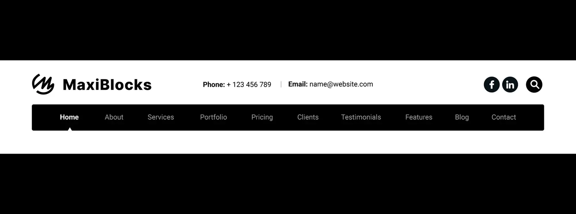
This is the main menu is usually at the top. Think: Home, About, Services, Contact. It should be short, sharp, and always visible.
Tip: Keep it to 5–7 items max. You want it easy to scan.
Contextual or hierarchical navigation
Menus that change based on where you are on the site. If someone’s browsing your blog, maybe they see categories. If they’re in your shop, they get product filters.
Use case: An online magazine added a category-specific sidebar menu to help readers jump between tech, lifestyle, and opinion pieces without going back to the homepage.
Footer navigation
Footer menus don’t get enough love. They’re like the safety net there when users scroll all the way down and want to keep exploring.
Tip: Add legal links, social media, maybe even a mini sitemap. Give people options when they’re at the end of the page.
Sidebar navigation
Still useful, especially for long-form content like docs or tutorials.
Tip: Keep it sticky if the content scrolls a lot. It saves users from having to scroll up and down constantly.
Best practices to follow
Let’s talk strategy. A pretty menu is great, but a smart menu is better.
Keep it clean and focused
Nobody wants to read a novel in the menu. Use clear labels like “About,” not “Learn Our Story.”
Tip: Don’t make users think. Say exactly what the page is.
Put things where people expect them
Header for your main links. Footer for the basics. Don’t try to reinvent the wheel unless you have a strong reason.
Tip: If you’re not sure where to put something, think: where would I look for it as a visitor?
Create a visual hierarchy
Use font sizes, colours, and spacing to guide the eye.
Use case: A nonprofit added icons next to their primary links (“Donate,” “Volunteer”) to make them stand out visually and their click-through rate went up 18%.
Design for mobile first
More than half of your visitors are probably on their phones.
Tip: Use a hamburger menu or off-canvas layout. Make tap targets big enough and leave room for fingers.
Build like a pro
Tools you can use in WordPress
Classic menus (Appearance > Menus)
Still around and still useful, especially if you’re using older themes. Great for people who prefer the old-school way of managing things.
The Site Editor + Navigation Block
If you’re using a block-based theme, this is your best bet. It’s visual, flexible, and future-proof.
Tip: You can even create different headers for different templates (like a landing page with no menu at all).

Minimalist, hidden menus
Use a hamburger icon to hide the menu until someone clicks. It keeps your design clean and distraction-free.
Use case: A creative portfolio used a full-screen hidden menu to keep the focus on artwork. When the user clicked the icon, the menu slid in with smooth animation.
Tip: Use animation wisely too much, and it feels slow.
Vertical menus for standout designs
Vertical navigation can look slick especially on portfolio sites or agency pages.
Tip: Works best when the content is centered or the layout is asymmetric. Avoid if you have lots of horizontal scrolling.
Full-screen overlays
Bold, immersive, and great for visual storytelling. Just make sure the content behind the overlay isn’t crucial because it’ll be hidden while the menu is open.
Don’t sleep on footer navigation
Footers menus are underrated but incredibly powerful.
- Repeat top menu links
- Add links that didn’t fit in the header
- Include helpful extras: support, docs, FAQs
- Embed social links or mini CTAs
Tip: Think of your footer as a secondary home page for serious users who scroll all the way down.
Here’s the thing: good navigation doesn’t just help users it makes your whole site feel more trustworthy, professional, and easy to use. And in WordPress, you have the tools to do it without needing a developer.
Whether you’re keeping it simple or going all-in with mega menus, the goal is the same: help your visitors get where they want to go, fast.
So build your menus with intention. Keep testing. And remember if your users feel lost, they won’t stay long.
Discover how to create clear, responsive, and stylish WordPress menus with expert tips and resources.
What are hidden menus, and why use them in WordPress websites?
Hidden menus, often represented by a hamburger icon, are used to conserve space and maintain a clean, minimalist website design. They become visible upon interaction, making them ideal for WordPress websites aiming for a sleek and modern aesthetic.
How do interactive mega menus enhance user engagement?
Interactive mega menus offer a dynamic user experience by incorporating images, animations, and featured products. They engage users by providing a visually rich and organized overview of the site’s content, particularly beneficial for WordPress e-commerce sites and content-heavy platforms.
Why consider vertical navigation for your WordPress site?
Vertical navigation offers a unique layout that stands out from the conventional horizontal menus. It’s especially suited for creative portfolios and blogs, providing a distinctive user experience and improved mobile usability.
What makes full-screen overlays a bold navigation choice?
Full-screen overlays capture the user’s full attention by covering the screen with the navigation menu, creating a bold and immersive experience. This approach is effective for sites focusing on visual impact, such as photography portfolios or design showcases.
How can footer navigation improve user discovery on WordPress sites?
Expansive footer navigation utilizes the often-overlooked space at the bottom of web pages, guiding users to additional content, social media links, and important site information. It encourages further exploration and enhances the overall user experience.
Are hidden menus suitable for all types of WordPress websites?
While hidden menus offer a minimalist aesthetic, they may not be suitable for all websites. Sites with a broad audience, including users who may not be familiar with this design pattern, could find it less intuitive. Consider your audience’s needs and preferences when choosing your navigation style.
Can mega menus affect website loading times?
If not properly optimized, mega menus with images and animations can impact website loading times. It’s crucial to optimize media files and consider lazy loading techniques to maintain fast loading times for your WordPress site.
What is navigation for modern WordPress?
Navigation for modern WordPress refers to the advanced and user-friendly navigation menus and systems that are designed to enhance the user experience on WordPress websites. These include features like responsive design, mega menus, and interactive elements that work seamlessly across all devices.
How do I create navigation for modern WordPress?
To create navigation for modern WordPress, use the block editor or page builder plugins like Elementor or Beaver Builder. These tools provide advanced features to design and customize navigation menus with ease. You can also use modern themes that offer built-in navigation options.
What plugins can improve navigation for modern WordPress?
Plugins like Max Mega Menu, WP Mega Menu, and UberMenu can significantly improve navigation for modern WordPress. These plugins offer advanced features such as mega menus, dropdowns, and customizable styling options to enhance your site’s navigation.
How do I make navigation for modern WordPress responsive?
To make navigation for modern WordPress responsive, ensure your theme supports responsive design and use plugins or menu systems that automatically adjust to different screen sizes. Many modern themes and plugins come with built-in responsive navigation options.
Can I add icons to navigation for modern WordPress?
Yes, you can add icons to navigation for modern WordPress using plugins like Menu Icons or Font Awesome. These plugins allow you to easily integrate icons into your menu items, enhancing the visual appeal and functionality of your navigation.
How do I style navigation for modern WordPress?
To style navigation for modern WordPress, use the WordPress Customizer under Appearance > Customize or a page builder plugin. You can apply custom CSS to change colors, fonts, sizes, and other design elements, or use a plugin that offers advanced styling options for menus.
How do I add a mega menu to navigation for modern WordPress?
To add a mega menu to navigation for modern WordPress, use a plugin like Max Mega Menu or UberMenu. These plugins provide features to create large, multi-column menus that can include images, videos, and other interactive elements, enhancing your site’s navigation.
How do I create a one-page navigation for modern WordPress?
To create a one-page navigation for modern WordPress, use a theme or plugin that supports one-page design. You can create anchor links within your page content that correspond to menu items, allowing users to smoothly scroll to different sections of the same page.
What themes support navigation for modern WordPress?
Many modern themes support advanced navigation features, including Astra, OceanWP, and Divi. These themes offer extensive customization options and are designed to work seamlessly with modern plugins and systems.
How do I customize navigation buttons for modern WordPress?
To customize navigation buttons for modern WordPress, use the WordPress Customizer or a page builder plugin to access button settings. You can adjust the appearance of buttons by changing colours, sizes, padding, and hover effects using custom CSS or the plugin’s built-in options.
How do you ensure vertical navigation is responsive on mobile devices?
To ensure vertical navigation is responsive, use CSS and WordPress themes designed to adapt to various screen sizes. Testing on different devices and using touch-friendly design elements are key to achieving a seamless mobile experience.
What are the best practices for designing full-screen overlays?
Best practices include ensuring easy access to close the overlay, optimizing for speed to prevent delays in menu display, and maintaining focus on the menu options to not overwhelm users with too much information at once.
How frequently should footer navigation be updated?
Footer navigation should be reviewed and updated regularly to reflect changes in your site’s structure, content updates, and user engagement metrics. Keeping footer links relevant and organized contributes to a better user experience and site usability.
WordPress itself
Official Website
wordpress.org – This is the official website for WordPress, where you can download the software, find documentation, and learn more about using it.
WordPress Codex
codex.wordpress.org/Main_Page – This is a comprehensive documentation resource for WordPress, covering everything from installation and configuration to specific functionality and troubleshooting.
WordPress Theme Directory
wordpress.org/themes – The official WordPress theme directory is a great place to find free and premium WordPress themes. You can browse themes by category, feature, and popularity.
maxiblocks.com/go/help-desk
maxiblocks.com/pro-library
www.youtube.com/@maxiblocks
twitter.com/maxiblocks
linkedin.com/company/maxi-blocks
github.com/orgs/maxi-blocks
wordpress.org/plugins/maxi-blocks

Kyra Pieterse
Author
Kyra is the co-founder and creative lead of MaxiBlocks, an open-source page builder for WordPress Gutenberg.
You may also like

