History of WordPress websites: evolution in design & development
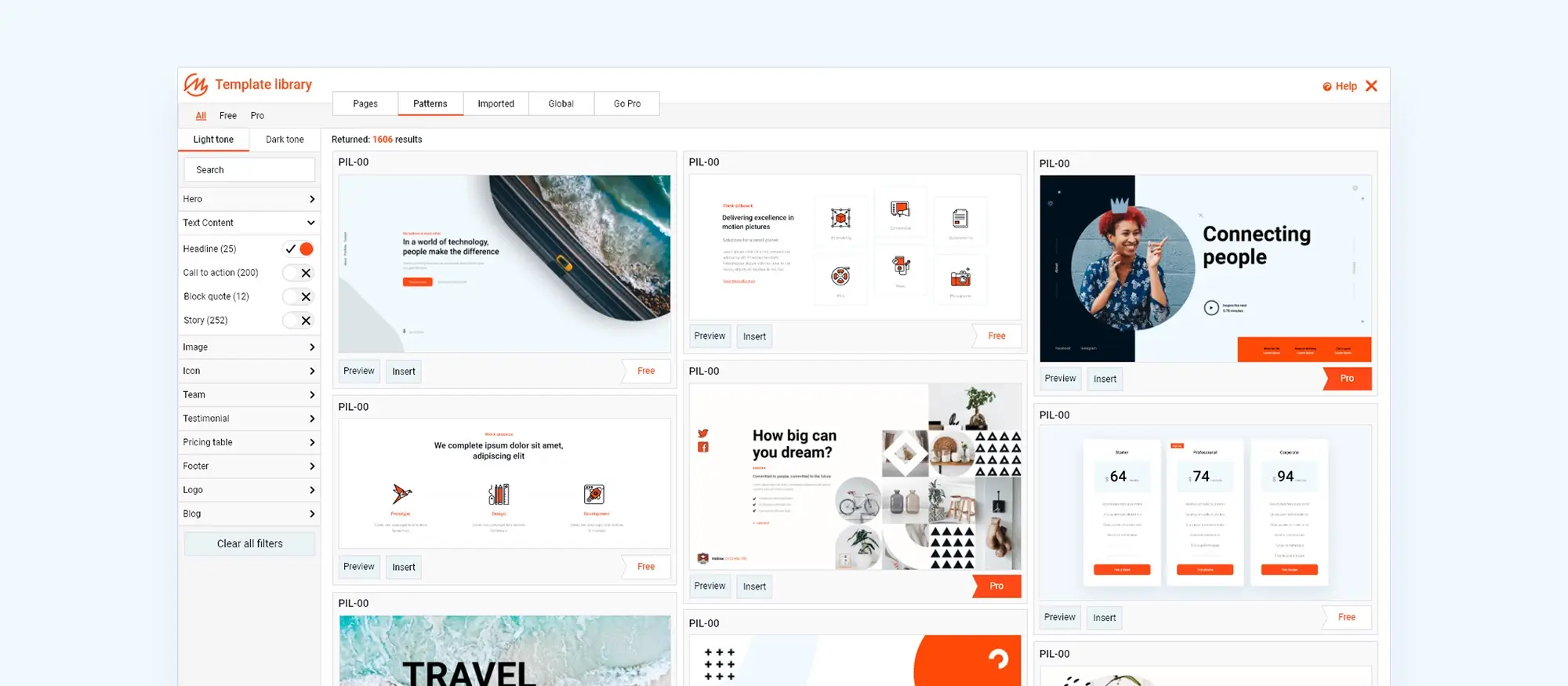
Try MaxiBlocks for free with 500+ library assets including basic templates. No account required. Free WordPress page builder, theme and updates included.
WordPress websites – A look at the past and a glance at the future
Those humans who’ve been navigating life for a few decades might recall “Happy Together” by The Turtles, an iconic song of the late 1960’s. The sentiment of “me and you, and you and me” perfectly reflects the intertwined relationship between web design and WordPress today. However, this relationship wasn’t always the case. Let’s take a quick turn through the history of WordPress and its effect on web design, exploring the development of WordPress and the evolution of web design, and uncovering how these two forces converged to become the powerful partnership as seen today.
Early days of web design
The story of web design from 1991, when Tim Berners‑Lee published the first site at info.cern.ch, to today is nothing short of remarkable. Whereas print—dating back to 1450 with Gutenberg’s functional printing machine—took centuries to mature, web design galloped through a few decades to reach its current sophistication. Early sites were built with tables everywhere and optimised for dial‑up connections, making lightweight pages essential for quick downloads.
Today, websites adapt seamlessly to any device and are packed with engaging animations, videos, images and colours. For a glimpse of how modern design is shaping the web in 2024, explore the MaxiBlocks library of pre‑made components and page templates. Its six breakpoints for responsive layouts place it at the forefront of contemporary web design.
Web design is no longer just about appearance; it’s about delivering a friction free experience. Remember those first cookie‑consent pop‑ups that practically shouted at you? Now they’re a normal part of browsing. The evolution of web design in such a short time has been truly extraordinary.
Main trends in WordPress website development and web design
Here are some interesting trends and developments of both WordPress and web design leading to a mutually beneficial marriage eventually. 21 years of WordPress are explored more fully in this article as well as a look at some of the technology that has been instrumental in adding momentum to where websites are now.
From fancy buttons to flat design: This section explores how website design styles have changed to better suit user preferences. Remember those websites where everything looked like a physical object, like buttons that mimicked wood grain? That trend has faded away. Today, clean and simple designs are more popular.
Mobile takes centre stage: This is most probably the shift that affected web design the most. Responsive design automatically adjusts website pages to fit screen sizes whether viewed on smartphone, tablet, computer or TVs. No more zooming in and out to read tiny text.
A WordPress web design history
Making websites user-friendly: In the past, websites could be confusing with navigation anything but clear to follow. Designers now use special techniques to make websites easier to use. This focus on “user experience” has completely transformed the way visitors interact with websites. It has also placed a much more important focus on making websites accessible. Not only is this benefitting disabled users but is also hugely important for the ageing population to easily access the information on websites.
Democratising web design: the impact of WordPress: Prior to WordPress, a Content Management System (CMS), creating a website required technical knowledge of coding languages like HTML and CSS. This barrier limited web design to programmers and professionals. The focus by developers rather than designers was represented in the design of websites at the turn of the century.
WordPress emerged as a game-changer: Its user-friendly interface and extensive plugin ecosystem allowed anyone, regardless of technical background, to build and manage their own website. This accessibility sparked a surge in web design popularity, allowing and encouraging individuals and businesses to establish an online presence without needing extensive coding expertise.
The start of the web design journey – late 1990’s early 2000s
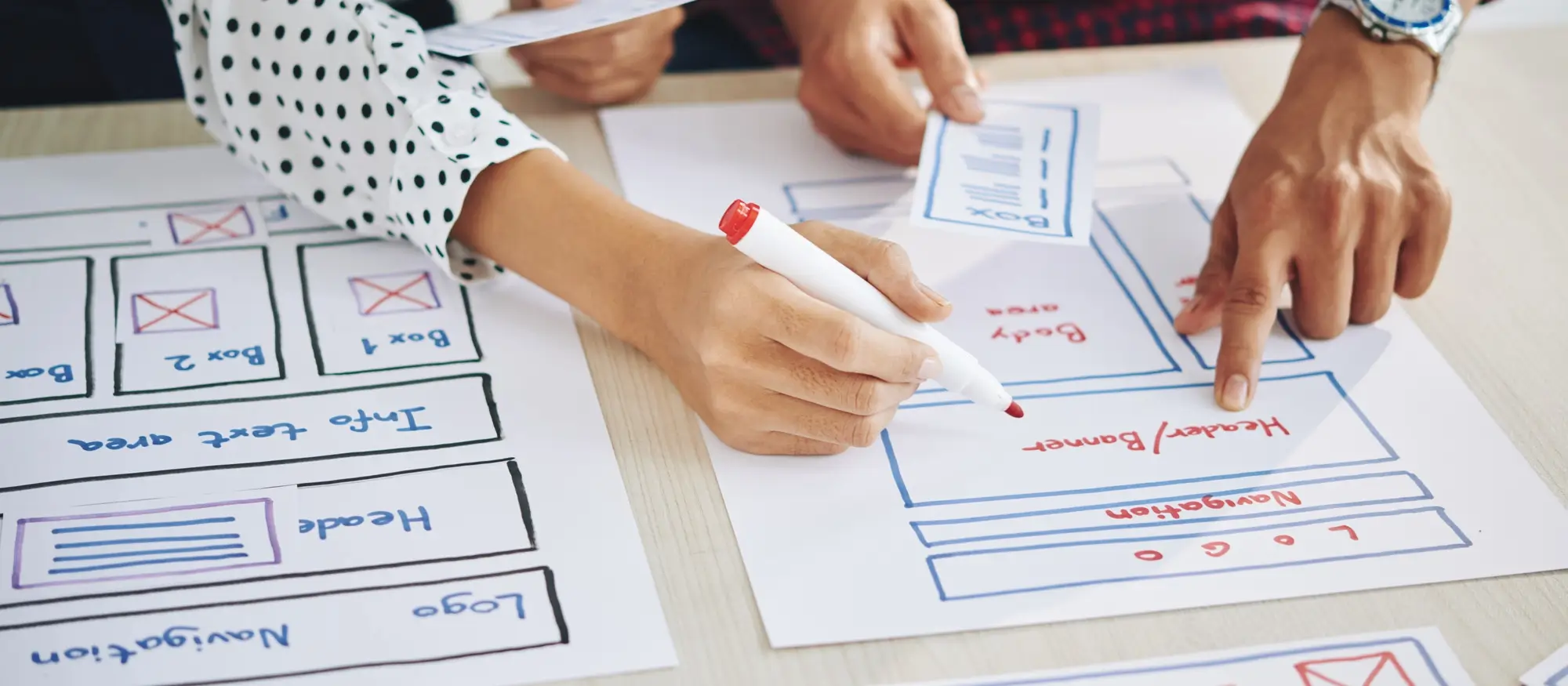
This early period of web design from the late 1990’s and early 2000s was an important time for web design. While user experience (UX) and user interface (UI) design were still in their infancy in fact mostly unheard of, significant progress was made. With large monitors and a standard resolution of 800×600, cartoon visuals dominated the web. Developers embraced new technologies like PHP3, HTML4, and CSS2, allowing websites to become more dynamic and text-light.
Design trends leaned towards smaller fonts, static pages, and a distinct design trend of gradients, dark backgrounds, funky fonts, and underlined menus. Images were used sparingly which made sense considering how slow the internet was at the time. However, the introduction of search bars and well-organised menus marked a major move forward. As internet speeds increased after 2001 designers could finally move beyond text-heavy layouts, paving the way for experimentation with subtle flash animations and even video content. Hello to Macromedia Flash which gave designers a tool to create some early web design magic.
The early 2000s witnessed a surge in social interaction online. 2002 to 2004 saw the rise of social media giants like Facebook, LinkedIn, and MySpace forever changing the way people connected. This period also coincided with the peak of Flash animations. These interactive elements, while not always the most user-friendly by current standards, added a layer of animation and movement to websites by 2004. Interestingly, during this time, web design prioritised functionality over styles. Readability and clear navigation were paramount, with less focus on visual elements like colour palettes, typography, and overall style.
However, a turning point arrived in 2004-2005. With the widespread adoption of high-resolution monitors boasting 17 million colours which was a huge leap from the previous standard, the web design landscape underwent a significant shift. This newfound ability to display a richer visual view introduced an era of “picture design.” Websites began to use the power of imagery, such as photographs and illustrations more prominently.
This trend was further amplified by YouTube in 2005. This innovative platform not only revolutionised online video sharing, but also encouraged web designers to explore video as a powerful storytelling tool. The early days of video content were undoubtedly modest compared to today’s high-definition standards, but they marked the beginning of a new chapter in web design, paving the way for a more visually engaging online experience.
The evolution of web design in the mid-2000s wasn’t a clean break from the past. The dominance of Flash animations softened into a “caramel” style, characterised by glossy highlights, rounded shapes, and a more subtle use of shine. These elements, while undeniably dated by today’s taste, still occasionally pop up on websites, much like the “semi-flat” designs that emerged later in the decade. It seems that with every new design trend, there’s always a period of slow decline alongside the rise of the new.
WordPress launched in 2003
WordPress, an open source CMS, made its entrance as a blogging platform on May 27th 2003. Twenty one years later it is still open source and now has 43% of all active websites running on it. This popular platform, founded by Matt Mullenweg and Mike Little, aimed to democratise website creation. WordPress tackled this challenge by offering a user-friendly interface with a focus on simplicity.
In its initial version (0.7), WordPress functioned primarily as a blogging platform. However, it included key features like the ability to create and manage posts, categorise content, and add comments. This foundational structure, coupled with its intuitive interface, paved the way for a future where anyone, regardless of technical expertise, could create and manage their own website.
Changes from 2006 onwards
WordPress web design evolved
By 2006, a new style appeared: skeuomorphism and naturalism. This movement emphasised stock photography, long scrolling pages, and realistic shadows. Cartoonish graphics, once the norm, began to be replaced with a more lifelike design. This shift coincided with another major turning point: the release of the first iPhone in 2007. This technologically advanced device not only sparked the rise of adaptive web design but also further solidified the “caramel” style. Adaptive design, now referred to as responsive design, was the answer to the requirement for websites to automatically resize to fit on mobile and tablet screens.
Remembering those iconic and somewhat cheesy iPhone app icons. designed by Steve Jobs. With their glossy sheen and almost edible charm, they perfectly represented the era’s obsession with a touch of digital cuteness.
Realism, it seemed, went hand-in-hand with a certain level of gloss. Textures mimicking real-world materials – wood grain, leather, brushed metal – became popular design choices. The goal was to create a user experience that felt familiar and intuitive, mirroring the physical world in the digital environment. This focus on realism would continue to evolve throughout the late 2000s, paving the way for a new chapter in web design.
WordPress websites – not only for blogging
By 2006, WordPress had evolved beyond its initial focus on blogging. While core functionalities like post creation and management remained central, the CMS began to work on features that expanded its capabilities. Developers saw the introduction of WordPress themes, offering users a wider range of design options to customise the look and feel of their websites. Additionally, plugins started to emerge, allowing for the integration of new functionalities beyond basic blogging, transforming WordPress into a more versatile content management system (CMS). This expansion in features helped to establish WordPress’ position as a user-friendly platform for building and managing websites.
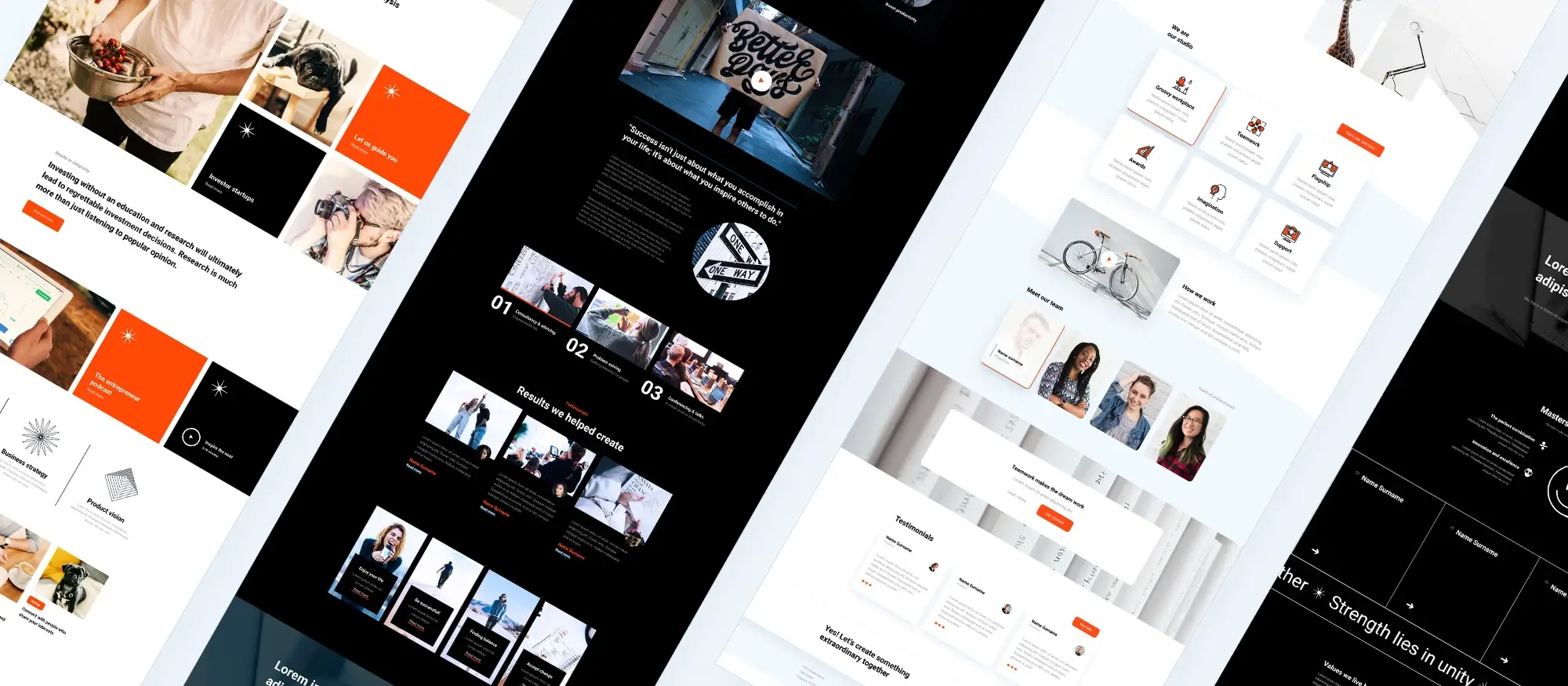
While glimpses of the “glossy” style emerged as early as 2003 on a few pioneering websites, it wasn’t until Darcy DiNucci coined the term “Web 2.0” that the style truly took off. Web 2.0 the term hijacked by Tim O’Reilly, refers to user generated content populating websites. It also references ease of use and a collaborative form of content compilation and sourcing.
This period, roughly between 2009 and 2010, saw the peak of the trend which was largely the result of the excitement surrounding the first iPhone and its emphasis on user-friendliness and a touch-screen experience.
Web design during this time embraced a playful and vibrant style. Bold, contrasting colours took centre stage, often accompanied by playful additions like virtual stickers, glossy icons and illustrations that seemed to pop off the screen. Rounded corners and buttons softened the overall look, while diagonal patterns and gradients added a touch of animation. These design elements, while used quite differently today, were proof of the growing realisation that web design was starting to be recognised as a creative medium.
The ability to create these more complex layouts is due to the introduction of HTML5. As an innovative programming language it offered a significant step forward for web developers. Unlike its predecessors, HTML5 was designed with both humans and search engines in mind. Its cleaner, more semantic structure made websites easier to understand and navigate for users, while also improving their discoverability in search engine results pages (SERPs).
HTML5, brought new life into many design trends from the past, allowing them to be reimagined in a more sophisticated way. The era of Web 2.0 wasn’t just about styles or collaborative publishing; it was also about providing designers and developers with the tools to create truly interactive and user-focused website experiences.
WordPress websites during this time
During this time WordPress grew its position as a leading content management system. The platform continued to evolve with a focus on user experience and customisation. Developers introduced a streamlined post editing interface, making content creation more intuitive. Additionally, the WordPress theme directory expanded significantly, offering users a wider selection of pre-built website tools. This period also witnessed a surge in plugin development, providing web designers with a growing selection of useful add-ons like contact forms, e-commerce capabilities, and SEO optimization. These advancements helped users to build increasingly complex and feature-rich websites without needing extensive coding knowledge.
2011-2012: Skeuomorphism came and so did flat design
The reign of skeuomorphism (2011)
Skeuomorphism, a term one might hear a lot while looking at the history of web design, refers to the practice of mimicking real-world objects in digital interfaces. Think of the recycle bin icon on a computer – that’s a prime example of skeuomorphism. By using familiar physical objects as inspiration, designers are able to create interfaces that are intuitive and easy to understand for users. It’s a way of leveraging everyday items to make the digital world a bit less foreign. It still continues today with the use of icons. By 2011 skeuomorphism had firmly established itself as an important design trend. This approach focused on realism emphasising such design items as:
Calming colour palettes
The aim was to imagine nature and tranquillity.
Natural textures
Wood grain, leather, grass, and fabric amongst many became popular choices, with the aim to create a sense of familiarity and tactile experience.
Embellishments
3D typography, ribbons, embossed effects, and even antique stamps added a touch of whimsy and kitsch special effects.
Skeuomorphism was all about meticulous detail. Icons and objects were carefully rendered to resemble their real-world counterparts as closely as possible. Textures, lighting, shadows, and colours all worked together to create a sense of depth and dimension, in an effort to blur the lines between the digital and physical worlds. Apple’s early iOS interfaces are a prime example of skeuomorphism at its peak.
Unsurprisingly, designers spent a considerable amount of time refining this style, seeing it as important to web design. Debates discussed the merits of following trends versus going with minimalism. But as with most things, web design found its own way.
The rise of flat design (2011)
Who can forget the Microsoft Windows 8 look! The first murmurs of a new design philosophy emerged in 2011, led by the likes of Microsoft and Twitter. Their card-based interfaces, characterised by simplicity, bold colours, clear fonts, and a minimalist style, began to make an appearance.
Flat design resonated with both designers and users wanting a more focused web experience. Gone were the days of glossy distractions. Minimalism brought the content and ideas front and centre. This shift mirrored a broader change in web design philosophy.
The 90s were dominated by content-heavy websites that often lacked visual appeal. The early 2000s saw a pendulum swing towards an overemphasis on glossy elements, which often overshadowed the text itself. Skeuomorphism’s peak marked a turning point.
Designers began to recognise that usability was more than just styles; it was about creating a clever composition. Flat design refined this concept, showing clear hierarchies and highlighting key elements with simple visual cues. The result? WordPress websites that were easy on the eyes, didn’t distract users from intended actions, and maintained a clean, modern look.
Flat design emerged as a dominant force in 2011, however, skeuomorphism didn’t disappear entirely. Even today, echoes of this naturalistic style can be found in the work of leading designers as well as icon collections.
Perhaps a famous fashion designer like Yves Saint Laurent would have said, “Trends come and go, but skeuomorphism has a certain timeless quality.” There’s some truth to that. It’s important to remember the distinction between realism and minimalism in design. While realistic elements can sometimes be minimalist they often lean towards the ornate. Imagine an interior designer obsessed with skeuomorphism – fancy arches, classic columns, and an abundance of light and colour. Every inch of space would be meticulously filled, leaving no room to breathe. Does happen of course!
Minimalist design, on the other hand, thrives on simplicity:
Less is more
Minimalist WordPress websites use a limited amount of text and graphics, allowing the content to shine through.
Flat is the new black
Shadows and depth are preferred in favour of a two-dimensional look.
Readability reigns supreme
Large, clear fonts take centre stage for optimal legibility.
Movement with a purpose
Parallax effects, GIFs, and simple Java animations can be used to add subtle movement.
Bold and bright
Don’t be afraid of bright colours, large photographs, and attractive background videos
While the flat design versus skeuomorphism debate carried on, visual programming languages continued to develop. In 2014, Google entered the ring with its “Material Design” style guide. Seeking a middle ground, Google developers aimed to refocus on some of the realism of skeuomorphism while maintaining the clean lines of flat design. The result? A new style: textural realism meets detailed minimalism. Imagine a computer screen transforming into a sheet of paper – a familiar, real-world object. But instead of being plain, it’s decorated with unique, easy-to-read typography, icons and subtle shadows and short animations. This combination of flat and naturalistic elements is what is called “semi-flat” design, a popular trend that is still being used today.
WordPress kept up with it’s development during 2011 and 2012
The years 2011 to 2012 saw WordPress refine its core functionalities and make use of emerging design trends. The CMS introduced features such as post formats which support more diverse content presentation rather than just traditional blog posts. Additionally, a revamped admin bar offered users quick access to essential tools and functions making website management easier. The focus on ease of use continued with the introduction of automatic upgrades. Users now could benefit if they wished, although a double edged sword in some cases, from the automatic updates of the latest security patches and features. Not all automatic updates benefit a website as plugins can break a website if they are not compatible with the new WordPress version.
This period also switched the focus to mobile responsiveness within the WordPress website creator community. Developers began developing themes and plugins that optimised website layouts for optimal viewing across different screen sizes also referred to as ‘responsive design’, catering to the increasing use of mobile devices for web browsing. These advancements solidified WordPress’s position as a platform that not only supported content creation but also prioritised user experience and adaptability to accommodate the many screen sizes in use.
The rise of semi-flat design and user experience (2015-2018)
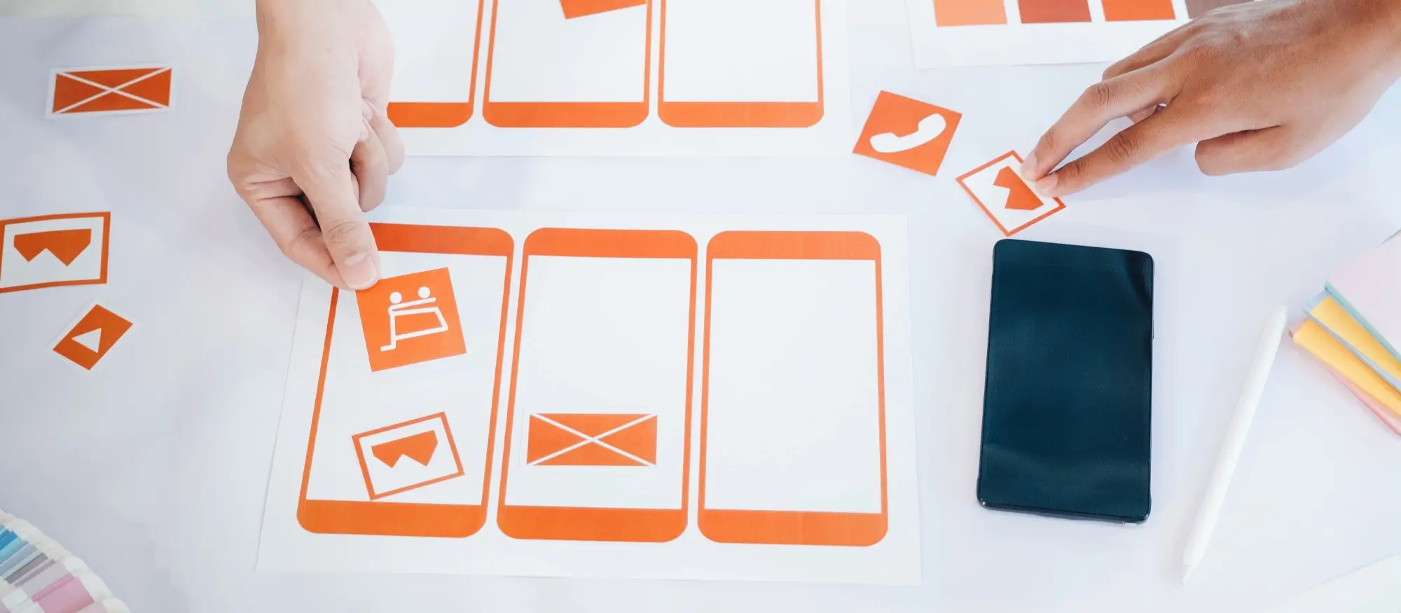
The years between 2015 and 2018 saw the rise of semi-flat design and a renewed focus on user experience (UX/UI). This period marked a turning point, bridging the gap between the flat design trend and the wish for more realistic elements. Mobile devices continued to capture the market globally prompting the beginnings of a more concentrated focus on a “mobile-first” approach to web design. This trend is ongoing with the perfect responsive layout still not achieved by all web designers. Flat design began a subtle shift towards semi-flat by offering a middle ground in the ongoing battle between realists and minimalists. Semi-flat embraced a light look and featured some of these elements:
Minimalist foundations: While semi-flat design incorporated some elements of realism, it didn’t forego the core principles that made flat design so successful. Clean layouts with minimal elements remained the foundation. This was great for making sure designs were clutter-free and user-friendly.
Bold typography: In the era of semi-flat design, typography came into its own. Building upon the flat design principle of clear and legible fonts, semi-flat embraced the power of bold typography. Large, clear fonts became popular and necessary to ensure best readability on the ever-shrinking screens of mobile devices. But beyond functionality, these bold fonts also served a style purpose. They added a touch of personality and visual interest to layouts acting as design elements that could grab user attention and set the overall tone of the page and of course the entire website. What fonts had done for print over centuries of publishing finally made it onto the web page.
This wasn’t just about using any large font. Designers carefully selected typefaces that complemented the overall look and feel. Playful, whimsical fonts could be used for a children’s website, while clean modern fonts might be a better fit for a corporate website. The size and weight of the font were also carefully considered. Strategic use of contrasting font sizes could guide the user’s eye through the hierarchy of information on the page, drawing attention to key headlines and calls to action. Careful use of bold typography became a powerful tool for improving user experience and adding visual appeal in semi-flat design.
Back to a touch of realism: While flat design offered a minimalist look it sometimes lacked a certain depth and engagement. The semi-flat movement addressed this by reintroducing touches of realism. Animations also referred to as interactions weren’t just about flashy special effects. They served a purpose. Subtle interactions could guide the user’s eye towards important elements or provide feedback on completed actions. Dynamic images offered a more immersive experience, showcasing a product from different angles or demonstrating a service in action.
This period also saw a greater focus on design systems
WordPress websites incorporated:
Consistent design language: The rise of mobile devices and the ever-growing complexity of websites demanded a new level of organisation and consistency in web design. This is where the concept of a “consistent design language” came into use during the semi-flat design era. Once could imagine a website as a conversation – a set of broadly used patterns, typography, colours, icons, and graphic elements act as the standard components of this conversation, making sure that users understood the “language” and could easily navigate the website.
A consistent design language doesn’t just make websites look polished; it also plays a crucial role in user experience (UX). By using the same set of design elements across all pages, users develop a sense of familiarity. This is similar to the layout of shopping malls or supermarkets that follow a fairly standard pattern. It means that website visitors know where to find information, how to interact with elements such as contact forms, and what to expect visually. This consistency takes away the need to spend too much time on search and helps users to focus on the content and whatever task they might be wanting to complete.
These consistent design principles are used in many areas of life. Whether a city layout or a Disney theme park, residents or visitors will be able find their way around fairly quickly. Similarly, a website with a well-defined design language allows users to get around with little need for orientation. The benefits are beyond user experience. A consistent design language benefits the design process for web development teams. This is a cost effective way to save time and resources. It also supports a brand identity for companies and for small businesses it can create a sense of familiarity and trust. A consistent design language is what holds a website together, creating a user-friendly experience for all.
Eye-catching geometry: The semi-flat design era saw a come-back of geometric shapes, particularly polygons and other bold forms. These weren’t just empty shapes though. They served a dual purpose: grabbing user attention and adding some depth to the design without losing sight of the clean lines and minimalist essence of semi-flat design.
Polygonal shapes, like triangles, squares, and hexagons offered a fresh alternative to the more traditional rounded shapes commonly used in flat design. These geometric forms could be used in a variety of ways:
Containers: The semi-flat design era saw geometric shapes, particularly polygons and other bold forms, as functional design elements. These shapes weren’t just window dressing. They served a special role in creating a well-organised and engaging user experience.
One key use of geometric shapes was as containers for various website elements. A call-to-action button housed within a bright hexagonal frame could be more effective. The effect not only adds a touch of visual interest but also helps the button stand out from the background, making it easier for users to locate and interact with. Similarly, text blocks inserted into triangular containers provided a clear structure for information, guiding the user’s eye and enhancing readability. This use of geometric shapes as containers encouraged order and organisation, making the layout less cluttered and easier to view and understand.
The benefits extended beyond basic functionality. Polygonal containers, when used creatively, could inject a touch of personality into the design. Playful pentagons holding product images on an e-commerce website, for instance, could make the product appear more interesting and underline brand identity. This allowed designers to use geometric shapes to not only organise content but also communicate the website’s overall tone and style. In essence, geometric containers offered a win-win situation for both user experience and visual appeal, perfectly representing the core principles of semi-flat design.
Background elements: The semi-flat design era resulted in a revival of the use of geometric shapes, particularly polygons, not just as containers but also as subtle background elements. These shapes weren’t merely decorative; they added a layer of depth and dynamism to layouts, without compromising the minimalist basics of semi-flat design.
A WordPress website with a faint gradient on a background made up of overlapping hexagons. This mix of colours and shapes makes the page visually appealing, easily directing the user’s attention around the page. Adding different sized and coloured polygons could make the design even more lively, suggesting a three-dimensional feel while keeping the simple look of flat design.
The key to using geometric shapes as background elements lay in their subtlety. Background designs should not interfere with the foreground content, but rather act as a design composition. Gradients, known for the smooth transitions between colours, could be particularly effective when added to geometric backgrounds. A cool blue gradient layered over hexagonal shapes could evoke a sense of calmness and professionalism.
The use of geometric shapes in the background wasn’t purely style. It offered designers a way to subtly communicate brand identity and website purpose. A background composed of interlocking squares, for example, might convey a sense of stability and trust for a financial institution’s website. By using geometric shapes and gradients, semi-flat design could add a layer of depth to layouts, encouraging a more engaging user experience.
Decorative accents: The semi-flat design period used geometric shapes not just for containers and backgrounds, but also as playful decorative accents. Simple shapes like triangles, circles, and squares became design elements in their own right.
These standalone geometric design elements served a two-fold purpose: adding an accent and highlighting specific areas of the website. A website promoting a children’s toy store, for instance, might incorporate playful star shapes scattered throughout the layout, bringing in a sense of fun and appealing to the brand’s target audience. Circles, on the other hand, could be used more subtly to draw attention to important elements like calls-to-action buttons or key product information. By strategically placing a vibrant circle behind a “Shop Now” button, designers could ensure it stood out from the background, prompting users to take action.
The beauty of these decorative accents lay in their versatility. They could be bold and colourful, grabbing immediate attention, or more subdued, offering only a hint of visual change. This allowed designers to tailor the use of geometric shapes to complement the overall tone and style of the website. A website for a design agency might utilise clean, minimalist triangles as accents, reflecting their modern style. In contrast, a website for a bakery might incorporate more playful, hand-drawn circles adorned with polka dots, reflecting the brand’s warm and inviting personality.
WordPress websites incorporated.
These geometric accents weren’t just about the look and feel. They made the navigation easier by drawing attention to specific areas of the website. In essence, simple geometric shapes added a playful touch to semi-flat design, resulting in a more engaging and user-friendly experience.

How these shapes were used effectively
The key to using these shapes effectively was in the details. Thick, contrasting outlines often accompanied these geometric forms. These bold outlines served two purposes:
Emphasis: They helped the shapes stand out from the background, drawing the user’s eye to important information or key elements on the page.
Visual Hierarchy: By using different line weights designers could create a visual hierarchy, guiding the user’s attention through the website’s content.
The resurgence of geometric shapes in semi-flat design wasn’t purely to look good, however. These shapes often represented a sense of order, stability, and modernity. They offered a way to add visual interest and structure to layouts while remaining consistent with the minimalist principles that underpinned semi-flat design.
Designers experimented with the notion of boundaries, embracing a layered and interactive style. This included the rise of haptic design, which aimed to create a more physical and engaging user experience.
Highly detailed images, attractive animations, and even full-motion video became commonplace. Web design became a balancing act between creating a visually pleasing experience and user convenience. The terms UX/UI became synonymous, highlighting the inseparable nature of user experience with the user interface when creating effective and appealing web pages.
The goal? High-quality, modern websites that actively engage users through a thoughtfully designed interface, to ensure a smooth and enjoyable journey through the digital space.
Subscribe to our newsletter
WordPress website designers focused on mobile first
Between 2015 and 2018, WordPress websites underwent significant advancements that solidified its status as the go-to platform for building dynamic websites. The focus shifted towards enhanced user experience and mobile-first design principles. Developers introduced a customisable dashboard, allowing users to personalise their website management environment.
The introduction of a native customiser feature empowered users to make real-time changes to their website’s appearance without having to know code. This period also saw a rise in block-based editing, offering a more intuitive and visual way to create and manage content layouts. Mobile responsiveness became a core design consideration, with themes and plugins increasingly optimised for easy viewing across smartphones and tablets. This emphasis on user-friendliness and mobile-first design significantly enhanced WordPress’s position as a platform catering to the evolving needs of WordPress website creators in the digital age.
Web design transforms: A look at 2019-2021 trends
The web design landscape is ever-evolving, constantly pushing the boundaries of creativity and functionality. As this web design retrospective journey moves into the latter part of the 2010s, the years 2019-2021 witnessed a fresh wave of trends that captivated the industry.
A return to minimalism (2021)
Encouraged by the ever-growing dominance of mobile web browsing constrained to a certain extent by slow internet access, 2021 saw the come-back of minimalism. Websites were stripped down to their essential elements, prioritising clean, crisp text, ample white space, and uncluttered layouts. Monochromatic or duo-chrome colour palettes added a touch of sophistication, while simple graphics kept the user focused on the content. This approach wasn’t just dictated by style; it actively encouraged viewers to go deeper and explore the content of the sites more thoroughly.
A combination of subtle movement: minimalism didn’t mean a static experiences. The subtle yet intentional use of parallax scrolling added a touch of depth and dynamism to web pages. As users scrolled, background elements moved at a different pace than foreground elements, creating a subtle 3D effect that enhanced the user experience. This, combined with a break from traditional scrolling methods, brought a refreshing and interactive vibe into web design.
Interactive landing pages take centre stage: landing pages, the first impression a website makes on a visitor, became a strategic tool for converting visitors into customers. Interactive landing pages, like Adobe’s MyCreativeType site with its engaging quiz, went beyond simply conveying information. They actively drew users in, encouraged engagement and increased the likelihood of conversion.
Dark mode rises to prominence: a trend that gained significant traction was dark mode. This design approach, featuring darker backgrounds and lighter text, offered several benefits. It reduced eye strain for users browsing in low-light environments and improved battery life on mobile devices. Recognising these advantages, major players like Facebook, Instagram, and Twitter all added dark mode as an option for their users.
Beyond flat design: a touch of realism: While minimalism was the go-to design style, there was also a shift towards incorporating a touch of realism into web design. This showed up in the use of 3D visuals, custom illustrated graphics, and carefully crafted gradients. These elements added depth and dimension to layouts, creating a more interesting user experience.
Multimedia is back: the focus wasn’t solely on styles. Web design during 2019-2021 embraced the power of multimedia. Websites incorporated multimedia elements, such as animations and videos, to further engage users and communicate brand stories.
Usability reigns supreme: at the heart of all these trends important considerations were functionality, usability, and accessibility. Designers prioritised creating websites that were not only visually appealing but also easy to navigate and use, regardless of their technical abilities.
The web design trends of 2019-2021 offered a glimpse into the future of the digital landscape. By embracing minimalism, subtle interactivity, and a touch of realism, designers crafted user-centric experiences that were both beautiful and functional. As we move forward, it will be interesting to see how these trends evolve and shape the web design landscape in the years to come.
WordPress web design and the block editor – development from 2019 to 2022
The years 2019 to 2022 witnessed WordPress refine its editing experience and embrace the future of web development. The block editor, introduced earlier, became the cornerstone of content creation, allowing users to build complex layouts with a drag-and-drop interface. This shift towards a block-based system offered greater flexibility and visual control over website design.
Developers focused on performance optimisation, ensuring websites built on WordPress loaded quickly and delivered a smooth user experience. Security also remained important, with regular core updates addressing vulnerabilities and maintaining a secure platform.
The WordPress community continued to flourish, offering a vast library of pre-built blocks, themes, and plugins, empowering users to create unique and feature-rich websites without requiring extensive coding knowledge. These advancements solidified WordPress’s position as a user-friendly and powerful platform for building modern and engaging websites.
Web design in 2022-and onwards: A blend of innovation and nostalgia
The web design landscape from 2022 onward has developed into a mix of new innovation and old traditions. Web design has developed into a field where new technology mixes with creative expression and bears in mind the important component of user experience.
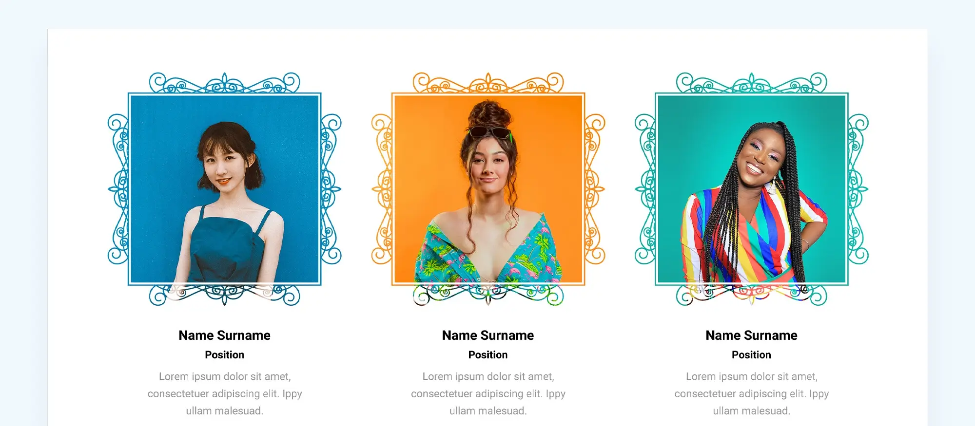
The top trends that are influencing WordPress websites
Inclusivity takes centre stage: increased web accessibility. Gone are the days of websites that exclude entire user groups. Thankfully, web design from 2022 onwards finally prioritises accessibility. This means incorporating features like closed captions for embedded videos, ensuring screen reader compatibility, and utilising clear and concise language. By focusing on accessibility, designers are able to create a more inclusive web that caters to a wider audience, enabling a positive user experience for everyone.
A blast from the past: the allure of nostalgia. There is a trend of revisiting the styles of the 80s and 90s. Bold colour palettes reminiscent of Memphis Design, pixelated graphics that evoke a sense of retro charm, and playful typography with a vintage vibe are making a comeback. This isn’t just about blind imitation; it’s about tapping into the power of nostalgia to create a sense of familiarity and emotional connection with users.
AI enters the design arena: Artificial intelligence (AI) is no longer only the stuff of science fiction. In web design, AI is being used to drive user engagement, particularly in the area of chatbot design. Websites are being built with friendly, AI-powered chatbots that greet visitors, answer their questions, and guide them through the user journey. This not only personalises the experience but also frees up human resources for more complex tasks. It’s a win-win for both users and businesses.
AI is also used extensively in compiling content for websites. ChatGPT or Gemini will create excellent articles as long as the prompts provided are sufficiently descriptive. AI voices are now available to read copy for videos. Adobe’s Firefly Generative AI takes image manipulation to a whole new discipline. There are first AI tools that are addressing the overall build of a website. These are still at the initial design and development stage but show great promise to eventually make the entire website design process automated.
AI will do to WordPress website design what no other technological advancement has done before. It will eliminate jobs and open up opportunities in new fields for tech and design specialists. New time saving tools are already coming onto the market in large numbers and there seems no end to the innovation. It will just depend on how willing the WordPress website community is to take these new tools on board. So far it looks like they are ready for it.
Build like a pro
Minimalism continues to be important in web design
Less is more: The enduring power of minimalism. Minimalism continues to be important in web design. Clean layouts, stripped-back styles, and a focus on negative space (white space) create a sense of order and clarity. However, from 2022 onward minimalism isn’t about empty voids. It’s about using design elements with purpose to ensure every element on the page contributes to the overall user experience. It’s along similar lines of a well-edited and composed photograph – everything has its place, and nothing is superfluous.
The power of tiny details: Subtle yet impactful design elements known as micro interactions are adding a layer of polish and fun to websites. These micro interactions can be anything from a progress bar that smoothly animates as a file uploads to a button that changes colour on hover. While seemingly small, these micro interactions play an important role in user experience. They provide feedback and elicit more patience from users as they can see something is happening when there is a delay in downloading a page or other item. It also enhances engagement and makes users feel like they are interacting with the website, not just passively consuming content.
Mobile reigns supreme: The dominance of mobile browsing continues to shape web design. Responsive design, the practice of ensuring websites adapt across different screen sizes, remains an absolute necessity. In 2022-2023, it’s not just enough for a website to look good on mobile; it needs to fully function as well. Fast loading times, intuitive navigation. designed for touchscreens, and user interfaces optimised for smaller screens are all crucial for creating a positive mobile experience.
Augmented reality: a bridge between the physical and digital. Augmented reality (AR) is no longer a futuristic fantasy. Forward-thinking brands like Amazon and IKEA are utilising AR to improve user engagement and streamline decision-making processes. Imagine virtually placing a new couch in a living room to see how it looks before buying it, or using AR to visualise how a new paint colour would transform a bedroom wall. AR has the potential to vastly improve the way users interact with brands online.
Darkness takes over: The rise of dark mode, once again. Dark mode, with its dark backgrounds and light text, continues to gain popularity again. This user-centric trend offers several benefits. It reduces eye strain, especially for users browsing in low-light environments, and can even improve battery life on mobile devices. Recognising these advantages, many websites now offer dark mode as an option, giving users the power to personalise their browsing experience.
The key to success in web design lies in striking a balance. Designers must embrace the new and innovative while acknowledging the power of the familiar. Bold styles can coexist with subtle details, and cutting-edge technology should always serve the goal of creating a user-friendly and accessible web experience for all. It’s an exciting time for web design.
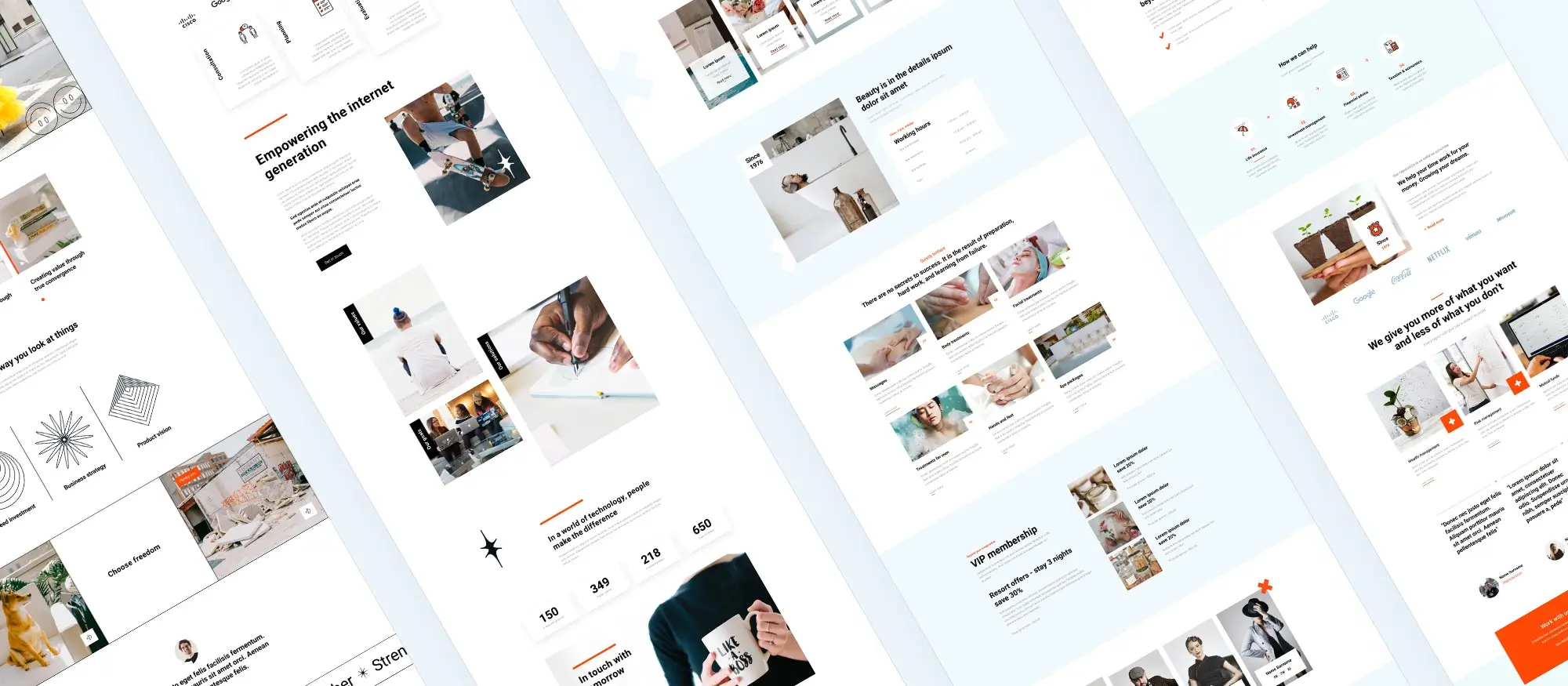
From 2022 and onwards. What did WordPress add to web design?
As of 2022 and beyond, WordPress development continues to prioritise user experience and works to adapt to or even lead the development in the web environment. Here is a glimpse into some key areas of focus:
Full embrace of block editing: the block editor, introduced earlier, has become the undisputed champion for content creation. Developers are constantly refining and expanding the block library, offering users a wider range of pre-built blocks for various functionalities and layouts. This helps users to build complex and dynamic websites with a visual, drag-and-drop approach, minimising the need for code.
Focus on automation and Artificial Intelligence (AI): WordPress is exploring the potential of automation and AI to streamline website management tasks. Features like automated content scheduling, image optimisation, and even AI-powered content suggestions are being explored and implemented. These advancements aim to free up valuable time for website owners and content creators.
Enhanced security measures: Security remains a top priority for WordPress developers. Regular updates address vulnerabilities and ensure a safe platform for users. Additionally, there’s an increasing focus on integrating security best practices into core functionalities, making it easier for users to build secure websites even without extensive technical knowledge.
Integration with emerging technologies: the WordPress community is actively exploring ways to integrate the platform with emerging technologies like the metaverse and blockchain. While still in its early stages, this could potentially open up new possibilities for user interaction and website functionalities in the future.
By focusing on these areas, WordPress aims to remain a user-friendly and powerful platform for building dynamic and future-proof websites.
Growth of the WordPress community of contributors
Beyond the core WordPress platform itself, a vibrant contributor community established itself, assisting web designers and developers with a vast selection of themes, plugins, and tools. This ecosystem fuels the platform’s versatility and assists users to customise their WordPress websites to fit any need. Some of the key components:
Themes: a diverse marketplace of themes, both free and premium, caters to a wide range of styles and functionalities. Whether the requirement is for a sleek, minimalist design for a portfolio website or a feature-rich online store, there’s a theme perfectly suited to a vision. The contributor community actively develops and maintains these themes, ensuring compatibility with the latest WordPress versions and design trends.
Plugins: plugins extend the core functionalities of WordPress, adding features that cater to specific needs. Whether a contact form, an e-commerce shopping cart, or an SEO optimisation tool – there are many plugins available to help with any of these and many more required website features, The WordPress plugin repository, now close to a staggering 60 000 free plugins, offers a vast selection, often with both free and paid options, allowing users to find the perfect fit for their budget and requirements. Many developers in the community actively contribute by creating and maintaining these plugins.
Community support: the WordPress contributor community extends beyond theme and plugin developers. A vast network of online forums, excellent YouTube channels, educational offerings of tutorials and courses, and knowledge bases provide invaluable support to users. Whether encountering a technical hurdle or simply seeking guidance on best practices, there is a wealth of information and assistance readily available. This collaborative spirit fosters a learning environment where users can help each other and contribute to the overall growth of the platform.
The WordPress contributor community forms the backbone of the platform’s rich ecosystem. By creating and maintaining themes, plugins, and offering support resources, these contributors empower users to build and manage websites that perfectly suit their needs, solidifying WordPress’s position as a user-friendly and adaptable platform for the digital age.
The future of web design and WordPress website development is?
Looking into the future with WordPress and web design
WordPress web design has come a long way as all who have been on the web since the late 1990’s will know. Remember the early 2000s, not so easy for the younger generation of course, with dial-up connections limiting the content websites could easily show users. Those days are long gone. Today, websites are smooth, flexible, and designed to work perfectly on any device. With the advent of satellite internet connectivity residents of even remote areas of the world can access websites.
Artificial intelligence (AI) is poised to significantly impact web design in the future. Here’s a glimpse into some potential areas of influence:
Personalised user experiences: AI algorithms can analyse user behaviour and preferences, allowing websites to dynamically adjust content and layouts to cater to individual visitors. This will eventually lead to websites recommending products based on the user’s browsing history or personalising the news feed to match their interests.
Automated design elements: AI will streamline the design process by automating repetitive tasks like generating basic layouts or suggesting colour palettes based on user preferences. This will free up designers to focus on more creative aspects and complex functionalities.
Enhanced accessibility features: AI-powered tools can analyse website content and suggest improvements for accessibility, ensuring websites are user-friendly for everyone, regardless of ability.
Content development: ask any web designer what their biggest irritation is and they will probably name waiting for content from clients as one of the worst issues to deal with. AI tools such as Gemini, ChatGPT or Perplexity to name just a few are already assisting web designers and website owners to more readily create the copy for their websites. It will also be possible for these tools to write the copy to fit copy blocks easily so that the design is not skewed by content. Image creation tools such as Midjourney and Adobe’s amazing Firefly software as well as Sora which creates video from text are being developed at high speed to assist with the visual content for websites.
Voice-controlled Interfaces: The rise of voice assistants like Siri and Alexa suggests a future where voice interactions become more prevalent. AI could play a crucial role in developing and optimising voice-controlled interfaces for websites, offering users a more intuitive and hands-free browsing experience.
While AI integration in web design is still in its early stages, it holds immense potential to transform the user experience, personalise content delivery, and streamline design workflows in the years to come.
There is no doubt that AI will impact the development of WordPress
Here are some potential areas that will feel AI:
Automated website management: AI could automate repetitive website management tasks such as image optimisation, broken link detection, and basic security checks. This would free up valuable time for developers and website owners to concentrate on more strategic initiatives.
Personalised user interfaces: the WordPress dashboard could leverage AI to personalise the user experience for each website owner. The dashboard could highlight frequently used features, suggest relevant plugins based on website functionalities, and even provide contextual help based on user actions. This personalisation would enhance workflow efficiency and enable users of all skill levels to effectively manage their WordPress websites.
Improved theme and plugin development: AI will further improve the help developers receive when using code assistants such as Copilot or CodeRabbit. AI Code Reviews improve developer teams’ workflow speed and code quality. CodeRabbit provides instant and accurate feedback on pull requests. by automating repetitive coding tasks and suggesting best practices during theme and plugin creation. This streamlines the development process and potentially leads to a wider range of high-quality themes and plugins available within the WordPress ecosystem.
Data liberation: During the State of the Word address 2023. WordPress founder Matt Mullenweg mentioned Data Liberation. He spoke about the significance of the open web and simplifying data portability allowing users to switch between page builders and core blocks envisaging a one-click migration.
While the full potential of AI in WordPress development is yet to be fully realised, it presents exciting possibilities for simplifying tasks, enhancing user experiences and fostering a more efficient and creative workflow for all stakeholders involved.
WordPress website design and development will be affected by new technology to an extent that most people cannot even imagine. In particular, progress in the field of AI will make it easier for web designers and developers to include voice, touch and AR/VR to play an important role in the navigation of online content. The only thing that will slow down the move to more immersive experiences will be the skills, knowledge and enthusiastic adoption of the web design industry.
Creating WordPress websites made simple and fast
From first install to full launch, discover everything you need to create stunning WordPress websites.
FAQs about WordPress websites and web design
What is WordPress?
WordPress is a content management system (CMS) that allows users to create and manage websites easily. It started as a blogging platform but has evolved to support various types of websites, including e‑commerce, portfolios, and business sites.
Is WordPress free to use?
Yes, WordPress.org is free to download and use. However, you may incur costs for hosting, premium themes, and plugins.
What is the difference between WordPress.org and WordPress.com?
WordPress.org is a self‑hosted platform that gives you full control over your website. WordPress.com is a hosted service that takes care of hosting and maintenance but offers less flexibility and customization.
Can I use WordPress for non‑blogging websites?
Absolutely! WordPress is versatile and can be used to create various types of websites, including e‑commerce stores, portfolios, forums, and business sites.
What are WordPress themes?
WordPress themes are pre‑designed templates that determine the look and feel of your website. They can be customized to fit your branding and content needs.
What are WordPress plugins?
Plugins are extensions that add functionality to your WordPress site. They can handle tasks such as SEO optimization, contact forms, security, e‑commerce, and more.
Is coding knowledge necessary to use WordPress?
No, you don’t need coding knowledge to use WordPress. The platform is user‑friendly, and many themes and plugins offer drag‑and‑drop functionality. However, knowing some HTML, CSS, and PHP can help you customize your site further.
How can I improve the performance of my WordPress site?
You can improve performance by using a good hosting provider, optimizing images, using caching plugins, minimizing the use of heavy plugins, and keeping your WordPress installation and plugins up to date.
How do I secure my WordPress site?
To secure your site, use strong passwords, keep WordPress and all plugins/themes updated, install security plugins, back up your site regularly, and use SSL certificates.
How do I add content to my WordPress site?
You can add content through the WordPress admin dashboard. Use the “Posts” section for blog entries and the “Pages” section for static content like About Us or Contact pages.
Is WordPress good for SEO?
Yes, WordPress is SEO‑friendly. Many SEO plugins, such as Yoast SEO and All in One SEO Pack, can help optimize your content for search engines.
Can I customize my WordPress theme?
Yes, most WordPress themes are customizable. You can use the WordPress Customizer, page builders, or custom code to change the appearance and functionality of your theme.
What are WordPress page builders?
Page builders are plugins that allow you to create, edit, and customize your website layout using drag‑and‑drop interfaces. Popular page builders include MaxiBlocks, Elementor, Beaver Builder, and WPBakery.
Is WordPress mobile‑friendly?
Yes, most modern WordPress themes are designed to be responsive, meaning they automatically adjust to fit different screen sizes, including smartphones and tablets.
What is responsive design?
Responsive design ensures that a website looks and functions well on devices of all sizes, from desktop monitors to smartphones. It automatically adjusts the layout based on the screen size and resolution.
What are some current trends in WordPress web design?
Current trends include minimalism, mobile‑first design, dark mode, augmented reality (AR) integration, and the use of AI for personalized user experiences and automated tasks.
How is AI impacting WordPress web design?
AI is used to personalize user experiences, automate repetitive design tasks, enhance accessibility, and improve website management through AI‑powered tools and plugins.
What is the block editor in WordPress?
The block editor, also known as Gutenberg, is a visual editor that allows users to create complex layouts using a drag‑and‑drop interface with pre‑built content blocks.
What is the WordPress contributor community?
The WordPress contributor community consists of developers, designers, and users who contribute to the platform by developing themes, plugins, providing support, and creating educational resources.
Where can I find support for my WordPress site?
Support can be found through the WordPress.org forums, YouTube channels, online tutorials, and various WordPress‑related communities and courses.
WordPress itself
Official Website
wordpress.org – This is the official website for WordPress, where you can download the software, find documentation, and learn more about using it.
WordPress Codex
codex.wordpress.org/Main_Page – This is a comprehensive documentation resource for WordPress, covering everything from installation and configuration to specific functionality and troubleshooting.
WordPress Theme Directory
wordpress.org/themes – The official WordPress theme directory is a great place to find free and premium WordPress themes. You can browse themes by category, feature, and popularity.
maxiblocks.com/go/help-desk
maxiblocks.com/pro-library
www.youtube.com/@maxiblocks
twitter.com/maxiblocks
linkedin.com/company/maxi-blocks
github.com/orgs/maxi-blocks
wordpress.org/plugins/maxi-blocks

Kyra Pieterse
Author
Kyra is the co-founder and creative lead of MaxiBlocks, an open-source page builder for WordPress Gutenberg.
You may also like
