Try MaxiBlocks for free with 500+ library assets including basic templates. No account required. Free WordPress page builder, theme and updates included.

To customise your WordPress navigation menus, go to Appearance > Menus in your dashboard. From there, you can create new menus, add items like pages, posts, categories or custom links, and arrange them in the order you prefer. Once you’re done, assign each menu to a location on your site, such as the main menu or footer.
Updated 21 May 2025
- Navigate to Appearance > Menus in the WordPress dashboard to create and manage navigation menus.
- Add various types of links to menus, organize them into a hierarchy, and apply them to different locations on your site.
- Customizing WordPress navigation menus through the Customizer for better branding.
- Plugins like MaxiBlocks offer advanced features, including sticky menus and buttons.
A well-structured navigation menu helps users move through your site easily and supports both usability and SEO. Whether you are running a simple blog or managing a larger business website, a clean and accessible menu is essential. WordPress gives you built-in tools to build and organise menus, and with MaxiBlocks, you can go further by designing menus that match your branding and layout needs.
Setting up your main navigation menu
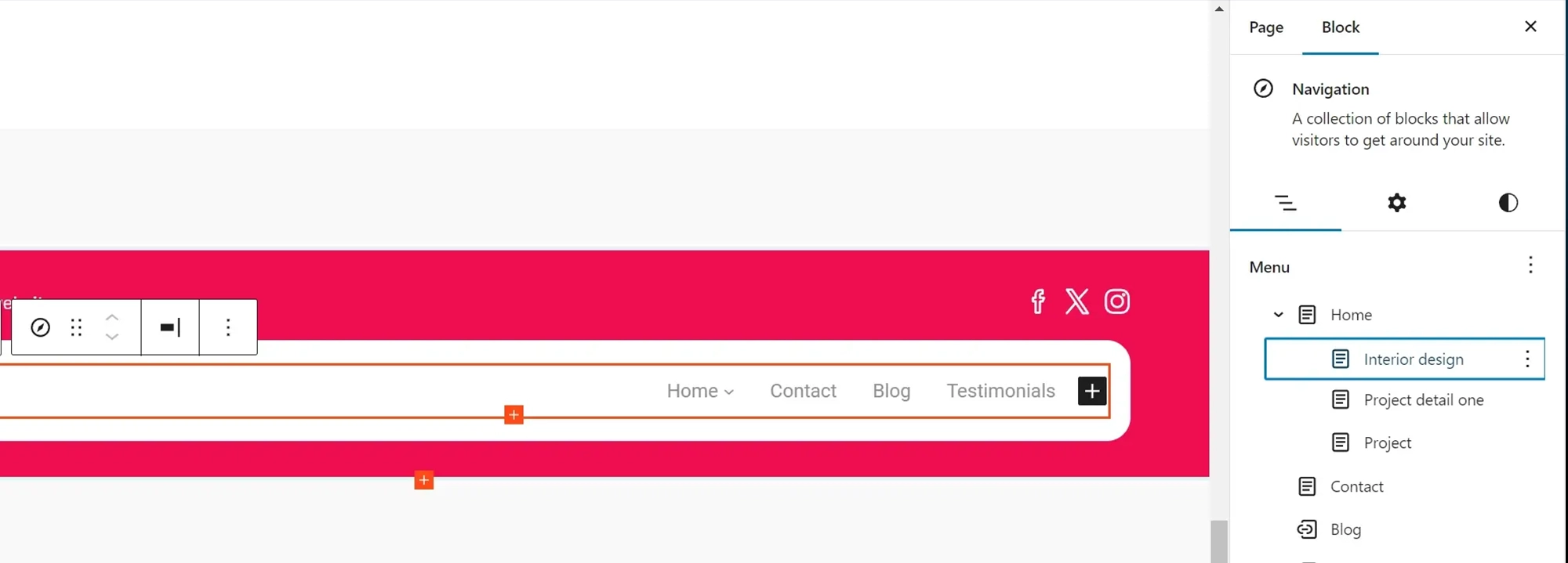
To get started, go to your WordPress dashboard and select Appearance, then Menus. From here, you can create a new menu and give it a name. You can then:
- Add links to any page, post, category or custom URL
- Rearrange menu items by dragging them into your preferred order
- Nest items under a parent menu to create dropdowns
WordPress supports multiple menus, so you can set up separate ones for your header, footer or even mobile layout depending on your theme.
Organise content clearly
Use simple labels like “About”, “Services”, or “Contact” to make your menu clear. Avoid overloading it with too many links. If you need to group content, use dropdown menus or secondary navigation areas.
Customising the appearance of your menu
For design changes like fonts, colours and spacing, open the Customizer under Appearance > Customise. Depending on your theme, you may have options for changing the menu style, alignment or background.
Get more control with MaxiBlocks
If your theme limits how much you can change, use MaxiBlocks to design a fully custom navigation bar. MaxiBlocks gives you layout flexibility, including:
- Custom header blocks with full-width or boxed menus
- Buttons and icons inside your navigation
- Responsive controls for mobile menus
- Sticky headers that stay visible as you scroll
You can place menus anywhere on your site and adjust them visually without writing any code. This is especially helpful when building landing pages or branded header layouts that go beyond the default theme settings.
Extending menu functionality with plugins
If you need features like mega menus, animation effects or conditional menu items, look for plugins that integrate with the block editor. MaxiBlocks is a good place to start, as it allows you to style and place complex menu layouts using drag and drop.
Keep it functional
Focus on user experience. Make sure your menu is readable, simple to navigate, and works well across screen sizes. Test it on mobile devices to ensure it is touch friendly and not overcrowded.

Navigation menus are one of the most important elements of your WordPress website. They help visitors move through your site, find information quickly, and understand your content structure. Whether you are just starting out or updating an existing site, learning how to use and customise WordPress menus will improve your site’s usability and design.
Understanding WordPress navigation menus
A WordPress menu is a collection of links displayed in key areas of your site, most commonly in the header. Depending on your theme, menus can also appear in sidebars, footers or within custom layouts. You can create multiple menus for different purposes, such as one for your main site and another for a landing page or footer.
Menus can include links to pages, blog posts, categories or external websites. You can also create dropdown menus by placing items under a parent menu item to group related content.
Where menus appear
Most themes display the primary menu at the top of your website, but some layouts support multiple menu locations. If you are using MaxiBlocks, you can place menus anywhere on the page by dragging and dropping them into your custom header, footer or sidebar layout.
Creating a new menu
To create a new navigation menu in WordPress:
- Go to your WordPress dashboard
- Select Appearance, then Menus
- Click Create a new menu at the top of the page
- Name your menu, then click Create Menu
Once your menu is created, you can begin adding items to it.
Adding links to your menu
WordPress makes it easy to add a variety of links to your menu. These include:
- Pages from your site, such as Home, About or Contact
- Posts, especially useful for blog highlights
- Custom links, such as to another website or a section within a page
- Categories, which group blog content under a shared topic
To add these items, use the panel on the left side of the Menus screen. Tick the boxes next to the items you want, then click Add to Menu.
Structuring your menu
Drag items into the order you want. To create a dropdown, drag an item slightly to the right under another. This makes it a submenu item and helps organise larger menus.
Customising menu design
For basic design changes, go to Appearance > Customise. Many themes let you change font styles, colours and menu position. If you are using MaxiBlocks, you can build fully custom menus using block-based navigation elements. This gives you more control over layout, style and responsiveness—without writing code.
With MaxiBlocks, you can:
- Place menus anywhere on the page
- Add icons or buttons inside the menu
- Create mobile-friendly layouts with toggle menus
- Apply consistent styling across every section of your site
Next step
Once your menu is created and styled, test it on different devices. Make sure links work, dropdowns are easy to use, and mobile users can navigate your site with ease.
Making sure your website is easy to navigate on all devices is essential for user experience and SEO. With more than 60 percent of web traffic now coming from mobile devices, your WordPress menu needs to be both responsive and accessible. Sticky menus help users stay oriented as they scroll, while mobile-friendly menus ensure that visitors on smaller screens can browse without frustration. MaxiBlocks makes both of these easy to implement with no code required.
What is a sticky menu?
A sticky menu stays visible at the top of the screen as the user scrolls down the page. This type of menu improves navigation by giving visitors constant access to important links without having to scroll back to the top.
What is a mobile menu?
A mobile menu is a version of your site’s navigation designed specifically for small screens. It usually appears as a “hamburger” icon that, when tapped, expands into a full menu. Mobile menus save space and make browsing easier on phones and tablets.
Creating a sticky menu in MaxiBlocks
To create a sticky header using MaxiBlocks:
- Open your page or template in the WordPress Site Editor with MaxiBlocks enabled
- Insert or select a header block
- In the block settings panel, turn on the Sticky option
- Choose the position (usually “Top of page”)
- Adjust spacing and background styles to ensure your menu is readable when it sticks
You can style your sticky header independently, for example by reducing padding or adding a drop shadow for visibility.
Building a mobile menu in MaxiBlocks
MaxiBlocks includes responsive controls for mobile layout by default. To create a mobile-ready menu:
- In the block settings, set the Mobile toggle option to appear below a certain screen width
- Customise the menu toggle icon, text label, colours and animation
- Preview the menu at different breakpoints using MaxiBlocks’ responsive preview tools
- Fine-tune spacing and padding so the menu opens clearly on all devices
MaxiBlocks also supports nested menus and dropdowns, so you can manage complex content structures even on mobile screens.
Best practices for sticky and mobile menus
Keep it clear
Limit your sticky menu to essential links like Home, Services or Contact. Too many items can clutter the interface.
Design for touch
Make sure mobile menu links are large enough to tap comfortably. Follow accessibility guidelines for spacing and contrast.
Check performance
Sticky headers should not cover content or cause layout shifts. MaxiBlocks helps prevent this by allowing you to set fixed heights and responsive padding.
Test across devices
Use your browser’s mobile preview or real devices to test behaviour on phones, tablets and desktops.
Why use MaxiBlocks?
With MaxiBlocks, everything is done visually. You do not need to add extra plugins for mobile menus or sticky headers. Every element is fully customisable inside the block editor, and your menus can be adjusted on a per-device basis to keep your design consistent across breakpoints.
Subscribe to our newsletter
Final thoughts and your next steps with MaxiBlocks
A clear, responsive navigation menu is more than just a design detail—it is a vital part of your user experience and search performance. As you have seen, WordPress gives you the tools to build basic menus, but with MaxiBlocks, you can take that experience further by creating menus that adapt across devices, stay visible as users scroll, and integrate cleanly with the rest of your site.
Whether you are building your first site or refining an existing one, here are a few key takeaways:
- A simple, well-structured menu helps people explore your site quickly
- Mobile menus are essential as mobile traffic now accounts for more than half of web visits
- Sticky menus increase usability by keeping key links accessible at all times
- Using MaxiBlocks lets you do all this visually, with no need for extra plugins or code
If you are just getting started, try out the MaxiBlocks plugin on WordPress.org and pair it with the MaxiBlocks Go theme for a fast, flexible base. You can explore more patterns, headers, and navigation layouts inside the plugin’s library.
Where to learn more
To go deeper, browse the Help Centre at help.maxiblocks.com for step-by-step guides, video tutorials and common questions. You’ll find walkthroughs on building menus, customising headers, and improving mobile responsiveness.
Want to improve your design skills or learn about performance best practices? Keep learning by:
- Exploring patterns and templates directly inside the Site Editor
- Reading WordPress block theme documentation
- Experimenting with live mobile previews inside MaxiBlocks
- Visiting communities like WordPress Slack or the MaxiBlocks forum
Building smarter menus means better websites. And with MaxiBlocks, you have everything you need to keep improving, one block at a time.
Discover how to create clear, responsive, and stylish WordPress menus with expert tips and resources.
Can I create a mobile-friendly menu without any coding?
Yes. With MaxiBlocks, you can create fully responsive menus that work beautifully on mobile devices. The drag-and-drop editor allows you to customise layout, toggle behaviour and spacing directly within the block editor—no code required.
How do I make my WordPress menu sticky?
Sticky menus can be created using the block editor with MaxiBlocks. Simply select your header or container block and toggle on the Sticky option. You can then adjust the styling for when it sticks, such as background colour or shadow.
What is the benefit of using a sticky header?
A sticky header keeps your navigation visible as users scroll. This improves usability, especially on long pages or landing pages where users may want quick access to key links like Contact or Services.
Can I have different menus for desktop and mobile?
Yes. Many themes support responsive menu variations, and MaxiBlocks gives you full control over how your menu looks and behaves on different screen sizes. You can show or hide blocks based on the device, or customise layout and toggle options just for mobile.
Is it possible to add buttons or icons in my WordPress menu?
With MaxiBlocks, it is. You can insert icons next to text or even turn menu items into buttons with hover effects. These features help improve navigation and draw attention to key actions like “Get a quote” or “Book now”.
Will changing my menu affect SEO?
Navigation affects both user experience and search engines. A clean, logical menu with clear labels helps search engines understand your site structure. MaxiBlocks supports semantic HTML and accessibility best practices to keep your navigation SEO friendly.
Can I add a dropdown menu?
Yes. You can create dropdown menus by nesting menu items under a parent in the menu builder. MaxiBlocks allows you to visually manage this with control over spacing, alignment and animation.
Does MaxiBlocks work with any theme?
MaxiBlocks is designed to work best with block-based themes like MaxiBlocks Go, but it also works with many popular block-compatible themes. For full flexibility, start with a theme made specifically for block editing.
How can I preview my mobile menu?
In the WordPress Site Editor or MaxiBlocks builder, switch to mobile preview mode. This allows you to see how your menu will appear on tablets and phones. You can adjust spacing and alignment without publishing changes.
WordPress itself
Official Website
wordpress.org – This is the official website for WordPress, where you can download the software, find documentation, and learn more about using it.
WordPress Codex
codex.wordpress.org/Main_Page – This is a comprehensive documentation resource for WordPress, covering everything from installation and configuration to specific functionality and troubleshooting.
WordPress Theme Directory
wordpress.org/themes – The official WordPress theme directory is a great place to find free and premium WordPress themes. You can browse themes by category, feature, and popularity.
maxiblocks.com/go/help-desk
maxiblocks.com/pro-library
www.youtube.com/@maxiblocks
twitter.com/maxiblocks
linkedin.com/company/maxi-blocks
github.com/orgs/maxi-blocks
wordpress.org/plugins/maxi-blocks

Kyra Pieterse
Author
Kyra is the co-founder and creative lead of MaxiBlocks, an open-source page builder for WordPress Gutenberg.
You may also like

