How to use and customise the MaxiBlocks WordPress home page design template
Looking to build an exceptional website for your winery or wine shop? The MaxiBlocks WordPress home page design template provides a flexible and visually appealing foundation for your online presence. This template is perfect for showcasing wine offerings, highlighting your story, and encouraging customer interaction. In this blog post, we’ll break down each section of this homepage template, offering tips on how to make it your own, from imagery to customisation suggestions, as well as use cases for different industries.
Header section: Hero image and call to action
The homepage begins with a vibrant hero image of two people toasting with wine glasses, providing an inviting, celebratory introduction to your website. The image captures the spirit of high-quality wine and enjoyment, setting the tone perfectly for a wine brand. The hero image is full-width, immediately drawing visitors in with its warm, festive atmosphere.
The text overlay reads “EXCEPTIONAL WINES,” followed by a subheading that emphasises the quality of your wines. The text is bold and positioned centrally, ensuring it stands out against the background image. The call to action (CTA) buttons, including “Say hello” and a hotline number, are placed prominently for immediate engagement. The CTA buttons are designed with clear, contrasting colours to draw attention and are strategically located just below the main headline for easy access. The icons used are clean and functional, providing a quick way for customers to connect, whether they want to book a tasting or join the wine club.
Tips for customising the header section:
- Replace the hero image with one that represents your brand, such as a close-up of your vineyards or a joyful wine-tasting event.
- Customise the headline text to be more specific, like “Award-Winning Family Wines Since 1906.”
- Change the CTA buttons to reflect your specific goals—e.g., “Schedule a Visit” or “Join Our Exclusive Club.”
- Use icons that reflect your business’s unique offerings, such as a wine bottle or a grape bunch. You can find relevant icons in the MaxiBlocks icon library.
- Add a short video clip instead of the hero image to make it more engaging.
- Update the hotline number with a contact form using a WordPress contact form.
- Adjust the colour scheme of the text overlay to match your branding.
- Use an animated number counter to show statistics such as “Years of Experience” or “Bottles Produced.”
- Experiment with different call to action examples that suit your website’s voice.
- Link the CTA buttons to different block pattern text elements for a dynamic user experience.
Our story section
The next section features an image of a woman strolling through a vineyard. This gives a personal and authentic touch, illustrating a rich history connected to the land. The accompanying text tells the story of your winery, with “1906 Since” boldly marking your heritage. The image is placed to the left, with the text to the right, creating a balanced and visually appealing layout that is easy to read.
The layout of this section encourages storytelling, with enough space for a substantial paragraph that explains the brand’s history. The typography is elegant, giving a sense of tradition and quality, while the use of white space ensures the section feels open and inviting.
Tips for customising the story section:
- Use a different image that reflects the core of your business, such as your production team or a scenic shot of your estate.
- Update the text to share specific anecdotes that make your story unique.
- Include a block pattern text element to create a timeline of important milestones.
- Add an animated element such as a website hero showcasing the evolution of your winery.
- Use different fonts for the year to make it stand out more or match your brand’s aesthetics.
- Incorporate testimonials from long-time customers as part of your story.
- Replace the “Say hello” button with a link to your about us pages.
- Use WordPress icons to visually indicate different elements like sustainability or family heritage.
- Add more visual interest by including a pricing table that highlights different experiences you offer.
- Link to a detailed page using a content pattern for customers interested in learning about your production process.
Feature cards: Dine, taste, tour
This section highlights three key experiences—dine, taste, and tour. Each experience is represented by a circular image and a short descriptive text, creating a cohesive and visually appealing layout. The images are placed above the titles, making the cards easy to scan and visually engaging.
The feature cards are set against a light background to ensure they stand out. The use of circular images gives a modern touch while also providing visual separation from other sections. The descriptive text below each image is kept concise, providing just enough information to intrigue visitors and prompt them to explore further.
Tips for customising the feature cards:
- Change the images to reflect unique experiences, such as a sunset dining setup or a behind-the-scenes vineyard tour.
- Customise the titles to include the specific names of your experiences—e.g., “Sunset Vineyard Dinner.”
- Update the descriptions to add more details about each experience.
- Include a link to Gutenberg blocks for visitors who want to book directly.
- Replace the rounded images with another shape that fits your brand’s style—squares or hexagons, for instance.
- Add subtle animations to each card to make them more engaging when hovered over.
- Change the background colour of the cards to make them pop more on the page.
- Link each feature card to a relevant blog post on your site, like one covering the history of vineyard tours.
- Use icons from the WordPress icon library to accompany each experience.
- Replace the feature card with an accordion to include more information in a compressed format.
Wine selection section
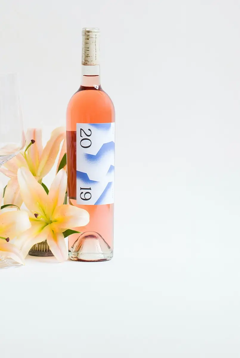
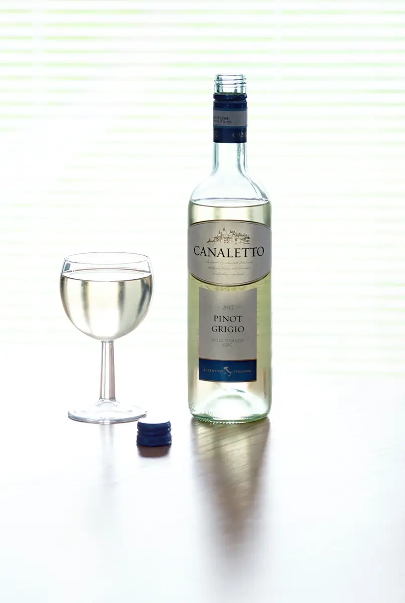
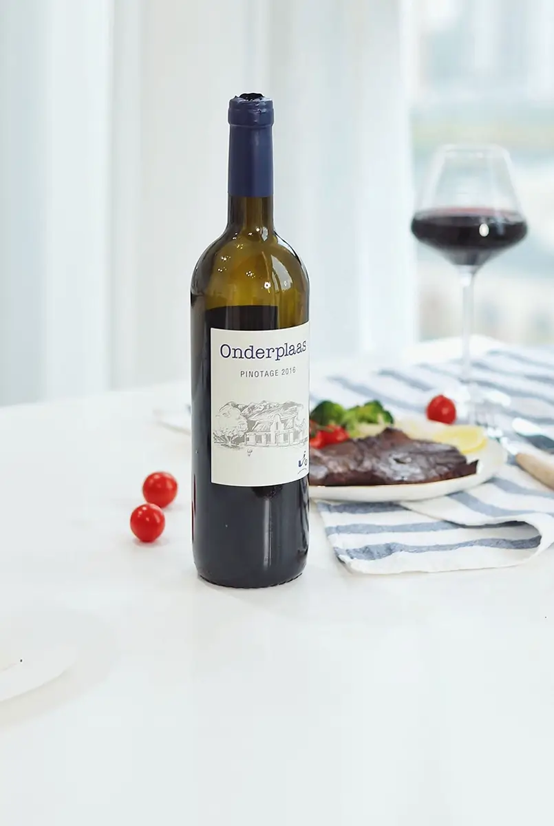
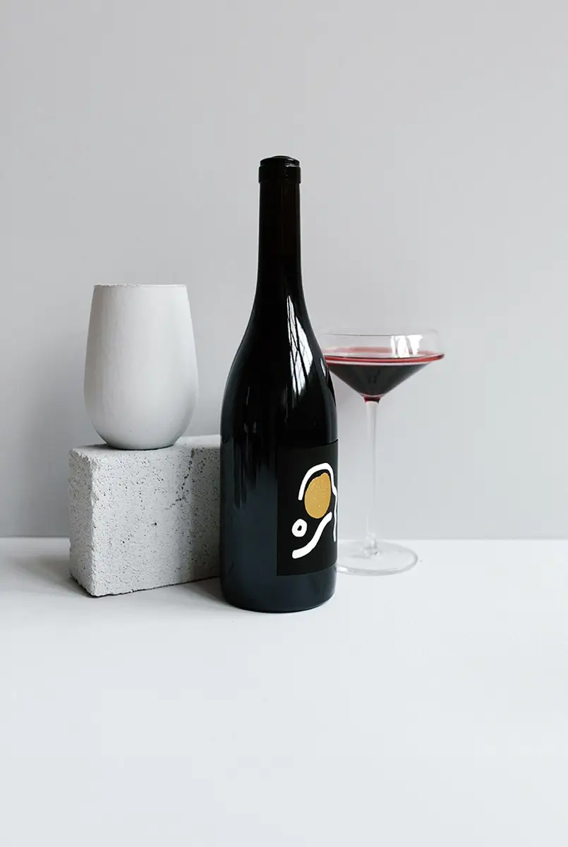
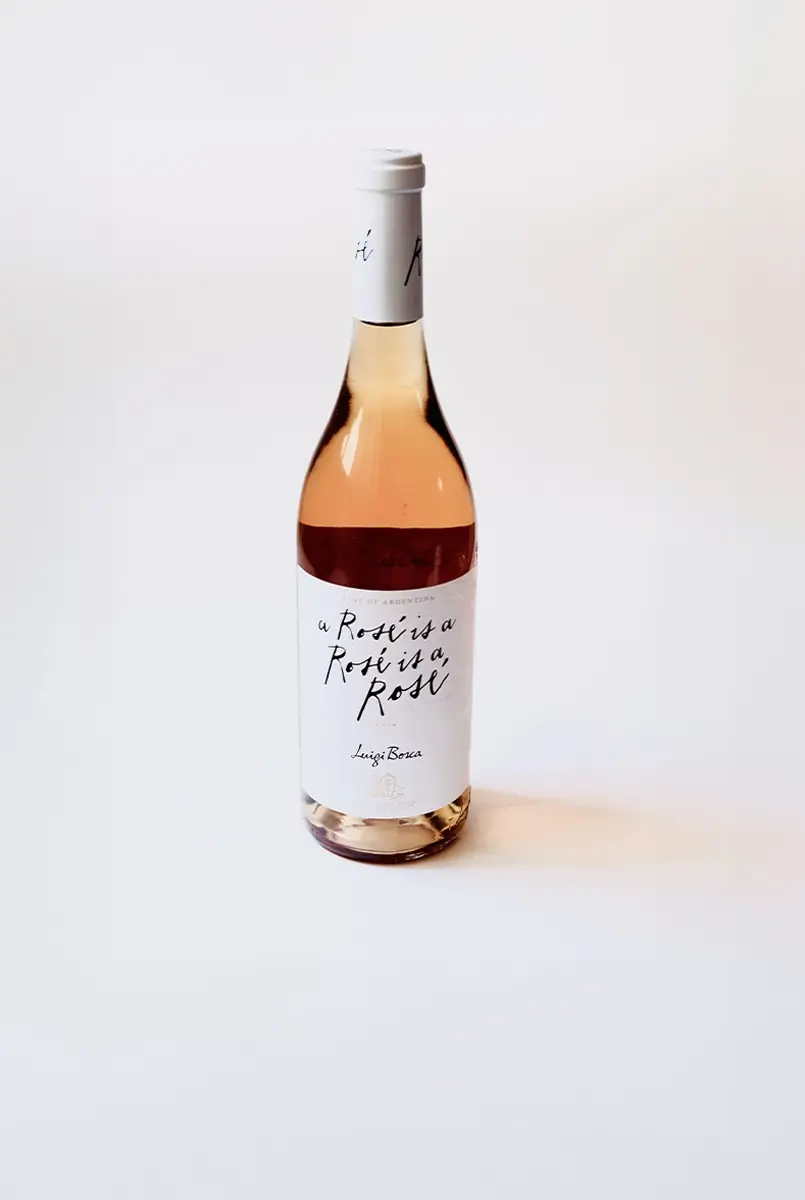
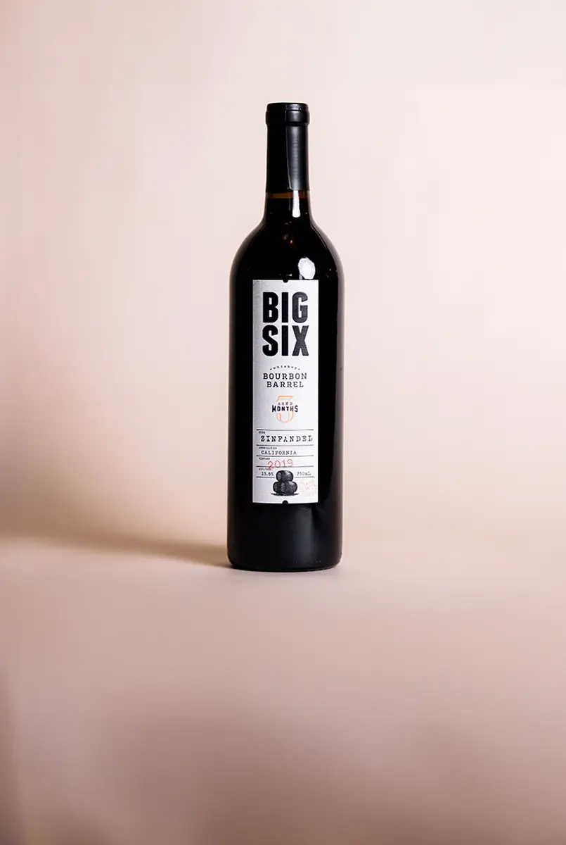
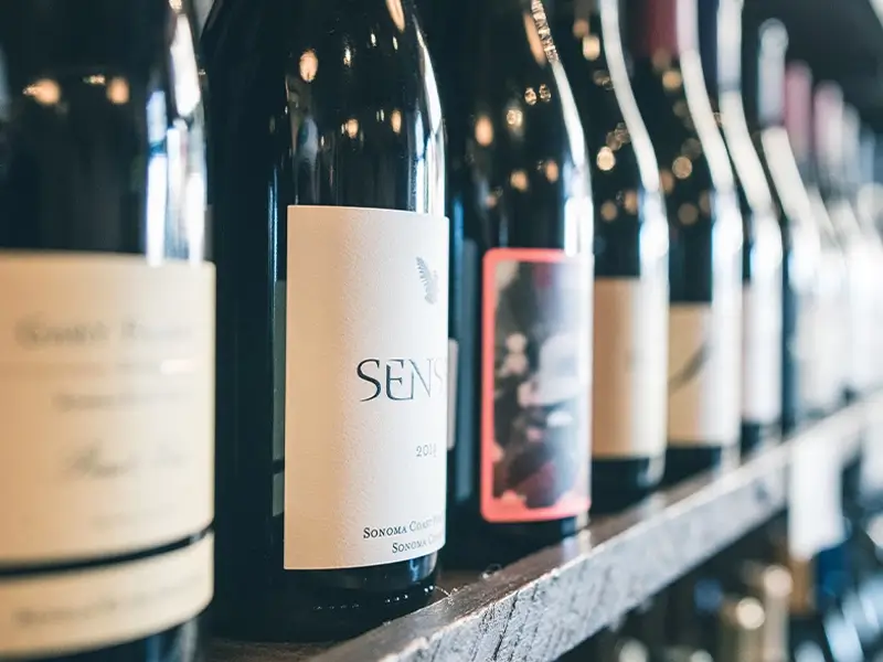
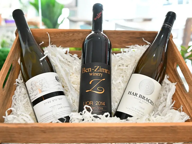
This section showcases your wine offerings in a clean, grid-style layout. Each product card displays an image of the wine bottle, the name of the wine, and the year. The grid layout is designed to be both functional and aesthetically pleasing, allowing visitors to easily browse through the selection.
The images of the wine bottles are arranged in rows, providing a straightforward, organised look. The labels are easy to read, and the year is highlighted to add context and value. The overall design is minimalistic, ensuring that the focus remains on the product images. The use of a consistent background colour helps unify the section and makes the wine bottles the centre of attention.
Tips for customising the wine selection section:
- Use professional images of your wine bottles taken in natural light.
- Highlight customer reviews or ratings directly under each wine.
- Link each wine to a WooCommerce product page for online purchasing.
- Incorporate a website team section, introducing key team members involved in making each wine.
- Customise the font style to reflect the elegant nature of your brand.
- Add animated number counters showing limited edition wines available.
- Use block patterns to highlight certain products, such as a “featured wine of the month.”
- Add a “Buy Now” or “Pre-Order” button to encourage direct sales.
- Include detailed tasting notes for each wine, using a WordPress block template.
- Use icons to represent wine types—e.g., a grape cluster for red wines and a sun for summer blends.
Event hosting section
This section includes an image background of people toasting, promoting event hosting services. The background image is slightly blurred, allowing the overlaid text to be more prominent and easily readable. The overlaid text invites users to let the winery host their special events, with a clear CTA button encouraging action.
The layout here is designed to evoke emotion, with the image capturing a joyful moment. The use of large, bold text helps convey the message quickly, while the CTA button is strategically placed to drive conversions. The warm colours used in this section further enhance the feeling of celebration and hospitality.
Tips for customising the event hosting section:
- Replace the background image with one from an actual event hosted at your venue.
- Adjust the call to action to something more specific, like “Book Your Wedding Today.”
- Include a video testimonial from a satisfied event client.
- Use website icons for easy navigation—such as a calendar or champagne glass.
- Add an email subscribe form for those interested in learning about upcoming events.
- Customise the button to link to a services page design.
- Change the text colour to match the tones used in your branding.
- Add a WordPress contact form directly under the image for easy inquiries.
- Experiment with different headline options that are more engaging.
- Offer different event packages with a pricing table.
Blog or news section
The blog section features three cards with images, dates, titles, and short excerpts—all designed to encourage engagement. The cards are arranged side by side, providing a preview of the content available on the website.
Each card has an image at the top, followed by a date marker in a bright colour that contrasts with the rest of the card, making it easy to spot. The titles are bold and engaging, encouraging users to click and read more. The use of white space around each card helps keep the section clean and easy to navigate, while the consistent layout ensures a cohesive look.
Tips for customising the blog section:
- Replace the current images with high-quality photos relevant to each post.
- Add categories like “Wine Tasting Tips” or “Food Pairing Suggestions” for easy navigation.
- Use a different layout for block patterns blog hero to make the section more dynamic.
- Experiment with different WordPress navigation menus to categorise blog posts.
- Incorporate testimonials design to highlight user feedback about your blog.
- Add hover effects to the blog cards for a more interactive user experience.
- Create a unique tagline for the section to draw readers in.
- Link to popular articles on consulting websites.
- Use submenus in the navigation to make it easy for readers to find articles.
- Add a WordPress accordion to compress lengthy blog descriptions.
Contact section
This section provides contact information and social media links, making it easy for visitors to connect with you. The layout is simple, with two columns—one for the address and another for contact details.
The contact section includes social media icons that are minimalist in design and placed at the bottom for easy access. The use of consistent iconography helps reinforce brand identity, and the clean layout ensures that visitors can quickly find the information they need. The section also includes a footer with links to legal information, providing a comprehensive wrap-up to the page.
Tips for customising the contact section:
- Add a small map to show your location.
- Include a 404 page link for easy navigation in case of an error.
- Use WordPress icons for each method of contact.
- Include a short FAQ next to the contact information.
- Add a block pattern email form for inquiries.
- Include links to your law firm websites if relevant.
- Update social media icons to match your website’s colour scheme.
- Use block compatible themes and plugins to add a chatbot.
- Experiment with different WordPress templates for a unique look.
- Link to landing pages websites for visitors who might want more information.
Different types of websites that can use this WordPress home page
This home page design template is versatile and can be adapted for various industries:
Final thoughts
The MaxiBlocks WordPress home page design template provides a solid starting point for building an impressive and functional website. Whether you’re designing a health website, event website, or photography portfolio, this template can be easily customised to fit your needs. Explore more options with WordPress websites, WordPress website design, or find alternatives to traditional page builders like Elementor. If you’re in need of a WordPress website designer or looking for reliable WordPress website builders, MaxiBlocks has you covered.


