Discover the eye-catching hero banner block design!
Imagine a stunning hero banner that instantly captures your audience’s attention! This modern and engaging layout combines a left-aligned text block with a captivating collage of images on the right. Perfect for showcasing your brand’s story or important information, this design is as functional as it is visually appealing.
Layout analysis
overall structure
The layout features a single column with a staggered arrangement that beautifully balances visual content and textual information. This type of WordPress website design is practical and makes a strong statement.
arrangement of rows and columns
On the left side, a text block introduces your message, while the right hosts a dynamic set of images that catch the eye. It’s designed with one prominent row split into two sections for optimal impact.
asymmetrical elements
The asymmetry, with text on one side and images on the other, adds a lively touch, making your banner stand out.
Element and feature description
- Header: “About us” is displayed prominently at the top, setting the tone.
- Text blocks: A descriptive paragraph follows, providing essential details to engage your visitors.
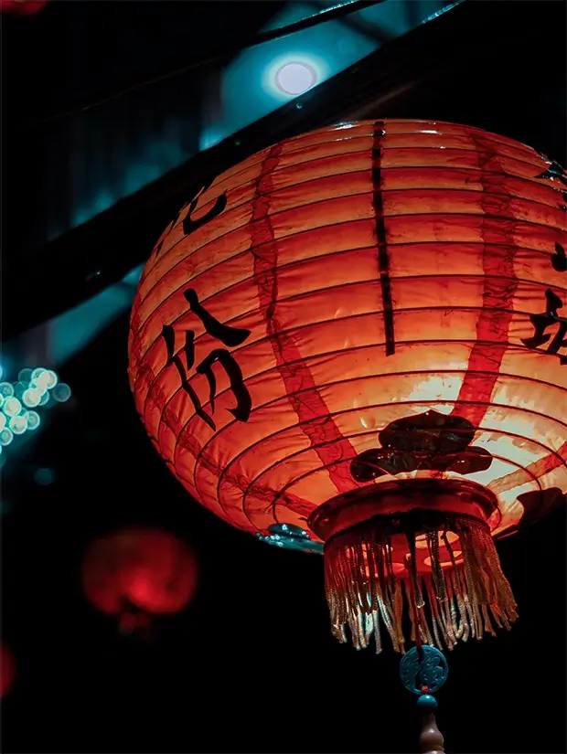
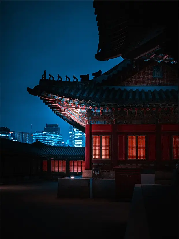
- Images: Three striking images are arranged in two columns on the right, illustrating your theme or products.
- Call-to-action button: A bold “Learn More” button invites user interaction, enhancing engagement.
interactive elements
The prominent button is designed to encourage clicks, making it easy for your audience to delve deeper into your content.
typography
A clear header font for “about us” catches the eye first, followed by a smaller, readable font for the paragraph, with the button text designed to stand out.
graphical elements
Each image is thoughtfully presented, likely with subtle borders or shadows to add depth to your design. The use of WordPress icons can further enhance the style.
image orientation
The rectangular orientation of the images contributes to a visually dynamic collage effect.
Unique design aspects
standout design choices
A striking diagonal segment at the top left against a dark background showcases a modern aesthetic, similar to a WordPress site design.
hover effects
Although not definitively showcased, the button’s design suggests it may feature hover effects, enhancing user experience.
responsive design
The adaptable layout is perfect for various screen sizes, ensuring your hero banner looks great on all devices.
accessibility considerations
With contrasting colors and clear text, this design considers readability, making it user-friendly for everyone.
Overall design style
design style
This hero banner captures a modern yet playful vibe, blending professionalism with visually engaging elements.
visual hierarchy
The structured hierarchy ensures that your header is the first element noticed, followed by the information and supporting images.
use of white space
The effective use of space enhances balance, draws focus to key elements, and eliminates clutter.
Use cases for the hero banner
- Business branding: Use the hero banner to establish a visual identity for your business. The design elements work together to showcase your company’s brand image and message, enhancing customer perception.
- Launching a new product: Announce and highlight your latest product with dynamic imagery and engaging text on the hero banner, drawing in consumers with enticing designs and layouts.
- Promotional campaigns: Integrate a call-to-action into your banner to boost engagement for promotional offers and campaigns. This draws your audience in with clear and compelling messaging.
- Seasonal highlights: Take advantage of the hero banner for seasonal themes and promotions. Adding festive graphics and timely messages can captivate audiences year-round.
- Event announcements: Host events or webinars? Use your hero banner to spotlight the details, ensuring participants know what you offer and fostering curiosity and interaction.
- Portfolio showcase: Display your portfolio in a visually compelling way, whether it’s art, design, or photography. The hero banner’s image collage options make it ideal for visual storytelling.
- User testimonials: Enhance credibility with customer testimonials presented in an appealing, well-arranged format. This builds trust and engagement with potential customers.
- Blog highlights: Feature your top blog posts by linking them directly through your hero banner. Keep content evergreen with eye-catching text and dynamic buttons that lead directly to your blog.
- Charity causes: If you’re running a charity organisation, elaborate on causes with sympathetic designs in the hero banner, inviting community support and involvement.
- E-commerce promotions: Use the hero banner for flash sales or exclusive online deals, making it easy for customers to see, click, and purchase directly from the link provided.
Ways to use the hero banner
- Image sliders: Add variety to your website with rotating images and text that grab attention while providing visual interest, ideal for showcasing multiple products or offerings.
- Background videos: Integrate short, engaging background videos to provide depth and draw viewers in, capitalising on dynamic content for interaction.
- Custom animations: Incorporate custom animations into your hero banner to create a unique user experience that stands out and holds attention.
- Interactive elements: Include clickable links and measurements to promote user interaction, directing them to important information or product pages.
- Content flipping: Introduce flipping elements in the hero banner to provide snippets of information that flip when hovered over or clicked, intriguing users.
- Enhanced navigation: Utilise responsive design elements for a complete navigational experience within your hero banner, helping users find exactly what they need.
- Lightbox integration: Expand images or content stored within your hero banner in a lightbox for detailed viewing experiences, enhancing interaction.
- Brand storytelling: Use your hero banner to communicate brand stories that highlight core values and mission, resonating with audiences on a personal level.
- Prominent typography: Capture attention with bespoke typography and vivid colour schemes that anchor your brand message and visual identity.
- A/B testing: Ensure you reach maximum engagement by conducting A/B testing for your hero banner, refining elements that drive user attraction and interaction.
Conclusion
This hero banner is not just a design; it’s a powerful tool for engagement! With its asymmetrical layout, combined text and visuals, eye-catching typography, and a clear call-to-action, this pattern is ideal for any WordPress website user looking to create an impactful presence online. Elevate your website with this modern hero banner that attracts attention and drives action, whether using free WordPress themes or exploring Elementor alternatives or enhancing your WordPress website design with the latest tools and techniques.


