20 creative ways on how to design a website layout
Try MaxiBlocks for free with 500+ library assets including basic templates. No account required. Free WordPress page builder, theme and updates included.
Updated 15th May 2025
20 useful layout ideas for a better website
Creating a well-designed website layout is more than just arranging elements on a page. A thoughtful layout can greatly affect how users interact with and perceive a site. It’s not just about looking good it’s about making sure that users can navigate and find what they need efficiently.
Trend analysis
Website layout design trends are always shifting as technology and user behaviour change. In recent years, we’ve seen a rise in minimalist design, mobile-first thinking, and interactive layouts. More designers are prioritising speed, clarity, and accessibility because users expect sites to be fast, easy to use, and helpful.
Other trends include:
- Grid-based modular systems that help with scalability
- The use of oversized typography for impact
- Layouts designed around storytelling or content-first approaches
- Sticky navigation and dynamic headers that stay in view while scrolling
- Flexible sections built with block-based tools like MaxiBlocks or Elementor
Keeping an eye on layout trends doesn’t mean copying everything new. But understanding what’s becoming standard can help you make design choices that feel current while staying useful.
Key Definitions & Concepts
Website layout: The way content is arranged on a page, including text, images, navigation, and interactive elements.
Visual hierarchy: The order in which the eye notices elements on the page, influenced by size, colour, contrast, and placement.
Responsive design: A layout that adjusts to fit various screen sizes, like desktops, tablets, and phones.
Navigation structure: How menus, links, and buttons guide users through the site.
Above the fold: The part of the webpage visible without scrolling; it’s where you should place key info.
Pro Tips from the Experts
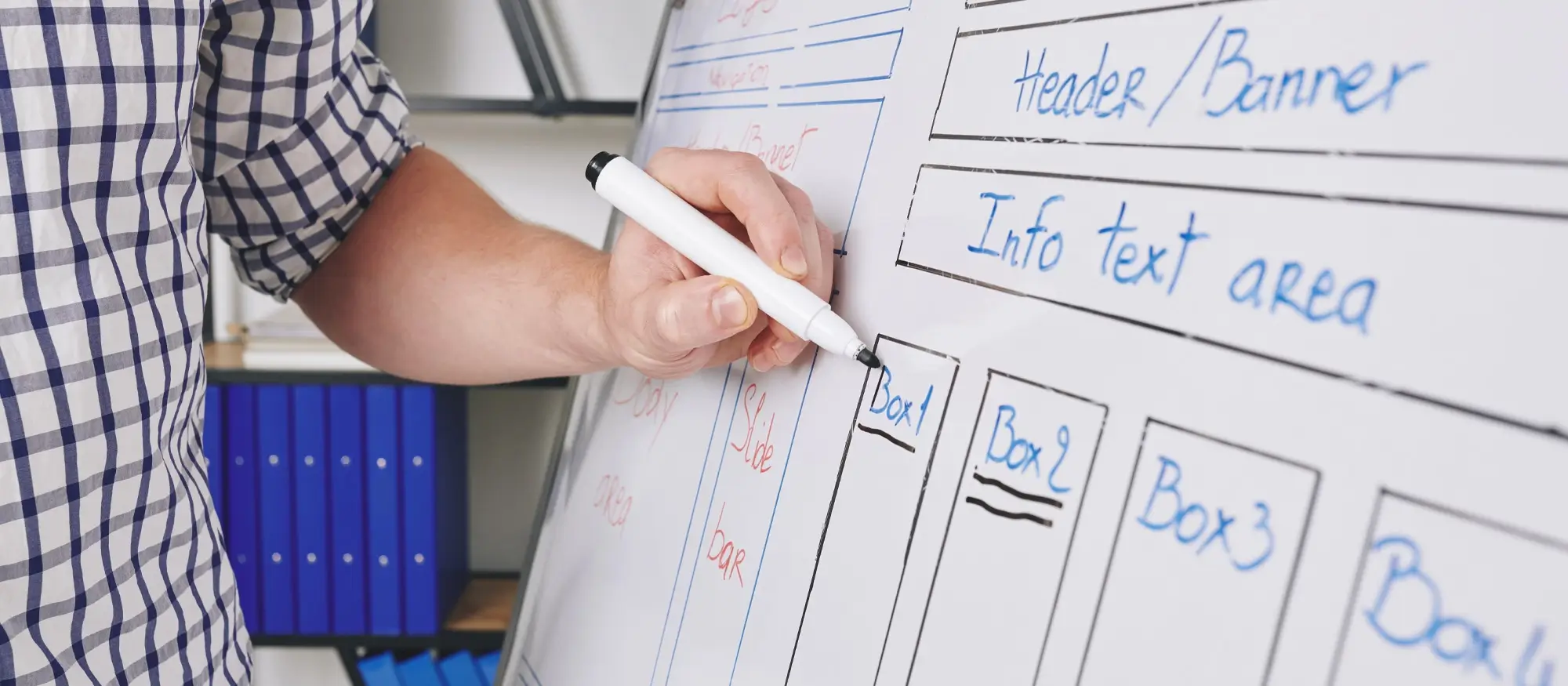
- “Start with wireframes. It’s easier to fix layout issues before adding design.” – Mia Harper, UX Designer
- “Keep user goals in mind. A layout should make it easy to get to the info that matters.” – Dan Liu, Web Strategist
- “Don’t crowd the page. Use white space to give elements room to breathe.” – Claire James, Front-end Developer
- “Always test your layout on a phone. Most users will visit your site on mobile first.” – Jay Moreno, UX Engineer
Keep it clear and simple
Start with layouts that make your site easy to understand and navigate. These methods help visitors find what they need quickly without distractions.
1. Adopt a minimalist design approach
Minimalist design is all about stripping away excess and focusing on what’s truly important. This approach helps avoid overwhelming visitors with too much information at once. By concentrating on essential elements, you can create a clean and functional layout that guides users naturally through your content.
2. Use bold typography
Typography isn’t just about readability; it’s a way to make a statement. Bold and distinctive fonts can capture attention and set the tone for your site. By choosing the right typefaces, you can establish a clear hierarchy and make important information stand out.
3. Design with a mobile-first approach
Designing with mobile devices in mind means creating layouts that work well on smaller screens. A mobile-first approach ensures that your site is accessible and functional across various devices. This method often involves simplifying the layout and focusing on essential content to fit mobile screens effectively.
Subscribe to our newsletter
Add visual interest
Visual details catch attention and help your site stand out. These layout ideas use contrast, shapes, and images to make pages more engaging.
4. Incorporate asymmetrical layouts
Asymmetrical layouts might sound a bit unconventional, but they can make your site more visually interesting. By breaking away from traditional symmetry, you can create a sense of movement and dynamism. The key is to balance these elements so that the layout remains harmonious and does not feel chaotic.
5. Experiment with split screens
Split screens offer a unique way to present two types of content side by side. This layout can be particularly effective when you want to compare or contrast information. By dividing the screen, you can provide a clear visual separation that helps users focus on each part of the content.
6. Embrace full-screen backgrounds
Full-screen backgrounds can make a powerful visual impact. Whether it’s a high-quality image or video, this type of background can draw attention and set the mood for your site. It’s a great way to make a strong first impression and highlight key messages.
7. Incorporate bold imagery and graphics
High-quality images and graphics can significantly enhance a website’s visual appeal. Bold visuals can capture attention and make your site more engaging. Choosing the right images and graphics helps convey your message clearly and attractively.
8. Use contrasting colours and bold visuals
Contrasting colours and bold visuals can help direct attention to important elements on your site. By using colours that stand out and strong imagery, you can make sure that key messages are noticed and understood quickly. This approach can also make your site more visually appealing.
Make it interactive
Websites aren’t just about reading they’re about doing. These layout features let people click, scroll, and engage directly with your content.
9. Integrate dynamic content sections
Dynamic content like sliders, carousels, and interactive tabs can make your site more engaging. These features allow for a more interactive experience, where users can click or swipe through content. This kind of layout can keep visitors interested and encourage them to explore more.
10. Incorporate micro-interactions
Micro-interactions are small, subtle animations that can enhance user engagement. These might include things like buttons that change colour when hovered over or small animations that provide feedback. They help make the site feel more interactive and responsive to user actions.
11. Incorporate interactive elements
Interactive elements like hover effects or clickable animations can make a site more engaging. These features encourage users to interact with the content and provide immediate feedback. They can also help make the site feel more lively and responsive.
12. Experiment with unconventional scrolling effects
Unconventional scrolling effects, like parallax scrolling or infinite scroll, can make browsing your site more interesting. These effects create a sense of depth and motion or allow users to keep scrolling without reaching the end of the page. They can add an extra layer of engagement and make the site feel more interactive.
Build like a pro
Help users move around
Good layouts guide people through your site. These ideas focus on navigation and flow, helping users explore without feeling lost.
13. Implement sticky elements
Sticky elements like headers, footers, or sidebars remain in place as users scroll through the page. This feature ensures that important information is always visible, making navigation easier and keeping key content within reach.
14. Experiment with unconventional navigation
Unconventional navigation methods, such as hidden menus or gesture-based controls, can make your site stand out. While these approaches can offer a unique experience, it’s important to balance creativity with functionality to make sure that users can still easily find their way around.
15. Create a storytelling experience
A storytelling approach to website layout involves guiding users through a narrative. By structuring your content in a way that unfolds like a story, you can lead visitors from one section to the next, making the experience more engaging and memorable.
Stay organised and flexible
These approaches make it easier to build, update, and manage content. They give your site structure while keeping things adaptable.
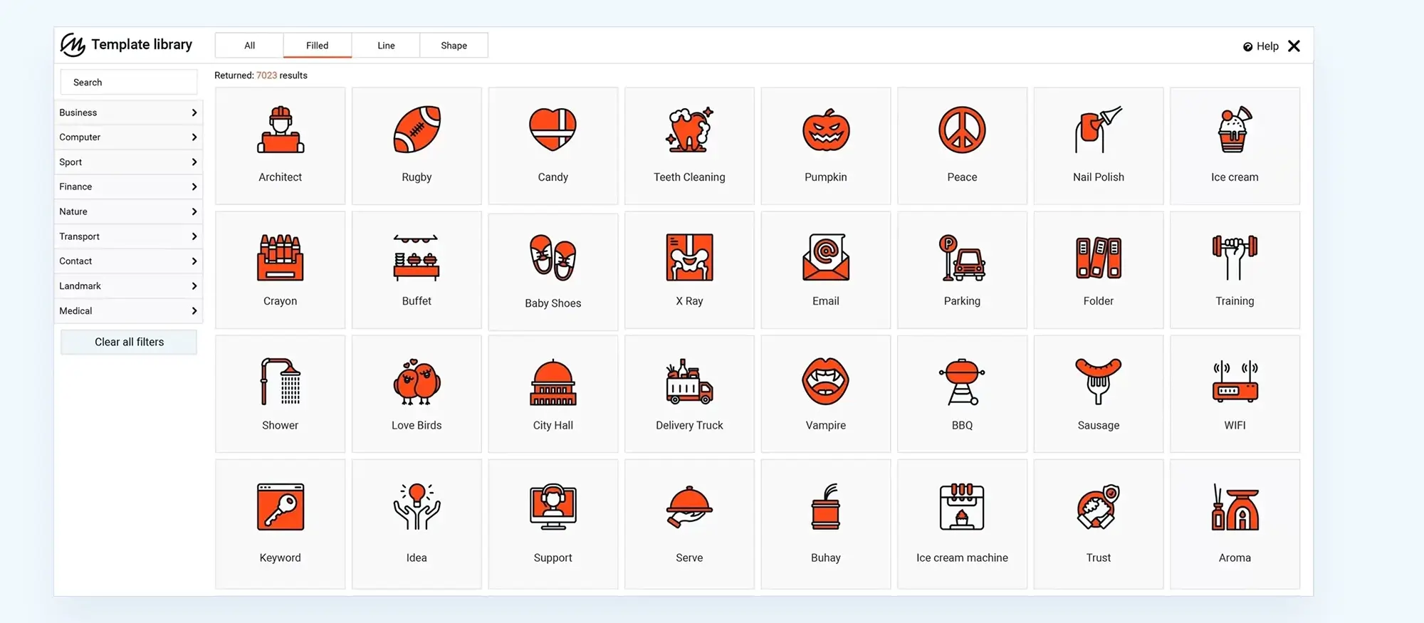
16. Employ a grid-based design
Grids are a classic method for organising content. They help create a structured layout where elements align neatly. Using a grid can make your site feel orderly and easy to navigate, as it provides a predictable framework for placing content.
17. Implement modular design
Modular design involves breaking down content into reusable sections or modules. This approach offers flexibility, as modules can be rearranged or updated without redesigning the entire site. It’s a practical way to manage and present content in a more adaptable manner.
18. Use unique layouts for different types of content
Tailoring layouts to fit different types of content can improve how information is presented. For instance, a blog might benefit from a different layout than an e-commerce site. Customising the layout to suit the content type helps in presenting information more effectively and making the site more user-friendly.
19. Integrate social media feeds
Including live social media feeds on your site can keep content fresh and engaging. This feature allows users to see real-time updates and interactions from your social media channels directly on your site. It’s a great way to integrate your online presence and encourage more interaction.
20. Design with accessibility in mind
Accessibility in web design means creating layouts that everyone can use, including those with disabilities. This involves making sure that content is easy to read, navigate, and interact with. Practical steps might include using readable fonts, providing text alternatives for images, and ensuring that all interactive elements are accessible.
Designing a website layout is more than just putting content on a page it’s about making sure that layout helps users do what they came to do. From guiding navigation to highlighting the most important details, a good layout can improve everything from user experience to engagement.
The best ideas often come from experimenting and testing. Try combining different techniques from this list. Mix minimalist principles with bold imagery, or pair modular sections with storytelling to lead users through your site.
If you want to start building right away, the MaxiBlocks plugin and MaxiBlocks Go theme are free and flexible options. They’re built to help you create modern layouts fast, without needing to code.
Now’s a good time to refresh your layout or start something new. Take what works, leave what doesn’t and build a site that’s easy to use, good to look at, and ready to grow.
Designing a standout WordPress website portfolio starts with mastering creative approaches to layout. Instead of relying on standard templates, consider exploring innovative techniques in how to design a website layout that balance visual hierarchy with seamless user flow. Whether you’re presenting projects for clients or showcasing personal case studies, the structure of your pages should guide visitors naturally through your content.
For those starting from scratch, dive into how to design a WordPress website from scratch to learn how to build from a blank canvas. You can also enhance your skills with WordPress website design tutorials and practical tips that reveal how to combine creativity with user-centred thinking. If you’re building for local clients, the guide on WordPress website design for small business shares focused advice for small enterprises.
To bring your creative layouts to life, it’s crucial to integrate strong fundamentals of WordPress design and development and WordPress web design. Don’t forget to optimise for usability with strategies on optimising user experience and responsive design, especially if you’re building a portfolio that must impress across devices. For those aiming to position themselves as a WordPress website designer, referencing curated collections of WordPress website designs and best WordPress website designs can provide further visual inspiration.
Not sure where to begin? If you’re asking yourself, how do I design my own WordPress website, the answer might lie in using powerful design systems like the MaxiBlocks design library to build dynamic layouts more efficiently. Pair it with expert tools using this WordPress guide to choosing a block addon to elevate your creativity. And if you ever decide to collaborate with professionals, understanding what is the best WordPress design agency can help you scale with confidence.
Inspiring WordPress designs for any type of site
Explore creative WordPress designs that balance style, performance, and usability.
FAQs – website layout
WordPress itself
Official Website
wordpress.org – This is the official website for WordPress, where you can download the software, find documentation, and learn more about using it.
WordPress Codex
codex.wordpress.org/Main_Page – This is a comprehensive documentation resource for WordPress, covering everything from installation and configuration to specific functionality and troubleshooting.
WordPress Theme Directory
wordpress.org/themes – The official WordPress theme directory is a great place to find free and premium WordPress themes. You can browse themes by category, feature, and popularity.
maxiblocks.com/go/help-desk
maxiblocks.com/pro-library
www.youtube.com/@maxiblocks
twitter.com/maxiblocks
linkedin.com/company/maxi-blocks
github.com/orgs/maxi-blocks
wordpress.org/plugins/maxi-blocks

Kyra Pieterse
Author
Kyra is the co-founder and creative lead of MaxiBlocks, an open-source page builder for WordPress Gutenberg.
You may also like
