What is a WordPress icon?
Try MaxiBlocks for free with 500+ library assets including basic templates. No account required. Free WordPress page builder, theme and updates included.
Updated 8th May 2025
Key takeaways
- Effective use of icons enhances website navigation, communication, and design.
- Icons must be meaningful, visually clear, and consistent across the site.
- Consider accessibility, ensuring icons are understandable for all users.
- Utilize SVGs for responsive design and CSS for custom styling.
The power of icons in WordPress themes
Icons are more than decorative flourishes. They are functional design elements that improve navigation, communicate actions clearly, and help users engage with your content more intuitively. In WordPress themes, icons contribute to both form and function, making websites not only look more polished but also easier to use.
What are WordPress icons
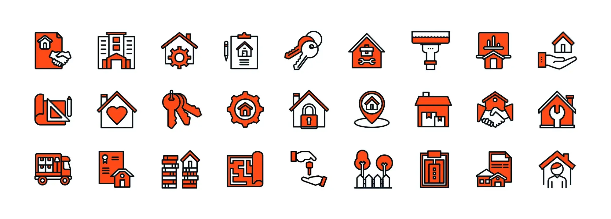
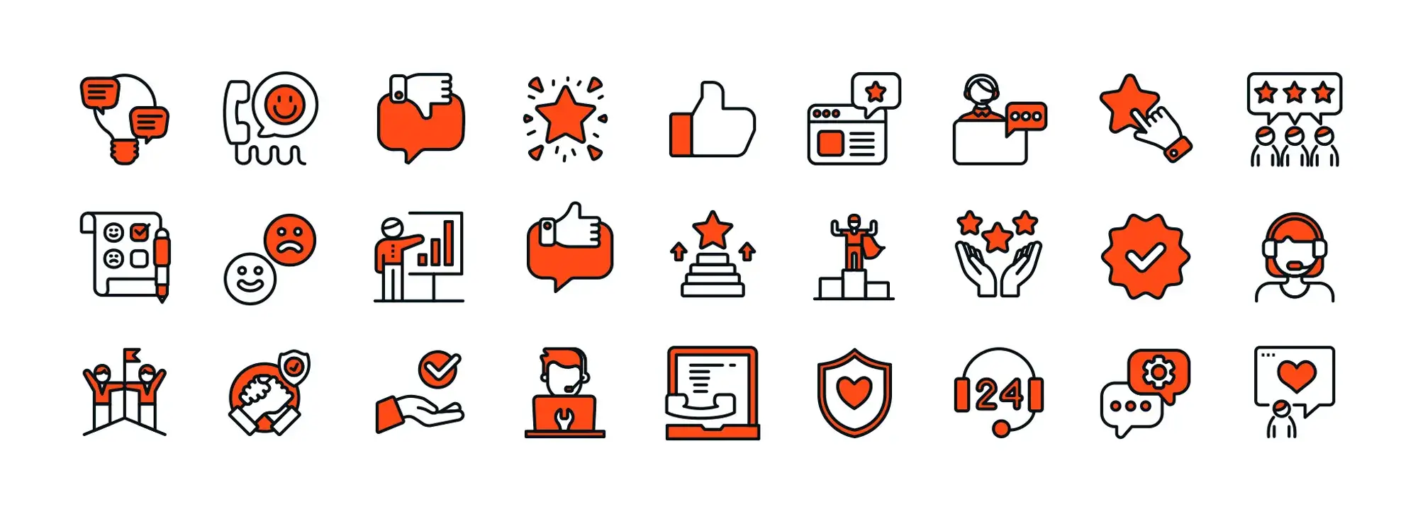
WordPress icons are small visual symbols that represent specific actions, objects or sections within a website. You might recognise a magnifying glass as a search tool, a heart for favourites or a cart for e-commerce checkout.
These icons form a universal visual language that transcends text. Even if someone doesn’t speak the language used on your site, they can still understand the meaning of familiar symbols.
Why icons matter
Icons improve usability by helping visitors find what they need quickly. Instead of relying solely on text, icons provide instant visual cues that guide users through the website.
They also save space. Especially on mobile devices, where screen real estate is limited, icons allow designers to convey more with less, resulting in cleaner layouts.
Icons are effective across cultures and languages. A gear icon for settings or an envelope for email means the same thing to most users around the world. This familiarity reduces confusion and creates a more inclusive experience.
From a branding perspective, consistent icon use reinforces your identity. When icons match your site’s colour palette and style, they help create a cohesive visual experience that users remember.
Icons also support accessibility. When used alongside text labels and implemented correctly with alt tags or ARIA attributes, they help screen readers communicate function clearly to users with visual impairments.
Where icons fit into a WordPress theme
Icons can be used in several key areas throughout a WordPress website
Navigation menus often feature icons beside items like Home, Blog or Contact, helping users move through the site with ease
Within page content, icons break up text and highlight important sections or categories
Call-to-action buttons become more engaging when paired with icons, such as a padlock next to “Secure checkout” or a paper plane beside “Send message”
Widgets and plugins frequently include built-in icons for social media sharing, newsletter sign-ups, and calendar features
How icons relate to modern web design trends
Today’s design trends emphasise clarity and speed, especially with the rise of mobile-first design. Icons help support these goals by replacing text with compact, meaningful visuals that work well on smaller screens.
Flat design and Material Design both favour simple, clean icon styles that fit seamlessly into contemporary layouts. They also reduce visual clutter, helping users stay focused on important content and actions.
Icons can increase user engagement too. When placed near buttons or within interactive elements, they encourage clicks, taps and swipes, which can improve navigation flow and conversion rates.
Purpose of this guide
This guide is designed to help you use icons effectively in your WordPress site. It will cover both technical and design aspects, including how to add icons using HTML, CSS and plugins, as well as how to style and position them for maximum impact.
You’ll also find tips for maintaining consistency, avoiding common mistakes and improving accessibility, along with useful resources to support your implementation.
Why icons matter in WordPress
Icons are far more than decorative elements. In WordPress, they function as intuitive signposts that enhance usability, improve aesthetics, and support a smoother user experience. By implementing them purposefully, you create an interface that speaks clearly and visually to your audience.
Enhanced navigation
Icons support faster, more efficient browsing. Universal symbols like a magnifying glass for search or a shopping cart for checkout are recognised instantly, reducing the need for lengthy descriptions.
In structured menus, icons help define layers—such as breadcrumbs or dropdowns—ensuring users can trace their journey through your site. This is particularly valuable for mobile layouts, where space is limited. Compact, icon-driven menus retain clarity without compromising function.
Quick communication
A single icon can deliver a message faster than a sentence. For example, a bin icon signals delete, while a heart indicates favourites. Because icons transcend language, they are especially valuable for multilingual or international audiences.
Reducing reliance on text also lightens cognitive load. Visitors can make decisions more quickly when presented with simple visuals instead of reading through dense content.
Improved user experience
When icons are used consistently across a site, users become familiar with their functions. This familiarity increases ease of use, making the experience more intuitive and comfortable.
Icons can also be used to highlight actions, such as “Sign Up” or “Contact,” ensuring high-priority elements are easy to spot and engage with.
Aesthetic appeal
Icons contribute to a clean and visually consistent design. By aligning with your colour palette and design style—whether flat, outlined or filled—they reinforce your branding and create a cohesive appearance across your website.
They also add a sense of professionalism and attention to detail, helping your site appear polished and trustworthy.
Accessibility benefits
Icons can play a significant role in making your site more inclusive. When paired with ARIA labels or alt text, they become accessible to screen readers, ensuring visually impaired users can navigate and interact with your content.
Keyboard navigation and consistent placement (such as a magnifying glass in the top right corner for search) further support usability for users with different needs.
Supporting different user preferences
Combining icons with text labels offers the best of both worlds. While an icon might be familiar to some users, adding a short label ensures clarity for everyone. This approach is particularly helpful when an icon’s meaning could be misinterpreted in isolation.
Icons also adapt well across devices. On mobile, where screen size is limited, icons conserve space and remain touch-friendly, ensuring smooth, responsive design.
Practical examples in WordPress
Icons are widely used in different types of WordPress websites:
E-commerce: Shopping carts, wishlist hearts and share icons improve user interaction and drive conversions
Blogs and magazines: Category icons, such as a pen for editorial content or a camera for photography, offer visual clues to content type
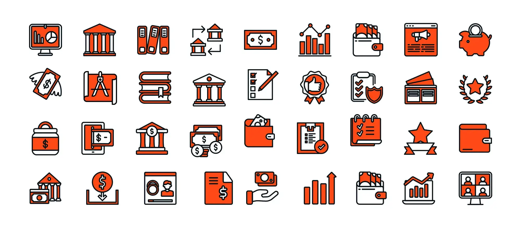
Corporate sites: Service icons—like a graph for analytics or a shield for security—add clarity and professionalism to your services page
Icons streamline navigation, reinforce brand identity and contribute to a user-friendly design. When used strategically, they become an integral part of the visual and functional language of your WordPress website.
Subscribe to our newsletter
Selecting the right icons for your WordPress theme
Icons play an essential role in shaping both the visual appeal and usability of a WordPress site. Choosing the right ones means finding a balance between style and function. The ideal icon set blends into your theme seamlessly, enhances your brand identity and improves user navigation across devices.
Consistency in style
Maintaining visual harmony is crucial. Icons should share similar line thickness, shape proportions and overall style. Mixing outlined icons with solid ones can disrupt the flow and make your design appear inconsistent. A unified style not only looks better but also helps users feel more confident as they navigate the site.
Thematic relevance should also guide your choices. A creative portfolio site may benefit from playful and artistic icon shapes, while a finance-related website may lean towards minimal, geometric forms. It is important that the icons complement your fonts, buttons and overall interface elements.
Clarity and recognition
Icons should be instantly recognisable. Symbols like a magnifying glass for search or a heart for favourites are universally understood. If your design relies on unfamiliar or overly abstract icons, users might hesitate or misunderstand their function.
To improve clarity, consider pairing icons with brief text labels where appropriate. This adds support for first-time visitors and assists users who rely on screen readers or assistive technology. Proper labelling, such as ARIA attributes or descriptive alt text, makes a big difference in accessibility.
Sizing and responsiveness
Modern websites must work well across all screen sizes, from smartphones to desktop monitors. Icons need to be large enough to tap easily on a mobile device but still elegant and proportional on larger screens. Using scalable vector formats like SVG ensures crisp presentation regardless of resolution.
Responsive units like em or rem are preferable to fixed pixel sizes, as they scale with text and surrounding elements. You can also apply media queries to fine-tune icon size at different breakpoints, ensuring an optimal experience for every user.
Colour and branding
Icons should reflect your brand’s personality and integrate with its colour palette. Using brand colours helps maintain cohesion across your theme, while contrast ensures readability and accessibility. A good icon should stand out enough to be seen but not so much that it disrupts the overall design.
Your choice of tone also communicates mood. Bright and bold colours tend to create a playful and energetic feel, whereas muted or monochrome tones lend themselves well to minimalist and professional aesthetics.
Choosing between icon libraries and custom sets
Many WordPress users start with established libraries such as Font Awesome or Material Icons. These collections offer thousands of options with consistent design and easy integration. They are perfect for quickly populating your theme with commonly used icons.
Custom icons, on the other hand, provide complete control. You can match your exact brand style and introduce a unique flair that no one else has. This approach takes more time and may require a designer, but it sets your site apart and can reinforce a strong visual identity.
A combination of both approaches often works best. Use a library for standard functions like navigation and social links, and develop custom icons for areas that define your brand, such as key call-to-action buttons or category markers.
Balancing form with usability
An attractive icon is not enough on its own. Functionality should always come first. Conduct user testing to see how visitors interact with your site. If icons cause confusion or are overlooked, it’s worth revisiting their design or placement.
Performance should also be considered. Avoid heavy image formats where possible and opt for optimised SVG files. Where many icons are in use, loading them as a sprite or using an icon font can reduce loading times.
Above all, make sure that icons are accessible. Every visual element should include support for keyboard navigation and assistive technology. High-contrast colours and meaningful labels help ensure everyone can interact with your site comfortably.
How to add icons to WordPress themes
Icons are essential in modern web design, improving both usability and visual appeal. There are several ways to add icons to your WordPress theme, whether you’re working with code or using plugins.
Integration methods
- HTML and CSS: Manually add SVGs, PNGs, or font icons into your theme files. This method gives you full control and flexibility but requires a bit of coding knowledge.
- Plugins: Install a plugin like Font Awesome or WP SVG Icons to quickly access thousands of ready-made icons and insert them via shortcodes or the block editor.
- Theme functions or shortcodes: Some themes include built-in support for icons. You can use shortcodes like [icon name=”search”] depending on your theme’s capabilities.
Adding icons using HTML and CSS
Choose your icon format
SVG
Pros: crisp at any size, lightweight, stylable with CSS
Cons: slightly more complex to embed and style inline
PNG
Pros: easy to insert
Cons: not scalable, not easily stylable
Font icons
Pros: scalable, stylable using CSS
Cons: limited design flexibility, not ideal for detailed or multicolour icons
Embed the icon in your theme
Example: inline SVG <div class=”icon”> Paste your SVG code here </div>
Example: Font Awesome icon
<i class=”fa fa-search”></i>
Example: PNG image
<img src=”path/to/icon.png” alt=”search icon”>
Make sure you enqueue any necessary libraries in your functions.php file. For example, enqueue Font Awesome if using its icon classes.
Style your icons with CSS
For SVG icons
.icon {
width: 32px;
height: 32px;
fill: #333333;
}
For Font Awesome icons
.fa-search {
font-size: 32px;
color: #333333;
}
For PNG images
img {
width: 32px;
height: auto;
}
Use fill for SVG elements and colour for font icons. For image icons, only sizing can be controlled via CSS.
Make your icons responsive
Use relative units like rem, em, or % instead of fixed pixel values. For example:
.icon {
width: 2rem;
height: 2rem;
}
Apply media queries to adjust icon size on different screen sizes:
@media (max-width: 768px) {
.icon {
width: 1.5rem;
height: 1.5rem;
}
}
Using plugins to add icons
Font Awesome
Install and activate the plugin. Add icons with HTML like
<i class=”fa fa-check”></i>
or use built-in shortcodes if supported.
WP SVG Icons
Allows you to insert vector icons via shortcodes or the block editor interface.
Simple Icons
Provides a collection of brand and UI icons—ideal for social links or buttons.
Build like a pro
Improving your WordPress theme with advanced icon techniques
Once you’ve covered the basics, advanced icon techniques can bring your theme to life. With CSS, animations and smart placement, icons can guide users and improve engagement.
Customising icon appearance with CSS
Make icons flexible and styled for any screen:
Responsive size:
- Use relative units like rem
- Add media queries for smaller screens
Example:
.icon { width: 3rem; height: 3rem; }
@media (max-width: 600px) { .icon { width: 2rem; height: 2rem; } }
Change colours:
- Font icons: .icon-class-name { color: #ff5722; }
- SVG icons: .icon svg { fill: #ff5722; }
Add style effects:
- Gradients: .icon svg { fill: url(#myGradient); }
- Shadows: .icon { filter: drop-shadow(0 2px 4px rgba(0, 0, 0, 0.3)); }
- Colour shifts on hover: .icon:hover { filter: hue-rotate(90deg); }
Hover effects and interactions
Let icons respond to user actions:
Hover effects:
- Colour transitions
- Scale or rotate on hover
- Smooth animations with transition
Example:
.icon:hover {
transform: scale(1.1) rotate(10deg);
transition: transform 0.2s ease;
}
Focus and active states:
- Focus outline for keyboard users
- Slight scale on click for tactile feel
.icon:focus { outline: 2px solid #4a90e2; outline-offset: 2px; }
.icon:active { transform: scale(0.95); }
Tooltips:
- Show extra info on hover
- Great for icons without labels
Basic structure:
- .icon-wrapper { position: relative; }
- .tooltip is hidden by default, visible on hover
Icon animations
Make icons eye-catching without overdoing it:
Bounce or spin effects:
- Use keyframes for playful movement
- Apply on hover or click
Example:
@keyframes bounce {
0%, 20%, 50%, 80%, 100% { transform: translateY(0); }
40% { transform: translateY(-15px); }
60% { transform: translateY(-7px); }
}
.icon-bounce:hover { animation: bounce 1s ease infinite; }
Interactive animations:
- Toggle classes with JavaScript to trigger effects
- Example: rotate an icon on click
JS:
document.querySelector(‘.icon’).addEventListener(‘click’, function () {
this.classList.toggle(‘animate-icon’);
});
CSS:
.animate-icon { animation: spin 2s linear infinite; }
@keyframes spin { to { transform: rotate(360deg); } }
Smart icon placement
Use icons where they guide or support content:
Menus and navigation:
- Animate dropdown arrows or toggles
- Use rotation to show open/closed states
Calls to action:
- Pulse or bounce icons near CTAs
- Add feedback animations on form submission
Section highlights:
- Animate icons when sections scroll into view
- Use rotating icons for accordions or tab states
Keep it fast and accessible
Don’t sacrifice performance or usability for style:
Performance tips:
- Use transform: translateZ(0) for smoother animations
- Keep SVGs lightweight
Accessibility tips:
- Add focus styles for keyboard navigation
- Avoid hiding essential content with animation
- Respect motion settings:
@media (prefers-reduced-motion: reduce) {
.icon-bounce:hover { animation: none; }
}
Important note
- Use CSS and animations to enhance, not overwhelm
- Place icons where they help users navigate or take action
- Keep performance fast and motion respectful
- Always include keyboard and screen reader support
Real-world examples of icon use in WordPress themes
Icons are incredibly versatile. They help users navigate, communicate content types, and reinforce branding. Below are common use cases across different WordPress theme types.
E-commerce theme
Common icons and placements
- Shopping cart in the header for quick access
- Wishlist or heart icon near product listings or “Add to cart” buttons
- User account icon in the top nav for login or profile access
How icons improve user flow
- Speed up recognition with familiar symbols
- Help non-native speakers understand actions without translation
- Animate or colour icons on CTAs to boost conversion
Visual and branding impact
- Match icon colours to brand palette
- Use refined, thin icons for luxury shops
- Use rounded, colourful icons for kids or playful brands
Educational blog
Differentiating content types
- Play icon for video tutorials
- Pencil or document for written articles
- Puzzle piece or question mark for quizzes or interactive content
Enhancing engagement
- Let users scan by format with visual cues
- Reinforce learning themes with relevant symbols
- Colour-code icons by content type
Building trust
- Icon-labelled sections signal structure and quality
- Use familiar educational symbols like lightbulbs and books
Business or corporate site
Highlighting services
- Briefcase or handshake for consulting
- Charts or graphs for analytics
- Lock or shield for security services
Improving navigation
- Icons paired with short text in homepage feature blocks
- Use checkmarks or arrows in CTA buttons
Cohesive branding
- Stick to clean, minimalist icons
- Add subtle brand colour accents for consistency
Portfolio or creative agency
Showcasing skills
- Pencils, paintbrushes or design software icons
- Category-specific icons like cameras or film reels
Adding interactivity
- Icons change colour or size on hover
- Scroll-triggered animations for modern appeal
Storytelling through icons
- Timeline icons highlight key projects or milestones
- Past clients shown through branded icons or logos
News or magazine-style site
Categorising content
- Lightning bolt for breaking news
- Heart or leaf for lifestyle
- Gear or circuit for tech stories
Driving engagement
- Thumbs-up or star icons for ratings
- Author icons add clarity to bylines
Improving scannability
- Icons next to headlines for quick skimming
- Social media icons near articles to encourage sharing
Restaurant or food blog
Menu highlights
- Pizza slice, burger, or bowl icons to show cuisine types
- Leaf or gluten-free icons for dietary preferences
Streamlining navigation
- Calendar or clock icons for reservations
- Map pins for location links
Boosting appeal
- Bright, playful icons that match the restaurant vibe
- Star or trophy icons to show awards or top dishes
Community or niche site
Membership and forums
- User silhouettes or lock icons for login/register
- Chat bubbles or group icons for community forums
Event listings
- Calendar icons for upcoming events
- Ticket icons for RSVPs or bookings
Gamification features
- Trophy or badge icons for achievements
- Stars and points to reward engagement
Trends and takeaways
- Universal icons work everywhere: Cart, heart, user, play and search are universally understood
- Strategic placement: Use icons near CTAs, in headers, and within content blocks
- Style matters: Align icon thickness, colour and animation with your brand look
- Icons encourage interaction: Hover states, animations and feedback icons boost engagement
Troubleshooting common icon issues in WordPress
Even when icons are properly added, display or functionality problems can still crop up. Here’s how to identify and fix the most common issues quickly and effectively.
Icons not displaying
If your icons aren’t showing up, the most common reason is a broken file path. Double-check the URL in your CSS or HTML, and use browser dev tools to spot any 404 errors. If you’re using a font library like Font Awesome and icons are missing, the stylesheet might not be enqueued correctly. Add it to your functions.php file and confirm the link works in the browser. Hosting assets on a different domain can also trigger CORS issues — in that case, ensure your server is sending the correct access-control headers.
Scaling and responsiveness problems
Icons that look too small or oversized on mobile are usually using fixed units like pixels. Switch to relative units such as em or rem, and use media queries to adjust sizes for smaller screens. If icons appear blurry on high-DPI (Retina) displays, it’s likely because they’re raster images like PNGs. Replace them with SVGs or icon fonts where possible for crisp, scalable results.
Styling conflicts
Sometimes custom styles get overridden by a theme or plugin. This often happens when the CSS selector you’re using has lower specificity. You can solve it by writing a more targeted rule or, only if necessary, using !important. Mixing icon libraries (like Font Awesome and Ionicons together) can also cause class name clashes. To avoid this, stick to a single icon set where possible, or rename conflicting classes.
Alignment and sizing inconsistencies
If your icons appear off-centre or uneven, it could be due to inconsistent SVG viewBox settings or different font sizes. Editing SVGs in tools like Illustrator or Figma can help unify dimensions. Misalignment can also be caused by different internal padding or margins — using consistent spacing in your CSS and placing icons in a flex or grid container usually fixes this.
Broken hover effects and animations
When hover effects don’t work, check that your CSS includes the necessary transition or animation properties. Missing or mismatched @keyframes names are a common issue. If your animations rely on JavaScript, make sure scripts are loaded in the right order and not being blocked or interfered with by another plugin. Use your browser’s console and console.log() statements to help debug.
General tips
Always test icon changes in a staging environment before going live, and view your site across multiple browsers and devices to catch issues early. For older browsers, consider using PNG fallbacks if SVG support is limited. Developer tools are invaluable — inspect elements to see which styles are applied and look out for console errors like missing files or blocked resources. If a plugin update breaks your icons, check the changelog or consider rolling back until a fix is released.
Additional resources for working with icons in WordPress
Once you’re confident with selecting, styling and troubleshooting icons, you can take your skills further with specialised tools, guides and communities. These resources will help you stay current, sharpen your design thinking and apply icons more effectively within your WordPress themes.
Icon libraries
Font Awesome
Font Awesome offers thousands of icons across different styles including solid, regular, duotone and brands. It’s easy to integrate using CSS classes or inline SVGs, and backed by frequent updates and strong community support.
Material Icons
Material Icons from Google follow the Material Design system. They come in multiple styles such as filled, outlined, round and sharp, and can be embedded using CSS, fonts or inline SVG.
Ionicons
Ionicons were designed for mobile-first frameworks like Ionic but work seamlessly across web platforms. They’re open source, lightweight and easy to customise with CSS.
Feather Icons
Feather Icons are thin, minimalist SVGs ideal for modern or minimal designs. Because they’re SVG-based, they’re easy to style or animate without extra overhead.
SVG Repo
SVG Repo provides a huge selection of free SVG icons and illustrations in a variety of styles. It’s especially useful for quick downloads and basic customisation needs.
MaxiBlocks
MaxiBlocks includes over 13,000 icons designed with WordPress blocks in mind. You can easily recolour icons inside the editor, making it an efficient choice for Gutenberg users.
UX guidance and icon strategy
Nielsen Norman Group
Nielsen Norman Group publishes research-based insights on UX and usability, including how icons impact user behaviour, recognition and clarity across devices and demographics.
Smashing Magazine
Smashing Magazine features hands-on articles from experts in design and development. Topics include icon performance, accessibility, SVG workflows and practical implementation strategies.
A List Apart
A List Apart focuses on inclusive, semantic and standards-based web design. It often explores how icons intersect with accessibility, progressive enhancement and meaningful UI structure.
Tutorials and learning platforms
CSS-Tricks
CSS-Tricks is a go-to for understanding CSS and SVG. It offers in-depth tutorials on icon positioning, animation, responsive layouts and real-time examples you can modify.
WebAIM
WebAIM helps you make icons accessible. It offers checklists and practical tools for colour contrast, ARIA labelling, and compatibility with screen readers and other assistive technologies.
Envato Tuts+
Envato Tuts+ provides tutorials at every skill level. You’ll find beginner guides to WordPress icon use and advanced lessons in design systems and UI consistency.
WordPress Developer Docs
The official WordPress documentation covers how to enqueue scripts and styles, create child themes, and even build plugins—essential reading for anyone integrating custom icon sets.
Books and references
The Icon Handbook
The Icon Handbook by Jon Hicks explains the fundamentals of icon design, with examples of how to apply icons across different platforms and devices.
Rocket Surgery Made Easy
Rocket Surgery Made Easy by Steve Krug focuses on usability testing, offering simple ways to assess whether your icons are working for real users.
Designing Interfaces
Designing Interfaces by Jenifer Tidwell explores UI patterns with sections dedicated to visual language, including how icons function in interface hierarchies.
Design tools for creating icons
Figma
Figma is a collaborative browser-based tool for designing vector icons. It supports real-time prototyping, shared libraries, and plugin integrations to streamline icon creation.
Sketch
Sketch is a Mac-only design app popular for UI work. Its symbol management and export options make it ideal for building reusable, scalable icon sets.
Adobe Illustrator
Adobe Illustrator remains the professional standard for vector graphics, offering powerful tools for icon illustration, path editing and export flexibility.
Inkscape
Inkscape is a free and open-source alternative to Illustrator. It offers precise control over SVG editing, node manipulation, and exports in multiple formats including EPS and PDF.
Staying current with icon trends
To keep your icon use modern and effective, check platforms like Dribbble and Behance for design inspiration and new releases. Many icon designers share free resources, case studies and techniques on Twitter, Instagram, and LinkedIn. You can also explore conference content from An Event Apart or Smashing Conf, where icon accessibility and performance often feature in talks and workshops.
Conclusion
Icons are a powerful part of WordPress theme design. They act as visual cues, guide users through interfaces with minimal effort, and add personality to a site. When selected and implemented thoughtfully, icons can dramatically improve usability, reinforce branding and boost overall engagement.
Summary of key insights
Icons bring clarity and efficiency by reducing the reliance on text and breaking through language barriers. A well-placed icon speeds up navigation and makes the interface feel intuitive. Beyond function, icons also support brand consistency—matching the shape, colour and line style of your icons to your brand helps create a unified visual identity.
Choosing the right type of icon matters. SVGs offer scalability and are great for animation, while icon fonts are quick to style with CSS. You might opt for ready-made libraries like Font Awesome or Material Icons to save time, or go with custom sets for a more unique and consistent brand look.
From a technical standpoint, you can manually add icons using HTML and CSS for full control, or use plugins to speed up implementation—especially helpful for beginners or when working on tight deadlines.
Best practices remain essential. Accessibility should come first, with appropriate aria-labels, alt text, and clear focus states. Responsive sizing using units like em or rem ensures your icons look good across devices. Performance also plays a role: minify your SVGs, combine assets where possible, and use lazy loading for better speed.
Advanced techniques such as CSS animations and microinteractions make icons more dynamic and engaging. Small effects like hover transitions or tooltips can enhance usability without overwhelming the design.
When icons break or behave inconsistently, the cause is usually a missing file path, improperly loaded font library or a conflict in stylesheets. Regular testing, checking paths, inspecting elements and reviewing console logs—helps catch and resolve these issues early.
Looking ahead: continuous improvement
Revisit your icons regularly. What worked a year ago might feel outdated today. Auditing for relevance, performance and consistency helps keep your site looking fresh. Subscribe to design newsletters or follow community forums to keep up with new icon sets and best practices. And don’t overlook your audience by collecting feedback can reveal where icons confuse or delight, guiding future improvements.
Final thoughts
Icons may be small, but they play a big role in how users experience your site. When done well, they support navigation, reinforce branding, and create visual rhythm. Whether you’re building a portfolio, managing an e-commerce shop, or designing a corporate website, good icon strategy helps turn a functional layout into a seamless, engaging journey.
Moving forward, try different icon types, experiment with new placements or styles, and observe how users respond. Keep refining based on real-world results and don’t stop learning. As your design evolves, so should your icon usage.
The more you hone your skills, the more confidently you’ll create WordPress themes that look polished, feel intuitive, and leave a lasting impression.
If you’re looking for an easy way to integrate and customise thousands of professional icons directly within the WordPress block editor, MaxiBlocks is a powerful plugin worth exploring. With over 14,000 free icons and built-in visual controls, it helps streamline your workflow, no coding required.
WordPress icons resources for design and customization
Explore our articles on choosing, customizing, and optimizing WordPress icons for faster, accessible sites.
FAQs – WordPress icons
Can I use both custom icons and a popular icon library in the same theme?
Yes, it’s common to mix both. Many designers use a standard library like Font Awesome for universal actions such as search or cart icons, while adding a few custom-designed icons to match their brand. Just be mindful of naming conflicts and consider performance—loading multiple libraries may affect page speed.
Which is better for WordPress: SVG icons or font icons?
Both have advantages. SVGs scale perfectly, are great for animations, and offer full styling flexibility. Font icons behave more like text, making them simple to style with CSS. The choice depends on your project—SVGs are more flexible overall, but font icons can be quicker to implement in some themes.
How do I ensure my icons are accessible to screen readers?
Use aria-label on interactive icons to describe their function, such as aria-label="Search". For purely decorative icons, set aria-hidden="true" so they’re skipped by screen readers. If you’re using <img> tags, include meaningful alt text for functional icons and empty alt attributes for purely visual ones.
Why are my icons not displaying even though I added the code?
The issue often comes down to incorrect file paths, missing stylesheets or scripts, or CSS conflicts. Check your browser console for errors—especially 404s. Make sure your icon library is correctly enqueued in functions.php, and look for any CSS rules overriding your icons.
How can I optimise icon performance?
Reduce HTTP requests by using sprite sheets or icon fonts. Optimise SVGs with tools like SVGO to strip out unnecessary metadata. Use lazy loading for icons that appear below the fold, and enable browser caching on static assets to speed up repeat visits.
Are there risks in using external CDNs for icons?
CDNs can improve load times, but if they go down, change their file paths, or introduce a breaking update, your icons may fail to load. You might also encounter cross-origin issues. Hosting the library locally gives you more control and stability.
Is it possible to animate icons without slowing down my site?
Yes—lightweight animations using CSS transitions or keyframes work well. Stick to hardware-accelerated properties like transform and opacity to maintain performance. Always respect user preferences by including a prefers-reduced-motion fallback.
Can icons improve SEO?
Not directly. Icons don’t affect rankings like meta tags or content do, but they enhance usability. Improved engagement and lower bounce rates can indirectly help SEO. Adding descriptive alt text to image-based icons also improves accessibility and may boost image search visibility.
How do I pick the right icon size for my theme?
Keep sizes consistent and legible. Most icons fall between 16px and 48px on desktop. For mobile or touch devices, make sure interactive icons are at least 44x44px. Use relative units like em or rem so icons scale naturally with your layout.
Can I swap one icon set for another without breaking my site?
It depends on your implementation. If you’ve used a plugin or consistent class naming, swapping libraries may be as simple as changing a link. But if you’ve manually embedded SVGs or used unique class names, each icon reference may need updating to match the new library’s structure.
Should I provide fallback icons for older browsers?
If you’re supporting outdated browsers like Internet Explorer 11, fallbacks might help. Use PNGs as backups for SVGs or pick icon libraries with legacy support. However, it’s best to check your site analytics—if only a small percentage of users rely on older browsers, full fallbacks may not be worth the effort.
WordPress itself
Official Website
wordpress.org – This is the official website for WordPress, where you can download the software, find documentation, and learn more about using it.
WordPress Codex
codex.wordpress.org/Main_Page – This is a comprehensive documentation resource for WordPress, covering everything from installation and configuration to specific functionality and troubleshooting.
WordPress Theme Directory
wordpress.org/themes – The official WordPress theme directory is a great place to find free and premium WordPress themes. You can browse themes by category, feature, and popularity.
maxiblocks.com/go/help-desk
maxiblocks.com/pro-library
www.youtube.com/@maxiblocks
twitter.com/maxiblocks
linkedin.com/company/maxi-blocks
github.com/orgs/maxi-blocks
wordpress.org/plugins/maxi-blocks

Kyra Pieterse
Author
Kyra is the co-founder and creative lead of MaxiBlocks, an open-source page builder for WordPress Gutenberg.
You may also like
