Try MaxiBlocks for free with 500+ library assets including basic templates. No account required. Free WordPress page builder, theme and updates included.
To create a sticky menu in WordPress, also called a sticky or fixed header, you can use built-in theme settings, a plugin like Sticky Menu or myStickymenu, or add custom CSS or JavaScript. The simplest option is usually through your theme’s customiser or a plugin, where you can turn on the sticky feature with just a few clicks.
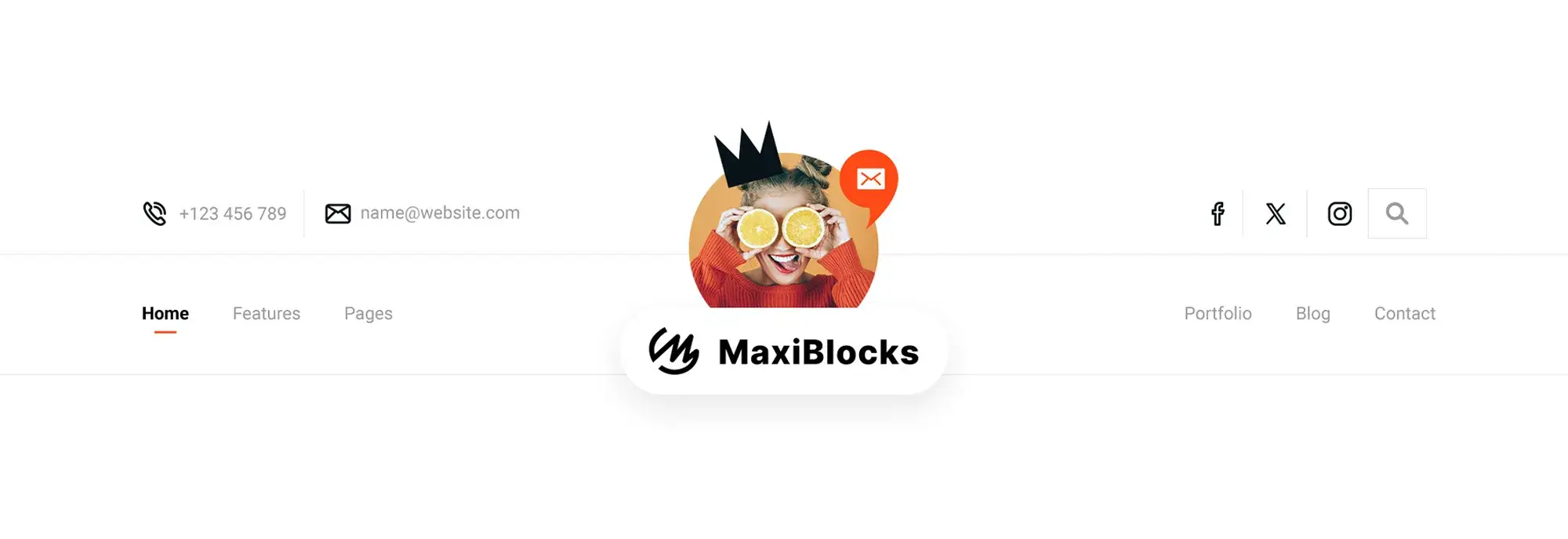
A sticky menu stays pinned to the top of the screen as users scroll. It allows visitors to navigate without needing to scroll all the way back up saving time, reducing friction, and increasing the chance they’ll explore more of your site.
Situations where sticky menus shine
- Long-scroll content: Blogs, landing pages, tutorials
- Ecommerce: Always-visible cart and product categories
- Service businesses: Contact, Book a Call, or Quote CTAs
- Mobile navigation: Keeps users from having to swipe endlessly
Real-world benefits
- Users can jump between sections without losing their place
- Important CTAs like “Buy Now” are always visible
- Helps reduce bounce rates by removing navigation friction
- Keeps users feeling in control of the browsing experience
Sticky menus aren’t just helpful they’ve become an expected part of a modern, well-structured website.
MaxiBlocks makes it incredibly easy to create and customise sticky headers using visual controls. Here’s how to do it step by step.
Step 1: Select your navigation container
- Go to your header or menu section
- Click the block that holds your navigation links this is usually labeled “Menu” or “Navigation Wrapper” in MaxiBlocks
Step 2: Access advanced settings
- In the right sidebar panel, scroll to the Advanced Settings
- Click into the “Position” tab to control how the block behaves while scrolling
Step 3: Enable sticky position
- Change the position from Default to Sticky
- This locks the menu to the top of the screen as users scroll
Step 4: Fine-tune sticky settings
- After selecting “Sticky,” open the Set equal settings panel
- Enter 0px as the Top offset to keep the header tight against the viewport
- Optional: Add a small shadow or semi-transparent background to distinguish it from page content
Step 5: Preview and test
- Save and preview your layout
- View in incognito or after logging out to avoid the WordPress admin bar overlapping the sticky header
- Test on multiple screen sizes to ensure consistent behaviour
Optional enhancements
- Add animation for when the menu appears or hides
- Hide sticky headers on mobile if your design feels cramped
- Use a separate mobile version of your sticky menu with simplified items
Subscribe to our newsletter
The Do’s: Best practices for success
Do keep it minimal
Too many items in a sticky menu will clutter the interface and overwhelm users. Stick to:
- Primary navigation (Home, Services, Contact)
- One or two CTA buttons (Book Now, Free Trial)
- Optional icon-based links (cart, search, hamburger menu)
Do optimise for mobile
- Use larger touch targets
- Keep the menu under 60px tall
- Collapse secondary items into a hamburger menu for a clean experience
Do maintain brand consistency
- Use the same colour palette, font styles, and button designs
- Match spacing and shadows with the rest of your layout
- Keep interactions predictable and smooth
The Don’ts: Pitfalls to avoid
Don’t cover key content
Sticky headers that overlap your hero section or obscure headings create a frustrating UX. Always:
- Add top padding to the section below the sticky header
- Preview layout shifts on different screen sizes
- Use z-index wisely to ensure proper layering
Don’t ignore accessibility
Make sure your sticky menu:
- Can be navigated with a keyboard
- Has clear focus states for links and buttons
- Uses proper heading levels and ARIA labels when needed
Don’t slow down the site
Avoid using oversized images, heavy scripts, or bloated plugins inside your sticky header. Keep things lean for speed.
Myths vs. Facts
Myth: Sticky menus annoy users
Fact: Users appreciate navigation that stays put especially on long pages or mobile devices.
Myth: They only matter for ecommerce
Fact: Any website can benefit portfolios, service businesses, blogs, even nonprofits.
Myth: They require advanced coding
Fact: MaxiBlocks lets you build sticky menus visually, with drag-and-drop controls and no technical setup.
Build like a pro
Common mistakes and how to overcome them
The header looks fine on desktop, but breaks on mobile
Use MaxiBlocks’ responsive controls to hide or modify the sticky menu for smaller screens. Sometimes a simpler layout works better on mobile.
Sticky setting is applied, but it’s not working
Double-check you’ve selected the correct parent block. Some headers use multiple nested containers and ensure the one set to Sticky is the wrapper.
Menu overlaps the admin bar
This only happens while logged in. Preview your site logged out or in an incognito window to see the real result.

Life hacks and UX enhancements
Add a contrasting scroll-state background
A transparent sticky menu looks elegant, but it may be hard to read against certain content. Add a background on scroll to solve this.
Use sticky menus as a conversion tool
Include a CTA like “Schedule a Call” or “Subscribe” inside the sticky header. Make sure it stands out visually and leads to a high-converting page.
Pair with anchor links
For one-page websites, anchor links in a sticky header help users navigate instantly to any section perfect for portfolios, product features, or FAQ pages.
Key terms you should know
Sticky menu: A navigation bar that remains fixed at the top of the screen when users scroll.
Offset: The distance (in pixels) between the sticky element and the top of the screen. Typically set to 0 for a seamless lock.
Z-index: A CSS property that determines layering. Higher values ensure sticky menus stay on top of other elements.
Tap targets: The clickable area for menu items especially important on mobile. Recommended size: 44x44px minimum.
Troubleshooting common issues
Sticky header not appearing
Check that you applied the Sticky setting to the correct container and that the page has enough scrollable height to activate it.
Menu breaks on scroll
Avoid absolute positioning or conflicting animations. Keep it simple and clean.
The header is too tall
Reduce padding, scale down logo size, and limit menu items. Compact headers improve clarity and leave more room for content.
Next steps: Moving forward with confidence
Sticky headers aren’t just a style choice they’re a UX powerhouse. By creating a sticky menu in WordPress with MaxiBlocks, you’re helping users navigate faster, take action more easily, and stay engaged longer.
Keep it simple. Focus on clarity. Make sure it works across every screen. And don’t be afraid to test new layouts MaxiBlocks makes it easy to adjust, preview, and refine.
You’ve now got the knowledge (and the tools) to create a sticky menu that not only looks good but works hard behind the scenes to boost usability and performance.
Discover how to create clear, responsive, and stylish WordPress menus with expert tips and resources.
What is a sticky menu in WordPress?
A sticky menu is a navigation bar that stays fixed at the top of the screen as users scroll through your website. It ensures that key links and calls-to-action remain visible at all times, improving navigation and user experience.
How do I create a sticky menu in WordPress without using custom code?
You can create a sticky menu easily using the MaxiBlocks plugin. Simply select your menu block, go to the “Advanced Settings,” change the position to “Sticky,” and set the top offset to 0. No coding required.
Does the sticky menu work on mobile devices?
Yes, sticky menus can work well on mobile when designed correctly. MaxiBlocks lets you customise layouts for different screen sizes, and you can enable or disable sticky behavior per device view for maximum flexibility.
Can I add buttons like “Contact” or “Buy Now” in the sticky menu?
Absolutely. Adding call-to-action buttons to your sticky menu is a great way to keep important links visible. You can customise these buttons using MaxiBlocks to match your brand and link them to high-converting pages.
Will a sticky menu slow down my site?
Not if it’s implemented correctly. Sticky menus made with MaxiBlocks are lightweight and optimised for performance. Avoid loading heavy images or excessive animations inside the sticky header to keep things fast.
My sticky menu overlaps the content and how can I fix it?
You’ll need to add padding or a spacer below your sticky header to push the content down. This prevents it from being hidden behind the menu. MaxiBlocks gives you full control over spacing and layout adjustments.
What if the sticky menu isn’t showing after setup?
Check that you’ve applied the sticky setting to the correct container or wrapper block. Also, ensure the page has enough scrollable content to trigger the sticky behavior. Preview while logged out to avoid interference from the WordPress admin bar.
Can I hide the sticky menu on certain devices?
Yes. MaxiBlocks allows you to control visibility across breakpoints. You can choose to show the sticky menu only on desktop, tablet, or mobile depending on your needs and design preferences.
How can I style my sticky menu differently when it becomes active?
Use background colors, shadows, or border styles to differentiate your sticky menu when it’s in scroll mode. You can apply these styles in MaxiBlocks using conditional or hover-based settings for a dynamic effect.
Is a sticky menu good for SEO?
While it doesn’t directly impact rankings, a sticky menu improves usability, reduces bounce rates, and keeps users engaged longer all of which contribute positively to user signals that search engines consider.
WordPress itself
Official Website
wordpress.org – This is the official website for WordPress, where you can download the software, find documentation, and learn more about using it.
WordPress Codex
codex.wordpress.org/Main_Page – This is a comprehensive documentation resource for WordPress, covering everything from installation and configuration to specific functionality and troubleshooting.
WordPress Theme Directory
wordpress.org/themes – The official WordPress theme directory is a great place to find free and premium WordPress themes. You can browse themes by category, feature, and popularity.
maxiblocks.com/go/help-desk
maxiblocks.com/pro-library
www.youtube.com/@maxiblocks
twitter.com/maxiblocks
linkedin.com/company/maxi-blocks
github.com/orgs/maxi-blocks
wordpress.org/plugins/maxi-blocks

Kyra Pieterse
Author
Kyra is the co-founder and creative lead of MaxiBlocks, an open-source page builder for WordPress Gutenberg.
You may also like

