Best WordPress themes for hairdressers | Build a website
Try MaxiBlocks for free with 500+ library assets including basic templates. No account required. Free WordPress page builder, theme and updates included.
A customizable WordPress block template for hairdresser services
Tailored for beauty and wellness professionals
This professionally designed WordPress block template is ideal for hairdressers and adaptable for a variety of beauty and wellness services. Whether your client offers spa treatments, nail services, makeup artistry, or holistic wellness, this homepage layout can be easily customised to reflect their unique brand and services.
A predesigned WordPress block template for hairdressers
If you’re a hairdresser looking to build your own website, there is a learning curve but with the right tools, it’s very achievable. Start by choosing a reliable hosting provider and installing WordPress. From there, install the free MaxiBlocks page builder plugin and use the MaxiBlocks theme, which will soon be available on WordPress.org. This setup gives you everything you need to get started, including access to the Pro library via the mini option.
For web designers using Gutenberg, MaxiBlocks is the perfect companion, offering an intuitive interface, a growing collection of templates and design assets, and helpful support. If you haven’t used Gutenberg yet, MaxiBlocks might just change your mind. It’s fast, flexible, and doesn’t require any coding knowledge.
Overview of the hairdresser homepage design
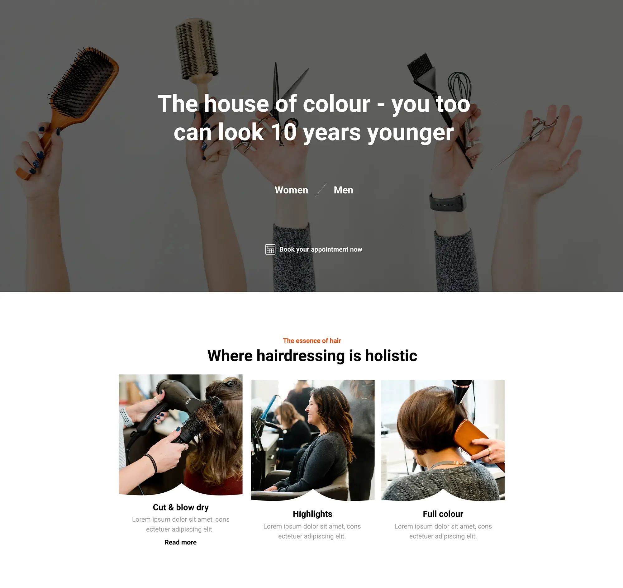
This hairdresser WordPress page template is clean and engaging, structured in distinct content sections with plenty of room for customisation. The default design features white backgrounds, warm accent colours, and black text, which can be modified using MaxiBlocks style cards for a more personalised look.
Hair salons offer an essential service in busy lives. A website acts as a digital storefront, communicating the salon’s value and giving visitors the convenience of online booking.
A closer look at the top banner section
Background image
The banner image shows a stylist in action hands expertly crafting a hairstyle, capturing the artistry and professionalism of hairdressing. This sets the tone for visitors and communicates quality and care.
Text overlay
A semi-transparent white overlay softens the image and provides a clean space for text. The headline reads “The House of Colour – Look 10 Years Younger!” in a bold sans-serif font. This can be replaced to match your client’s message or specialty.
Subtext
Beneath the main headline, a smaller line reads “Expert hairdressing services for women and men. Book your appointment today!” which highlights availability and encourages action.
Call-to-action button
A bold orange button with the label “Book Now” stands out and drives engagement. This call to action can be changed to reflect your desired tone, such as “Get Your New Look” or “Schedule Your Appointment.”
Customising the top banner
Image selection
Choose a high-quality photo that represents the stylist’s work. This might include shots of the salon, stylists in action, or finished looks on happy clients.
Editing the headline
Use language that aligns with your brand or the service being promoted. Highlight what makes the business unique, whether it’s hair colouring, cutting, or other specialties.
Updating the call to action
Encourage interaction with compelling CTAs. Examples include “Claim Your Free Consultation,” “View Services,” or “Let’s Transform Your Hair.”
Why this hairdresser WordPress template works
It’s ready to use and requires no advanced technical skills. You can adjust the layout, change colours, update fonts, and modify images and copy using the block editor and MaxiBlocks plugin. It’s also responsive and looks great on all devices. The template is flexible enough to adapt to different beauty niches beyond hairdressing.
Subscribe to our newsletter
Showcasing your services with the WordPress block template
A visual guide to professional hairdressing services
The services section of the hairdresser WordPress block template is designed to visually communicate the salon’s range of offerings in a clean, engaging layout. It allows potential clients to quickly understand what services are available and gives the website a polished, professional appearance.
High-quality images that inspire confidence
Each image acts as a visual cue, showcasing the results clients can expect. From sleek blow-dries and precision haircuts to bold colour transformations and smoothing treatments, these images should reflect the skill and variety the salon offers. Use real client photos or styled shoots that include models with different hair types and styles. Don’t forget to include a photo or two for senior clients with silver or thinning hair—this shows inclusivity and expertise across age groups.
Captions that inform and support SEO
Beneath each image is a bold, clear caption like “Cut & Blow Dry,” “Highlights,” or “Full Colour.” These concise labels help users quickly identify the service they’re interested in and provide a great opportunity to add targeted keywords for search engine optimisation.
A responsive, balanced layout
The default grid layout displays six service blocks in two neat rows of three. This balanced design is visually appealing and ensures easy navigation. On smaller screens like tablets and phones, the grid automatically adjusts, stacking elements in a user-friendly format thanks to MaxiBlocks’ six responsive settings. This ensures your site always looks great, no matter the device.
A neutral, brand-consistent colour palette
The template uses a white border around each photo, ensuring a clean presentation that makes each image stand out. With neutral backgrounds and natural lighting, the focus remains on the hair and styling work, supporting a cohesive and professional brand image.
Customising the services section for your business
Personalise your image gallery
Swap out the default photos with visuals that reflect your salon’s specialties. Whether it’s expert men’s grooming, curly hair cuts, or bridal styling, this gallery is your space to shine. Use photos that resonate with your target audience and showcase your team’s talent.
Use captions to highlight niche services
Tailor the captions to feature your unique services. Instead of generic labels, use specific ones like “Balayage Colouring,” “Kids’ Haircuts,” or “Senior Hair Care.” This helps attract diverse clients and boosts your SEO by including keywords that people actually search for.
Design a layout that connects with your audience
Think about how different customer segments browse for services. A parent might appreciate seeing a “Haircuts for Kids” label, while someone planning for a big event might be drawn to a “Special Occasion Styling” section. Use this flexibility to build trust and interest.
Highlight offers and pricing options
Consider adding a note about pricing or limited-time deals below each caption. For example, “Introductory offer: Full Colour for $75” or “20% off blow-dries this month.” These details make your site more informative and can help convert casual visitors into paying clients.
Would you like help crafting service blurbs or testimonials to pair with this layout? Just let me know!
Encouraging action with a strong call to book
A compelling visual prompt
The CTA section is designed to drive engagement and conversions by prompting users to take immediate action. It blends visual appeal with persuasive text to nudge visitors toward booking an appointment.
Background image that speaks quality
The background features a close-up image of a stylist’s hands gently working on a client’s hair. This subtle yet effective image conveys attention to detail and personalised care qualities that build trust and professionalism. The photo choice reinforces the hands-on expertise and premium service clients can expect.
Clear messaging that connects
Headline with impact
Overlaying the background image is a bold and motivating message: “Get a new look today!” This headline is short, confident, and action-driven—ideal for encouraging instant engagement.
Supporting statement for reassurance
Just below the main headline is a reassuring follow-up sentence: “Experience our top-notch hairdressing services and walk out looking fabulous.” This line offers a clear value proposition and builds confidence in the quality of the service.
Effective use of typography
The headline uses a modern, sans-serif font in a large, bold weight to command attention. The supporting text is smaller but still easily readable, maintaining a professional and polished feel. The typography is consistent with the overall website design and reinforces a stylish and welcoming tone.
A button that converts
Bright and action-oriented CTA
The section includes a highly visible button labelled “Book now.” Styled in the site’s signature warm orange tone, the button contrasts well with the semi-transparent background and encourages clicks. It acts as a visual anchor, drawing attention to the next step in the customer journey.
Seamless user experience
Clicking the button should lead to a booking form or contact page, allowing visitors to act on their interest without delay. The entire section is designed to be mobile-friendly, ensuring that the CTA remains effective on all screen sizes.
Build like a pro
Designing a compelling call to action
Crafting a CTA that converts
The “call to action” (CTA) section is your opportunity to turn curious visitors into loyal clients. It combines powerful visuals with persuasive messaging to create an irresistible invitation.
A picture’s worth a thousand styles
The background image features a stylist’s hands mid-action, perfectly capturing the artistry and care behind every hair transformation. It’s more than a photo—it’s a promise of quality.
Words that encourage booking
The headline, “Get a new look today!” is direct, inviting, and actionable. Beneath it, the supporting text—“Experience our top-notch hairdressing services and walk out looking fabulous”—reassures visitors and builds excitement. It highlights both the service and the outcome.
Typography that leads the way
The main CTA is bold, large, and impossible to miss. A clean, modern sans-serif font adds a friendly and professional tone, while the smaller subtext reinforces the message without overwhelming the design.
A button that stands out
A vibrant orange “Book now” button commands attention and makes the next step crystal clear. Its consistent use of the brand’s accent colour helps it blend with the design while standing out where it matters most.
Customising the CTA for your audience
Make it irresistible
While “Get a new look today!” is compelling, you can sweeten the deal even more. Try something like “Get 10% off your first visit” or “Free consultation with your first appointment.” These simple offers can significantly increase conversions.
Speak to their needs
Tailor the message to reflect your client’s pain points. If colour correction is a popular request, say so: “Specialising in expert colour correction” or “Say goodbye to brassy tones.” This creates instant relevance.
Keep it clean and focused
Your CTA should never be cluttered. Stick to one strong message and one clear action. Let your design breathe and let the CTA shine. When done right, it invites clicks and bookings naturally.
Creating a well-designed footer
The footer is the final touchpoint for visitors—it should be both functional and stylish.
Colour scheme and readability
A vibrant accent colour sets a strong visual foundation for the footer. White text and icons contrast clearly against the background, ensuring legibility and reinforcing brand consistency.
Menu navigation
The footer includes essential links like “About,” “Services,” “Team,” and “Contact.” These links offer quick access to key sections of the website. The menu layout is spacious, keeping the experience clean and easy to navigate.
Social media integration
Minimalist social media icons Facebook, Instagram, and Twitter/X sit neatly to the right. Their white-on-accent design ensures visibility without distracting from the overall look.
Typography and layout
A modern, sans-serif font is used for both links and text. The layout separates menu items from social media icons, making navigation intuitive. A subtle white line acts as a clean visual divider between the footer and main content.
Company information and accessibility
A copyright notice in the bottom-left corner adds professionalism. High contrast throughout supports web accessibility, helping users with visual impairments interact easily.
Highlighting unique selling points
This section is your chance to show what sets the business apart—and do it with style.
Eye-catching icons
Four bold icons represent standout services such as “Precision Cuts” or “Expert Colouring.” Each icon is simple yet immediately recognisable.
Short, benefit-driven descriptions
Below each icon is a brief, engaging description that highlights the benefit of the service, like “Transformative cuts for every style.” These concise phrases help visitors instantly understand what makes the salon different.
Clean layout
Arranged in a horizontal row or grid, the icons and descriptions are easy to scan. This format draws attention without overwhelming the user.
Customising the unique features section
Identify the real differentiators
Start with what makes this salon special—perhaps expert balayage, senior-friendly services, or a commitment to sustainable haircare products.
Choose icons that represent your brand
With access to MaxiBlocks’ 14,000+ SVG icon library, you can quickly swap out any default icons for something more tailored. For example, a leaf for “eco-friendly products” or a blow-dryer for “express styling.”
Write with clarity and intent
Revise the descriptions to speak directly to your audience. For example, change “Colour Services” to “Flawless, fade-free colour that lasts.”
Final thoughts
This WordPress theme for hairdressers offers a fast, stylish starting point for salons looking to establish their digital presence. Whether you’re a web designer presenting this to a client or a salon owner taking a DIY approach, having a ready-made homepage saves hours of design work.
Even a single-page website can make a strong first impression. As the business grows or the owner becomes more comfortable with web design, it’s easy to expand with additional pages, features, and plugins. Booking systems, extended about sections, pricing pages, and contact forms can all be added in time.
WordPress themes for hairdressers like this one make building a website simpler, faster, and more visually impressive—helping salon professionals stand out and attract more clients online.
WordPress themes for every style and project
Find beautiful WordPress themes for portfolios, businesses, blogs, and online stores.
💇♀️ Hairdresser WordPress Theme – Frequently Asked Questions (FAQs)
What is a WordPress block theme for hairdressers?
A block theme is a modern WordPress theme built for the Gutenberg editor. A hairdresser block theme includes pre-designed patterns and layouts tailored for salons, making it easy to showcase services, team members, and online booking options without coding.
Can I customise the hairdresser template to fit my brand?
Yes! The template is fully customisable using MaxiBlocks and the Gutenberg editor. You can change fonts, colours, images, and text to reflect your salon’s unique style and services.
Is this theme beginner-friendly?
Absolutely. The combination of Gutenberg and MaxiBlocks offers a no-code, drag-and-drop interface. It’s ideal for salon owners building their own site or for web designers working on a client project.
Does the template include a booking system?
The base theme includes a “Book Now” call to action, and you can easily integrate a booking plugin like WP Simple Booking Calendar or Bookly for full appointment functionality.
Can I use this theme for other beauty services?
Yes! The template is versatile and can be adapted for spas, nail salons, makeup artists, wellness coaches, or any beauty-related business.
Is the theme mobile responsive?
Yes. The theme is built with responsive design in mind and adapts seamlessly to all screen sizes — from mobile phones to 4K displays.
How do I change the colours and images?
You can use the built-in MaxiBlocks style cards and block settings to quickly update colours, swap out images, and adjust layouts site-wide or per block.
What is included with the free version?
The free setup includes the MaxiBlocks plugin, access to selected block patterns, and the theme itself. You can build a full-featured website without needing a paid upgrade.
Do I need hosting and a domain name?
Yes. Before installing WordPress and the theme, you’ll need to choose a hosting provider and purchase a domain name. Many hosting providers offer one-click WordPress installations.
Where can I get support?
Support is available through the MaxiBlocks website and community forums. The team offers guidance for setup, theme customisation, and troubleshooting.
What are the top WordPress themes for business sites?
If you’re building a business website, start by exploring the best-rated themes for business or check out this expert roundup. For more ideas, browse 10 solid WordPress themes or try one of the free themes built for business use. If you want more control, see how to create your own custom theme.
What is a WordPress block theme and why should I consider one?
Block themes are built for full site editing. You can customise everything — headers, footers, templates — directly in the editor using blocks. Learn more in this guide on block themes, or get started with a quick overview. You can also compare different styles in this walkthrough and explore the best block themes available today.
Are there themes made for specific types of businesses?
Yes, many themes are tailored to suit certain industries. For example, try the architecture theme from MaxiBlocks, or explore options for upholsterers, carpet cleaning businesses, and hairdressers. If you’re after something more visual and bold, check out this creative theme example.
Can I design and sell my own WordPress themes?
Definitely. You can learn how to build and sell WordPress block themes and discover ways to monetise your designs. To ensure compatibility, check out what makes a theme block-enabled and block-compatible. For design inspiration, read up on web design with block themes.
What else helps my WordPress site run smoothly and rank well?
Beyond choosing a great theme, use helpful WordPress plugins to extend site features. You can also improve visibility by following SEO tips for block themes. If you’re building your first site, this complete guide to WordPress websites will help. And if you’re a business owner, take a look at these theme tips and explore the role of Gutenberg themes and plugins in modern site building.
WordPress itself
Official Website
wordpress.org – This is the official website for WordPress, where you can download the software, find documentation, and learn more about using it.
WordPress Codex
codex.wordpress.org/Main_Page – This is a comprehensive documentation resource for WordPress, covering everything from installation and configuration to specific functionality and troubleshooting.
WordPress Theme Directory
wordpress.org/themes – The official WordPress theme directory is a great place to find free and premium WordPress themes. You can browse themes by category, feature, and popularity.
maxiblocks.com/go/help-desk
maxiblocks.com/pro-library
www.youtube.com/@maxiblocks
twitter.com/maxiblocks
linkedin.com/company/maxi-blocks
github.com/orgs/maxi-blocks
wordpress.org/plugins/maxi-blocks

Kyra Pieterse
Author
Kyra is the co-founder and creative lead of MaxiBlocks, an open-source page builder for WordPress Gutenberg.
You may also like
