Hospitality WordPress icons: Creativity with MaxiBlocks’ 14K icon library
Try MaxiBlocks for free with 500+ library assets including basic templates. No account required. Free WordPress page builder, theme and updates included.

Updated 8th May 2025
Introduction
How can I incorporate hospitality-themed icons into my WordPress website to enhance the user experience? In this guide, we explain how to use hospitality-themed icons to make your website more intuitive and visually appealing. Using the MaxiBlocks plugin, you can access a wide range of free SVG icons specifically designed for business needs. These icons can help you highlight features like room amenities, dining options, and guest services, thereby improving navigation and boosting overall customer satisfaction. The following sections provide clear, practical tips on selecting and implementing these icons to create a seamless and engaging experience for your visitors.
Key takeaways
MaxiBlocks provides a collection of free SVG icons that improve both the appearance and functionality of your website. These icons work across multiple niches to enhance user experience and support effective communication.
Benefits for various website types
- Health & wellness: Use fruit icons to represent vitamins and nutrients, helping convey healthy lifestyle information visually.
- Beverage manufacturers: Utilise fruit icons for interactive juice menus, simplifying visualisation and customer engagement.
- Culinary blogs: Apply herb and spice icons to categorise recipes and improve site navigation, making it easier for readers to find content.
- Fast food restaurants: Design menus with food icons to streamline browsing and ordering, guiding customers efficiently through the process.
- Cafés: Use icons to inform customers about coffee, tea, and brewing methods, enhancing the overall dining experience.
- Street food trucks: Incorporate menu icons into a real-time locator to help customers quickly find your truck.
Overall advantages
- Enhanced usability: Icons make websites easier to use by breaking up text-heavy content and guiding users through key sections.
- Clear communication: Visual symbols can communicate ideas quickly, regardless of language, and clickable icons add interactive elements for accessing further information.
- Brand reinforcement: Consistent, well‑designed icons help reinforce your brand identity, making your site memorable and professional.
Creative uses for the MaxiBlocks icon library
The MaxiBlocks SVG icon library offers a versatile resource for improving website design and functionality. These icons allow you to create an engaging and efficient user experience across various sectors.
Website design ideas for health and wellness platforms
Enhance interaction and information delivery by integrating vibrant fruit icons:
Integrating fruit icons into nutritional guides
Nutrition guides can benefit from visual elements that illustrate health information clearly.
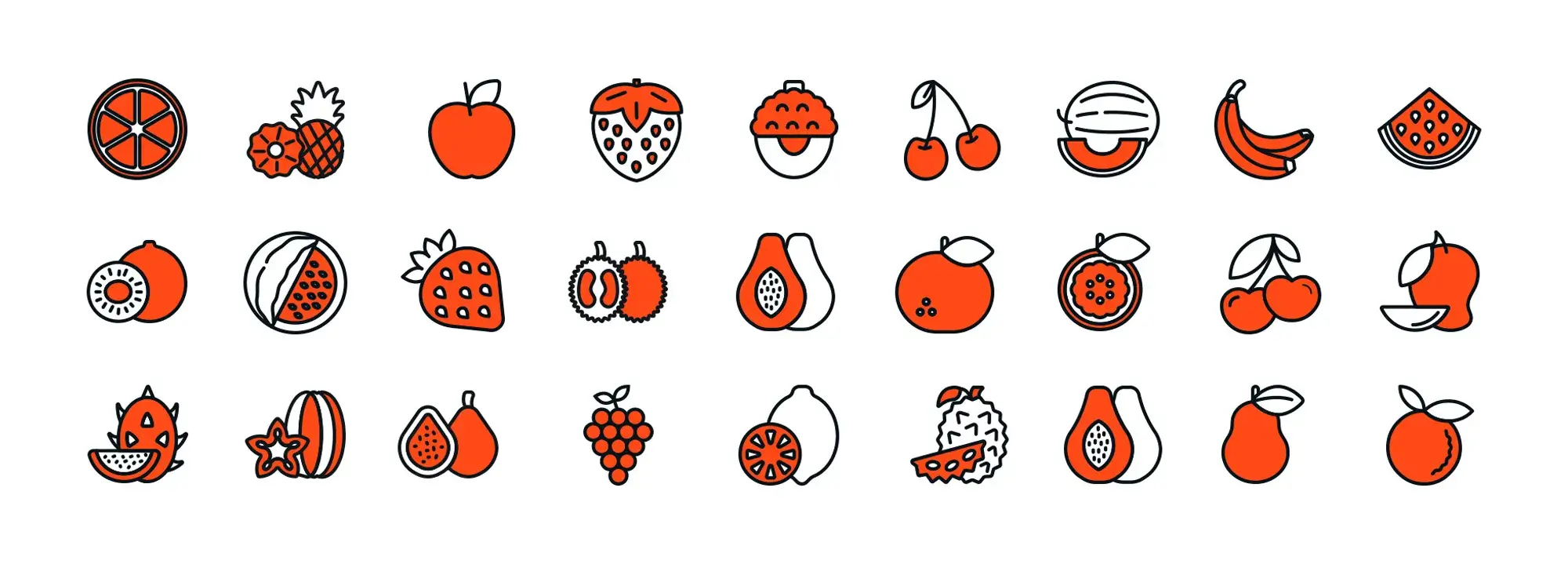
- Visualise vitamin abundance: Create an interactive section where users can explore vitamins and their benefits. Fruit icons like grapefruit, orange, and kiwi represent vitamin C sources, and a click may reveal detailed nutritional benefits in a pop-up or sidebar.
- Energy snacks page: Feature high-energy snacks with banana or apple icons. Each icon can link to an article or infographic that explains its energy contribution to a balanced diet.
- Highlight antioxidant fruits: Use berry and pomegranate icons to showcase antioxidant-rich fruits. An interactive chart or carousel can allow users to learn about each fruit’s health benefits.
These design ideas show how using MaxiBlocks icons in a health and wellness context not only enhances visual appeal but also conveys valuable information efficiently.
Subscribe to our newsletter
Beverage companies and juice bars: enhancing user experience with MaxiBlocks icons
MaxiBlocks’ free SVG icons offer a dynamic way to refresh the look and usability of websites for beverage companies and juice bars. By incorporating vibrant fruit icons, these businesses can craft interactive menus and visually communicate the quality and origin of their ingredients. The following sections outline practical ways to use these icons for improved navigation and customer engagement.
Menu visualisation with fruit icons
Design a fruit juice menu that is both clear and attractive by integrating fruit icons into your pricing table. Each juice offering can be symbolised by an appropriate icon alongside its description and price. For example, your menu might include:
- 🍍 Tropical Delight – A vibrant blend of pineapple, mango, and papaya
- 🍓 Berry Blast – Fresh strawberries, blueberries, and raspberries mixed into a sweet, tart juice
- 🍊 Sunrise Citrus – A refreshing mix of orange, grapefruit, and mandarin
- 🥥 Coconut Water Refresh – Pure coconut water with a hint of lime
- 🍉 Watermelon Cooler – Juicy watermelon juice cooled to perfection
- 🥒 Green Detox – A combination of cucumber, spinach, apple, and lime
- 🍇 Grape Escape – Sweet and rich purple grape juice
- 🍋 Lemon Zest – Zesty lemon juice sweetened with a touch of honey
- 🍑 Peach Orchard – Ripe peach juice with a splash of ginger
- 🥭 Mango Mania – Thick and creamy mango juice, a tropical treat
- 🍌 Banana Blend – Smooth banana juice mixed with a hint of vanilla
- 🍈 Melon Medley – A mix of cantaloupe, honeydew, and watermelon
These visual cues not only attract attention but also help customers quickly understand the range of options available.
Ingredient highlights using fruit icons
Fruit icons can also be used to emphasise the freshness and quality of ingredients on your website. This approach reassures customers about the health benefits of your offerings through clear visual storytelling.
Map of ingredient sources
Create an interactive map that shows the origins of your fruits. Use specific fruit symbols—for example, an orange for Florida or a banana for Ecuador—to visually represent the sourcing locations of your ingredients.
Seasonal offers section
Highlight seasonal beverages by using the appropriate fruit icons. For example, a watermelon icon may indicate summer specials, while an apple icon can denote autumn harvest drinks. This not only highlights freshness but also informs customers about seasonal availability.
Behind-the-scenes content
Develop a blog series or a dedicated page that tracks your ingredients from farm to glass. Use fruit icons as markers at each stage such as a lemon for selection and cleaning, or a grape for juicing—to provide customers with a clear, visual narrative of your production process.
Culinary blogs and recipe websites with herb and spice symbols
Overview
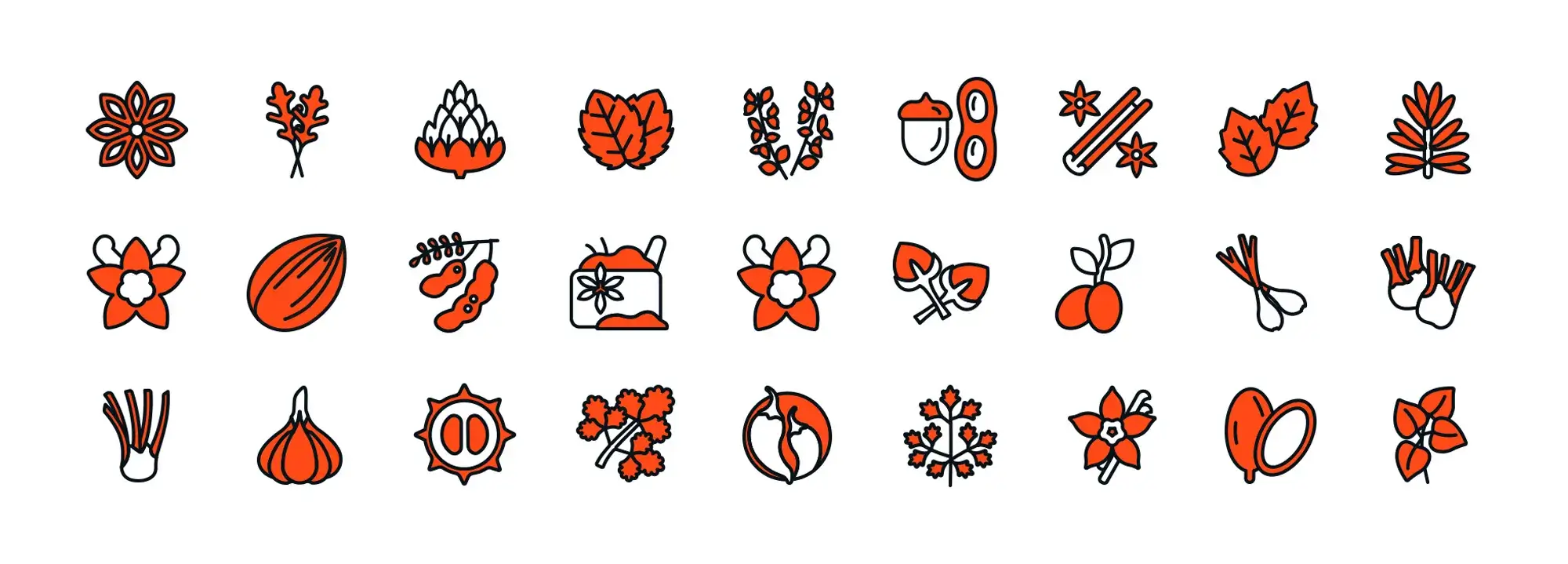
Using herb and spice icons (🍃, 🌿, 🌱) on a culinary blog or recipe website helps visitors quickly find recipes that match their tastes or available ingredients. These icons not only enhance visual appeal but also improve navigation and overall user experience, making your site stand out.
Implementation strategy
Icon-driven recipe categories
Create a dedicated section on your homepage or recipe page that displays herb and spice icons. Each icon acts as a clickable link that filters recipes by that herb or spice. Adding a hover effect can briefly display the flavour profile or common use, giving users useful information at a glance.
Labeling recipes with icons
Place appropriate icons alongside recipe titles or on recipe cards. For instance, a 🍃 basil icon clearly indicates dishes featuring basil, while a 🍂 cinnamon icon signals warm, sweet spices in desserts. These symbols allow users to navigate your content faster by quickly spotting key ingredients.
Examples of herb and spice symbols in use
🌿 Basil icon
Use with Italian recipes such as pesto, tomato basil soup, or Margherita pizza to indicate a fresh, herbaceous flavour profile.
🍂 Cinnamon icon
Place next to desserts like cinnamon rolls, apple pie, or spiced carrot cake to signal the presence of warm, sweet spices.
🌱 Cardamom icon
Feature in Indian and Middle Eastern dishes such as chai tea, biryani, or kheer to showcase aromatic, slightly sweet flavours.
🍃 Coriander icon
Apply to Mexican and Asian recipes like coriander lime rice, Vietnamese pho, or salsa verde to represent fresh and vibrant flavours.
🍠 Ginger icon
Use with stir-fries, ginger cookies, or ginger tea to communicate a spicy, warming accent.
🍃 Mint icon
Perfect for refreshing drinks, salads, or Middle Eastern dishes like tabbouleh and mint chutney that demand a cool, crisp flavour.
🍃 Oregano icon
Use with Greek and Mediterranean recipes such as Greek salad, lemon oregano chicken, or marinated olives, highlighting bold, earthy notes.
🥬 Parsley icon
Feature in French or Mediterranean dishes like parsley potatoes, chimichurri, or tabbouleh to add a bright, fresh touch.
🍀 Tarragon icon
Use in French cuisine such as béarnaise sauce or tarragon chicken to denote its distinctive, aniseed-like flavour.
🌿 Thyme icon
Include with savoury soups, stews, or roasted vegetables to represent a subtle, earthy essence.
Integrating herb and spice icons from MaxiBlocks (🍃, 🌿, 🌱) transforms a culinary site into a visually engaging and intuitive resource. By categorising recipes with clear icons and signalling flavour profiles through emojis, your website becomes easier to navigate and more appealing to food enthusiasts. Enjoy creating a site that not only informs but also inspires culinary exploration.
Build like a pro
Overview
Develop an interactive online menu for your fast food restaurant using MaxiBlocks food icons (🍔, 🍕, 🍟) to represent various categories and items. This visual approach makes your menu more appealing and helps customers quickly identify their favourite food options, streamlining the ordering process and enhancing the user experience.
Implementation
Visual category navigation
Customise the main menu page with large, clickable MaxiBlocks icons for different food categories, such as burgers (🍔), pizza (🍕), chicken (🍗), and tacos (🌮). This setup enables customers to easily navigate to the section they’re interested in.
Detailed menu items with icons
Within each category, display specific icons like a bacon and eggs icon (🥓🍳) for breakfast, a burrito icon (🌯) for Mexican dishes, or a fries icon (🍟) for side options next to item names. Use hover effects or clickable icons to open pop-up windows that show item descriptions, nutritional details, or customisation options.
Icon-based customisation
Allow customers to personalise their orders through an interactive interface. For example, they can click on icons for extra cheese (🧀), onion rings (🧅), or jalapeños (🌶️) to add toppings to their burger or pizza. This feature makes customising an order intuitive and engaging.
Promotions and quick combo options
Highlight special promotions by adding effects to specific icons. For instance, apply a sparkling effect around a chicken bucket icon (🍗) to signal a special offer. Additionally, group icons—such as a hot dog (🌭), nachos (🍤), and a fizzy drink (🥤)—to create a quick combo selection that lets customers order a complete meal with a single click.
Order tracking and additional services
Incorporate icons for services such as home delivery (🚚), takeout, or order tracking (⏱️). These icons help customers understand their options and manage their orders more easily.
Benefits
Improved user experience
Vivid, recognisable icons enhance navigation, making it simpler and faster for customers to find what they need especially on mobile devices where space is limited.
Enhanced visual appeal
A visually attractive, icon-driven menu draws attention and keeps customers engaged. An appealing layout can also encourage users to explore additional menu items.
Increased sales
By streamlining the ordering process with clear, interactive icons, customers are more likely to add extra items to their orders, helping to boost overall sales.
Stronger brand identity
Consistent, customisable icons reinforce your brand’s visual identity. Over time, these icons become associated with your restaurant, helping your business stand out in a competitive market.
These practical tips show how using MaxiBlocks icons with their customisation options and intuitive drag‑and‑drop functionality—can create an engaging, efficient online menu for fast food restaurants and juice bars. Enjoy designing a menu that makes ordering fun and hassle-free while strengthening your brand.
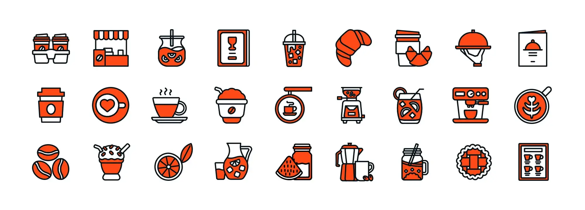
Overview
Create an interactive online menu for your café using MaxiBlocks icons to showcase your beverages and brewing equipment. These icons not only improve navigation but also provide educational insights about coffee and tea types, their origins, and brewing methods. This visual approach enhances customer engagement and makes ordering and learning both fun and informative.
Implementation
Beverage categories
Use large, clickable icons for each category:
- ☕ Coffee: Represented with a coffee cup icon
- 🍵 Tea: Represented with a tea bag or teacup icon
- 🥤 Speciality drinks: Use icons such as boba or bubble tea
- 🔧 Accessories: Use a coffee grinder or similar icon
Explanations of brewing methods
Place brewing method icons next to each beverage option:
- 🏺 French Press
- 🍶 Moka Pot
- 🕌 Turkish Coffee
Customisation options
Enhance interactivity by allowing customisation:
- For drinks like lattes or espresso, use icons such as:🥛 Milk selection🍬 Sugar cubes🌶 Spice additions (e.g. cinnamon stick)This icon-based customisation simplifies the ordering process and makes it engaging.
“What’s your brew?” quiz
Create an interactive quiz with icons:
- Use a coffee bean icon for a strong flavour preference
- Use ice cubes (❄️) for cold drinks
Seasonal highlights and special offers
Highlight promotions using themed icons:
- 🍉 Iced tea for summer specials
- 🎃 Pumpkin for autumn drinks
Showcase for brewing equipment
Display icons for brewing appliances:
- 🖥️ Coffee maker
- 🌀 Hand coffee grinder
- ☕ French press
Educational content
Incorporate icons that direct users to educational resources:
- 🌍 World map icon for origins of coffee
- 📚 Book icon for detailed insights on tea ceremony traditions
Benefits
- Improved user experience: Clear, recognisable icons make navigation faster and more intuitive.
- Enhanced visual appeal: Vibrant icons break up text, making your menu attractive and easy to scan.
- Increased engagement: Interactive icons encourage users to explore and customise their orders.
- Stronger brand identity: Consistent, customisable icons reinforce your café’s visual identity, making your site stand out.
This approach leverages MaxiBlocks’ free SVG icon library to create an engaging, interactive, and educational online menu that enhances the overall user experience for your café. Enjoy building a menu that not only informs but also inspires your customers with every click.
Street food truck locator: addressing customers with real-time information
Interactive map integration
Add a live, interactive map to your food truck website. This map, featuring a clear street food truck icon (🥙), displays the current location of your truck in real time using GPS or a similar tracking solution. This ensures customers always see an accurate position when they need to find you.
Menu item icons
Place smaller icons next to the truck icon on the map to represent daily menu items. For example, display a burger icon for burgers, a taco icon for tacos, and a soda icon for drinks. These visuals help customers quickly identify what’s on offer.
Detailed information about dishes
Make each menu item icon clickable. When a user clicks an icon, a pop-up window or sidebar should appear with details about the dish, including ingredients, price, and a photo. This immediate access to detailed information supports faster decision-making for customers.
User interaction and feedback
Include features that allow users to interact such as a “like” button or a comment section next to dish icons to share their opinions about favourite menu items. Consider adding a “suggest a location” option to let customers recommend places for the truck to visit, encouraging community involvement.
Mobile optimisation
Ensure that the street food truck locator is fully optimised for mobile devices. Since customers are often on the move, a mobile-friendly interface is crucial for smooth operation. Test the feature on various devices and browsers to confirm it functions seamlessly.
Advertising and social sharing
Integrate social sharing buttons so users can share the truck’s location and menu on platforms like Facebook, Twitter, or Instagram. Regular updates via your website and social media can keep customers informed about your latest location and special offers.
These strategies, using MaxiBlocks’ free SVG icons, create an interactive online presence that enhances the customer experience. By combining real-time tracking with informative, customisable icons, your street food truck website becomes a powerful tool for boosting engagement and driving traffic directly to your location.
Final thoughts
Integrating a street food truck locator with MaxiBlocks icons transforms your website into a dynamic, user-friendly tool. By using clear, interactive icons alongside real‑time map features, you not only improve navigation and customer engagement but also create a visually appealing experience that reinforces your brand. Regularly updating the menu and incorporating social sharing further enhances your online presence, ensuring that both new and returning customers can easily locate your food truck and discover your daily offerings. Start integrating these features today to drive engagement and build trust with your audience.
WordPress icons resources for design and customization
Explore our articles on choosing, customizing, and optimizing WordPress icons for faster, accessible sites.
FAQs for Hospitality WordPress icons
What are free WordPress icons in MaxiBlocks?
They are a collection of over 14K scalable vector (SVG) icons provided by MaxiBlocks that you can use to enhance your WordPress site’s design and functionality.
How do I use free WordPress icons from MaxiBlocks?
You can add these icons directly through the MaxiBlocks editor by selecting the “SVG Icon Maxi” block and choosing the icon from the library. They integrate seamlessly with your WordPress site’s pages.
Can I customise free WordPress icons in MaxiBlocks?
Yes, you can adjust colours, resize icons, and modify line styles in real time directly within the MaxiBlocks editor to match your brand identity.
What benefits do free WordPress icons from MaxiBlocks offer?
They improve navigation, enhance visual appeal, and help communicate information quickly. Because they are vector-based, they load fast and look sharp on any device, contributing to a more professional appearance.
Are the icons responsive and scalable?
Absolutely. SVG icons are scalable without losing quality, ensuring they remain crisp on any screen size or resolution.
Do MaxiBlocks free icons integrate easily with WordPress?
Yes, MaxiBlocks is designed to work seamlessly with WordPress, making it simple to add, customise, and manage icons without requiring any coding skills.
Is there any cost to using these icons?
No, the icons available in the MaxiBlocks library are completely free, making them a cost-effective solution for improving your website’s design.
How can these icons improve my website?
They make your website more user-friendly by providing clear visual cues for navigation, calls to action, and key content areas, thereby enhancing overall usability and engagement.
Where can I get support for using MaxiBlocks icons?
Support is available through MaxiBlocks documentation, WordPress support forums, and various online tutorials that cover how to customise and integrate these icons into your site.
What is the recommended favicon size for WordPress?
If you’re unsure about image dimensions, this guide on the best favicon size for WordPress explains what works across different devices and browsers.
How do I add a favicon to my WordPress site?
Adding a favicon is quick and easy. Follow the steps in this guide on how to add a favicon in WordPress using the Site Icon feature.
What is a WordPress site icon?
A site icon is what appears in browser tabs and bookmarks. Learn more about it and how to set it up in this guide on the WordPress site icon.
Can I use Dashicons as a favicon in WordPress?
Dashicons are meant for admin interface elements rather than favicons, but you can still learn more about them in this guide to WordPress Dashicons.
WordPress itself
Official Website
wordpress.org – This is the official website for WordPress, where you can download the software, find documentation, and learn more about using it.
WordPress Codex
codex.wordpress.org/Main_Page – This is a comprehensive documentation resource for WordPress, covering everything from installation and configuration to specific functionality and troubleshooting.
WordPress Theme Directory
wordpress.org/themes – The official WordPress theme directory is a great place to find free and premium WordPress themes. You can browse themes by category, feature, and popularity.
maxiblocks.com/go/help-desk
maxiblocks.com/pro-library
www.youtube.com/@maxiblocks
twitter.com/maxiblocks
linkedin.com/company/maxi-blocks
github.com/orgs/maxi-blocks
wordpress.org/plugins/maxi-blocks

Kyra Pieterse
Author
Kyra is the co-founder and creative lead of MaxiBlocks, an open-source page builder for WordPress Gutenberg.
You may also like
