How can icons in WordPress simplify your web design?
Try MaxiBlocks for free with 500+ library assets including basic templates. No account required. Free WordPress page builder, theme and updates included.
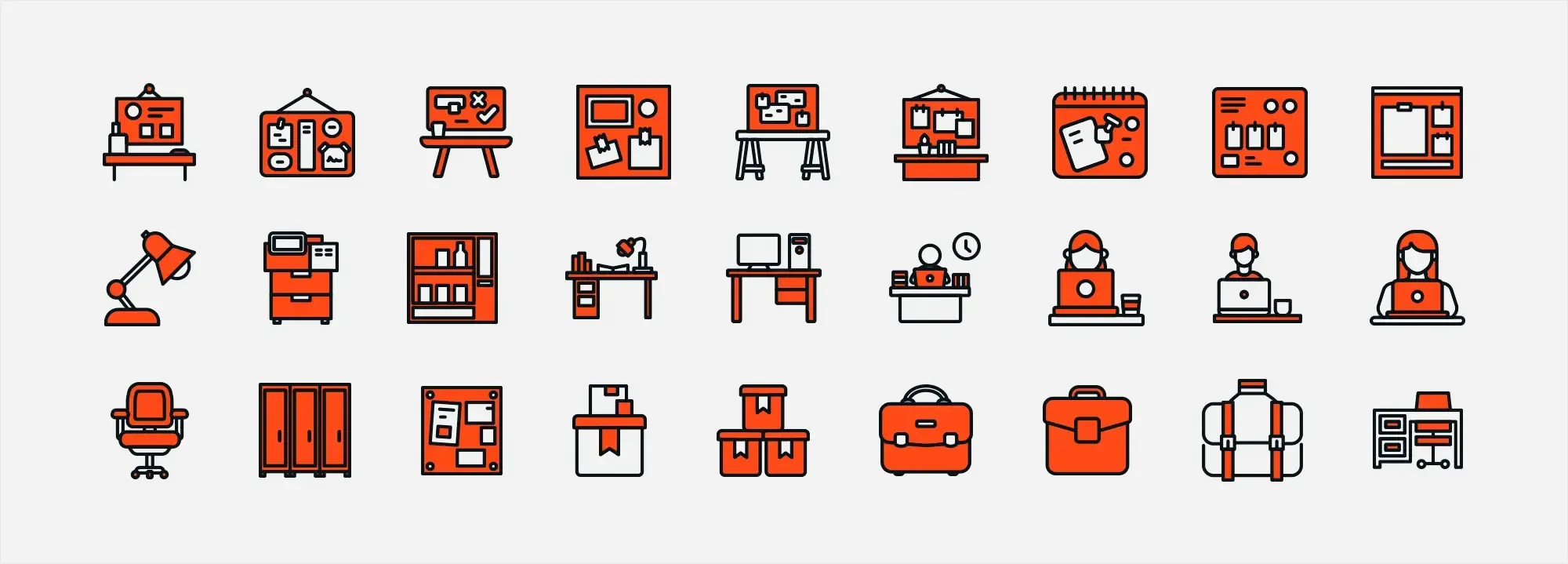
Icons play an important role in WordPress web design by improving user experience and adding visual interest. They help with navigation, highlight actions, and make content easier to understand. You can add icons using fonts, plugins like MaxiBlocks, or WordPress’s own Dashicons.
Updated 8th May 2025
Key takeaways
- Minimalist design in web design focuses on simplicity, clarity and usability
- Icons in WordPress enhance navigation, reduce mental effort and improve the overall look
- Selecting the right icons means ensuring they’re relevant, consistent and stand out without clutter
- Embedding icons can be done using plugins, custom CSS or SVG for optimal performance
- Custom icons provide unique branding opportunities but must remain scalable and responsive
- Icons simplify layouts by breaking up text, representing concepts visually and guiding attention
- They improve user experience by reducing reliance on text, especially on smaller mobile screens
From clutter to clarity: Icons in WordPress minimalist web design
Introduction to Minimalism in Web Design
Minimalism in web design strips away the clutter, focusing on just the essentials for a clean and user-friendly experience. It prioritizes content and user experience (UX) by eliminating unnecessary elements. Think flat layouts, limited colours, ample white space, and minimal graphics. The goal: a clear interface that guides users to the core message or functionality.
A Short History
Minimalism’s roots trace back to early 20th-century art and architecture, emphasizing the reduction of a subject to its necessary elements. Faster loading times, improved usability, and the rise of simple designs fueled this trend. Mobile technology further accelerated it, as designers needed websites that looked good and functioned well on smaller screens. Today, minimalism goes beyond visual simplicity, encompassing usability optimization for navigation and content discovery.
Why is it Important?
Minimalism benefits both engagement (UX) and website performance. It reduces cognitive load, making information processing and decision-making easier. Faster loading times, achieved through less complex design and fewer graphics, keep users engaged and improve search engine ranking.
The role of icons in minimalist design
In minimalist design, icons play a role in decluttering the website by replacing long text descriptions. Icons can convey functions, features or content categories through simple visual cues, making it easier for users to find their way around the website without having to read text-heavy instructions. This not only saves space but also speeds up the interaction process as users can quickly identify actions or sections of interest to them through universally recognized icons. The use of icons contributes to a clearer, more organized user interface that is consistent with the minimalist philosophy.
How icons affect user understanding
Icons play a role in how people interpret and move through a website. Because users often rely on visual cues, the right icons can significantly reduce the effort needed to grasp your site’s structure. They tap into visual memory, making tasks like finding products or navigating categories much more intuitive. When chosen wisely, icons enhance the user experience by quickly conveying ideas, actions or services.
Minimalist vs traditional design: how icons differ
Minimalist icon use
- Fewer, clearer icons – minimalist design typically features just enough icons to guide users, focusing on function over decoration
- Stylised and instantly recognisable – the aim is to reduce visual noise by keeping icon details to a minimum, ensuring each symbol stands out
- Focus on efficiency – each icon is there for a reason, helping users navigate quickly and easily
Traditional icon use
- More icons, more detail – traditional designs sometimes have a larger number of intricate icons
- Visual interest but potential clutter – highly detailed graphics can be engaging but may also distract or overwhelm users
- Diluted focus – with too many icons, visitors might struggle to determine which symbols are most important
Choosing the right icons for your WordPress website
Match icons to your brand identity
Consistent branding makes your site feel more cohesive. Pick icons that reflect your brand’s personality—whether it’s playful, formal, modern or classic.
Ensure relevance
Icons should have a direct connection to the action or page they represent. This helps users understand your content without thinking too hard.
Maintain design consistency
All icons on your WordPress site should share a uniform style, colour palette and line thickness. A mismatched set can look messy and undermine your brand’s credibility.
Emphasise uniqueness
Standing out doesn’t mean confusing your audience. If you go for custom icons, keep them intuitive. Users appreciate originality as long as they can quickly recognise what each icon does.
Icons can make or break your site’s user experience. They guide navigation, speed up comprehension and add visual interest especially when integrated into a minimalist layout. By sticking to a consistent, relevant and brand-focused approach, you’ll end up with an icon setup in WordPress that’s both attractive and user-friendly.
Subscribe to our newsletter
Recommendations for size, colour and style consistency
Size
Use the same icon dimensions across your site to maintain a uniform and readable look. Adjust sizes for desktop and mobile as needed, but keep the overall scale consistent. This allows visitors to recognise icons quickly without straining their eyes or needing to search the screen.
Colour
Stick to your brand’s colour palette to reinforce visual identity and build recognition. Icons should contrast clearly with the background so they’re easy to spot, but they should remain simple enough not to distract from the overall design. Strong contrast ensures accessibility and immediate visibility.
Style
Whether you use outlined, filled or flat icons, consistency is essential. Mixing different styles can make your site feel unpolished or visually chaotic. Choose a style that suits your design tone—minimalist, playful, modern or professional—and apply it throughout for a cohesive experience.
Minimalist-friendly icon libraries
A wide selection of icons supported by many WordPress themes and plugins.
Clean, simple icons based on Google’s Material Design system—ideal for modern and minimalist layouts.
A versatile set that pairs well with both iOS and Android aesthetics, offering responsive compatibility across devices.
Lightweight, outline-based icons that integrate smoothly into minimalist web designs.
Embedding icons in WordPress: best practices
Technical tips for adding icons to menus, buttons and widgets
Menus and buttons
- CSS classes: In the WordPress menu settings, add the appropriate CSS classes based on your icon library (e.g. Font Awesome or Ionicons).
- Direct HTML: For buttons, embed the icon’s HTML code directly into the button label. Alternatively, use a plugin that supports icons for a more visual editing experience.
Widgets
- Shortcodes and HTML: If your chosen icon library offers shortcodes, use them in text or custom HTML widgets. You can also paste raw HTML to insert icons exactly where you need them.
Use of plugins for icon integration
Plugins like Font Awesome, Menu Icons by ThemeIsle, and other icon-specific tools simplify the integration process. These often include:
- Built-in shortcodes for posts, pages and widgets
- Visual icon pickers in the WordPress dashboard
- Seamless menu and widget integration for easy placement
These features reduce the need for custom code and let you focus on layout, branding and user flow.
Design tips for balancing icons and text
Complementary use
Icons should work alongside text not replace it entirely. They help break up long paragraphs, highlight key information and make the content easier to scan.
Proportions
Keep icon size proportionate to nearby text. Oversized icons can dominate the layout, while too-small ones may be missed. Balanced proportions maintain visual harmony.
Whitespace
Provide enough spacing around each icon. Breathing room improves legibility, especially in minimalist designs, and keeps the layout from feeling crowded.
The meaning of whitespace
Also known as negative space, whitespace helps highlight icons and other important elements by removing visual clutter. A clean layout with well-placed icons makes navigation easier and the interface more approachable.
Match icons to the website’s grid system
- Align with columns and gutters: Ensure icons follow your site’s grid layout to maintain a neat, structured appearance.
- Responsive scaling: Grid-based alignment also helps icons scale consistently across desktops, tablets and mobile devices.
Combining solid technical practices such as inline SVG or icon plugins with thoughtful design principles like spacing, alignment and proportion, results in a polished WordPress site. A cohesive, accessible and responsive icon system not only looks great but also supports usability for all users.
Build like a pro
Customising icons for unique branding
Basic guide to creating custom icons
1. Choose your design software
Use vector-based tools such as Adobe Illustrator, Sketch or Figma. These programs offer robust features for creating clean, scalable icons suited to digital use.
2. Start with simple shapes
Most effective icons begin with basic shapes like circles, squares or lines. Simplicity ensures the design remains clear and recognisable.
3. Keep it minimal
Focus on only the essential details that represent the icon’s function. Avoid excessive decoration, which can reduce clarity—especially on smaller screens.
4. Stay consistent
Apply a uniform style across your icon set. Use the same stroke width, proportions and corner radius to reinforce brand identity and visual coherence.
5. Test scalability
Check how your icons look across different screen sizes. Icons should be legible and sharp whether viewed on a mobile device or a large desktop monitor.
How to ensure your custom icons are scalable and responsive
Vector formats
Save your icons in SVG or other vector formats. Vectors maintain quality at any size, making them ideal for responsive layouts and high-resolution screens.
Consistent artboard sizes
Use uniform artboard dimensions when designing your icons. This helps maintain alignment, spacing and visual balance when icons are placed across your site.
Optimise for performance
Use optimisation tools like SVGO to reduce SVG file sizes. Smaller icons load faster and contribute to better site performance without compromising visual quality.
Upload and implement custom icons in WordPress
Why use custom icons?
Custom icons can elevate your site’s appearance, enhance navigation and reinforce your brand identity. When implemented correctly, they contribute to a smoother, more professional and responsive user experience.
Step 1: Prepare your icons
Web-friendly format
Use a scalable and lightweight format such as SVG, which works well across all screen sizes and maintains quality without bloating your site.
Optimisation
Optimise your icons using tools like SVGO to reduce file size without affecting visual quality. This improves load times and site performance.
Step 2: Upload your icons
WordPress media library
You can upload your custom icons directly to the media library for easy access within your dashboard.
FTP to theme folder
Alternatively, upload icons to your theme folder via FTP for more direct file control ideal for developers or advanced users.
Step 3: Implement icons with custom CSS or a child theme
Custom CSS or child theme edits
Use custom CSS or modify your child theme to insert your icons. For SVGs, either embed the raw <svg> code directly into your HTML or use an SVG plugin for better management.
Responsive code
Ensure your styles use responsive units (e.g. em, rem, %) and media queries so that icons adapt smoothly across devices.
Step 4: Test responsiveness
Device testing
Check your site on desktop, tablet and mobile to make sure icons are proportionate and display correctly on all screen sizes.
Screen-specific adjustments
Use media queries in your CSS to fine-tune icon sizing across breakpoints for consistency and accessibility.
Tools for designing, editing and optimising icons
Professional vector design software with powerful customisation and export tools.
Popular among UX/UI designers for its intuitive interface and strong vector editing features.
A browser-based design and collaboration tool, ideal for creating and testing icons with your team.
A free, open-source alternative for creating SVG icons. Great for those seeking a budget-friendly option.
Avoid common pitfalls when using icons
- Overuse of icons: Avoid cluttering your design. Use icons selectively to highlight key actions or content—not as decorative elements.
- Inconsistency: Mixing icon sets with different styles, sizes or stroke widths disrupts visual harmony. Choose a single, cohesive icon set and apply it consistently.
- Neglecting accessibility: Always provide alternative text or ARIA labels for icons so screen readers and assistive technologies can interpret them properly.
Advantages of using icons in WordPress design
- Improved navigation: Icons act as quick visual cues, helping users identify key actions and content areas without relying on text-heavy menus.
- Cleaner interface: Minimalist icon use helps break up text blocks, creating a more organised and visually appealing layout.
- Enhanced performance: Well-optimised icons, especially SVGs, load faster, contributing to better page speed and a smoother user experience.
Final takeaways and action steps
Why minimalist design matters
Minimalist design isn’t just a trend—it’s a proven strategy for creating websites that are easy to navigate and visually appealing. By removing clutter and focusing on clean, consistent visual cues like icons, you can improve user comprehension and reduce cognitive load across your WordPress site.
Key summaries
Simplicity and clarity
Minimalist design removes unnecessary elements and puts your content front and centre. Icons simplify navigation and make key functions immediately recognisable.
Consistency is crucial
Whether you’re using free libraries like Font Awesome, Material Icons, or Ionicons, or designing your own custom icons, maintaining a consistent style, size and colour scheme reinforces your brand and creates visual harmony.
Enhanced user experience
Icons improve readability by replacing long strings of text and providing visual shortcuts—especially valuable on mobile devices where screen space is limited.
Technical best practices
Embedding icons through plugins, custom CSS or inline SVG improves performance and ensures your site adapts well across all devices.
Next steps and resources
Evaluate your icon strategy
Review your current icon setup. Do your icons support your content and help visitors navigate effectively? Identify what’s working and where improvements are needed.
Experiment with tools
Use tools like WordPress page builders and icon libraries to try out new icon styles. Test how different sets align with your brand identity and layout.
Implement and test
Use plugins, inline SVG or custom CSS to embed your icons. Check their performance on different devices and screen sizes. Adjust sizing and spacing to maintain clarity and accessibility.
Keep learning
Continue exploring best practices in minimalist design and user experience. The more you learn, the more refined and effective your website will become.
Final thoughts
By embracing minimalist principles and mastering the use of icons, you can transform the usability and look of your WordPress site. This strategy not only streamlines navigation but also builds a stronger, more professional digital presence.
Ready to take your design further? Subscribe to our newsletter for expert insights, helpful resources and practical tips to help you keep building sleek, high-performing websites.
WordPress icons resources for design and customization
Explore our articles on choosing, customizing, and optimizing WordPress icons for faster, accessible sites.
FAQs about using icons in minimalist WordPress design
Why are icons important for minimalist web design?
Icons cut through the clutter. They provide clear visual cues that help users quickly identify functions and content areas, reducing cognitive load. This focus on simplicity and clarity aligns perfectly with minimalist design principles.
What benefits do icons bring to WordPress websites?
Icons enhance navigation, improve overall aesthetics and help break up large blocks of text for easier scanning. They also reduce the need for lengthy explanations by visually representing functions and concepts, which is especially helpful on mobile devices.
How can I select the right icons for my WordPress site?
Choose icons that directly represent the content or actions they support. They should reflect your brand identity in style, colour and overall tone. To maintain visual harmony, use a consistent design approach throughout your site.
What are some recommended icon libraries for minimalist WordPress designs?
Font Awesome, Material Icons, Ionicons and Simple Line Icons are popular choices. These libraries offer clean, modern styles that align well with minimalist design, and they integrate easily with most WordPress themes and plugins.
What are best practices for embedding icons in WordPress?
You can embed icons by using CSS classes in menus or buttons, inserting HTML or shortcodes into widgets, or installing plugins like Font Awesome or Menu Icons by ThemeIsle. For better performance, you can also embed SVG icons directly into your HTML code.
How do I maintain consistency with icon size, colour and style?
Use the same dimensions across your entire site, adjusting for mobile where necessary. Stick to your brand’s colour palette to ensure visual cohesion and accessibility. Choose one icon style, such as outlined or filled, and apply it consistently to avoid design clashes.
How can I create custom icons for unique branding?
Use vector-based design tools like Adobe Illustrator, Sketch or Figma to create icons from simple shapes. Focus on minimal detail and consistent proportions. Save your icons as SVG files so they remain sharp at any size, and optimise them for faster loading.
What should I consider when uploading and implementing custom icons in WordPress?
Make sure your icons are in a web-friendly format like SVG and optimised for performance. Upload them to your WordPress media library or use FTP to place them in your theme’s directory. You can integrate them using custom CSS or a child theme, and you should always test icons across devices to ensure responsiveness.
What common pitfalls should I avoid when using icons?
Avoid overloading your layout with too many icons, which can confuse users. Mixing different styles or sizes will make your site feel inconsistent. Also, ensure accessibility by adding alt text or ARIA labels so that screen readers can interpret the icons properly.
How do icons impact user comprehension and navigation psychologically?
Icons engage visual memory, allowing users to recognise functions and navigate more efficiently. By replacing or enhancing text with recognisable symbols, icons make it easier to understand the layout of a site, reducing cognitive effort and improving the user experience.
What is the recommended favicon size for WordPress?
To make sure your site icon looks sharp across all devices, follow this guide on the best favicon size for WordPress.
How do I add a favicon to my WordPress site?
You can easily add a favicon using the Site Icon feature in the Customizer. Follow this step-by-step guide on how to add a favicon in WordPress.
What is a WordPress site icon?
A site icon is the small image shown in browser tabs, bookmarks, and on mobile screens. Learn more in this explanation of the WordPress site icon.
What are Dashicons and how are they used?
Dashicons are WordPress’s built-in icon set used mainly in the admin area. Find out how they work in this guide to WordPress Dashicons.
WordPress itself
Official Website
wordpress.org – This is the official website for WordPress, where you can download the software, find documentation, and learn more about using it.
WordPress Codex
codex.wordpress.org/Main_Page – This is a comprehensive documentation resource for WordPress, covering everything from installation and configuration to specific functionality and troubleshooting.
WordPress Theme Directory
wordpress.org/themes – The official WordPress theme directory is a great place to find free and premium WordPress themes. You can browse themes by category, feature, and popularity.
maxiblocks.com/go/help-desk
maxiblocks.com/pro-library
www.youtube.com/@maxiblocks
twitter.com/maxiblocks
linkedin.com/company/maxi-blocks
github.com/orgs/maxi-blocks
wordpress.org/plugins/maxi-blocks

Kyra Pieterse
Author
Kyra is the co-founder and creative lead of MaxiBlocks, an open-source page builder for WordPress Gutenberg.
You may also like
