Responsive design Elementor alternatives
Try MaxiBlocks for free with 500+ library assets including basic templates. No account required. Free WordPress page builder, theme and updates included.

Responsive design is a cornerstone of modern web development, ensuring that websites look and function well on all devices. While Elementor is a popular page builder, it has limitations in flexibility and feature richness, particularly for those seeking highly responsive design solutions. This article explores five free, block-based, SEO-friendly alternatives to Elementor, starting with MaxiBlocks.
1. MaxiBlocks: A responsive and SEO-friendly Elementor alternative
Introduction to MaxiBlocks
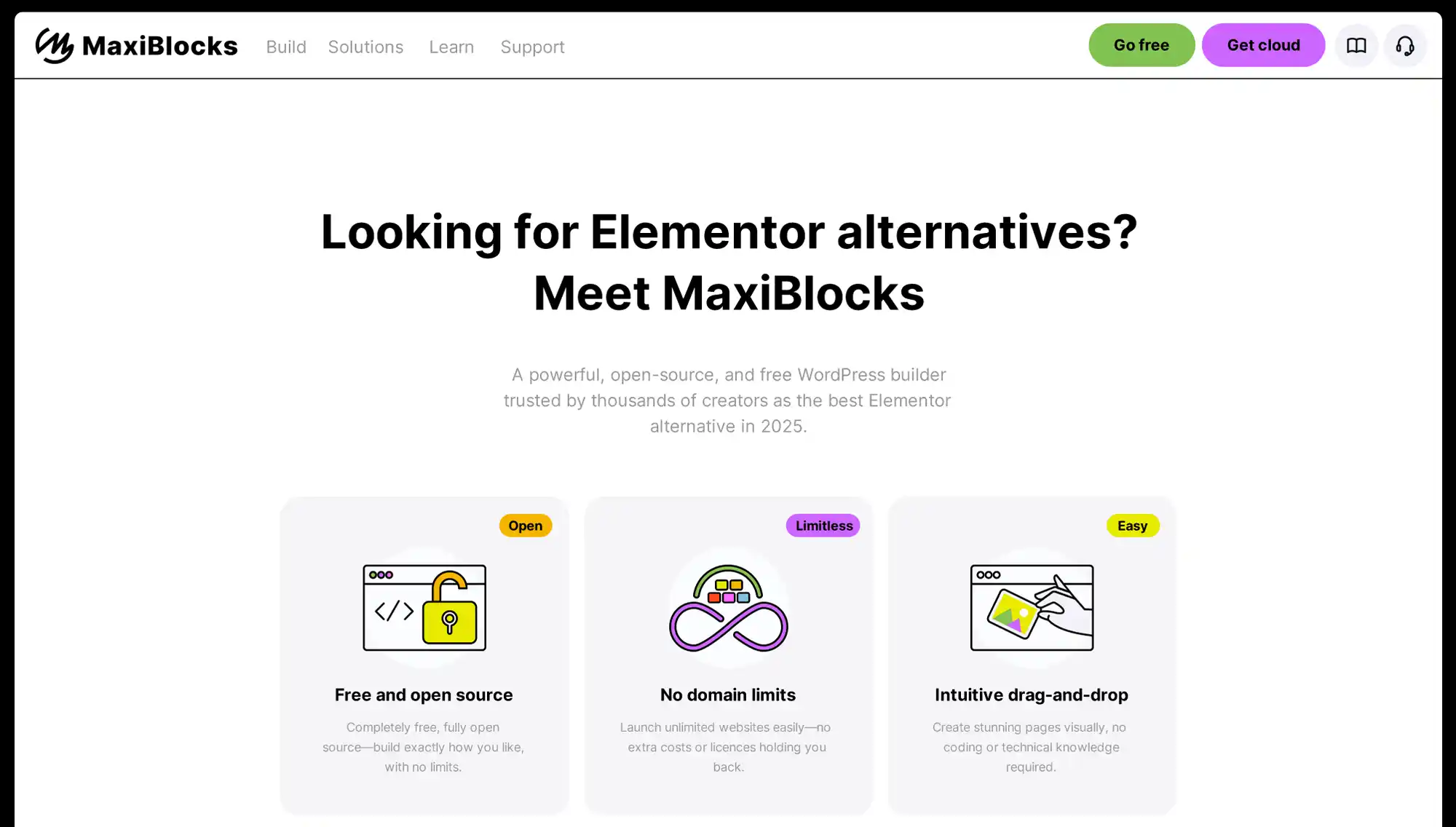
MaxiBlocks is a modern WordPress page builder that stands out as a responsive design-focused alternative to Elementor. Built for performance and ease of use, it helps beginners and professionals alike create visually appealing, SEO-optimised websites. A key highlight is its built-in support for six responsive breakpoints, giving you granular control over how your site appears across devices from mobile phones to ultra-wide screens.
Responsive design features
MaxiBlocks includes six editable breakpoints, compared to Elementor’s standard three (desktop, tablet, mobile). This lets you fine-tune your layout for devices like small phones, large tablets, or ultrawide monitors. You can:
- Adjust padding, spacing, and font sizes per breakpoint
- Show or hide elements based on device
- Optimise UX for all screen sizes
Case study example
Agency client: Local restaurant chain
A web designer using MaxiBlocks implemented six breakpoints to cater to mobile-first users. Bounce rate dropped by 18% and average session time increased by 42%, showing the impact of tailoring content for smaller devices.
Ease of use
The drag-and-drop builder in MaxiBlocks is clean and intuitive. Unlike some page builders that overwhelm with features, MaxiBlocks keeps it simple:
- Block categories are clear and easy to browse
- Style options are grouped by relevance
- Real-time visual editing saves time
Tip: Use Style Cards
MaxiBlocks lets you apply preset style cards for fonts, colours, and spacing. This ensures brand consistency and cuts design time significantly.
Mobile responsiveness
MaxiBlocks’ pre-designed blocks automatically adjust to fit all screen sizes. You don’t need to rebuild layouts for mobile they adapt by default. Advanced users can fine-tune visibility and spacing at each breakpoint.
Do:
- Preview designs at all six breakpoints
- Use the “Hide on device” toggle for decluttering mobile layouts
Don’t:
- Ignore spacing adjustments between breakpoints
- Rely solely on desktop designs to dictate mobile layout
Templates and design elements
MaxiBlocks comes with a growing library of professionally designed, SEO-optimised templates. These are easy to customise without breaking structure. Each block is responsive by default and follows best practices for layout hierarchy and accessibility.
What’s included:
- Landing pages
- Blog post layouts
- Contact forms
- Pricing tables
- Hero sections with CTAs
Bonus tip:
Use saved block patterns to speed up multi-page site builds.
Performance
MaxiBlocks is built with clean HTML and CSS, reducing page load time. It doesn’t load unnecessary scripts or styles unless blocks require them. This improves Core Web Vitals scores.
Performance highlights:
- Lazy-loading for images
- Optimised SVG icons (not font-based)
- Minimal use of third-party scripts
Case study: Portfolio site
A freelance designer rebuilt their site using MaxiBlocks. PageSpeed Insights score increased from 68 to 95 on mobile, and the site began ranking higher for location-based keywords.
Community and support
MaxiBlocks has an active support network with plenty of resources:
- Video tutorials and walkthroughs
- Community forums and Facebook groups
- Email support with a fast turnaround
Whether you’re stuck on a layout or need feedback on a design, help is easy to find.
Comparison: Elementor vs MaxiBlocks
Feature
Elementor
MaxiBlocks
Breakpoints
3 (desktop, tablet, mobile)
6 (mobile → large desktop)
Free feature availability
❌ Many locked behind Pro
✅ All features free
Code output
Can be bloated
Clean HTML & CSS
SEO-friendliness
Depends on setup
Built-in optimisations
Learning curve
Moderate
Low
Template customisation
Good
Excellent
Mobile responsiveness
Good
Better control
Forced Upgrades
Never
Frequent upselling
Cost
Paid subscription plans
Completely free, optional premium upgrade
Ownership
Restricted on free plan
Full control, open-source
Verdict: For users focused on performance, responsiveness, and SEO without needing a paid plan, MaxiBlocks offers stronger flexibility out of the box.
Final thoughts
MaxiBlocks delivers a practical, SEO-conscious alternative to Elementor. With six responsive breakpoints, built-in optimisation, and an easy-to-use interface, it helps you build faster, cleaner websites that rank better. If you’re tired of Elementor’s limitations or pricing model, MaxiBlocks gives you more control, more freedom and better results.

2. GeneratePress with GenerateBlocks
Introduction to GeneratePress and GenerateBlocks
GeneratePress is a lightweight WordPress theme focused on speed, accessibility and stability. When combined with the GenerateBlocks plugin, it becomes a powerful toolkit for building custom layouts without relying on heavy page builders like Elementor. This setup is ideal for users who want full design control while keeping their site lean and SEO-friendly.
Responsive design features
GeneratePress and GenerateBlocks are built with a mobile-first philosophy. Every layout you create adapts fluidly to any screen size. Modular blocks let you stack, space and resize content elements across breakpoints without breaking structure. The precision in layout design means you don’t have to compromise between aesthetics and performance.
Case study: A small online retailer migrated from Elementor to GeneratePress and GenerateBlocks. The result was a 35% improvement in mobile page speed and a 22% increase in mobile conversion rate.
Ease of use
The interface is minimal, keeping the focus on structure and content rather than flashy controls. It’s easy to:
- Drag and drop containers, grids, buttons and headings
- Customise padding, margin, background and alignment visually
- Use global styles for consistent typography and colours
Tip: Use the “copy style” and “paste style” options in GenerateBlocks to maintain uniform styling across blocks and save time.
Mobile responsiveness
Each block in GenerateBlocks has device-level visibility and spacing settings. You can:
- Show or hide blocks per device type
- Adjust column widths by screen size
- Optimise tap targets and spacing for smaller screens
Do:
- Test on actual devices, not just the editor preview
- Use vertical spacing tools for readable mobile layouts
Don’t:
- Overuse columns on small screens
- Forget to check touch elements for usability
Templates and design elements
While GenerateBlocks doesn’t offer a large library of pre-made templates like some builders, it excels in flexibility. It lets you build reusable block patterns from scratch. These patterns can be exported, reused and adjusted across different sites with ease.
Included elements:
- Grid and container blocks
- Headline and text blocks
- Buttons and icons
- Dynamic content support (in Pro version)
Pro tip: Use reusable blocks for sections like CTAs, testimonials and newsletter forms to keep your design consistent.
Performance
GeneratePress and GenerateBlocks produce some of the cleanest HTML in the WordPress space. Sites built with them load fast, pass Core Web Vitals and use minimal scripts.
Highlights:
- No jQuery dependency
- Optimised CSS loading
- Works well with caching and optimisation plugins
Case study: A blogger switched from Elementor to GeneratePress and saw their Lighthouse performance score increase from 73 to 98, with reduced time to first byte.
Community and support
You’ll find a strong support base through the official GeneratePress and GenerateBlocks forums. The documentation is clear, searchable and updated regularly. Premium users also get access to ticket-based support with fast replies.
Final thoughts
GeneratePress and GenerateBlocks offer a modular, performance-first alternative to Elementor. If you value clean code, full layout control and mobile responsiveness without plugin bloat, this combination is a smart choice. Whether you’re running a personal blog, agency site or online shop, it gives you the tools to build fast and flexible WordPress websites.
Subscribe to our newsletter
3. Oxygen Builder: A high-control, SEO-focused alternative to Elementor
Introduction to Oxygen Builder
Oxygen Builder is a visual WordPress builder aimed at designers and developers who want more control. Known for its lightweight output and precision, it’s especially useful if you’re focused on site speed, clean code, and fully responsive design. While it’s not as beginner-focused as other builders, it offers advanced tools for serious site creators.
Responsive design features
Oxygen lets you control every part of your layout with custom HTML structure and full CSS access. The builder supports custom breakpoints, giving you total freedom to shape how your site looks on any device.
Case study: A creative agency rebuilt a client site with Oxygen, adding five custom breakpoints to fine-tune for smartphones, tablets, and wide-screen displays. Page engagement improved by 30% due to a smoother mobile experience.
Ease of use
The drag-and-drop interface is powerful but has a learning curve. Unlike more basic builders, you’ll need to understand the structure behind your design. Still, once you grasp the layout logic, the builder becomes a highly efficient tool.
Tip: Use the structure panel to keep track of nested elements. It makes complex layouts more manageable and ensures nothing gets buried.
Mobile responsiveness
Custom breakpoints let you go far beyond default settings. You can:
- Resize elements by screen width
- Set visibility rules for specific devices
- Adjust flexbox settings per breakpoint
Do:
- Create specific layouts for horizontal tablets and small phones
- Use the visual responsive preview to check each change instantly
Don’t:
- Skip testing on real devices
- Add global styling before defining breakpoint-specific overrides
Templates and design elements
Oxygen includes a range of pre-built templates and reusable blocks designed with speed and SEO in mind. You can also save your own layouts and use them across projects.
What’s included:
- Hero sections, content blocks, pricing tables, and contact forms
- Customisable headers and footers
- Dynamic templates with repeaters for blog or product listings
Pro tip: Build with the reusable component system to avoid repetitive edits and ensure consistent structure.
Performance
Oxygen outputs extremely lean code with zero reliance on jQuery. This has a direct impact on site speed and Core Web Vitals scores.
Performance strengths:
- No unnecessary CSS or JS
- Inline styling for better control
- Works smoothly with optimisation plugins
Case study: A WooCommerce store built in Oxygen saw a 1.2s drop in load time and passed all Lighthouse audits after replacing a heavier page builder setup.
Community and support
Oxygen has an active and technical user base. Support is offered through:
- Private Facebook group and forums
- Regular updates and bug fixes
- Extensive video tutorials and documentation
You’ll also find advanced walkthroughs created by the community, from how to build mega menus to setting up dynamic content systems.
Final thoughts
Oxygen Builder is one of the best Elementor alternatives if you want pixel-level control, custom breakpoints, and minimal code bloat. It’s ideal for developers, freelancers, and agencies who prioritise SEO, speed, and flexibility over ease-of-entry. Once mastered, it’s an incredibly powerful tool for building fast, responsive, and professional WordPress websites.

4. Brizy: A simple and fast Elementor alternative for SEO-friendly websites
Introduction to Brizy
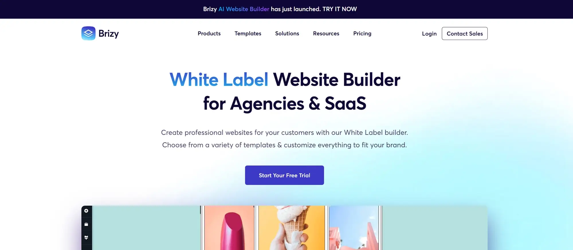
Brizy is a lightweight WordPress page builder with a clean interface and intuitive workflow. It’s designed to make web design easy for users of all skill levels. Whether you’re building a personal blog, business site, or landing page, Brizy provides a smoother experience compared to bulkier builders like Elementor. With performance and SEO in mind, it helps deliver fast-loading, responsive pages.
Responsive design features
Brizy’s layout system is built to be mobile-first. Its blocks adapt automatically to different screen sizes. You can:
- Set responsive font sizes and spacing
- Preview layouts by device type
- Control element visibility on mobile, tablet, or desktop
Case study: A local service business rebuilt its site using Brizy. The new mobile-friendly design led to a 26% decrease in bounce rate and a 19% increase in contact form submissions.
Ease of use
Brizy’s editor is one of the easiest to learn. You can:
- Click directly on elements to edit text, colours, and spacing
- Drag and drop blocks without dealing with sidebars or complex panels
- Use undo/redo functionality like a desktop app
Tip: Use Brizy’s global styling settings to update fonts and colours across the whole site in seconds.
Mobile responsiveness
Brizy ensures that every block and layout looks polished on mobile. You can:
- Customise layouts per breakpoint
- Use mobile-specific padding and alignment
- Preview on actual devices for testing
Do:
- Keep CTA buttons centred for better tap accessibility
- Use smaller image sizes on mobile to improve loading speed
Don’t:
- Overload mobile layouts with animations
- Rely on desktop layouts to automatically convert well to smaller screens
Templates and design elements
Brizy includes a wide library of pre-made blocks, page sections, and templates that you can customise to fit your brand. These follow design and SEO best practices and are easy to adapt.
What you get:
- Hero sections, forms, pricing tables, testimonials
- Navigation menus, galleries, and footers
- Conversion-focused landing pages
Pro tip: Save custom blocks as templates to use across future pages or projects.
Performance
Brizy is built with a lightweight codebase, resulting in faster load times compared to heavier builders. It avoids loading unused scripts, and is fully compatible with caching and optimisation plugins.
Performance features:
- Clean code output
- Smart image loading
- Fast inline editor response
Case study: A creative freelancer moved from Elementor to Brizy and cut their average page load time by 1.3 seconds, which helped improve rankings and UX scores.
Community and support
Brizy has a strong knowledge base with written and video tutorials, plus:
- An active Facebook group
- Public roadmap and regular updates
- Quick-response ticket support for paid users
Final thoughts
Brizy offers a well-balanced mix of simplicity, speed, and design flexibility. It’s ideal for those who want to create SEO-friendly, responsive websites without a steep learning curve. Compared to Elementor, Brizy is lighter, quicker to set up, and perfect for projects where speed and clean design matter most.
Build like a pro
5. Gutenberg: A lightweight, SEO-focused alternative to Elementor
Introduction to Gutenberg
Gutenberg is the default WordPress block editor, offering a straightforward and powerful way to build websites. It’s part of WordPress core, so there’s no need for third-party plugins. With a visual block-based system, Gutenberg helps users of all skill levels create content-rich, mobile-friendly, and SEO-optimised sites directly in WordPress.
Responsive design features
Gutenberg is built on a mobile-first approach. The code it generates is minimal and well-structured, supporting good performance across all device types. Layout adjustments are simple, and many blocks include settings for spacing, width, and alignment that scale properly across devices.
Case study: A small online business switched from a third-party builder to Gutenberg and used block patterns to rebuild its product pages. After the switch, mobile usability improved and bounce rates dropped by 17% in just one month.
Ease of use
Gutenberg’s interface is clean and designed with ease in mind. Each content element text, images, headings, buttons is handled as a block, which you can move or customise without any coding.
Tip: Use keyboard shortcuts and the block navigator panel to work faster when editing longer pages or posts.
Mobile responsiveness
Built-in blocks such as columns, images, and groups automatically adapt to screen size. Gutenberg also allows for:
- Full-width or wide-aligned blocks
- Vertical stacking of columns on mobile
- Spacing controls to fine-tune layout for small screens
Do:
- Test layouts in mobile preview mode
- Use Group blocks for logical layout containers
Don’t:
- Overuse column layouts without checking mobile stacking
- Ignore vertical spacing on smaller devices
Templates and design elements
Gutenberg offers a variety of reusable blocks and block patterns. These are pre-designed layouts or elements you can insert into pages and adjust to match your brand.
What’s included:
- Hero sections
- Text and image combos
- Call-to-actions
- Testimonials
Pro tip: Save custom blocks as reusable elements to keep your design consistent across multiple pages.
Performance
Because Gutenberg is built into WordPress core, it loads faster and outputs cleaner code than most third-party builders. This helps improve:
- Core Web Vitals
- Page speed scores
- SEO and crawlability
Highlights:
- No extra scripts or libraries by default
- Works seamlessly with caching and optimisation plugins
- Fewer compatibility issues with themes
Community and support
The Gutenberg project is actively maintained by WordPress core developers. You’ll find:
- In-depth documentation at WordPress.org
- Video tutorials and third-party guides
- A strong community on support forums and GitHub
Final thoughts
Gutenberg provides a clean, fast, and SEO-conscious way to build websites inside WordPress. It doesn’t require a separate plugin, and it offers powerful tools like reusable blocks, templates, and mobile-friendly layout options. For those who want to avoid plugin bloat and still create beautiful, responsive websites, Gutenberg is a strong alternative to Elementor.
Exploring SEO-friendly alternatives to Elementor can help you find the perfect page builder to suit your specific needs and preferences. Each of the options discussed MaxiBlocks, GeneratePress with GenerateBlocks, Oxygen Builder, Brizy, and Gutenberg offers unique features and benefits that can enhance your website’s SEO performance. By considering these alternatives, you can choose the right tool to create beautiful, high-quality websites that rank well on search engines.
Additional resources
Links to official websites for each page builder:
By exploring these resources, you can gain a deeper understanding of each page builder and make the most out of their features to create beautiful and functional SEO-optimised websites.
Discover the best Elementor alternatives for WordPress
Explore a complete collection of Elementor alternatives with tips, comparisons, and tutorials for every type of WordPress site.
FAQs about responsive design Elementor alternatives for WordPress
What are some responsive design Elementor alternatives for WordPress?
Some responsive design Elementor alternatives for WordPress include Divi Builder, Beaver Builder, and Brizy. These page builders offer robust responsive design features that ensure your website looks great on all devices.
Is Divi Builder a good responsive design Elementor alternative?
Yes, Divi Builder is a good responsive design Elementor alternative. It includes built-in responsive editing tools that allow you to customize how your website appears on different screen sizes, ensuring a seamless user experience across all devices.
How does Beaver Builder compare as a responsive design Elementor alternative?
Beaver Builder is an excellent responsive design Elementor alternative. It provides easy-to-use responsive design controls that let you adjust settings for different devices, ensuring your website is fully responsive and looks great on mobile, tablet, and desktop.
Are there any free responsive design Elementor alternatives?
Yes, Gutenberg with GenerateBlocks is a free responsive design Elementor alternative. This combination allows you to create responsive layouts using the default WordPress editor, ensuring your site is optimized for all devices.
What makes Brizy a strong responsive design Elementor alternative?
Brizy is a strong responsive design Elementor alternative due to its intuitive interface and powerful responsive editing features. It allows you to easily customize the appearance of your website on various devices, ensuring a consistent and professional look.
Which responsive design Elementor alternative is best for beginners?
Divi Builder and Brizy are excellent responsive design Elementor alternatives for beginners. They offer user-friendly interfaces and straightforward responsive design tools, making it easy for new users to create responsive websites.
Do responsive design Elementor alternatives support advanced customization?
Yes, responsive design Elementor alternatives like Divi Builder and Beaver Builder support advanced customization. They provide a range of responsive design settings, allowing you to fine-tune your website’s appearance on different devices.
Can I achieve responsive design with Visual Composer as an Elementor alternative?
Yes, Visual Composer is a responsive design Elementor alternative that offers extensive responsive design features. It allows you to customize how your content appears on various devices, ensuring a mobile-friendly website.
How do responsive design Elementor alternatives handle mobile optimization?
Responsive design Elementor alternatives like Beaver Builder and Divi Builder handle mobile optimization by providing dedicated tools and settings for mobile devices. These features allow you to adjust font sizes, spacing, and layout specifically for mobile screens.
Are there responsive design Elementor alternatives with strong community support?
Yes, Divi Builder and Beaver Builder have strong community support. These responsive design Elementor alternatives benefit from active user communities that share tips, tutorials, and solutions to common design challenges.
WordPress itself
Official Website
wordpress.org – This is the official website for WordPress, where you can download the software, find documentation, and learn more about using it.
WordPress Codex
codex.wordpress.org/Main_Page – This is a comprehensive documentation resource for WordPress, covering everything from installation and configuration to specific functionality and troubleshooting.
WordPress Theme Directory
wordpress.org/themes – The official WordPress theme directory is a great place to find free and premium WordPress themes. You can browse themes by category, feature, and popularity.
maxiblocks.com/go/help-desk
maxiblocks.com/pro-library
www.youtube.com/@maxiblocks
twitter.com/maxiblocks
linkedin.com/company/maxi-blocks
github.com/orgs/maxi-blocks
wordpress.org/plugins/maxi-blocks

Kyra Pieterse
Author
Kyra is the co-founder and creative lead of MaxiBlocks, an open-source page builder for WordPress Gutenberg.
You may also like

